November 29, 2014
Tableau Tip: Conditional Axis Formatting Using an Axis Selector
container
,
dashboard
,
hide
,
parameters
,
show
,
tableau
,
tips
,
tricks
3 comments
Back in July 2012, I wrote about "Dynamic Axis Selections". The problem with this approach, though, was that it created a single axis, which only allows for a single format. Reader Dave Andrade posted a different, yet related question in the comments.
Download the workbook here.
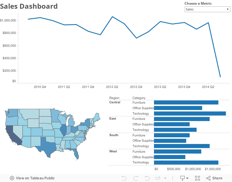
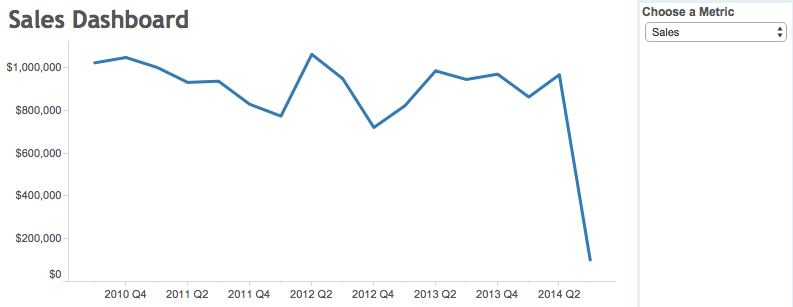
Let's say we choose 3 metrics - Mail Volume, Spend, and Response Rate as part of our parameter metrics. That means we now have a regular number, a dollar value, and a percentage as part of our available measures. After building the case statement and building a chart similar to the one you've shown in this post, the best thing we can do to show the correct values (sans label of $ or %) on the y-axis is using the "automatic" number formatting option for the 'Measure chosen' measure. I know Tableau has made it much easier to add the label on the chart itself with the Label mark after v8.0, but what about the actual y-axis value? Is there any way to dynamically update the measure value's axis label to reflect it's true number format?While the direct answer to Dave's question is no, there's isn't a way to dynamically update the format of the Measure Values pill, there is a work around using containers, which will can give the perception of conditional formatting. Here is the final output of the technique I've used. Read farther down for detailed step-by-step instructions, plus a video.
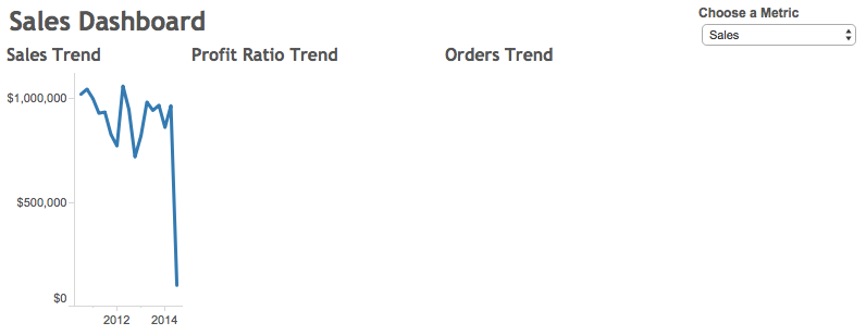
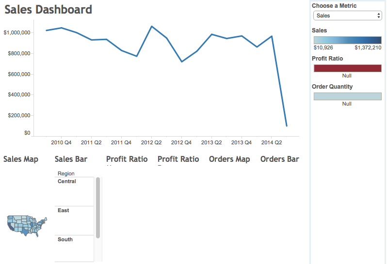
In this example, I've created a simple dashboard with three viz types: Line Chart, Map, and Bar Chart. I created three separate sheets for each type of chart, one for each metric: Sales, Profit Ratio, and Order Quantity, each having a different format for a total of nine worksheets.
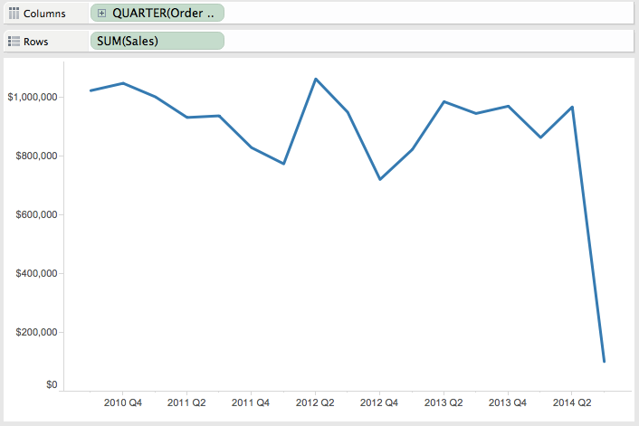
Step 1 - Create the lines charts. I started with Sales and then duplicated the sheet and replaced Sales with Profit Ratio and Order Quantity, leaving me with three separate worksheets.
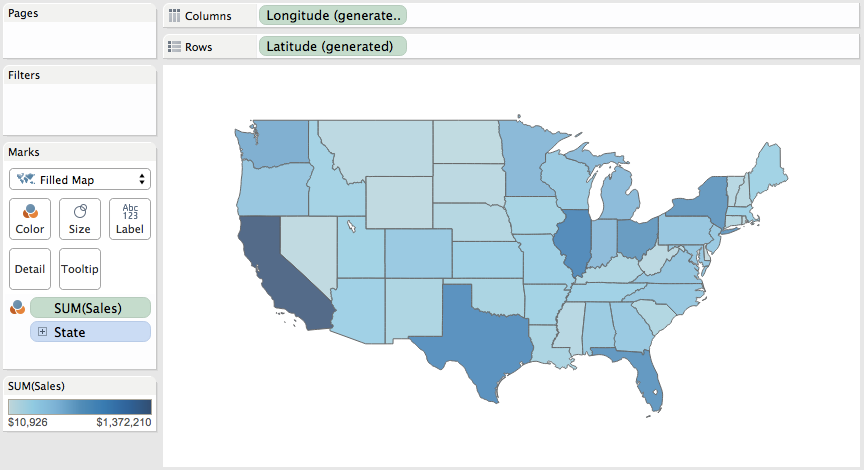
Step 2 - Create a map for each metric. Again, I end up with one worksheet for each metric.
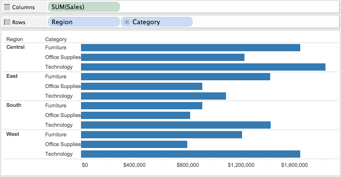
Step 3 - Create a bar chart for each metric, giving us three more worksheets for a total of nine.
Step 4 - Create a parameter with a list of the metrics.
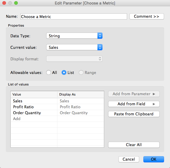
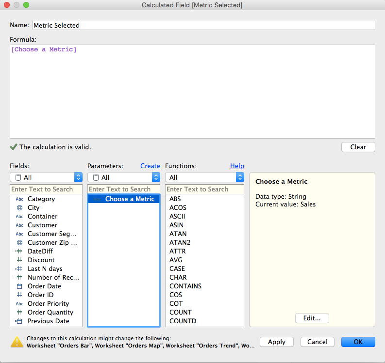
Step 5 - Create a calculated field to get the value selected in the parameter created in Step 4.
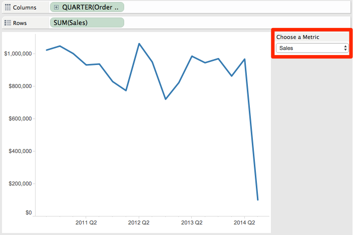
Step 6 - Show the parameter control on one of the Sales worksheets and choose Sales from the list.
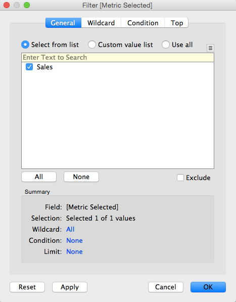
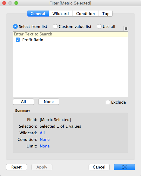
Step 7 - For each of the worksheets that is using the Sales measure, drag the calculated field created in step 5 onto the Filters shelf and explicitly choose Sales from the list. There should only be one item in the list of available selections. Do NOT choose the "Use All" option or this hack won't work.
Note what happens when you change the selection in the parameter (e.g., choose Profit Ratio); the worksheet will go blank. This is exactly what we want because we want the Sales worksheets to go blank when a different metric is chosen. Go ahead, give it a try.
Step 8 - Change the metric chosen in the parameter to Profit Ratio and then add the calculated field created in step 5 onto the Filters shelf for each of the worksheets that contains Profit Ratio and explicitly choose Profit Ratio from the list.
Again, notice how Profit Ratio is our only available selection in the filter list.
Step 9 - Repeat step 8, but this time choose Order Quantity and add the filter to each of the Order Quantity sheets.
Step 10 - Create a new dashboard.
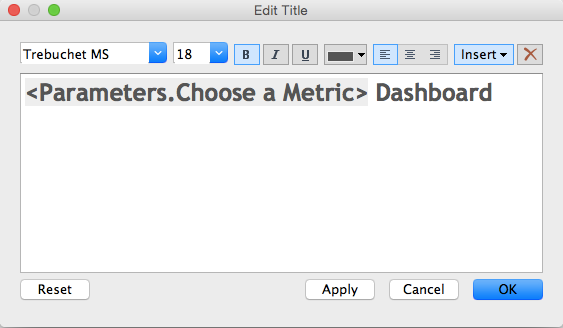
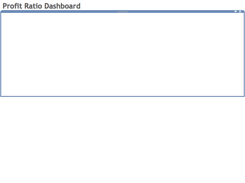
Step 11 (optional) - Add the title to the dashboard and in the title, include the parameter. This way the title will make the dashboard more intuitive.
Step 12 - Add two horizontal containers to the dashboard, one above the other.
...then hide the titles for each worksheet.
Step 14 - Add all of the maps and bar charts to the bottom container...
...then hide the titles for each worksheet.
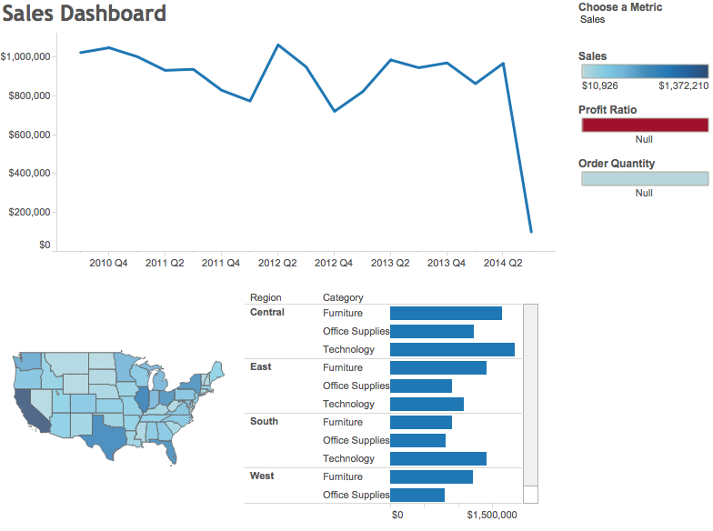
Step 15 - A bit of cleanup, like sizing the charts to fit the view, removing the color legends, making it all looks pretty and floating the parameter and you're all done!
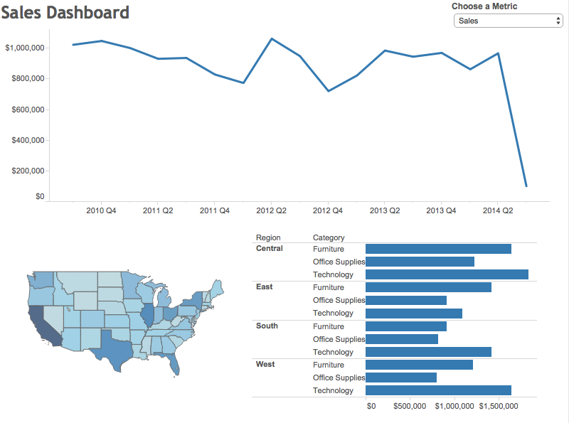
Go back to the viz at the top to play with the interactive version. Here's a video recording of how I built this dashboard.
November 28, 2014
My new website focusing on data viz best practices
andy cotgreave
,
best practices
,
data viz done right
,
emily kund
,
matt francis
,
podcast
,
tableau
,
viz of the day
,
wannabe
1 comment
This week on the Tableau Wannabe Podcast, Emily and Matt were joined by Andy Cotgreave, Tableau's Social Content Manager. When they were discussing the Viz of the Day content, one of the things they talked about was that VotD isn't necessarily about best practices and that there was a need to highlight great content.
This led me to create www.DataVizDoneRight.com, which I will use to highlight examples of data viz best practices I find around the web. The content will not be exclusively Tableau focused, as there is tons of great content outside the Tableau community as well.
The first post is up. Go check it out here.
November 17, 2014
Makeover Monday: The Facebook Election
buzzfeed
,
democrats
,
election
,
facebook
,
Makeover Monday
,
pie chart
,
politics
,
republicans
,
sentiment
,
stacked bar chart
4 comments
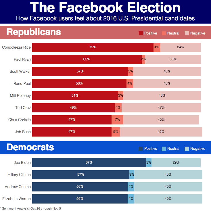
From Buzzfeed: "The social network (Facebook) may end TV’s long dominance of American politics — and open the door to a new kind of populism." The purpose of this article was to demonstrate that conversations on Facebook are becoming a dominant force in the U.S. political landscape. The article included this infographic about Facebook users' sentiment towards 2016 Presidential candidates.

There are several things about this infographic that I don't like:
There are several things about this infographic that I don't like:
- The title doesn't tell us what the graphic is about.
- The pie charts; simply too many of them making comparisons difficult.
- There's no apparent order to the candidates.
- Candidate names are in ALL CAPS...why?
- The label for the Democrats section is off to the right, why?
- Some of the pies add up to less than 100% and some to more than 100%.
Those are the immediate things that stuck out in my initial review. I recreate the data in Excel, imported it into Tableau and built my own infographic. Download the workbook here.
I believe I've made improvements to all of my concerns above:
- The title makes it more clear what you're looking at.
- I switched the pie charts to stacked bars.
- The candidates are ordered by positive sentiment.
- The candidates names are easier to read since they're in proper case.
- The labeling for the two sections is aligned.
- Since I'm using stacked bars, the fact that some of the candidates are not equal to 100% is irrelevant.
According to this sentiment data, it will be Condoleeza Rice vs. Joe Biden in 2016. I certainly am not looking forward to all of the political ads coming our way.
Thoughts? Which one do you prefer? What would you do differently?
November 9, 2014
Tableau Tip: KPIs and Sparklines in the Same Worksheet
calculated field
,
dates
,
KPI
,
sparklines
,
table calc
,
tableau
,
tips
,
tricks
57 comments
I'm writing this blog post outside of a Starbucks in the Sao Paulo airport. Sao Paulo you say? I'm in Brazil this week with four other folks from the San Francisco Bay Area TUG to help Tableau leaders in Rio de Janeiro and Sao Paulo get their own TUGs started. I see this as a way that I can give more than I take from the Tableau community. Yes, this is what I choose to do with my vacation time (it's a bit of a sickness) and no, Tableau doesn't pay me to do this.
Anyway, as I was on the plane, I thought it would be great to kick off the week with a new tip. Today, I'm writing about combining KPIs and sparklines in a single view. It's very common for business users to want to see KPIs and trends in the same view. These give them a sense for the overall direction of their product and also highlight the most meaningful numbers to them. I often see people create these as separate worksheets in Tableau, but with this post, I'm going to show you how to combine them into a single view.
Combining them into a single view provides a couple of benefits:
- Tableau only needs to render a single sheet, so until parallel processing comes out in v9, you'll see a performance benefit.
- If you have a hierarchy, then expanding the hierarchy will keep the table and the sparklines together.
- Trading volume for the last 7 days
- Trading volume for the prior 7 days
- Week over week change (raw & %)
This should be a fairly typical set of KPIs for most products. You could easily expand this technique to include m/m or y/y calculations depending on how your organization calculates those. Here's the final solution, with details on how to create this view below.
Subscribe to:
Posts
(
Atom
)


