April 1, 2018
Makeover Monday: World Wine Production
alcohol consumption
,
change
,
difference
,
highlight
,
line chart
,
Makeover Monday
,
parameter
,
wine
6 comments

What works well?
- It's a simple line chart, which makes it easy to understand.
- The red line stands out well against the white background without being too bright.
- The units on the axis are labeled.
- The title tells is what the line represents.
What could be improved?
- The subtitle could be moved to a caption below the image.
- The axis has a strange scale. Why does it start at 180?
- Adding the drop lines makes it look like the length of those lines is important, but if you compare the length of the lines, then that could be misleading due to the axis starting at 180. I'd remove those lines.
- The year labels are diagonal.
- Each year doesn't need a label.
- Why doesn't the source document contain data for all of the years?
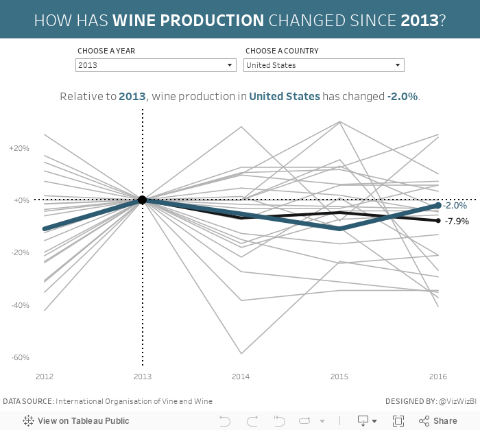
My Goals
- It's Easter and I have basically no time to work on this, so do something quick.
- Mimic what we created for Workout Wednesday week 33.
- Focus on the relative change from a chosen period instead of the absolute change. For me, this is more meaningful if you want to see how much a country has changed and it normalizes all of the countries.
That's it. All done!
Subscribe to:
Post Comments
(
Atom
)


First of all, thank you for reviewing my chart in this week's webinar.
ReplyDeleteI've been thinking and wanted to give my humble opinion:
What is the point of telling a new story?
When I started participating in the Makeover Monday, I wanted to sharpen my critical eye, find weaknesses and try to improve the chart chosen.
If the original author wanted to show the annual production of wines, I do not think I should tell a different story. I think I should tell the same story, but with a better and more appropriate chart.
Telling a new story, especially when the data is obtained externally (not in the data.world or the original source) turns everything into a new project instead of a makeover.
What do you think about this?
Hi Bruno.
DeleteThe point of telling a new story is to learn to think like an analyst. If you don't want to tell a different story, that's perfectly fine; sometimes it's good practice to try to rebuild the original as well. I've done that myself before.
The data we use always comes from the source of the original chart, so it's NOT a new project; it's definitely a makeover.
Dear Andy Kriebel,
ReplyDeletePlease guide how did you resize the dashboard title. I have replicate everything except this title resizing.
Regards
Arshad
The challenge is to reproduce the work. You should try to figure it out.
DeleteI have reproduce all Boss, But since long I have been stuck at this point, bit clue please.
ReplyDeleteNext step then is to download the workbook and see if you can see how I did it.
Delete