October 22, 2019
#TableauTipTuesday: Using Distribution Lines to Provide Space for Labels
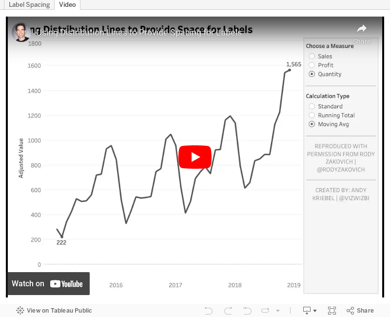
Credit for this tip goes to Rody Zakovich (@RodyZakovich). In the past, I've always created complicated table calcs to give labels room above the max and below the min of a line chart.With distribution lines, you no longer need to do that. Simply set a percentage offset and you're good to go! So simple!

October 20, 2019
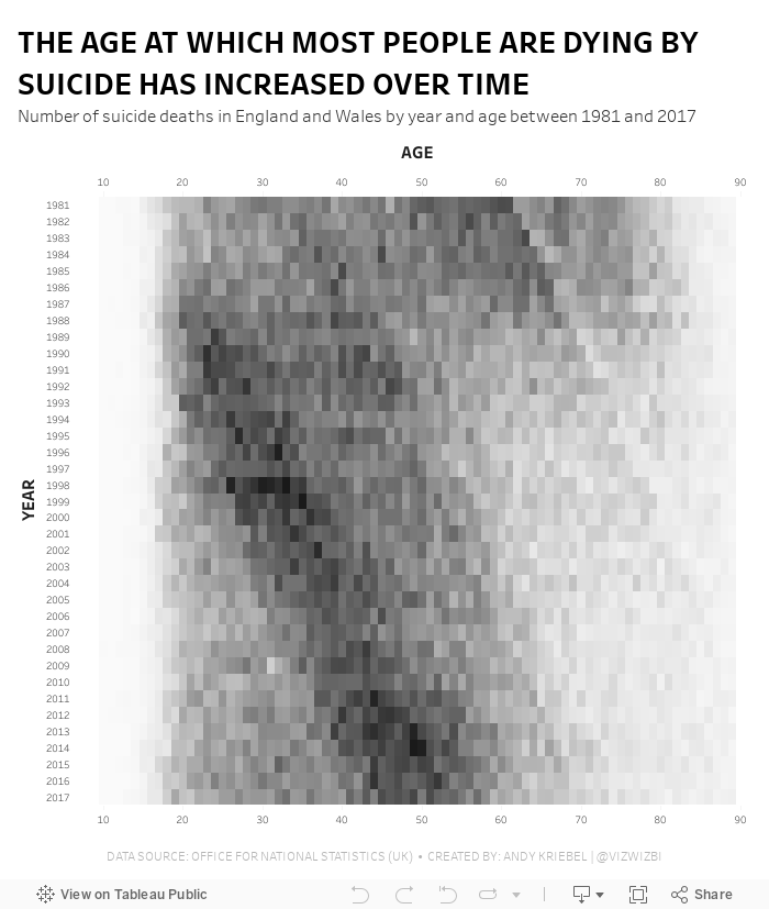
#MakeoverMonday: The Age at Which Most People Are Dying by Suicide Has Increased Over Time
death
,
Makeover Monday
,
mental illness
,
office for national statistics
,
ONS
,
suicide
No comments

- It's a simple data set.
- The original visualization is really good.
Let's have a look.
What Works Well?
- The patterns are super intuitive to see and understand.
- Amazing interactivity that allows you to look at an entire year without the overlap of the other years.
- Nice annotations
- Years and ages are in the appropriate order
- Using the intensity of a single color to emphasize the number of suicides
What could be improved?
- The number of axis ticks could be reduced to every five or ten years.
What I did
I thought I would try to build a horizon chart, but it became too complex and the data wasn't quite suited for it. I then built a series of area charts like the original, but without the overlap. It didn't look good; the original has nice rounded lines, whereas a Tableau area chart has sharp edges.
I tried line charts, small multiples, running totals, none of them worked. I ended up keeping it very simple and went with a heatmap that I think gets pretty close to the same analysis as the original.
October 14, 2019
#MakeoverMonday: Ironman World Championship Medalists
champions
,
championship
,
cycling
,
Hawaii
,
ironman
,
medals
,
running
,
sports
,
swimming
,
triathlon
No comments

The viz to makeover is a simple table from Wikipedia:

What works well?
- The years are listed in order from most recent to oldest.
- Table can be sorted
- Including separate columns for each medal
- Including links to each athlete
What could be improved?
- I'm not convinced that both the flag and country abbreviations are necessary; one is probably enough.
- Some of the athletes have red text and some have blue. I couldn't find anything on the page that explained this.
- Comparing athletes across years is difficult because of the precision of the times/
What I did
After exploring the data for a few minutes, I remembered that Rody Zakovich created an incredible viz about the Winter Olympics (check it out here) and I've been wanting to emulate it. This data set proved perfect for it. This is the beauty of Tableau Public; you can download workbooks, see how someone created their work, and use it to help create your own.
Here's my viz for Makeover Monday week 42 (click on the image for the interactive version).
October 8, 2019
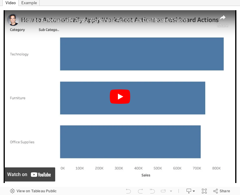
#TableauTipTuesday: How to Automatically Apply Worksheet Actions as Dashboard Actions
This week's tip was brought to my attention by Zen Master Rosario Gauna. One of the really annoying things about Tableau for the longest time has been needing to create a separate dashboard action that mimics a worksheet action. In other words, you create a worksheet action, you like it, then when you add the sheet to a dashboard, the action is no longer there and you have to create it again.Well in this tip, I show you how to make a worksheet action automatically apply to a dashboard action without having to create a separate dashboard action. Genius!

October 7, 2019
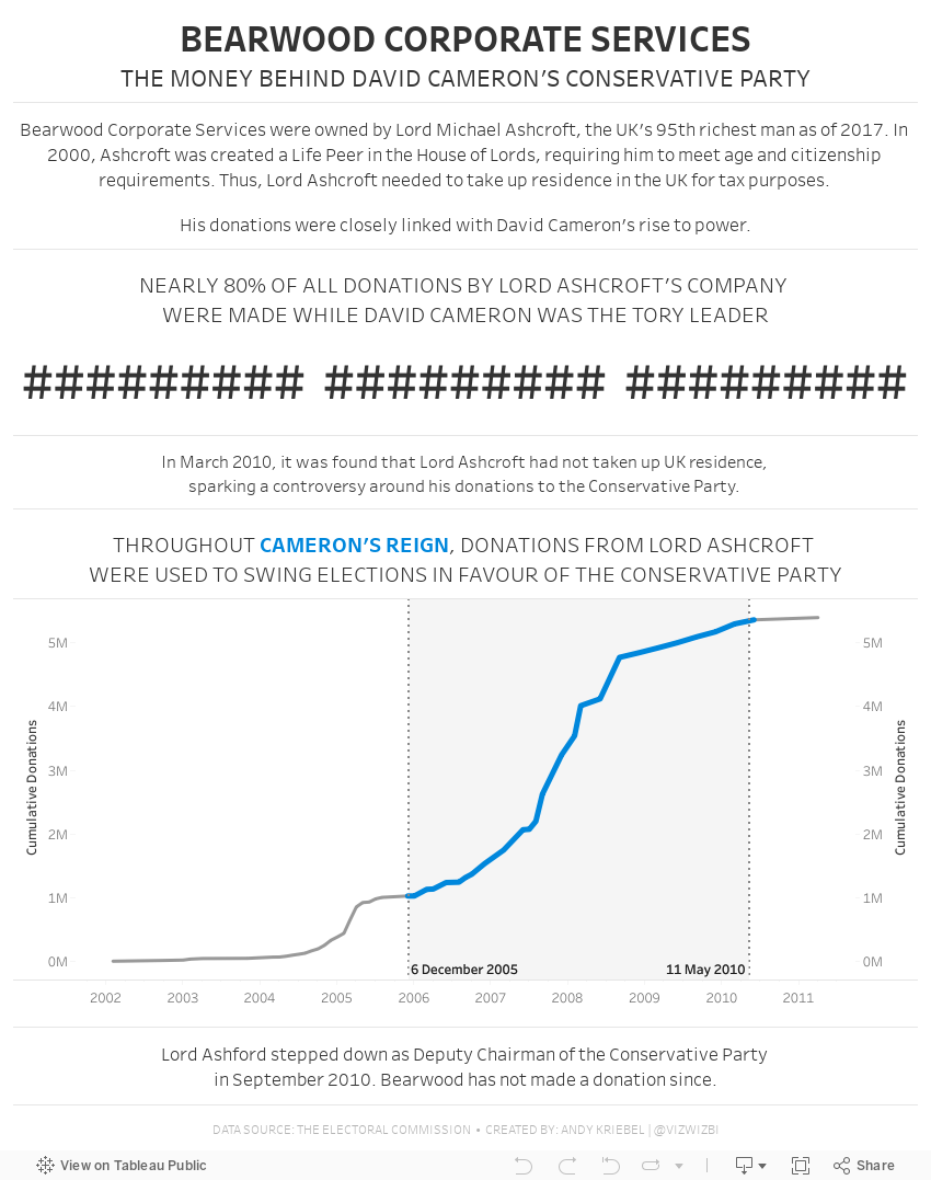
#MakeoverMonday: Bearwood Corporate Services - The Money Behind David Cameron's Conservative Party
conservative
,
David Cameron
,
election
,
influence
,
Lord Ashcroft
,
Makeover Monday
,
money
,
politics
,
tory
,
UK
,
united kingdom
No comments

 |
| SOURCE: THE ELECTORAL COMMISSION |
WHAT WORKS WELL?
- Placing the filters on the upper right let me know immediately that I can interact with the data to find my own story.
- The bar chart is sorted in descending order.
- The summary numbers provide some context, but not much.
WHAT COULD BE IMPROVED?
- The bar chart would be easier to read if it was horizontal.
- Why are all of the bars colored? There are way too many colors and they have no meaning.
- The packed bubbles would be much better as a bar chart or BANs.
WHAT I DID
I started by exploring each field in the data set. Many of them didn't have information I found useful, so I hid all of those fields so that they would not distract from my analysis.
As I explored the donors and who gave what to whom, I saw that Bearwood Corporate Services was donating A LOT to the Conservative Party over a period of a few years. I hadn't heard of it before so I did some research on Google and it turns out that they were pretty controversial and closely linked to the rise to power of David Cameron.
That's where my story begins...
Subscribe to:
Posts
(
Atom
)


