May 19, 2015
Tableau Tip Tuesday: How to Label the Top of Stacked Bars
dual axis
,
gantt
,
labels
,
reference line
,
stacked bar chart
,
tableau
,
tip
,
Tuesday
10 comments

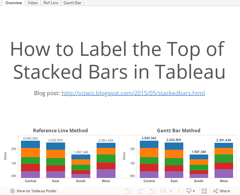
This week's tip covers two methods for displaying the total of a stacked bar chart. Enjoy!
Subscribe to:
Post Comments
(
Atom
)


simply great method :-)
ReplyDeleteSometimes simplest is best.
DeleteHi Andy,
DeleteWe need to plot a stack bar with three diff sales value and also two targets as a scatter.
Could you please advise if that is possible ?
Regards
Siddharth
Siddharth, first, I would recommend you try on your own. This is the best way to learn. Second, yes this is possible, though I'm not sure why you would want a stacked bar and a scatter on the same plot. In my head, I'm picturing sales as a stacked bar on the left axis and budget synchronized on the dual-axis set to a gantt bar. On the gantt bar, you'd have to change the calc to a running total so that they align with the stacks properly.
DeleteHi Andy, very helpful tips. I have a dual axis stacked bar + line chart. I want to show both the grand total and individual values for the stacked bars. My stacked bars are showing 'Number of Records', split by colour for a specific state. Any advice on how best to accomplish this? I've tried both relative line and Gantt methods but neither work, think the dual axis might be the culprit.
ReplyDeleteMany thanks!
Gudmundur
Double check what is on the Marks card for your secondary axis. Tableau will divide up the bars or lines if you have anything on the marks card.
DeleteHow would one put a different cell-based value (e.g. MAX(OrderDate)) as the label?
ReplyDeleteI am stacking bars in which the colors represent bins of completion time. Typically, I get a large number of green (good) with a possible red (oh no!) which is very small. I would like the top label to have something like MAX(CompletionTime) (bonus points if it could be color-coded) to show which mostly-good bars actually have one or more problematic members. Thoughts?
Tom, if you use the secondary axis/Gantt technique then you can put whatever you want on the label shelf for that axis.
DeleteIf I have my stacked bar charts as percent of total, calculated table down, how do I put the total number of cases (instead of 100%) at the top if each bar? With the Gantt method, it leaves my totals very low on the chart, instead of at the top. I wasn't able to get anything other than 100% using the reference line method. Thanks
ReplyDelete- Amy
Hi Amy. To get the number above the bar instead of the percentage, put the field that represents your number of cases on the label shelf.
Delete