December 24, 2014
Tableau Tip: How to make KPI donut charts
donut chart
,
dual axis
,
KPI
,
Ryan Sleeper
,
tableau
,
tips
,
tricks
40 comments
On his great Evolytics blog, Ryan Sleeper, former Iron Viz Champ and renowned design guru, wrote about how to create donut charts in Tableau. His technique is sound. The concern I have is that he recommends using floating objects on a dashboard to create the hole in the donut.
If you have any experience with floating objects in Tableau, you know the pain of taking lots of time to make a dashboard look perfect in Desktop with floating objects, only to have it get all messed up once you publish it to Server or Public. I rarely recommend using floating objects for just this reason; it's frustrating and can make your work look sloppy. Hopefully Tableau soon fixes this bug that has been around as long as floating objects have existed.
Another reason to avoid floating objects is that there are more objects that have to be drawn on the dashboard, which can potentially have a performance impact.
While I typically hate pie charts, I think that donut charts, used in this specific way, can indeed be effective. As Ryan says in his post:
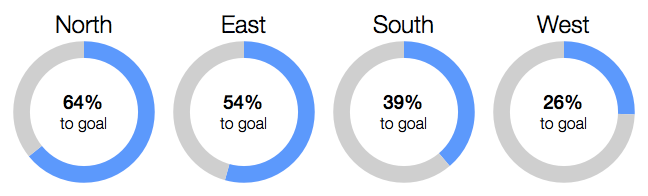
Step 1: Create a two-slice pie chart. This example uses actual sales and sales left to hit the goal.
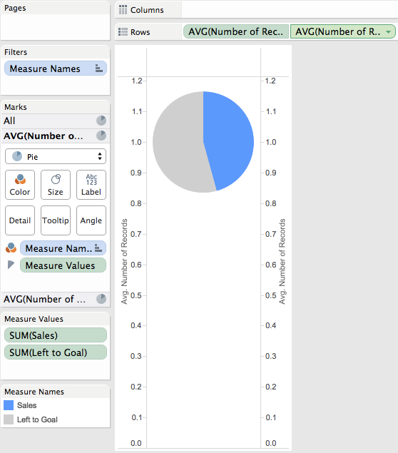
Step 2: Drag the Number of Records measure to the Rows shelf and change the aggregation to an average. Repeat this a second time and then right-click on the second pill and choose "Dual Axis". Finally, remember to synchronize the axes.
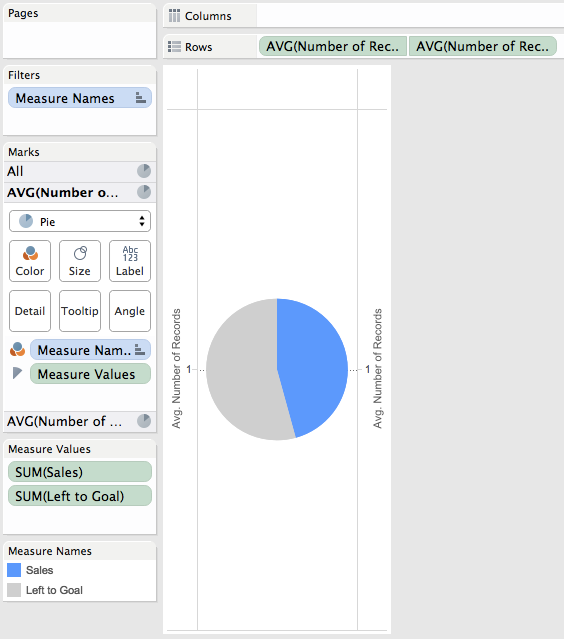
Step 3: Double click on the left axis to bring up the Edit Axis window. Uncheck Include Zero.
Step 4: Do a bit of formatting: (1) Remove Zero line, (2) Remove Row & Column dividers, (3) Hide the headers
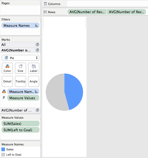
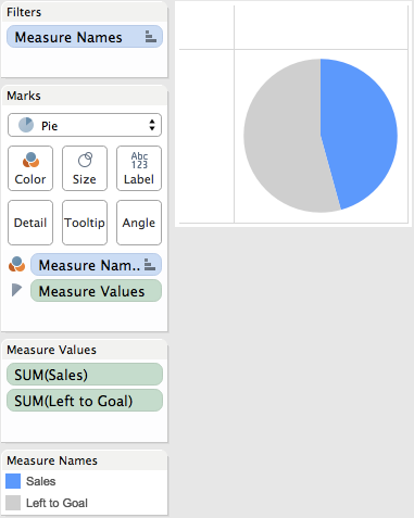
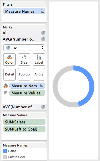
Step 5: On the secondary axis, remove Measure Names from color and Measure Values from Angle. Click the Color shelf and choose white. Adjust the size of the pie down slightly to reveal the donut.
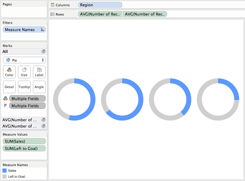
Step 6: Add Region to the Columns shelf and then hide the headers.
Step 7: On the first pie chart on the Marks card, add Region to the Label shelf, set the alignment to the top and make the font bigger.
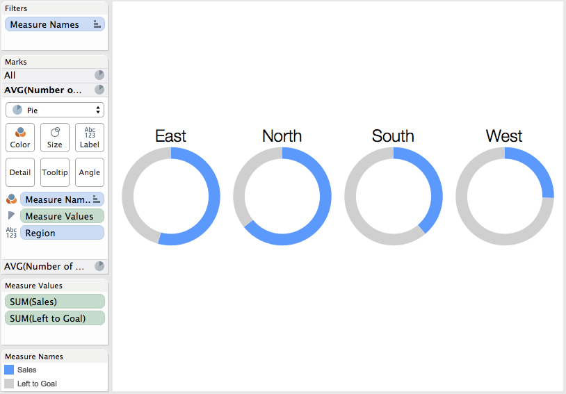
Step 8: On the second pie chart on the Marks card, add a % to goal measure to the Label shelf and customize the font.
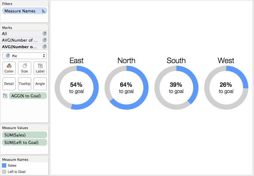
Step 9: Sort Region by the % to goal metric in descending order.
Download the Tableau workbook used to create this post here.
If you have any experience with floating objects in Tableau, you know the pain of taking lots of time to make a dashboard look perfect in Desktop with floating objects, only to have it get all messed up once you publish it to Server or Public. I rarely recommend using floating objects for just this reason; it's frustrating and can make your work look sloppy. Hopefully Tableau soon fixes this bug that has been around as long as floating objects have existed.
Another reason to avoid floating objects is that there are more objects that have to be drawn on the dashboard, which can potentially have a performance impact.
While I typically hate pie charts, I think that donut charts, used in this specific way, can indeed be effective. As Ryan says in his post:
When used for the specific purpose of showing a metric’s progress to goal, with one “slice” being the current state of the KPI and one “slice” being the remainder to goal, I think a donut chart works well.Here's how I would create a donut chart in Tableau using a single worksheet. The final product looks like this:
Step 1: Create a two-slice pie chart. This example uses actual sales and sales left to hit the goal.
Step 2: Drag the Number of Records measure to the Rows shelf and change the aggregation to an average. Repeat this a second time and then right-click on the second pill and choose "Dual Axis". Finally, remember to synchronize the axes.
Step 3: Double click on the left axis to bring up the Edit Axis window. Uncheck Include Zero.
Step 4: Do a bit of formatting: (1) Remove Zero line, (2) Remove Row & Column dividers, (3) Hide the headers
Step 5: On the secondary axis, remove Measure Names from color and Measure Values from Angle. Click the Color shelf and choose white. Adjust the size of the pie down slightly to reveal the donut.
Step 6: Add Region to the Columns shelf and then hide the headers.
Step 7: On the first pie chart on the Marks card, add Region to the Label shelf, set the alignment to the top and make the font bigger.
Step 8: On the second pie chart on the Marks card, add a % to goal measure to the Label shelf and customize the font.
Step 9: Sort Region by the % to goal metric in descending order.
Download the Tableau workbook used to create this post here.
Subscribe to:
Post Comments
(
Atom
)


Hi Andy,
ReplyDeleteI know you are not a big fan of pie charts, but what if one of the regions above succeeded it's goal. Can we add a 3rd color to represent the success in the donut chart?
Would love to hear back from you.
Thanks,
Protyush
Protyush, I can't recommend that you use donuts any time. I wrote this as a joke.
DeleteAndy,
ReplyDeleteI figured it! You need to create 2 calculated metrics, in addition to the Actual Sales in the Measure Values of the first Pie (Assuming the forecast number is also present in the data set)
1st Calculated metric: Exceed Goal:(Let's color this Orange)
If (Sales>=Forecast) then Sales - Forecast else 0 end;
2nd Calculated metric:Left to achieve Goal: (Let's color this Grey)
If (Sales<Forecast) then Forecast - Sales else 0 end;
3rd is the Sales:(Let's color this Blue)
Thanks Andy for showing how to create a donut chart.
Protyush
Hi Andy: Any reason why you hate pie charts ? I learnt that atleast twice so far. First on your blogs, under About Me. And again here today.
ReplyDeleteHi Andy, Please send me the above created Donut Chart details. How to create calculated fields for Pie Chart for the above chart, i'm trying to that, but not clear for proper.
DeleteYou can download the workbook and see how it's built.
DeleteHi Andy. I am new to Tableau Community.Does the workbook has sales left to goal measure as a part of source data? where can I download the source data and the workbook? Thanks in advance
DeleteHi Andy,
ReplyDeleteHow to handle the situation when sales has exceeded the goal? If sales goal was 100 and we sold 120.
Simple, don't use a donut chart. Use a bullet graph instead.
DeleteI got to this post because I had the same question as Sharad. I did not have a column of data for "left to go" so I created a calculated field in which I just subtracted my current sales from my stated goal. For example:
Delete50000-SUM(Sales)
The thing that I didn't like about the visual result of the approach outlined above, is that once I surpassed 100% the pie chart would show a slice for the negative number that resulted from the calculated field.
My solution was to adjust the calculated field as follows:
IF 50000-SUM(Sales) > 0 THEN 50000-SUM(Sales)
ELSE 0
END
This made it so that the pie chart would just show a full closed circle with the percent complete (e.g. 115%) labeled in the center. It doesn't show graphically how much you exceeded your goal but it is well labeled and the donut shows a completed circle. This was good enough for my purposes, not sure if it accomplishes your objectives, Sharad.
By doing this you're defeating the purpose of this chart type in the first place which is to measure parts to whole. You'd be way better off with a bullet graph.
DeleteHi Andi, Is there any way to set the anegel of the donut chat...............?
ReplyDeleteYes, you use the Angle shelf.
DeleteWhen I try to adjust the size of the second pie chart, Tableau also adjust the size for the first one. what should I do?
ReplyDeleteYou are likely adjusting the size on the All option on the Marks card. Make sure you only adjust the size for the metric you want to resize.
DeleteHi folks, I'm getting the same issue. Resizing one pie and the other one automatically adjusts to the new size. I'm selecting the Size individually for each metric as opposed to adjusting the size for 'All'. Anyone know how to decouple this?
DeleteOk, I figured it out. I had some extra marks on my second pie. Once I removed everything but the Label, I was able to resize the second pie without it adjusting the first.
DeleteHello,
ReplyDeleteIs there a possibility to make the middle chart to be on top all the time, because now, if i click on the bigger one it sets the white one in background. Looked everywhere how to lock somehow the layers, but with no luck :)
Any ideas?
Thanks,
Vilija
Can you add the pictures back ;) links are broken! This was our go-to place to pick up donut making instructions!
ReplyDeleteThe pictures are there.
DeleteHi Andy. Thanks for posting this. I have a question. I created a parameter to let customer choose which group's data they want to see. But any time when they change the group names, the label inside of the donut chart will change the position, will not be show in the right middle anymore. Do you have any idea how to fix the position of the label? Thanks
ReplyDeleteMake sure you have everything on the text shelf on one line. I suspect you have several lines of text.
DeleteI only have the text on one line, and the position will be changed anytime I click different values in parameter.
DeleteHi Andy
ReplyDeleteThanks for the great guide. I have an issue.
I have created my donut chart, and filtered by relative date (current month).
Hvem no data has been inserted by the 1. of the month, the donut disappears.
How can I make a rule to show the pie and the % even though no data has been inserted?
How can you expect Tableau to draw something if no data exists?
DeleteI know.
DeleteThe pis illustrates reports made on 82 locations.
Every month a report should be made, so at the 1st of the month, no reports are made, so i would like the pie to show the total sum of locations, and the 100% missing value - does it make sense? :)
Then you need a separate chart in the view that only displays on the first of the month and hides when it's not the first of the month. Please don't be ridiculous and create a view with 82 donut charts.
DeleteI try it out, and try not to be rediculous :)
ReplyDeleteHi Andy
ReplyDeleteI just tried removing the Measure Names from color and Measure Values from Angle in the secondary axis. But it removes the entire chart, is there a way to lock the all options in the marks card.
Tried it in my worksheet and also in your workbook in sheet -4 . Need some help here.
Ok I figured it out. The size of the first axis needs to increased.
ReplyDeleteAndy, can I rotate the pie chart to start on the horizontal axis instead of the vertical Axis?
ReplyDeleteThis is awesome! Although I don't yet understand why Number of Records is used. I don't have another suggestion, will just accept because it worked.
ReplyDeleteAny thoughts on showing this in a Speedometer view. For example 1-3 represents a Low-Med-High risk ranking. color scale also. Needle points to the respective ranking. Get the idea?
Thanks!
Hi,
ReplyDeleteHow will the donut chart look like if sales exceeds the target(goal)?
How will the visualization look like?
Simple, don't use a donut chart. Use a bullet graph or other alternatives.
DeleteI can't find example on the list of files. I'd really like to see what your data looks like. I am getting pie angle and percent that just don't match.
ReplyDeleteDownload the workbook and unzip it.
DeleteHello All;
ReplyDeleteIs there any way to make the donut conditional formatting with fixed sized slices? I mean the size of the slices won't change , only the color ofeach portion change individully?
Thanks!
Why would you want to do that? The slice is the data value. You'll only confuse your audience.
DeleteHi Andy! Is there any way to force single donut to fit whole container on the dashboard? Making it smaller/taller works only for certain resolution. Donut is clipped when showing graph on the smaller resolutions :/.. It works properly with single axis but with dual it seems to be broken..
ReplyDeleteNot that I know of. I build the donuts, stick them in the dashboard, then go back and play with the sizes.
Delete