May 21, 2017
Makeover Monday: How has alcohol consumption in Britain changed since 2005?
A couple weeks ago, BBC Health published this simple viz about the change in drinking habits in the UK between 2015 and 2016.
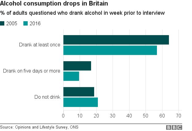
What works well?
- Simple title that tells me what the viz is about
- Subtitle that provides context for the numbers
- Side-by-side bars are a good way of comparing values year-over-year
- Overall clean layout
- Nice fat bars to make comparisons easier
- Colors are distinct enough
What could be improved?
- Include a % symbol on the axis somewhere
- This is a very narrow view of the data, whereas there are many more years available and it's also available by gender.
- It's a pretty boring viz; one that you'll often skim by and not engaged with.
- Label the bars
For my viz, I knew I wanted to use male, female and all people plus all years. This removes a bar chart as an option, preferring lines to show the trends since 2005. In addition, I wanted to show change since 2005 to provide better context that matches the purpose of the title.
I drew inspiration from this European IronViz entry by Ravi Mistry. I like how he is showing the change since the beginning.

Unlike Ravi, though, I decide to only label the line for all persons. I made this decision because labeling the end of each line would have made the viz feel crowded, as the numbers are varying enough to provide room to breathe.
I wanted to test out the Inconsolata font that Nathan Yau uses for his charts over on Flowing Data. If you have it installed on your computer, you'll see my intended display. If not, Tableau Public will server up something, not sure what really.
I wanted to test out the Inconsolata font that Nathan Yau uses for his charts over on Flowing Data. If you have it installed on your computer, you'll see my intended display. If not, Tableau Public will server up something, not sure what really.
Lastly, the colors. I picked them from the ONS dashboard about the UK economy.
Click on the image below for the interactive version.
Subscribe to:
Post Comments
(
Atom
)


how to get that dataset
ReplyDeleteIt's on makeovermonday.co.uk
Deletean interesting aspect that stands out and could not be guaged from the original viz is how women have been drinking more than men all across the dataset. i would have assumed otherwise.
ReplyDeleteThis may sound like a superbly silly question. But I can't seem to find the "Synchronize Axis" Option in my Tableau Public for the Proportion measure in the chart. Even though I can see it in the downloaded workbook of yours when I right click on the proportion field. Any suggestions?
ReplyDeleteThat happens when the fields aren't the same data type.
Delete