March 17, 2019
#MakeoverMonday: To what extent are women and men viewed equally in leadership positions?
equality
,
female
,
G7
,
Makeover Monday
,
Reykjavik Index
,
women
No comments

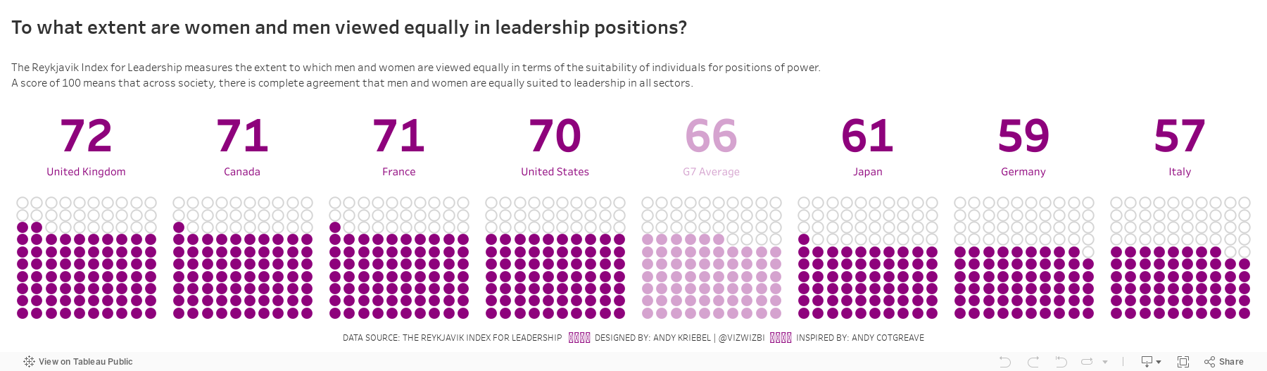
Let's have a look at the chart:
 |
| Source: World Economic Forum |
WHAT WORKS WELL?
- Ordering the countries from highest to lowest in terms of people that view women and men equally in leadership positions
- Including the G7 average for context
- Assigning a different color to the G7 average
- Labeling the end of the lines
WHAT COULD BE IMPROVED?
- Circular bar charts are horrible for comparisons.
- The title is meaningless.
- The lines start thin, get thicker, then get thin again. Why?
- The title and the center of the chart are the same. That's certainly unnecessary redundancy.
WHAT I DID
I started by creating a simple bar chart and that was fine. I also added a grey bar to have it as a stacked bar for each country that goes up to 100%. I then thought about doing a waffle chart (with circles) and then I remembered this viz from Andy Cotgreave back in Makeover Monday week 4 2016. I decided to replicate Andy's work since it looks great and gives lots of context. I created a mobile version like Andy did too.
With that in mind, here's my makeover for week 12.
Subscribe to:
Post Comments
(
Atom
)


No comments
Post a Comment