March 2, 2015
Makeover Monday: There Are Only Three Countries in the World Where Your Boss Is More Likely to Be a Woman
bar chart
,
color
,
country
,
Makeover Monday
,
managers
,
map
,
Mike Evans
,
rank
,
women
7 comments
Back in November 2013, the team I was on in Facebook at the time hosted the first VizCup. One of the participants, Mike Evans, flew all the way up from LA just to participate. Mike created this incredible UFO visualization, that got him 2nd place. From there, we invited Mike to have breakfast and talked him into working with us. Mike has become a very good friend of mine and is now writing a great column called Mike’s Advice, which you should follow on Facebook and Instagram.
Mike is actively involved in diversity efforts at Facebook and asked me to share this visualization he created as part of the Makeover Monday series. Mike’s post was triggered by this article on the Washington Post, which included this bar chart.

Mike is actively involved in diversity efforts at Facebook and asked me to share this visualization he created as part of the Makeover Monday series. Mike’s post was triggered by this article on the Washington Post, which included this bar chart.
In Mike’s own words:
Here’s a story just begging for context. Only three countries in the world have more women managers than men. The accompanying bar chart is really just a long list of countries though. You’d have to sift through it and mentally map out where these countries are to get a sense of regional trends.
I created a map with a simple red-blue color scale from 10%-60%. Since the top 3 countries were highlighted in the story, I decided to add labels on the map for these.
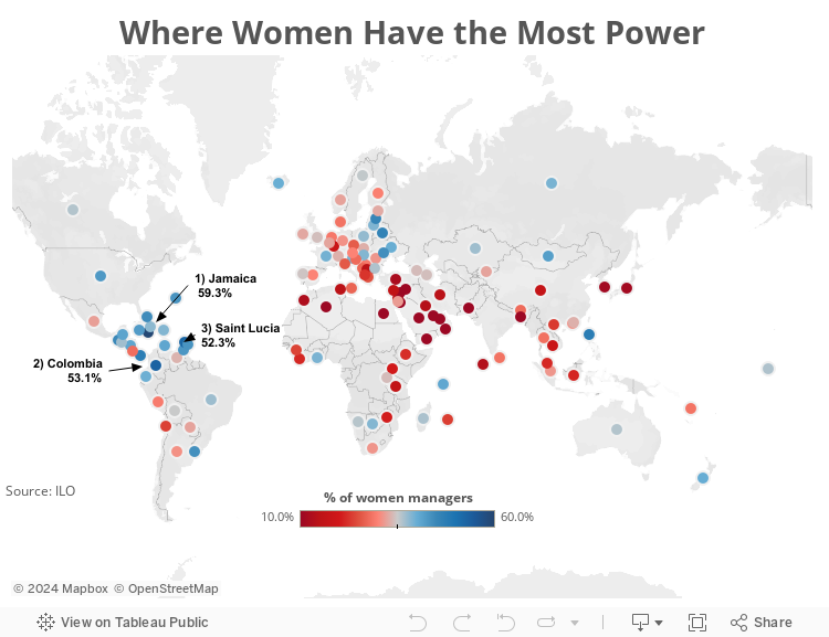
The story is much richer with this map. You can see swaths of red in the Middle East. Japan and South Korea jump out as well (at 11%!). I didn’t even notice these countries in the bar chart until I switched it to a map.
You can download the Tableau workbook used to created this map here (requires Tableau 9).
I created a map with a simple red-blue color scale from 10%-60%. Since the top 3 countries were highlighted in the story, I decided to add labels on the map for these.
The story is much richer with this map. You can see swaths of red in the Middle East. Japan and South Korea jump out as well (at 11%!). I didn’t even notice these countries in the bar chart until I switched it to a map.
You can download the Tableau workbook used to created this map here (requires Tableau 9).
Subscribe to:
Post Comments
(
Atom
)


What does this look like if you used the area map rather than the points?
ReplyDeleteMatt, here's the filled map version - http://bit.ly/1wNmpPh It's much harder to see the small countries.
DeleteI have another Monday Makeover candidate. A pie chart from French newspaper Le Monde
ReplyDeletehttp://mobile.lemonde.fr/les-decodeurs/article/2015/03/02/10-classements-dans-lesquels-la-france-arrive-en-tete_4550553_4355770.html?xtref=http://m.facebook.com
But that pie has such pretty colors. :-)
DeleteHa, they changed it! Did you tip them off? Now it's a horizontal bar chart.
DeleteHopefully they're people are learning ;-) I did not tip them off.
DeleteAndy, I haven't tried it but this may be one of those cases where a pie chart (with just two slices) makes it easier to see the split between men and women. Then again, it may be too many marks. I would probably want to have a filter so I could zoom in on certain regions. Thanks for posting.
ReplyDelete