February 8, 2016
Makeover Monday: How Many Blacks Did the Police Kill in 2015?
black
,
death
,
Makeover Monday
,
police
,
race
,
shooting
,
United States
,
white
3 comments

This week's Makeover Monday was much harder than I anticipated and I must note that it took me way, way over an hour to create something I was happy with (more about that in a bit). The website that we reviewed had a series of three charts about police killings in the United States. I'll focus on the first two:

What works:
- Good title and subtitle
- Bars are sorted properly
- Using a rate is good practice because it normalizes the data
- Using a different color of the U.S. average
What doesn't work:
- I hate charts that make me turn my head sideways to read the labels.
- I would have the U.S. average as a reference line.
- There's no sense for the rest of the population.
- It feels like there's more to the story.
Ok, so how about the second chart:
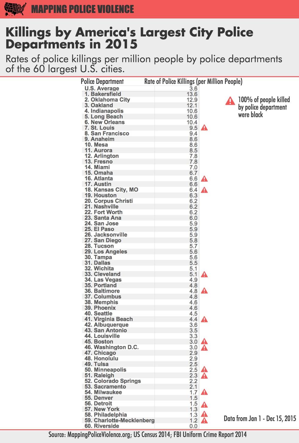
What works:
- Good title and subtitle
- Ranking the police departments
- Using a rate is good practice because it normalizes the data
- Calling out those that police departments that have only killed blacks
What doesn't work:
- I almost didn't notice the U.S. average (it's above the first police department).
- The column headers should wrap so they fit better.
- Again, it feels like there's more to the story.
- The table makes comparing police departments harder than necessary.
A quick bit of background before we get to my viz. Last week, we brought Caroline Beavon to the Data School to teach an infographics and information visualisation course. I would highly, highly recommend the course. It was a perfect blend of the courses that Andy Kirk and Cole Nussbaumer teach if you've ever been to their classes. We learned a ton about knowing your audience, choosing the aim for your visualisation and picking out the proper story in the data. In addition, we designed several infographics, which is something I was particularly excited to put into practice this week. With that being said, here's is my makeover of the two original charts, but really, it's completely different and delves much deeper into the story the data is trying to tell.
You can download the workbook from Tableau Public here.
Subscribe to:
Post Comments
(
Atom
)


This is disturbing, whats the overall message here? Why not show more context, such as how many of each race kill each other.
ReplyDeleteOh, no! What happened to all your cool analytical graphics?!?! I wanted to send this link to a coworker to check out but ... All I see now is a black X where your graphics used to appear at the bottom of the post. When I click it, I get this error:
ReplyDeleteAn unexpected error occurred. If you continue to receive this error please contact your Tableau Server Administrator.
Service Unavailable - Zero size object
The server is temporarily unable to service your request. Please try again later.
Reference #15.11f04f17.1455228077.6073e2d3
Would you like to reset the view?
That looks like a Tableau Public issue since that's where they are hosted. I sometimes see that error too and I just reload the browser. I just checked this one and it's working fine.
Delete