February 5, 2018
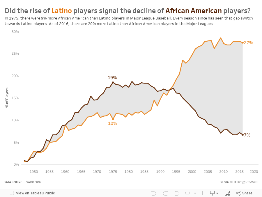
Makeover Monday: Did the rise of Latino players signal the decline of African American players?
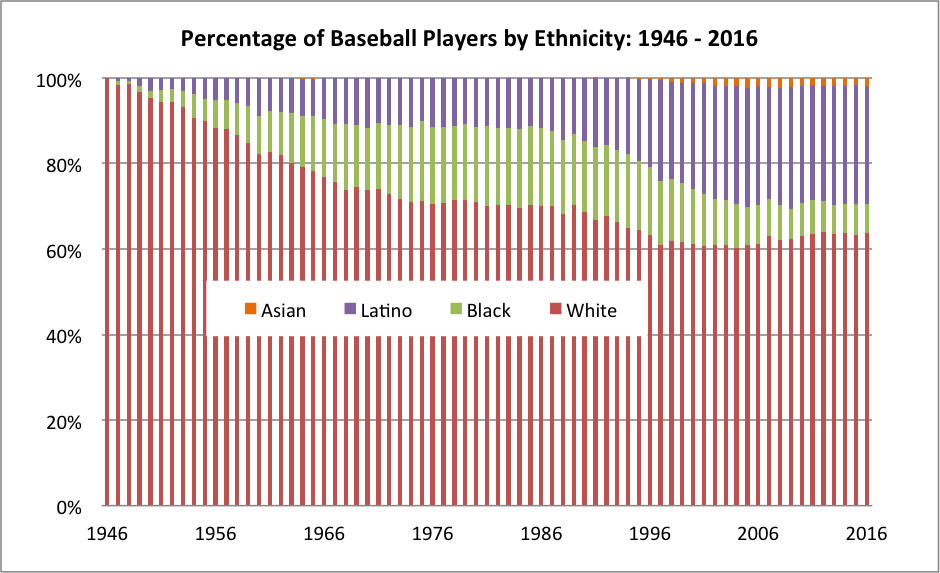
What works well?
- The x-axis is labeled every 10 years starting with the first year in the data set. This works well since there are 70 years in the data set.
- Labeling the y-axis for every 20% keeps that axis from getting too cluttered.
- The title is straight to the point.
- Placing the legend in the middle of the graph allows the chart to use the entire space.
- Stacking "White" on the bottom is a good choice since it's always the largest segment.
What could be improved?
- As it's stacked bars, it's harder than necessary to determine the percentage that Black and Latino comprise since their position is influenced by the colors below them.
- The bars appear to be of differing widths and that makes it look a bit blurry to me.
- An area chart would be much easier to understand.
- Consider more distinct color choices, particularly for White and Black.
- The visualization doesn't flow well with the accompanying story, which was about the increase in blacks and the more recent decrease. There's no indicator to the audience that this is what the chart is about.
What did I do?
I started by exploring the data and looking for a more interesting story. Was there a reason or cause for the recent decline of blacks in MLB? Is this the same for other minorities? How does WAR come into play, if at all? All of these questions are super simple to answer with Tableau's ability to support the way your brain thinks.
In the end, the most interesting story I found was the relationship between the decline of African Americans plays and the rise of Latino players. So my viz focusses on that.
Subscribe to:
Post Comments
(
Atom
)


Only one of many reasons. https://www.usnews.com/opinion/op-ed/articles/2017-07-10/3-reasons-for-the-declining-percentage-of-black-baseball-players-in-the-mlb
ReplyDeleteI find your comment on "Consider more distinct color choices, particularly for White and Black." a little surprising as White is in red and Black is in green. Are you by any chance Red-Green colour blind? Or would you tend to avoid red and green next to each other to cater for those who are?
ReplyDeleteGood question Jackie. I avoid red/green if I’m not 100% sure that the audience is not color blind.
DeleteThat makes sense. Thanks
DeleteCan you please tell me how you make the area color in between two lines?
ReplyDeleteI used this tutorial by Rody Zakovich. http://www.datatableauandme.com/2017/08/how-to-shade-between-2-lines-in-tableau.html
Delete