January 31, 2019
Set Actions: Dynamic Reference Lines and Coloring
color
,
comparison
,
dynamic
,
dynamic titles
,
reference line
,
set
,
set actions
,
tableau
No comments
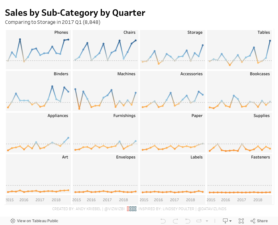
CONFESSION: I have been avoiding using set actions because I've struggled to wrap my head around getting them to work the way I think they should work.Fortunately, we're surrounded by brilliant people at The Data School, so today Coach Carl asked Harry Cooney from DS11 (graduating tomorrow) to run a lesson for the team. Harry clearly understand them and walked us through several practical use cases to help us understand the basics. He then assigned each of us the task of recreating one of the vizzes from Lindsey Poulter's amazing resource of Set Action use cases. I was tasked with recreating her dynamic reference lines and colors viz.
I took on this challenge as I would a Workout Wednesday:
- Understand the requirements
- Play with the viz to see what it's doing
- Rebuild the viz
- Don't look at the method for the original until I'm done
I find this my best method for learning. Simply downloading the workbook and seeing how it was built doesn't help me learn as effectively as I would like.
Before showing the viz, I want to recap some of the things I have done differently that I think make the visualization simpler.
- I built it all with one worksheet. Lindsey floated one sheet on top of another, meaning two sheets have to be maintained if changes need to be made.
- I labeled all of the sub-categories in the upper right of each box. Lindsey had it as a label for the last dot.
- I included tooltips and the x-axis.
- I added the circles directly on the line rather than as a separate chart. This allowed me to use the dual axis for labeling the sub-categories.
Other than that, we used pretty much the same techniques.
The team noticed that Lindsey used a lot of floating sheets on top of floating sheets to get the look she wanted. If that works for her, great! Our preference was to create them in a single sheet so that they are easier to maintain and debug by others later on if necessary.
I found this a really fun challenge and I learned a ton in a short amount of time. And thank you, Harry, for your fantastic teaching!

January 29, 2019
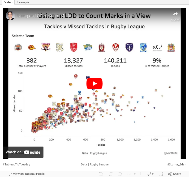
Using an LOD to Count Marks in a View

I also show how to combine multiple, disparate BANs into a single sheet.
January 27, 2019
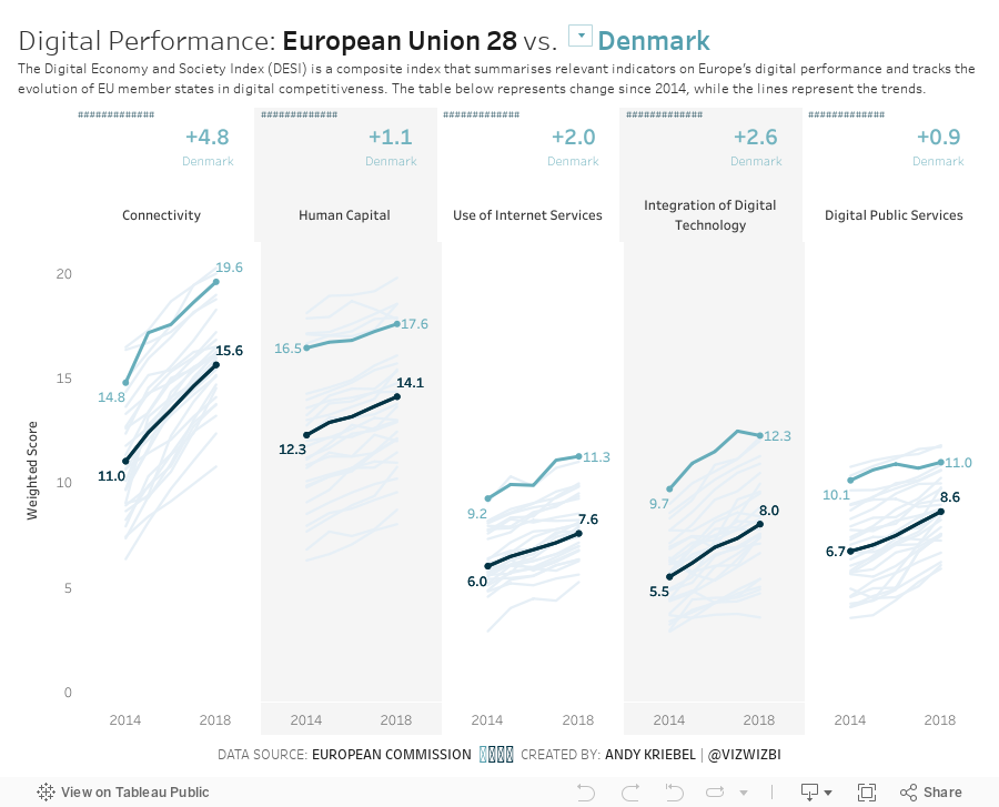
Makeover Monday: The Digital Economy and Society Index


What works well?
- The countries are sorted from best to worst.
- The scale and gridlines help guide the eye across the view.
- Using the country abbreviations so they are easier to read.
What could be improved?
- The title could include a subtitle to explain the DESI.
- Stacked bars are hard to compare across countries as they are influenced by the bars below them.
- The colors are too bright; everything is competing for attention.
- The legend does not need the numbers before each indicator.
What I did
- Added a subtitle to explain the DESI
- Split the indicators apart so they are easier to compare across countries
- Include a parameter to allow the user to select a country and have it highlighted
- Made the line representing the EU black so that it's in context for comparison
- Simplified the colors
- Added BANs to show the change vs. 2014 for the chosen country and for the EU (for context)
- Shaded every other column to guide the eye down the viz
Yes, I know this is the same highlighting technique I used in week 3. I used it again because it works.
January 21, 2019
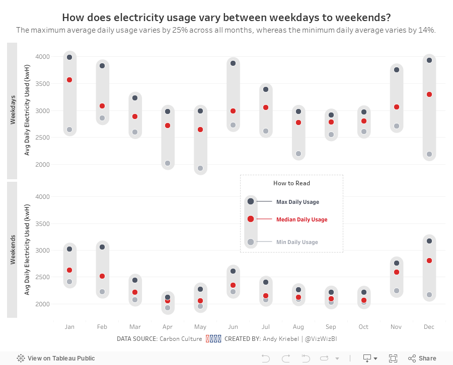
Makeover Monday: Electricity Use at 10 Downing Street
10 Downing Street
,
carbon footprint
,
energy
,
Makeover Monday
,
money
,
Prime Minister
,
UK
,
united kingdom
No comments

Here's the viz Eva chose:

What works well?
- Really nice BANs that also have context included. I give people feedback quite often that BANs can be great, but they're meaningless without context.
- Nice filter options with the buttons at the bottom
- The chart shows the peaks and troughs well.
- Using different colors for peak usage
- Data updates as you click on the BANs
What could be improved?
- Include a legend so you know what the colors signify
- A better x-axis is needed
- Remove the buttons that don't have any data, District Heat and Gas in this case
My Plan
- Hold off on working on my viz until we have our weekly Makeover Monday time at the Data School. I've written this section and the two above Sunday night.
- Explore the data with line charts to get a sense for the patterns in the data.
- Keep something similar to the BANs; consider different or additional context.
- Should the timeline show all of the data? Play about with different filter options.
- Consider a heatmap that shows usage by hour of the day compared to day of the week or perhaps month.
- Will reporting energy use, money, and carbon impact in the same dashboard be too crowded?
- Explore relationships between the metrics with scatterplots. Is a connected scatterplot an option?
- Would a mobile version be better so that people can look at it on the go?
- Is there any additional data?
What I Uncovered
- The data set only included 2017, so I downloaded back to 2008 as well. But data only existed back to 2013, so I had to deleted 2008-2012. Tableau Prep doesn't allow you to skip the first three rows, which is required for 2013-2016, so I used Alteryx instead and then unioned those years with 2017.
- Only data for electricity usage is consistent across the years; I was expecting to see money and carbon impact as well. I wonder why don't they include those as well. Anyway, this eliminates a scatter plot.
- Data was missing for December 2015, so I excluded that month from the data set.
- There were lots of zeros, so I removed those as well.
And here's my viz after working on it for 60 minutes at the Data School.
January 15, 2019
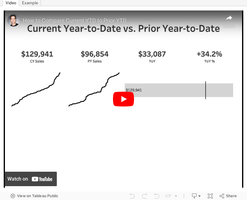
Tableau Tip Tuesday: How to Compare Current YTD to Prior YTD

How would you do year to date percent difference when you only have data for first 3 months in the current year? For example when you have data for the current year from January to March for 2018 and you want to compare it to January to March from 2017 and calculate percent difference then?
This is a very common business question. In this video I show you how to use level of detail expressions to calculate these two fields plus the difference.
NOTE: In the video, I have the Year over Year calculation backwards. The formula should be: SUM([CY Sales])-SUM([PY Sales])
January 14, 2019
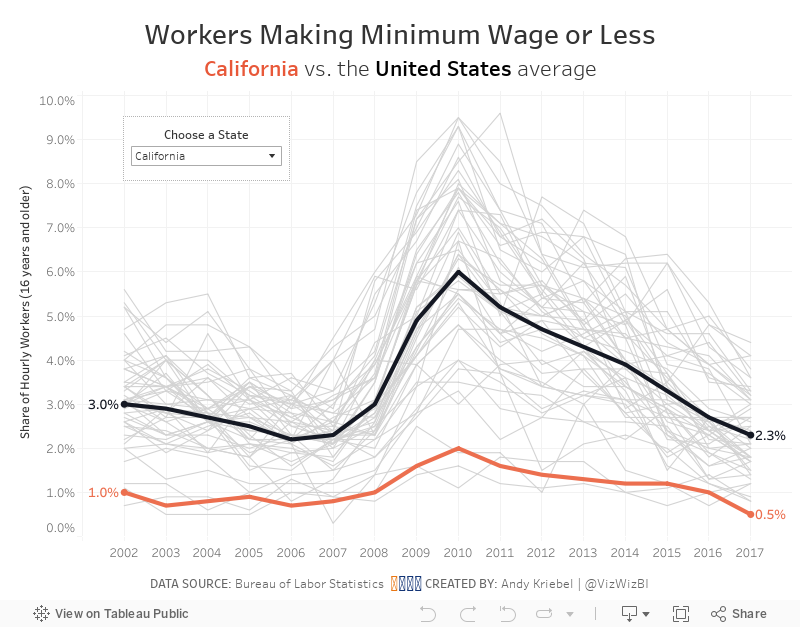
Makeover Monday: Workers Making Minimum Wage or Less in America
America
,
Business Insider
,
Chart of the Day
,
Makeover Monday
,
United States
,
USA
,
wages
No comments


What works well?
- Maps are easy to understand
- Positioning of Alaska and Hawaii in the available space
- Including notes about the data in the footer
- Simple, effective title
- Using a single color gradient; a diverging palette would not be appropriate
What could be improved?
- Ranges are not the same size
- Smaller States are nearly impossible to compare; this is a good use case for a hex or tile map
- No context for good vs. bad
What I did
- Looked at the data over time
- Included a comparison to the US average for context
- Included all States for context
- Allowed the user to highlight the State they are interested in
- Included labels on the ends to the lines to show change over the entire period
January 6, 2019
Makeover Monday: How Has Press Freedom Changed Around the World?
freedom
,
freedom house
,
liberty
,
Makeover Monday
,
press
,
rating
,
score
No comments

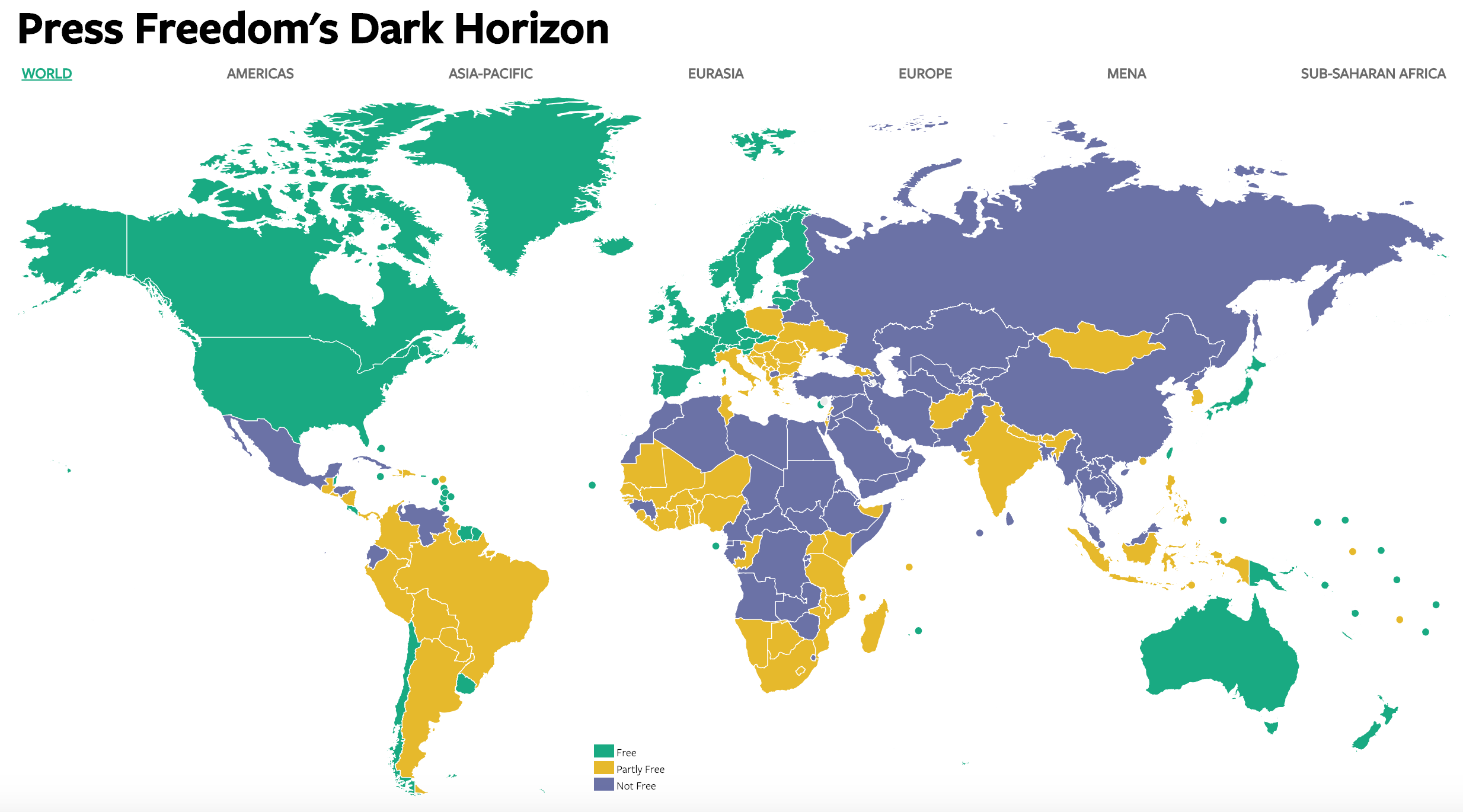
What works well?
- The colors contrast well and represent the values well (i.e., green = good, etc.).
- The map zooms in nicely as you select a region across the top.
- Good tooltips
- The white borders around each country make them easy to distinguish.
- Using dots to represent the small islands.
What could be improved?
- Without using the zoom feature, small countries are very hard to see.
- The title doesn't really tell me what the data map is about.
- You can't see trends over time. In other words, you don't know if the press are getting more or less free.
- There are no definitions for what the scores mean, unless you hover over a country.
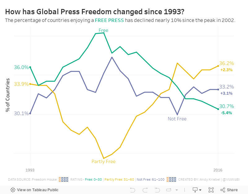
What I did
- I started by building a trellis chart that showed every country and its score over time. It was so messy and crowded so I scrapped it.
- I wanted to see the overall trends, so I focused on the percentage of countries within each year that fall into each status.
- I used the same color palette.
- I wanted to show the change vs. 1993, so I included that as text on the end of each line.
I found this to be a particularly interesting, and a bit alarming data set. According to this data, the Press are becoming less free. That's not good for democracy.
Subscribe to:
Posts
(
Atom
)


