May 29, 2017
Makeover Monday: How Has Internet Access Changed Around the World?
accessibility
,
comparison
,
country
,
highlight
,
internet
,
line chart
,
Makeover Monday
,
map
,
rates
,
time series
,
usage
11 comments
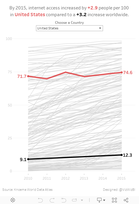
For #MakeoverMonday week 22, Eva picked an interactive map from Knoema that shows internet access over time.
| Click image for the interactive version |
What works well?
- Nice interactivity
- Informative tooltips
- Summary in the subtitle provides some context
- Including a definition of an internet user
- Highlighting on the timeline the block for the year you are seeing
- Providing the context of "per 100 people"
- Per 100 people makes it easy to understand because you can think of them like percentages
What could be improved?
- Include a more engaging title.
- Stoplight colors work ok for me, but not for the color-blind folks.
- The color scale in this case makes anything below 75% look bad. Is that really the case? Isn't providing more access over the years more important?
- Why are years without data included on the timeline?
- Having to flick through the years prevents you from seeing the change over time.
- Smaller countries get lost on filled maps
- Needs more context
What were my goals?
- Create something easy to understand
- Only include 2010-2015 since those were the only reliably consecutive years
- Eliminate countries without values for 2015
- Allow the user to pick a country to spotlight
- Be able to compare that to the worldwide average
- Label the ends of the lines for context
- Include a title with a summary of what happened between 2010 and 2015
With that, here's my Makeover Monday week 22 creation. Enjoy!
Subscribe to:
Post Comments
(
Atom
)


Hi Andy,
ReplyDeleteHow did you manage to control the size of only the Country Match line?
I'm trying to replicate your makeover, and, on the SUM(Internet users per 100 people) axis, I'm not being able to control separately the size of each Country line (in Detail) and the line of the Country Match... Whenever I mess up with the Size marks, the whole graph changes.
Thanks
I reflexively used a map for my viz but looking at yours, it occurs to me that national policies more so than geography determines internet access. The map in this case doesn't add much information while adding a lot of noise. Very instructive!
ReplyDeleteAndy - how did you get the 'Worldwide' numbers?
ReplyDeleteWould you mind sharing the values for each year?
I used the avg of all countries. Not 100% accurate as it's not population weighted but thought it was close enough given each country it already weighted.
DeleteOh, ok.
DeleteI am confused though. Can you elaborate on how that is different from the averaging of percentages that you've been talking about?
You're right Jamie. I need to eat my own words. Correcting it now by including population weighting for the US numbers.
DeleteOh, nice.
DeleteI thought maybe I was really missing something about the weighting...
So now you've got me wondering how you pulled the population data in. I am not very experienced with Tableau...were you able to pull in a data source for population, and join on the country name?
DeleteOr did you have to do an old fashioned manual process of merging the data?
You can download the workbook to see how I did it. Basically, I have a 2nd data source of population by country by year. I then blend to that in the calculation.
DeleteVery cool. Thanks.
DeleteI tried to download yesterday, but had problems. I probably need to update my version of Tableau Public.
I built it with 10.2.
Delete