January 1, 2018
Makeover Monday: How Has U.S. Consumption of Poultry and Livestock Changed since 1965?
Atlas
,
beef
,
change
,
chicken
,
cumulative change
,
line chart
,
livestock
,
Makeover Monday
,
pork
,
poultry
,
United States
,
US
3 comments
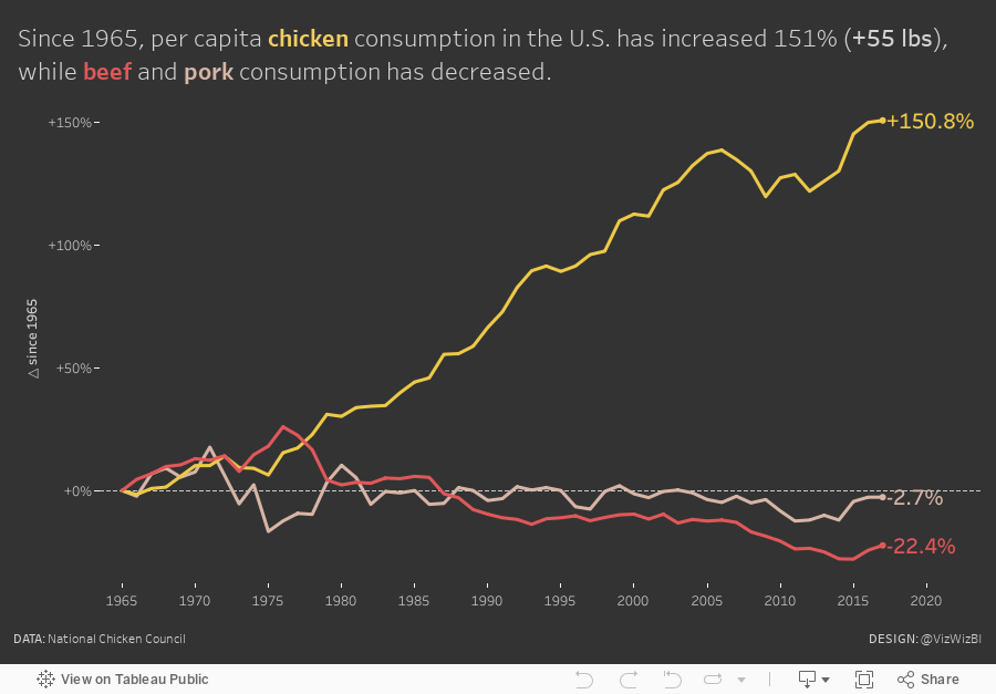
For week 1, we're looking at this chart from The Atlas about American poultry and livestock consumption. The data comes from the National Chicken Council (yes, there is such a thing) ; note that the source data is slightly different from the chart as the data is more up-to-date.

What works well?
- Using distinct colors
- Line chart shows the consumption trend well, particularly the increase in chicken consumption
- Including the word "pounds" on the top axis label
- Displaying every 5 years on the x-axis
- Including a solid line at zero
- Using light gridlines
What could be improved?
- There's no interactivity, making it impossible to know the exact values
- Labeling the start and end of the lines would help give the change more context.
My Goals
- Since the original chart is pretty good as a line chart, stick with lines.
- Focus on the change since 1965.
- Include big labels on the ends of the lines
- Use colors that associate more with the type of meat
- Remove as many gridlines and axis lines as possible to move the focus even more to the lines
With those goals in mind, here is my first Makeover Monday of 2018. Let's make this an amazing year! And remember to join the conversation on data.world, where you can embed your visualisations live (or simply post an image with a link).
Subscribe to:
Post Comments
(
Atom
)


One element of the original chart that was valuable and was lost in the remake was the ability to rank the three series easily. Graphs detailing percentage change can often be misleading when they include small values. (I recall a great xkcd comic about the world's "fastest growing religion" https://xkcd.com/1102/) Callouts that indicate when a change in ranking occurs would be helpful to ensure the reader knows that all three items are of comparable nominal scale. For example, in 1992 Beef surpasses chicken as the most consumed meat by American consumers, yet 1992 is just another datapoint in the remake. If not call-outs, another option would be a small icon on these data points like an up arrow or down arrow. A third option would be scaling based on color intensity, although you might have to change the pork color to something more vivid.
ReplyDeleteJust some thoughts.
Hi Andy,
ReplyDeleteI am new to Tableau and wanted to start this year with your weekly challenges, can you please guide me what I have to do to archive the objectives or what you are actually asking.
For Makeover Monday, watch this recording from yesterday - https://www.brighttalk.com/service/player/en-US/theme/default/channel/15837/webcast/298077/play
DeleteFor Workout Wednesday, the details are here - http://www.vizwiz.com/p/workout-wednesday.html