August 18, 2015
Tableau Tip Tuesday: How to Create Grouped Bar Charts
bar chart
,
grouped
,
PowerPoint
,
tableau
,
template
,
tip
,
Tuesday
,
video
5 comments

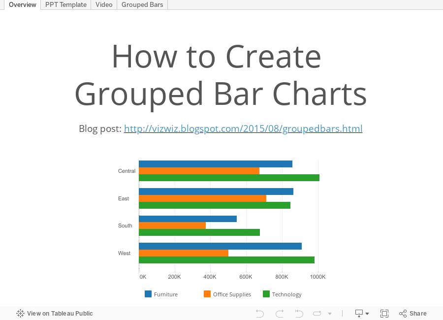
This week's tip started with the PowerPoint template sent by Tableau to #Data15 speakers. It includes a PowerPoint grouped bar chart template that isn't all the straight forward to build in Tableau.
Subscribe to:
Post Comments
(
Atom
)


Nice, Andy. My client just wanted a Powerpoint-style stacked bar chart and this is a very clever approach. I hate having to go back to MS Office for one or two charts and this workaround enabled me to avoid it. I also liked your use of Storypoints with intro, problem, video, solution. Elegant. Thank you for posting this.
ReplyDeleteThanks for the kind words Denko! I'm happy to hear it helped you.
DeleteAndy,
ReplyDeleteI have a table which has regions in the first coloumn. The second, third and fourth coloumn has percentages listed. How do I plot them as a grouped bar chart.
Thanks
You need to use Measure Name & Measure Values to create grouped bars for different measures.
DeleteYou are a rock star! Thank you for your post. I am very new to tableau and have lived in the SSRS and Excel world forever... so I was surprised this feature wasn't built in to tableau. But the fact they even have subtotals built in is so cool! I have do alot of coding to get that in other tools.
ReplyDelete