January 7, 2018
Makeover Monday: What characteristics are most important to British men and women?
british
,
characteristics
,
love
,
Makeover Monday
,
men
,
personality
,
UK
,
united kingdom
,
women
15 comments
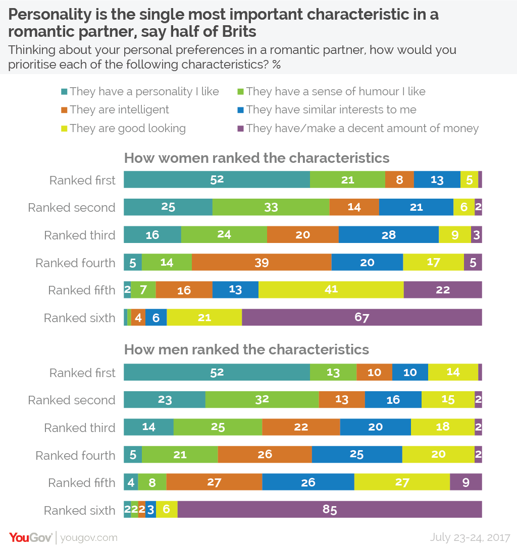
For week 2, we looked at this viz from YouGov.
What works well?
- The title and subtitle that make it clear what the viz is about.
- Splitting the view up between men and women keeps it from getting too busy.
- You can easily look up any value.
- The colors are easy to distinguish from each other.
- The colors are in the same order for each row.
- Including the survey dates in the footer.
What could be improved?
- Making comparisons between men and women takes longer than necessary.
- Repeating the word "ranked" on each row is unnecessary.
- While you can easily look values up, your eyes have to go back and forth to the legend.
- The legends could be reworded to be shorter. For example, change "They have a personality I like" to "Personality".
What I did
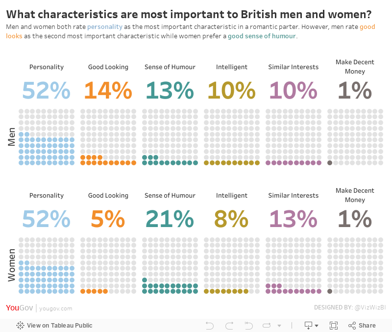
I struggled with this data set. I must have spent 2-3 hours trying to find something insightful, trying different chart types, etc. Nothing was working for me. When I get stuck like this, I like to turn to Google images. I searched for "looks vs. personality charts" to hopefully find some inspiration.
I clicked on one image and then some of the related images. This image in particular stuck out to me:

Oh maybe this is something to work with, but wait, I could swear I've seen this somewhere before. Turns out Andy Cotgreave created this for Makeover Monday week 4 back in 2016. How ironic!
So I set out to do something similar. Basically I wanted to take the original stacked bars, keep them separated by gender, and then create BANs and the units chart for each personality characteristic as Andy has done.
With that, here's is my viz.
Subscribe to:
Post Comments
(
Atom
)


Um... Men don't rate good look as the second most important characteristic. More men rate good look as a most important characteristic than women.
ReplyDeleteThe most popular second most important characteristic is still the sense of humor.
Um that’s not what it’s about. It’s about what their rate as their most important.
ReplyDeleteAndy - I'm just starting out and am curious how you created the above visual? Would you mind sharing? Love the representation!
ReplyDeleteDownload the workbook.
DeleteAndy - I am just starting out with Tableau visualizations and am curious how you created the above chart. Would you mind sharing? Love the representation!
ReplyDeleteHi Tanner. You can download the workbook to see how I built it.
DeleteI'm new to the community, and just posted my 6th viz. Just contemplating 600 vizzes makes my head hurt! Your dedication to the community is amazing. Between the Makeovers, Tips, Workouts and webinars, I'm checking into your site pretty much every day. Thanks for putting so much great content out there for us!
ReplyDeleteCheers John!
DeleteThanks a lot, Andy! I have also struggled a bit to choosing the proper way of presenting the points. I have downloaded your workbook, but wonder how you join waffle sheet to original datasheet? I thought there is no need to do the data joining, but without join, I couldn't compare the sum(percentage_looks vs personality) with sum(percentage_waffle).
ReplyDeleteThanks!
If you go into the data connection window you’ll see how I joined them. I prefer this to blending.
DeleteHi Andy,
ReplyDeleteThank you for quick reply. The point is that I couldn't get the data connection window. Whenever I click the data source button, it pops up a window to let me select the data file. Do you connect with excel or using data.world? I use the excel data, haven't connected to data.world for viewing your tableau work.
Ah gotcha! My apologies for the misunderstanding. What I do is create an inner join between the Looks vs Personality excel file and the Waffle Chart Template excel file. Since the Looks vs Personality excel file doesn't include a Number of Records field, I created a calculated field named "1" and all that is in the calculation is the number 1. I then join this 1 field to Number of Records in the waffle chart template file. When you do this, you should then make sure you use an average for your measures because they're all replicated for 100 rows.
DeleteThank you, Andy!!! It works now! Thank you for reminding for using Average!
ReplyDeleteI created a calculated field called Row which has the value 1. When I try to do an inner join in Tableau between LooksVsPersonality and Waffle sheet of Waffle Chart Template, I do not see the Row field showing up. Can you please explain how to do the join?
ReplyDeleteDownload my workbook and unzip it. Then when you open it, you should be able to see how I build the join.
Delete