April 30, 2019
#TableauTipTuesday: How to Make the Font Bigger than the Max Tableau Allows
BAN
,
big numbers
,
font
,
KPI
,
large
,
size
,
Tableau Tip Tuesday
No comments
In this video, I show you how to methods for making the size of the font in a text field larger than the maximum 72pt font Tableau allows.

April 28, 2019
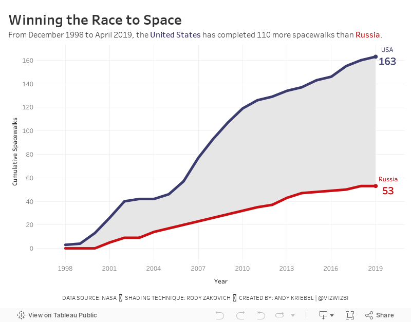
#MakeoverMonday: Space Station Spacewalks

 |
| Credit: NASA |
What works well?
- The title provides a nice summary of the data.
- The stacked bar chart makes is easy to compare the US and Russia within a single year.
- The colors are easy to distinguish from each other.
- Since there is no axis, labeling the bars makes sense.
What could be improved?
- The background image doesn't add any value and takes attention away from the chart.
- It took me a minute to figure out which color went with which country. That should be more obvious.
- Straighten the diagonal text for the years.
My Ideas
- Consider other chart types: area chart, stacked area chart, barbell chart, line chart.
- Consider other metrics like cumulative spacewalks or variance to some year.
- Check the two country flags for their official colors.
In the end I went with a cumulative line chart with shading between the lines. I did this with a polygon. See this blog post from Rody Zakovich to learn how to create it.
April 23, 2019
#TableauTipTuesday - How to create multiple lines in a single field with a line break
calculated field
,
carriage return
,
combined fields
,
line break
,
multiple lines
,
Tableau Tip Tuesday
No comments

In this tip, I show you how to:
- Take two fields and combine them into a calculated field.
- Take the combined field and force the fields to split into two separate lines within the same field.
- Build a quick heatmap.
April 22, 2019
#MakeoverMonday: Which NBA arena makes Stephen Curry's favorite popcorn?
basketball
,
food
,
Golden State Warriors
,
Makeover Monday
,
NBA
,
new york times
,
popcorn
,
Stephen Curry
No comments

In the NYT article, they included a simple heatmap:

What works well?
- A heatmap is a good chart choice. Because the highest rating is darkest, those pop out more.
- Sorting the teams/arenas by the total score.
- Including borders around each cell helps separate them.
- Have both the team and arena together in a single cell but in multiple rows.
- Including the rating for each field.
- I love the data source!!
What could be improved?
- Needs a better title
- The diagonal rotation of the text makes the categories harder to read than necessary.
What I did
- I really like the original, so I also created a heatmap.
- I change the colors to use the blue from the Golden State Warriors brand colors.
- I made the category headers horizontal.
- I created a calculation to include the team and arena in the same field, but on multiple rows.
- I used viz in tooltip to shows the rating across all categories for each team.
- I included an option to allow the reader to sort by their most important factor.
April 15, 2019
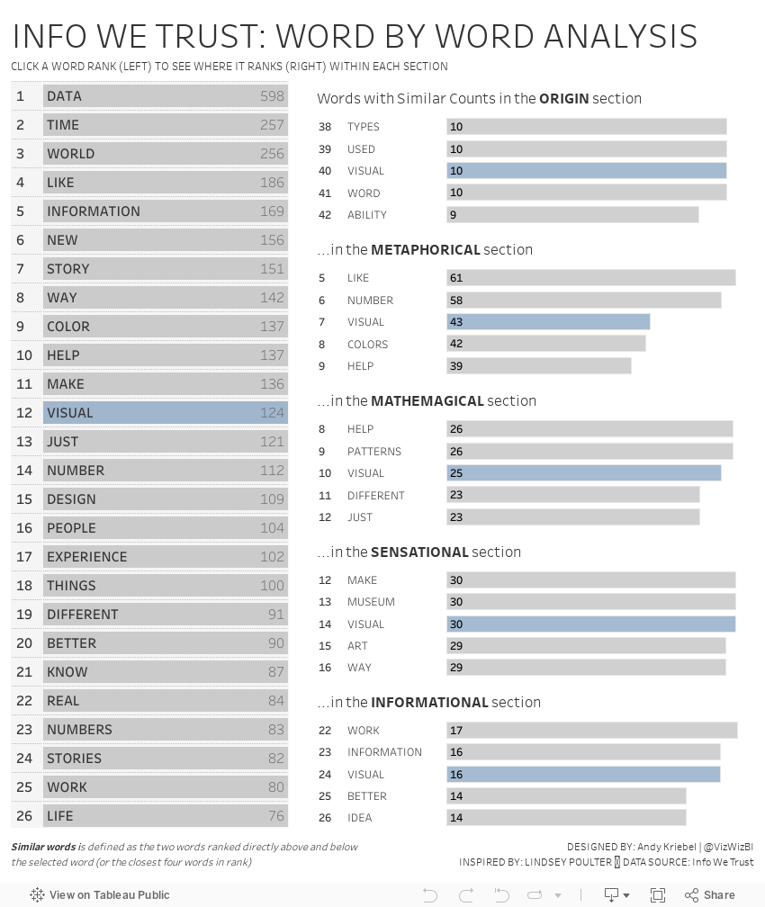
#MakeoverMonday: Info We Trust - Word by Word Analysis

UPDATE (19-Apr)
- Removed the sorting from the table on the right. When you click on a word, it now stays in its position rather than moving to the top.
- Made the titles of the bar charts on the right more succinct.
Thank you Jeff & Eva for your feedback!!
Week 16 is here and in collaboration with RJ Andrews, author of Info We Trust, we are making over a word cloud he created based on the frequency of the 270 most popular words in the book.

What works well?
- The most frequent words stand out because of their size.
- The word cloud looks interesting, meaning it captures your attention.
What could be improved?
- There are too many colors.
- The words are rotated in different directions.
- Sizing the words make it difficult to compare them and rank them.
- It's a book about data and the biggest word is data...go figure!
What I did
- We had been practicing set actions last week at The Data School, so I thought I'd replicate this dashboard by Lindsey Poulter.
- I wanted to rank the words and also rank the words within each section of the book.
- Create a mobile version based on the template Tableau builds for you automatically.
With that, here's my Makeover Monday week 16.
April 9, 2019
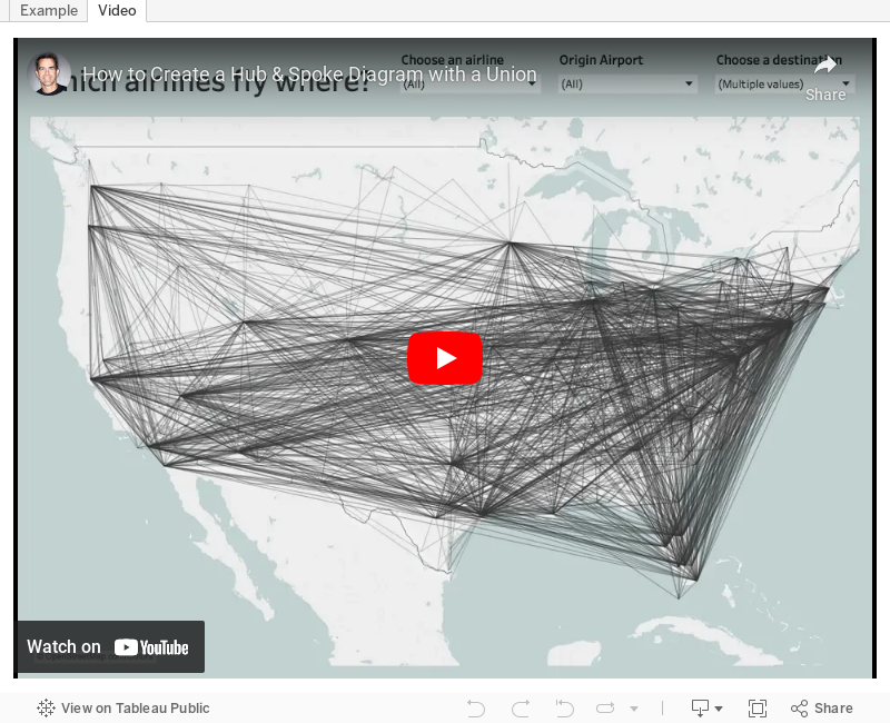
#TableauTipTuesday: How to Create a Hub & Spoke Diagram with a Union
airlines
,
airport
,
hub
,
path
,
routes
,
spoke
,
Tableau Tip Tuesday
,
union
No comments

April 8, 2019
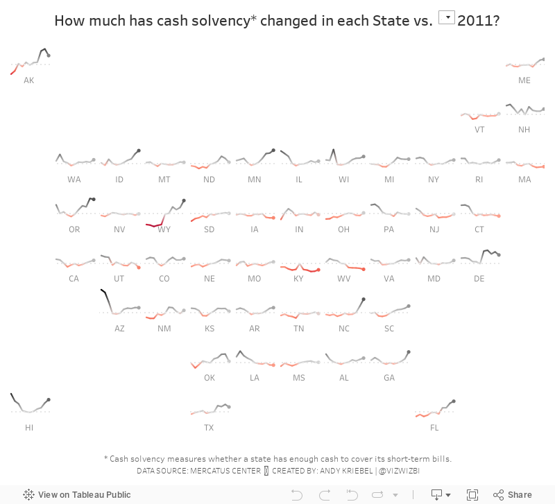
#MakeoverMonday: Cash Solvency of US States

States face many fiscal problems, but these problems are not insurmountable. Studying how each state is performing with regard to a variety of fiscal indicators can help state policymakers address persistent issues and anticipate potential problems.
Mercatus produces this simple map to visualize the results:

What works well?
- By using a map, people instantly know this is about geographical information.
- Using a clear legend with distinct colors to indicate good vs. bad
- Including the top 5 and bottom 5 as a summary/key finding
- Overall, a very nice layout with the map on the left and the additional context on the right.
- Including the numbers on the States for context.
What could be improved?
- Do the colors work for the color-blind? I'd recommend running it through a color blind checker.
- The States need equal size weighting to ensure they can all be visible equally. This would also help with some of the labels needing to be lines that point to the respective States.
- There's no definition for fiscal ranking.
What I did
- I wanted to look at the data over time, but also look at all of the States at the same time. For this I used a tile map. I based it on a similar viz I created.
- I wanted to give the user an option to compare years to a year they select so that they can see the change compared to a point in time.
- Use color to indicate the positive or negative change vs. the year selected.
- I created the calculations for each of the rankings and found cash solvency to be the most interesting, so I focused on that.
And here's my viz for Makeover Monday week 15.
April 1, 2019
#MakeoverMonday: How much plastic waste has been found on UK beaches?
beach
,
environment
,
Makeover Monday
,
plastic
,
UK
,
united kingdom
,
waste
No comments

Don't believe me? Watch Drowning in Plastic on the BBC. If this documentary doesn't change you mind about the amount of plastic you waste and the impact its having, then you need to have a deeper look into your soul.
This week, Eva chose a data set about the waste found on UK beaches.
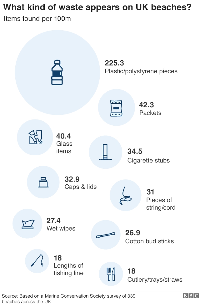 |
| SOURCE: BBC |
WHAT WORKS WELL?
- Including the raw numbers, and how big they are, provides great impact.
- They sort going down the page.
- The title is clear, concise, and tells you what you are about to see.
WHAT COULD BE IMPROVED?
- The infographic makes it appear as though this is ALL of the waste found on the beaches. However, it's only the top 10. You can see that if you read the original article Eva linked to.
- The icons are cute, but are the necessary?
- A simpler visualization, like a bar chart, would make the impact of the plastic more apparent.
WHAT I DID
As I did last week, I wanted to try out another tool. This week, I played around with infogram.
- Infogram is great for building simple infographics very quickly.
- The customization options help you create a good looking visual.
- The interactions on the charts are super responsive.
- You can change the theme or chart type with one or two mouse clicks.
- There's no "publishing" required. It's already live to everyone once you create your graphic.
- The chart types are limited, but I suspect 90% or more of what you need is available.
- If you want a chart to display the graphic a slightly different way, you may need to edit the data and either crosstab or transpose the data.
Overall, using infogram was a pretty fun experience. I haven't used it for a while and it seems to have come a long way since then. With that, here's my Makeover Monday for week 14.
Subscribe to:
Posts
(
Atom
)


