July 30, 2019
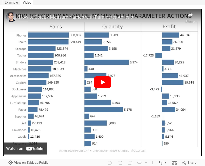
#TableauTipTuesday: How to Sort by Measure Names with Parameter Actions

July 29, 2019
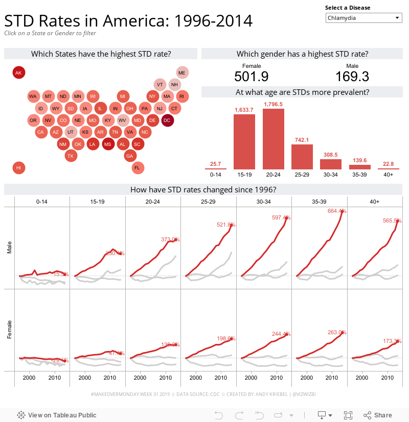
#MakeoverMonday: STD Infection Rates in America 1996-2014
America
,
CDC
,
infection
,
Makeover Monday
,
sexually transmitted disease
,
std
,
tableau 6
,
United States
,
USA
No comments

Here's the viz:

Eva had the idea this week to created a discussion on Twitter about what people thought could be improved. For me, it's been a fascinating discussion and it shows how much people participating in Makeover Monday have learned about data visualization. Follow the thread here.
WHAT WORKS WELL?
- Simple title that includes the time frame for context
- Using the subtitle as instruction
- Keep the filters grouped together on the right, out of the way
WHAT COULD BE IMPROVED?
- Lose the red/green color palette.
- A diverging color palette should only be used if there's a natural midpoint; there isn't one with this data
- There's double encoding on every chart.
- The State filter list it too big; granted though that there was no multi-select dropdown filter at the time.
- The map and the states bar chart are the same.
- The sparklines and the bar charts represent the same data.
- The reference lines aren't needed. What does an average infection rate really mean?
WHAT I DID
I decided to go back to Tableau 6 to see if I could create something decent. You can see the whole recording below. I took a lot of the feedback from Eva's thread and incorporated it into my viz. A few decision I made:
- Simplified the metrics
- Used a map that weights all states equally (like a hex map but circles)
- Used only a single color
- Used highlighting more effectively
- Created simple filter actions
- Used simple chart choices
So here's my Makeover Monday, built with Tableau 6.0:
July 21, 2019
#MakeoverMonday: Arsenal Player Stats 2018-19
andras szesztai
,
arsenal
,
context
,
English Premier League
,
KPI
,
Makeover Monday
,
players
,
stats
,
team
No comments

Here's the original viz:
 |
| SOURCE: transfermarkt.co.uk |
WHAT WORKS WELL?
- A table is a simple way to display stats that serve the purpose of looking up values. That seems to be what the designer had in mind here. This viz isn't for comparing players.
- Being able to sort by the headers
- Including an image of the player; this helps those that are already familiar with them.
- Including links to the player's profile
WHAT COULD BE IMPROVED?
- Other than this being used to look up information, what purpose does it server? It merely a list of facts.
- There's no context for the numbers. How does a player rank amongst the team?
- It's visually unappealing.
- I can't find definitions for some of the stats. For example, what does "In Squad" mean? No clue!
WHAT I DID
I first thoughts about creating player cards with the stats over time, big numbers, etc. But the data was only for one season, so I had to scrap that idea.
Then I thought back to a viz by Andras Szesztai that I was shown last week. His viz is about NBA basketball team spending by season, and it includes stats like the lowest, highest, and average payroll. He then has a mark on the viz for the salary cap.
I took his concept and applied it to the team and player stats. I included the minimum, maximum, and average for the team for each stat (like Andras did for each season). I then included a dot for the player selected. This allows you to see how the play compares within the team as a whole. So I got to include a player card of sorts after all!
Lastly, I made it mobile friendly because it seemed to make more sense to scroll down the viz vs. laying them out in a grid.
Check it out!

July 14, 2019
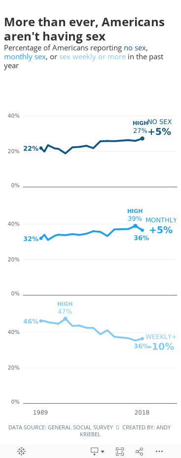
#MakeoverMonday: More than ever, Americans aren't having sex


What works well?
- Overall, the chart is really good.
- The title and subtitle make it very clear what the viz is about.
- The labels focus you to the topic the creator wants you to focus on.
- I like how the first year is a filled dot and the last year is an open dot.
- Bolding the first and last years on the axis
- Including the % sign on the y-axis for only the top value
What could be improved?
- Is this colorblind friendly? I'd recommend verifying.
- Does green mean good?
- I don't know how they came up with the percentages they did. They don't match the source.
- Label the lines directly with their frequency instead of using a color legend.
- Lighten the gridlines.
What I did
- Like the original, I filtered out 2012 because the data looks corrupted.
- I liked the original, so I didn't change a whole lot. The main difference was splitting up the frequencies vertically.
- Because I split of the frequencies, I made the viz tall and skinny and mobile friendly.
- I labeled the start and end of each line.
- I labeled the highest value for each frequency.
- I included the change between 1989-2018 on the end of each line as a summary. I had to float everything to make this work, which damaged my soul a bit.
- I'm only displaying the first and last year on the y-axis.
- I included tooltips so the reader can see the exact values.
- I used three shades of a single color that go from least sex to most sex (since the focus is on less sex).
- I kept the same title and subtitle.
- I used fonts from the Washington Post website. NOTE: They won't render on Tableau Public unless you have the same fonts installed (Playfair Display and Yantramanav).
July 9, 2019
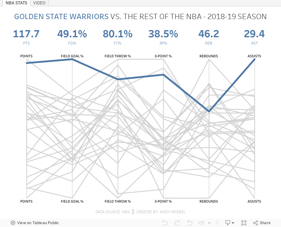
#TableauTipTuesday: How to Create a Parallel Coordinates Plot
In this week's tip, I show you how to create a parallel coordinates plot. If you want some additional practice, this chart type was used in Workout Wednesday 2019 Week 49.What is a parallel coordinates plot? Here's the definition from The Data Visualisation Catalogue:
This type of visualisation is used for plotting multivariate, numerical data. Parallel Coordinates Plots are ideal for comparing many variables together and seeing the relationships between them. In a Parallel Coordinates Plot, each variable is given its own axis and all the axes are placed in parallel to each other. Each axis can have a different scale, as each variable works off a different unit of measurement, or all the axes can be normalised to keep all the scales uniform. Values are plotted as a series of lines that connected across all the axes.
This workbook uses data from the NBA Stats website. You can get the data by downloading the workbook and unzipping it.
Enjoy!

July 8, 2019
#MakeoverMonday: Asylum Applications in the EU
asylum
,
EU
,
europe
,
Makeover Monday
,
migration
No comments

This week's topic relates to asylum seekers in the EU.
 |
| Source: European Asylum Support Office |
What works well?
- Map allows for exploratory analysis
- Using a time series for the years
- Informative tooltips
- Single continuous color scale for the pending cases
- The time series overall clearly show the growing trends.
What could be improved?
- The filled map makes it hard to find smaller countries and to compare them with larger countries.
- The diverging color scale of the dots on the map imply that once you get 50%, that means things are good. Is that true?
- There's no indication of what the size of the dots represent.
- There are too many colors fighting for attention.
- The stacked bar charts are good for showing the overall trend, but the patterns for the individual colors are hard to determine.
What I did
I started by reading the article and noted three key statements that I wanted to focus my analysis on:
- Most applications for asylum were lodged in Germany, France, Greece, Italy and Spain.
- Citizens of Syria, Afghanistan, Iraq, Pakistan and Nigeria lodged the most applications.
- Only five out of the 20 most common citizenships of asylum applicants in 2018 applied in increasing numbers compared to the previous year: Iranian, Turkish, Venezuelan, Georgian and Colombian nationals.
From there, I attempted to build charts for each of these facts. I was not able to create charts for the second and third facts as that level of detail was not provided in the data set. Instead, I changed my focus to the headlines at the top. I created BANs and some basic charts, but instead of comparing to 2017, I compared to 2015 since that was the peak of applications.
Click on the image to view the viz on Tableau Public.
Click on the image to view the viz on Tableau Public.
July 2, 2019
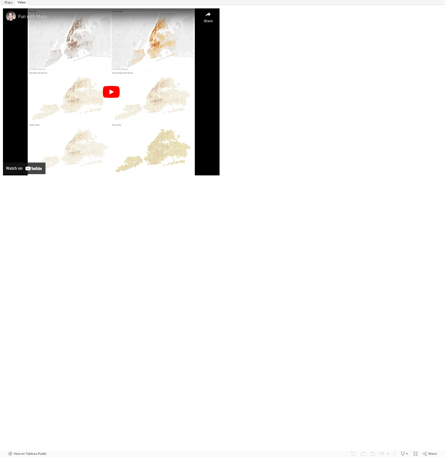
#TableauTipTuesday: Fun with Maps
density
,
dots
,
emoji
,
hexbin
,
maps
,
round
,
Tableau Tip Tuesday
No comments

July 1, 2019
#MakeoverMonday: The Top Killers in Game of Thrones

Now that I've admitted my shortcoming, I would like to thank David Murphy for volunteering his viz and data set for this week's Makeover Monday.
From the perspective of an analyst, this is exactly the kind of data I love; data I know nothing about. This helps me approach the data without any bias and to ask simple questions of the data before deciding on my visualization. More on that after a quick review of David Murphy's viz.
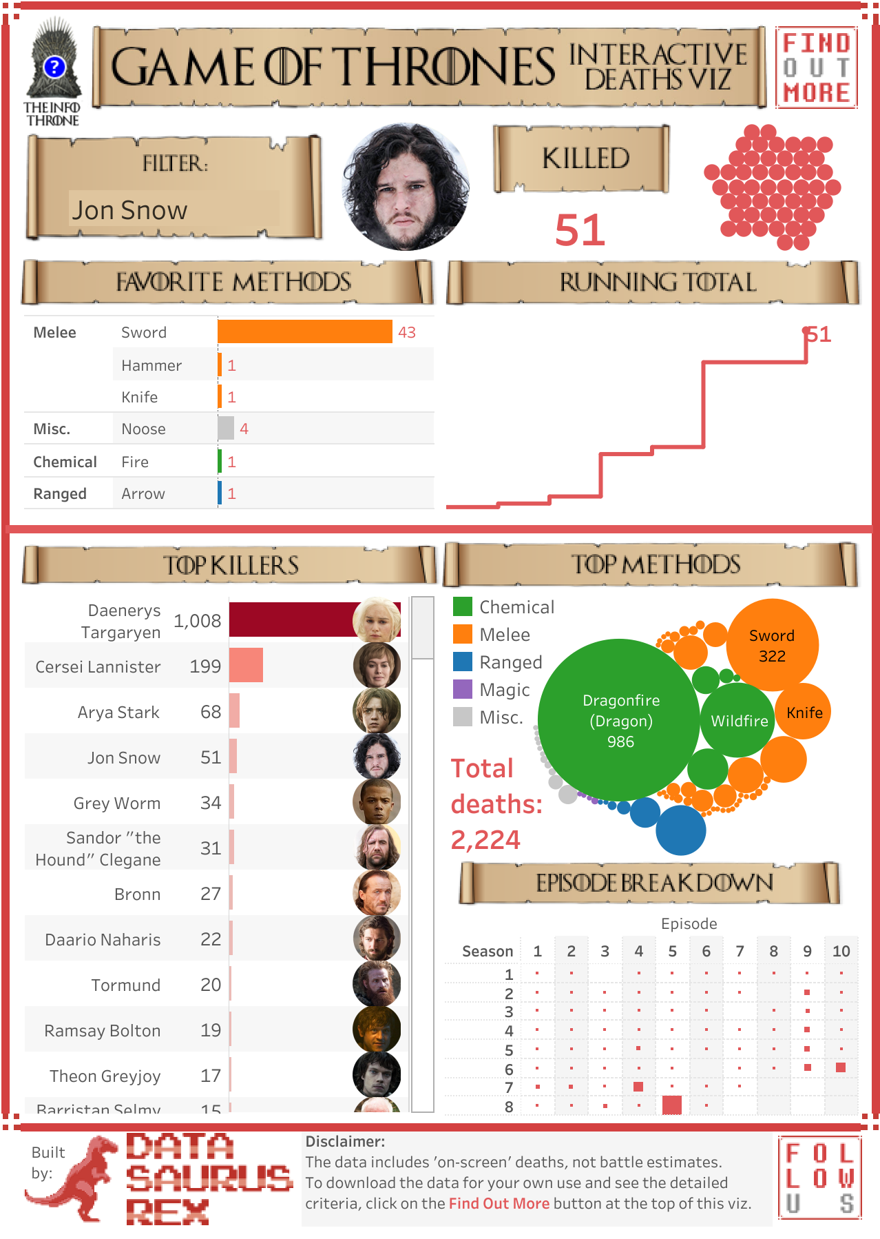
What works well?
- Visually, it captures your attention quickly.
- The person chosen, profile picture, and summary of people killed gives a quick summary before the viz goes into more detail.
- The viz is designed to go into more detail as you scroll down.
- The headers of each section look really cool and break apart the viz well.
- Using a bar chart to rank the killers.
What could be improved?
- The viz is only relevant to people who understand Game of Thrones.
- It's not obvious that the bubbles on the right represent people killed.
- Packed bubbles are rarely a good option for ranking.
- There are too many colors.
- The bar chart doesn't need to be double encoded (length and color represent the same data).
- The episode breakdown would be easier to understand as a heatmap.
- Remove the character pictures from the bar chart.
What I did
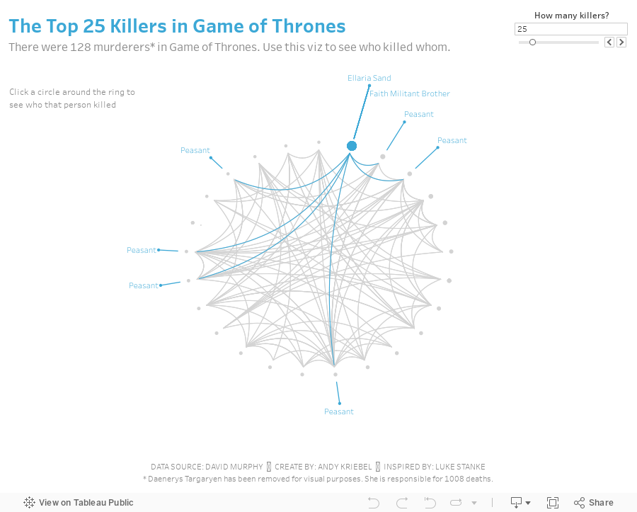
I started by trying to understand the data. Seasons, episodes, killers, and victims are all easy to comprehend so I stuck with those. The obvious chart choice would be a bar chart, but this week, I thought I would try something new. I supposed seasons and episodes create a time series, but I didn't like how that turned out.
The next chart that popped into my head was a network graph, but I wasn't sure it would work visually. I gave it a try though by assigning random coordinates to each person and connecting them using the makepoint and makeline functions. It looked like crap. That's because of my random coordinate generator; I imagine there's a better way to approach that.
I liked the idea of some type of graph connecting people so I did a google search for chord diagrams and this amazing viz and tutorial from Luke Stanke. Luke included all of his data prep steps. He used R, which I have used sporadically, but I thought it would be fun to learn how to create the workflow in Alteryx. His steps were really well documented, making them quite simple to replicate. All I had to do was swap out my dimensions for his and change a couple of aggregations.

His tutorial then take you through how to build the viz in Tableau. Easy peasy! Lastly, I removed Daenerys Targaryen from the data set because she killed 1008 people, which is over 500% more than the next highest killer and it was making everything else look terrible. I don't think the labeling is quite right, but I also couldn't figure out how to debug it after many tries.
And now I have my first chord diagram in Tableau showing who killed whom in Game of Thrones.
And now I have my first chord diagram in Tableau showing who killed whom in Game of Thrones.
Subscribe to:
Posts
(
Atom
)


