February 28, 2018
Workout Wednesday: The MLB Diversity Gap
action
,
area chart
,
baseball
,
ethnicity
,
highlight
,
labels
,
MLB
,
Workout Wednesday
No comments
This week, Rody had a few tricks up his sleeve for Workout Wednesday. At first, I thought we were going to need to do something with polygons like he did in this tip about shading between two lines. I started down that road, but quickly realized I'd used up all of the shelves and I needed more, so back to the drawing board I went.Suddenly a possible solution popped into my head (I figured it out by hovering again and again over his viz). I'm not going to give away any spoilers. Here's my solution if you get stuck...but give it a solid effort before you look at someone else's solution.
Good luck!
February 27, 2018
Tableau Tip Tuesday: Using LOD Expressions to Return the First & Last Values in a Densified Data Set
context
,
filter
,
first
,
isnull
,
last
,
level of detail
,
LOD
,
Tableau Tip Tuesday
No comments
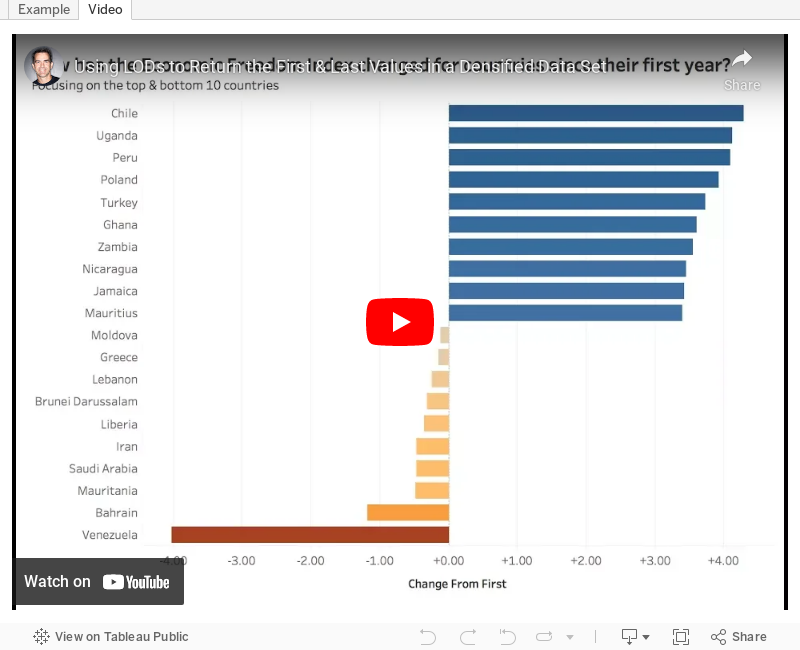
I'd like to get the difference from the first to last year for each country regardless of what year that is. When I use difference from first or a lookup, I get incorrect values for the countries that have a later year start than the others. I tried some LOD calcs, but that didn't seem to work either. Any help is appreciated!This week's tip walks you through tackling this problem. In particular, how do you do three things?
- Ignore years that have no values but a year exists
- Return the value from first and last years where data exists
- Compare the first and year to look at the change
The video and example below demonstrate the solution I came up with. Enjoy!
February 25, 2018
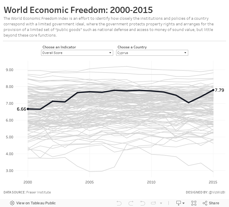
Makeover Monday: World Economic Freedom

What works well?
- Nice search functionality
- Simple colors (though maybe tough for color blind people)
- The table clearly show the top 10 countries
- Being able to "Play" the visualisation and watch the map change
- Really nice tooltips
- Clicking on a country give you specific information about each of the rankings for that country
What could be improved?
- The filled map makes it hard to see small countries and especially to see how they change.
- The up/down arrows next to the numbers clearly show better or worse, but compared to what?
- There's no sense of change because you can't easily compare years.
My Goals
- I knew I didn't want to use a map, so I wanted to focus on other chart types.
- Verify which countries had data for which years
- Limit the data to only years 2000-2015 and to those countries that had data for all of those years
- Provide the user with an option to swap out for a different metric
- Provide context for all countries against each other
- Allow the user to select a country to highlight
February 22, 2018
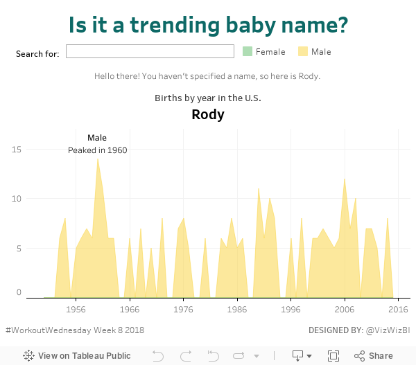
Workout Wednesday: Is it a trending baby name?
Ok, this week's workout sucked. The requirements and result you needed to achieve were super clear. What sucked was how fiddly the calculations were.Given it's day 2 of training for DS8 in The Data School, I thought they should give this a try, as a group, with me. It was mostly them speaking the logic out loud and me translating into Tableau. It made for a really fun exercise that took us about 3.5 hours.
Looking at Rody and Luke's methods, our's was most similar to Rody's and way different than Luke's. But that's the beauty of Tableau; we all approached it very differently, yet got the same result. Tableau works with the way you think.
Thanks for the challenge Luke! You almost got us! Here's our result:
February 18, 2018
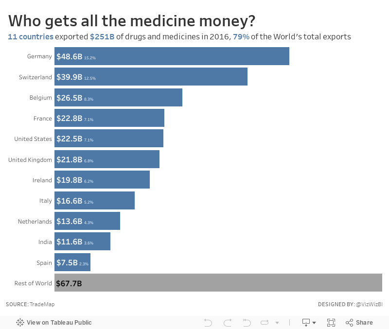
Makeover Monday: Who gets all the medicine money?
I love learning something new! Let's take a look at the original viz:

What works well?
- Resizing the continents by their overall exports makes it obvious that Europe is the largest exporter.
- I hate packed bubbles, however in this view, the largest countries stand out by double encoding with color.
- Including the percentages for each continent provides needed context
What could be improved?
- The packed bubbles make comparisons overly difficult.
- The color legend uses unequal intervals.
- Plotting the data on a map doesn't add any context.
- There's no sense of overall ranking across all countries.
- If you ask "so what?", there's no answer.
The article that accompanied the viz provided quite a few interesting statistics. It would have been great if these were included in the original viz, but they weren't, so I decided to make something super simple that:
- Has an informative title and subtitle
- Provides context
- Provides insight
- Uses color effectively
That's it. Simple, quick. That's how I like my Makeover Mondays.
February 14, 2018
Workout Wednesday: MAX and MIN Sales by Month
For this week's Workout Wednesday, Rody challenged us to create a highlight table that:- Only highlights the max and min per month
- Include the grand total (which is also highlighted)
- Resizes the rows based on the number of rows displayed
I'd done something very similar to this before when teaching in The Data School, so I got it sorted out fairly quickly. The trickiest bit was getting the nulls to display a value in the proper position. I took a different approach to Rody, I think his is simpler. I also took a different approach to the coloring; I went the discrete route and he went with continuous.
I really love how many way there are to tackle the same problem in Tableau. Click on the image for the interactive version.
February 11, 2018
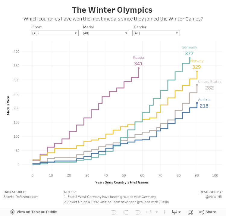
Makeover Monday: The Winter Olympics

What works well?
- Simple title and subtitle
- Noting when he combined countries
- Simple filtering
- Nice small multiples design
- Including summaries under each country name
- Sorting the countries from most medals to least
- Including blocks for each medal won
What could be improved?
- Right-align the filter titles so they are next to the filter itself.
- I'd prefer the gold medals at the bottom and bronze on top.
- Provide an option to look at the top N countries so that you can see it one screen.
- The x-axis doesn't make sense. If it's supposed to represent a year, why does it start at zero and end at 25?
What did I do?
- Focused the visualisation on the cumulative medals won by the top 5 countries based on the filters; I did this by creating stepped lines based on Rody's tutorial.
- Made the x-axis represent the number of years since a country first participated in the games; this makes comparing the cumulative medals easier. In other words, it's easier to see which country won medals the fastest.
- Place the filter titles above each filter
- Moved the notes to the bottom, out of the way
- Simplified the tooltips
Thanks Rody! You're a good sport!
February 8, 2018
Workout Wednesday: Regional Sales Across the Product Hierarchy
For week 6, Luke challenged us to build a connected dot plot. Get the requirements here. For me, it was all pretty straightforward except for the row banding. That was a pain in the ass and took some trial and error to get it just right. I also learned a nice little hack to emulate row borders.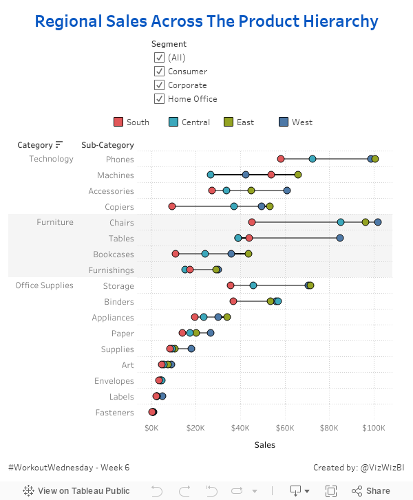
February 5, 2018
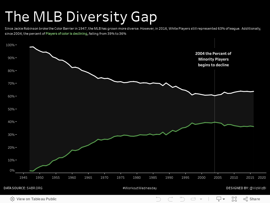
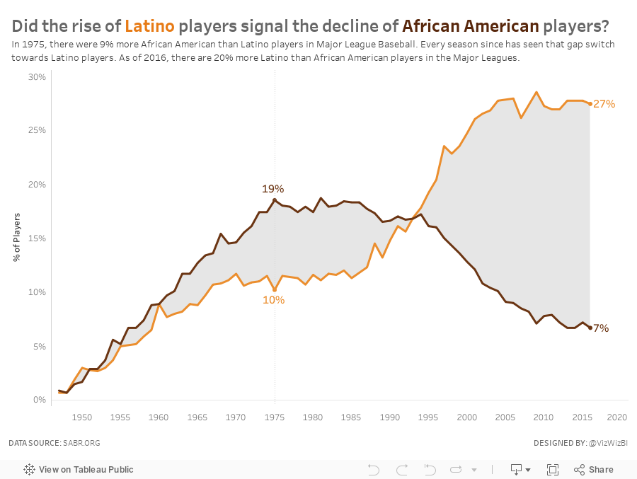
Makeover Monday: Did the rise of Latino players signal the decline of African American players?
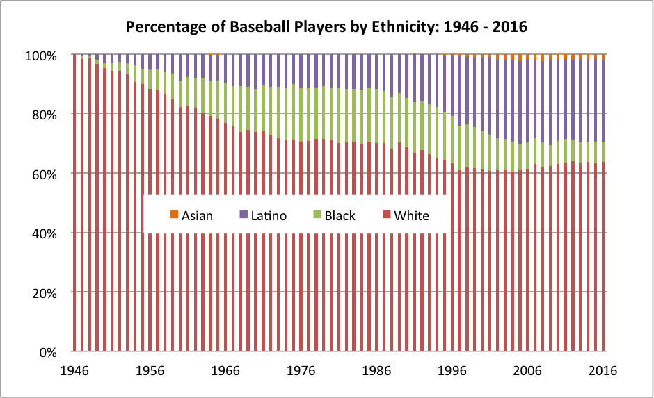
What works well?
- The x-axis is labeled every 10 years starting with the first year in the data set. This works well since there are 70 years in the data set.
- Labeling the y-axis for every 20% keeps that axis from getting too cluttered.
- The title is straight to the point.
- Placing the legend in the middle of the graph allows the chart to use the entire space.
- Stacking "White" on the bottom is a good choice since it's always the largest segment.
What could be improved?
- As it's stacked bars, it's harder than necessary to determine the percentage that Black and Latino comprise since their position is influenced by the colors below them.
- The bars appear to be of differing widths and that makes it look a bit blurry to me.
- An area chart would be much easier to understand.
- Consider more distinct color choices, particularly for White and Black.
- The visualization doesn't flow well with the accompanying story, which was about the increase in blacks and the more recent decrease. There's no indicator to the audience that this is what the chart is about.
What did I do?
I started by exploring the data and looking for a more interesting story. Was there a reason or cause for the recent decline of blacks in MLB? Is this the same for other minorities? How does WAR come into play, if at all? All of these questions are super simple to answer with Tableau's ability to support the way your brain thinks.
In the end, the most interesting story I found was the relationship between the decline of African Americans plays and the rise of Latino players. So my viz focusses on that.
Subscribe to:
Posts
(
Atom
)


