September 30, 2018
Makeover Monday: Historical Avocados Prices
avocado
,
food
,
fruit
,
hass
,
Makeover Monday
,
price
No comments

This week's chart to makeover comes from OverRidge Wealth Advisors:
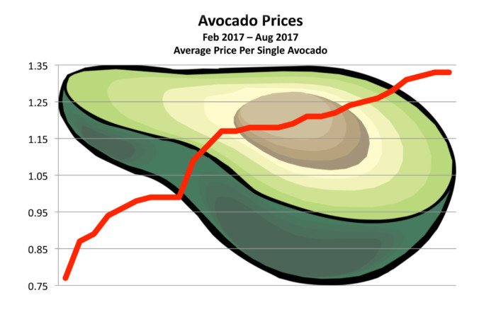
What works well?
- Using a line chart makes it easy to see the rising price.
- The title, while simple, tells us what the chart is about.
- The subtitle provides context.
What could be improved?
- There's no indication of the currency. The article mentions both US and Mexico as main sources, but the chart doesn't indicate whether it's dollars or pesos.
- The avocado in the background is distracting and completely unnecessary.
- If the avocado is removed, the line could be made black.
- Labeling the ends of the lines would add context.
- The title could be changed to something that tells the story in the data.
- Is this good or bad? Rising prices could be good if you're the produce, but bad for consumers.
- The gridlines could be more subtle.
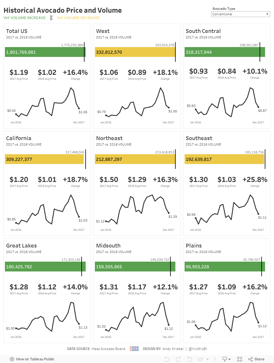
What I did
- I wanted to create something that shows the trends for each city plus the overall.
- Simplify the colors.
- Include BANs for the current price and an indicator of the change.
- Create "cards" for each region, similar to the profit and loss statement I created.
- Include a mobile version
September 26, 2018
Workout Wednesday: Discovery Dashboard
Ann Jackson
,
calculated field
,
dashboard
,
data discovery
,
dynamic
,
parameter
,
scatter plot
,
Workout Wednesday
No comments
I haven't been keeping up with as many Workout Wednesday's this year as I would like to, but when I saw some comments about the week 38 challenge, I thought it would be one I could get done quickly. The challenge comes from Ann Jackson and the idea is to build a dashboard where the users can pick and choose what they see. This is such a practical use case for anyone building dashboards.From Ann:
One of my absolute favorite things about Tableau is that not only is it a fantastic data display tool, but it is amazing at data exploration and discovery. While you’re in the flow of analysis there are tons of built in features that provide you feedback, awareness, and insight into your data. Everything from displaying the number of marks on a sheet in the lower left corner (along with the sum of a measure) to exposing the worksheet summary card. You can customize it to show you so many options and it’s one of the first tools I use when getting hands on with new data.
I thoroughly enjoyed this challenge and will use it going forward as a challenge in the Data School. Click on the image below for the interactive version.

September 24, 2018
Makeover Monday: Priorities for Progress on Gender Equality


What works well?
- The colors are easy to distinguish.
- The footnotes help to explain the percentages...sort of.
- The chart layouts are easy to understand. Bar charts nearly always work well.
- Labeling the top of each bar removes the need for an axis.
- Good drill down from the overall to the per region level.
What could be improved?
- I find the chart titles quite confusing.
- Comparisons within a single region are difficult.
- I had no idea how to read these charts without reading the article. A chart should, ideally, be able to stand on its own.
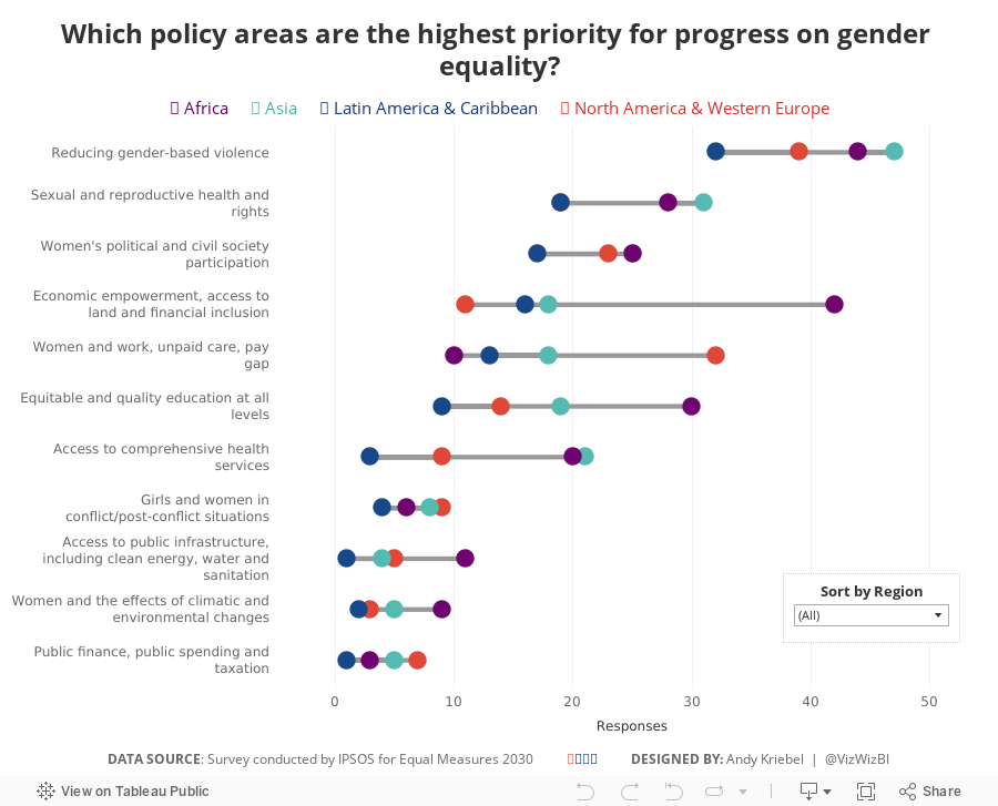
What I did
- I focused on making over the bottom chart.
- I kept the original colors.
- I changed the bars to dots to help show the range of responses better.
- I didn't convert the responses to percentages as I wasn't confident it was accurate.
- I included a sorting option to allow sorting by the total responses or the responses within a region.
- Based on a twitter conversation with Dan Caroli last week, I turned on advanced logging feature which tracks each change you make in a sheet and then I turned them into this gif.

With that, here's my Makeover Monday week 39 for Equal Measures 2030.
September 17, 2018
Makeover Monday: How does the cost of a ticket change as your trip approaches?
europe
,
Makeover Monday
,
places
,
trains
,
travel
No comments


What works well?
- Simple title and subtitle that explain what the viz is about
- Line colors are easy to distinguish
- Good small multiples layout
- Reversing the time scale so that the larger number is to the last since it represents more days in the past
- Making the obvious
- Sorting the routes by distance
What could be improved?
- Reduce the font size for additional information like the footnote and the source
- Move the subtitle closer to the title and add space between the subtitle and the first chart
- Label the ends of the lines
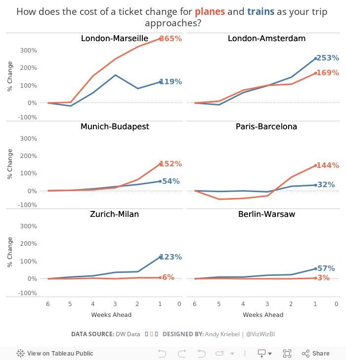
What I did
I don't mind the original too much other than I feel like it's missing some context. I decided to basically recreate the chart, but show the change in price as the days got closer. For me, this helped show how much more expensive tickets will be if you wait until the last minute.
September 13, 2018
Clayton Kershaw & My Learning Process
baseball
,
baseballsavant
,
clayton kershaw
,
density
,
heatmap
,
learning
,
major league baseball
,
pitcher
,
process
,
spatial
No comments
What is Learning?
According to UC Berkley, learning is a process that:
- is active - process of engaging and manipulating objects, experiences, and conversations in order to build mental models of the world (Dewey, 1938; Piaget, 1964; Vygotsky, 1986). Learners build knowledge as they explore the world around them, observe and interact with phenomena, converse and engage with others, and make connections between new ideas and prior understandings.
- builds on prior knowledge - and involves enriching, building on, and changing existing understanding, where “one’s knowledge base is a scaffold that supports the construction of all future learning” (Alexander, 1996, p. 89).
- is situated in an authentic context - provides learners with the opportunity to engage with specific ideas and concepts on a need-to-know or want-to-know basis (Greeno, 2006; Kolodner, 2006).
- requires learners’ motivation and cognitive engagement to be sustained when learning complex ideas, because considerable mental effort and persistence are necessary.
I've left a couple bits out that aren't relevant to learning in the context of data visualization, but all of the others should resonate with you if you approach learning with the correct mindset.
As an example, I am actively look for reasons to practice features in the Tableau 2018.3 beta, especially around density mapping. I was reading an article this morning about Clayton Kershaw, whom many consider the best pitcher in Major League Baseball. He also has highest base salary at $33M for 2018.
Most of the density maps I've seen have had a mapping component. In the case of baseball, and pitching in particular, the spatial zone is the strike zone. Data is easily accessible to get the coordinates of every pitch as it crosses home plate.
For this project, the learning process:
- is active in that I am building my knowledge as I explore the data set and learn the new features.
- builds on my prior knowledge of how the feature works and my knowledge of the game of baseball. However, I had never done a scatterplot of pitching before, so I had to learn new terminology in the data. This knowledge will help me be more productive and learn faster in the future.
- is situated in the authentic context of engaging with the ideas and visual concepts that I saw online and drew on paper.
- required my motivation and engagement to see the project through to fruition and the persistent to make the display visually accurate.
I hope my thought process helps you focus your learning. I love helping people get better at what they do and if I can help you speed up your learning, then we'll all be better for it.
With that in mind, here are two images I created for this project. The first is all pitches by Kershaw and the second is of his curveballs, which is known to be his most potent pitch. Once Tableau Public supports Tableau 2018.3, I'll publish them and include links on the images.


September 11, 2018
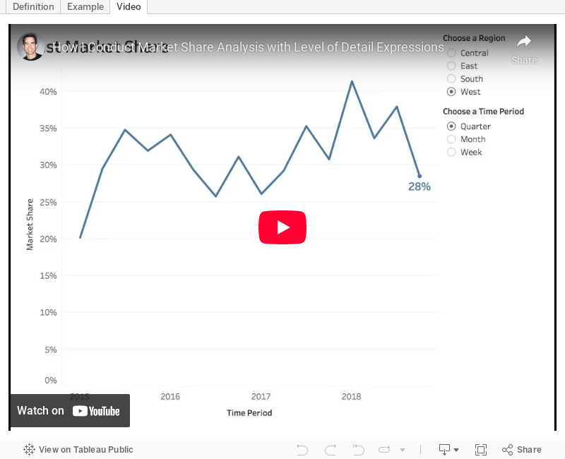
Tableau Tip Tuesday: How to Conduct Market Share Analysis with Level of Detail Expressions
analysis
,
datetrunc
,
fixed
,
level of detail
,
LOD
,
market share
,
parameter
,
Tableau Tip Tuesday
No comments
In this week's tip, I show you how to do market share analysis with Level of Detail expressions. In this video, I show you the calculations, then I expand it to make it more dynamic using a parameter.Enjoy!

September 10, 2018
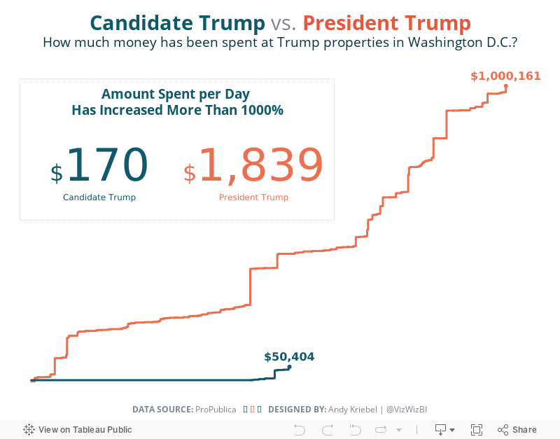
Makeover Monday: Spending at Trump Properties in Washington D.C.

Since Watergate, presidents have actively sought to avoid conflicts between their public responsibilities and their private interests. Every president since Jimmy Carter sold his companies or moved assets into blind trusts or broadly held investments – until now. Donald Trump never did this, despite his expansive holdings. He stands to gain personally when groups pay his companies.Let's start by looking at the chart created by ProPublica:
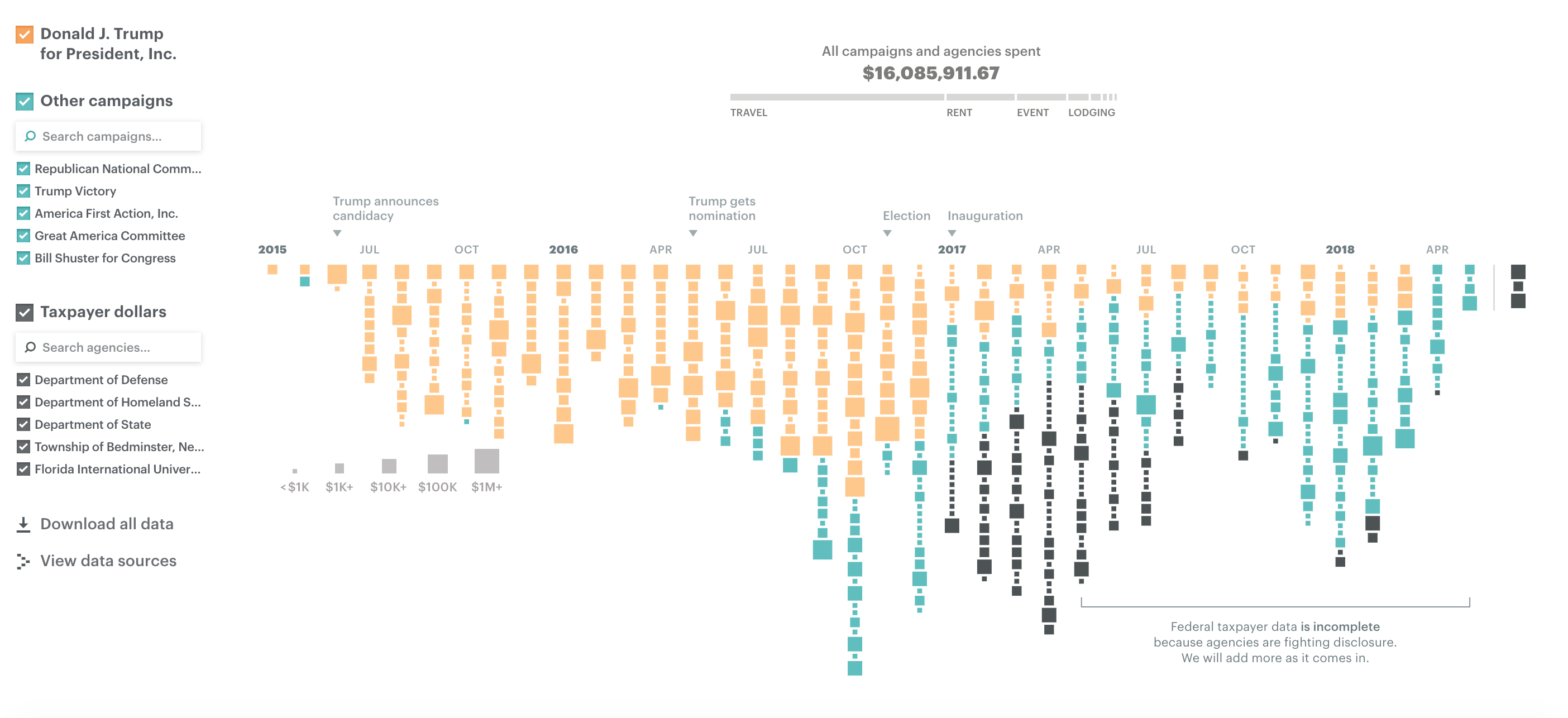
What works well?
- Colors are easy to distinguish
- Good interactivity for additional information
- Filter options are obvious and easy to use
- Sizing the blocks gives you relative comparisons
- Good use of annotations
- Stacking the blocks makes it obvious there were more records in one month versus another
What could be improved?
- Using size for the blocks makes exact comparisons difficult
- Include a title
- Include a subtitle with additional context
- Provides the user the ability to ask "How does this affect me?"
What I did
- I explored the data quite a bit, before focusing on Washington. I did this because I saw a large increase in spending after Trump was elected.
- Use simple colors like the original
- Compare spending during the Campaign vs since Trump has been President
- Use BANs to call out the import information
With that, here's my viz for Makeover Monday week 37:
September 3, 2018
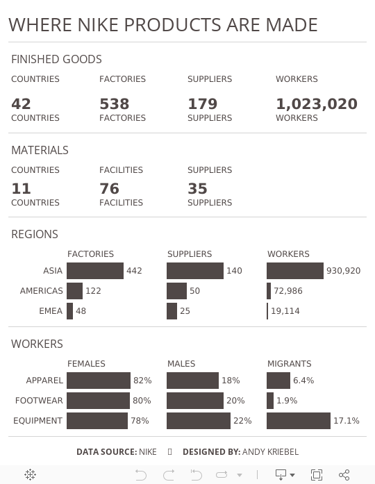
Makeover Monday: Where Nike Products Are Made


What works well?
- The summary card on the right is packed full of information and as you zoom, you get different levels of detail.
- Keeping the map a single color allows you to focus on where the factories are located.
- Excellent interactivity
- Overall, everything is simple and clean.
What could be improved?
- Adding some filtering capabilities
- Make it easier to identify the smaller countries, possibly by outlining the countries with a white border.
What I did
- Mimic the style of the cards with its BANs
- Make some of the importion that's buried deeper in the map more evident
- Use Nike official colors
- Add some simple interactivity through actions
This is a pretty simple viz this week and I really enjoyed making it. It's almost like a report card.
Subscribe to:
Posts
(
Atom
)


