March 28, 2018
Workout Wednesday: Color and Ordering
% of total
,
color
,
difference
,
level of detail
,
parameter
,
sort
,
table calculation
,
Workout Wednesday
2 comments
This week Rody challenged us to create a tabular view that has three columns, only one of which is colored and the user needs to be able to sort by a given year and metric. Find the full requirements here.I had done something like this previously for the color. What tripped me up was the sorting calculation. It's not overly complicated. The only hint I'll provide is that you can't sort the subcategory by this calculation. Click on the image below for the interactive version.
March 26, 2018
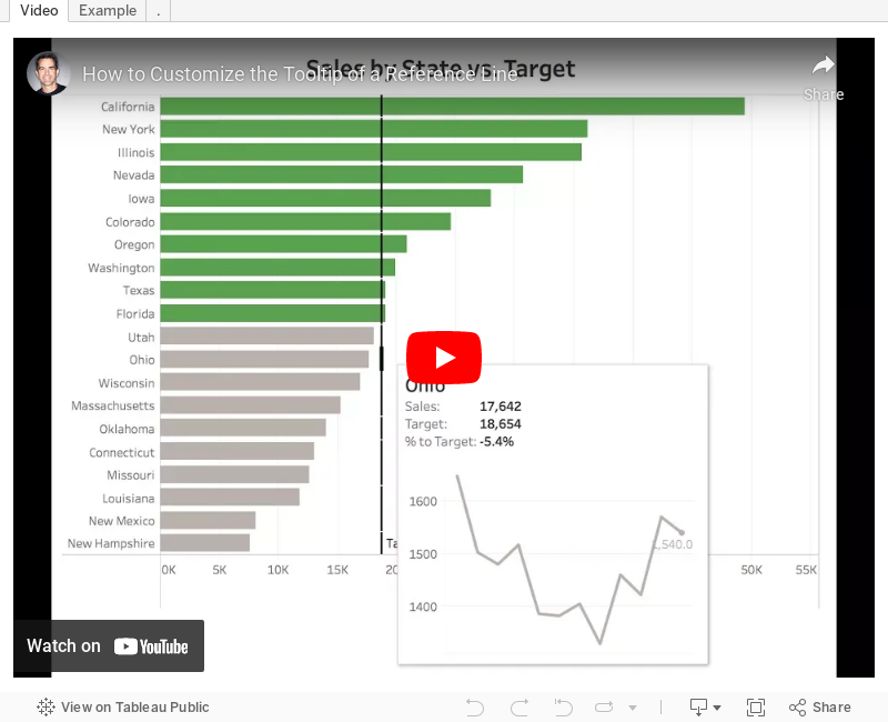
Tableau Tip Tuesday: How to Customize the Tooltip of a Reference Line
context filter
,
custom
,
gantt
,
level of detail
,
LOD
,
reference line
,
Tableau Tip Tuesday
,
tooltip
,
trick
5 comments
Tableau (as of this writing) does not allow you to customizing reference line tooltips. So how can you work around that? Simple! Check out this video and download the workbook to see how it's done.Enjoy!
March 25, 2018
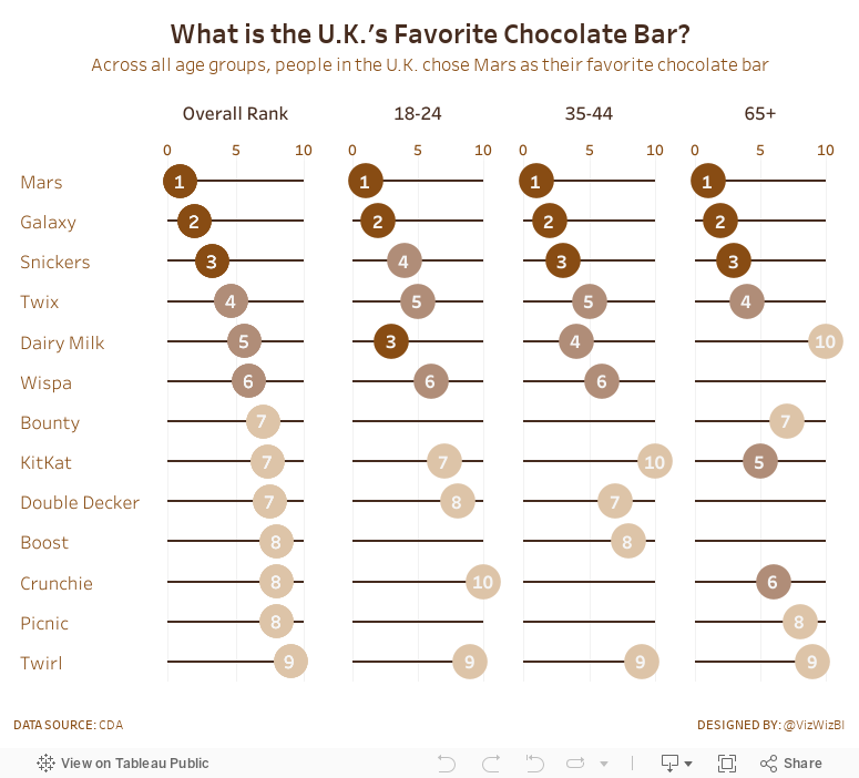
Makeover Monday: What is the UK's Favorite Chocolate Bar?
The chart we're making over this week is from CDA.

What works well?
- The bump chart is a very nice visual display for ranked data.
- Including the rank as a number at each point.
- The lines are easy to follow.
- Labeling both the left and right side so that you don't have to trace the line back to the start when you get to the end.
- Using a different mark type when the chocolate is not ranked.
- Simple title and subtitle.
What could be improved?
- This is a LOT of colors and some of them are very close to each other.
- Why are there age bands missing?
My Objectives
- Split each of the age groups out rather than connecting them and then include a total, which is the average across the age groups. I'm making the assumption here that the same number of people were surveyed in each age group.
- Display the data as a dot plot along a scale from 0-10 for each chocolate bar for each age group
- Use a brown theme to go with the connotative color of chocolate
- Color the values using a brown scale
March 21, 2018
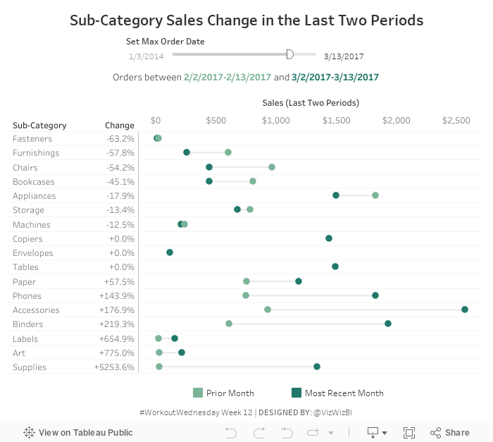
Workout Wednesday: Sub-Category Sales Change in the Last Two Periods
Another Workout Wednesday in the books. This week, Curtis Harris created the challenge in Luke's absence. Why didn't I think of subs last year?Find all of the requirements on the Workout Wednesday website. Essentially, you have to provide the user with a date filter and use that filter to display a barbell chart of sales up to the date selected for its month compared to the same days in the prior month.
What tripped me up most was creating the tooltips. I'm going to have to look at how Curtis did it, which I suspect was with LODs. I used LODs to get the sales based on the filter table calcs for the tooltips since all of the dimensions I needed were already in the view.
Give this one a go before downloading any of the solutions. You'll learn more by struggling through it.
March 18, 2018
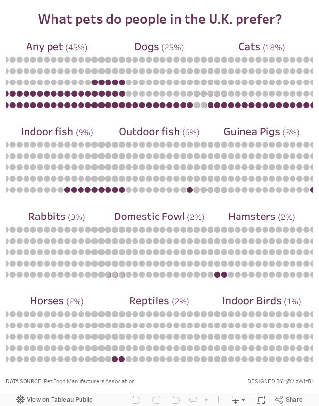
Makeover Monday: What pets do people in the U.K. prefer?

What works well?
- The pets are ranked in descending order.
- The bar colors match the icons.
- Including the text in the bars saves room
What could be improved?
- Include a title that explains the data a bit more
- While the icons are cute, are they necessary?
- If you remove the icons, you then don't need as many colors.
My Goals
- Practice what I learned in last week's Workout Wednesday because reinforcing the learning helps it stick for me
- Create a better title
- Simplify the colors
- Create a mobile version
That's it. Simple, quick and done!
March 14, 2018
Workout Wednesday: Candy Button Small Multiples
% of total
,
candy dots
,
circles
,
small multiples
,
text
,
unicode
,
waffle chart
,
Workout Wednesday
No comments
Rody brought back a classic technique for Workout Wednesday week 11. Get all of the requirements here. Almost exactly two years ago, he wrote a guest post on this blog about how to create the unit charts he's challenging everyone to make.One thing he mentioned in the blog is that now you can use unicode characters in 10.5, however, I've been using them for a long time. I got to this site, find the character I want to use, and paste it into the calculation or field name.
The trickiest part for me on this challenge was getting the dots in the right place, that is, starting at the bottom right. I had to swap some of the logic of the calcs around and it was done. As for the headers above each set of dots, well, I'll leave that to you to figure out. Here's my tip: don't overcomplicate it; it's quite simple.
Again, find all of Rody's requirements here. Click the image below for the interactive version.
March 11, 2018
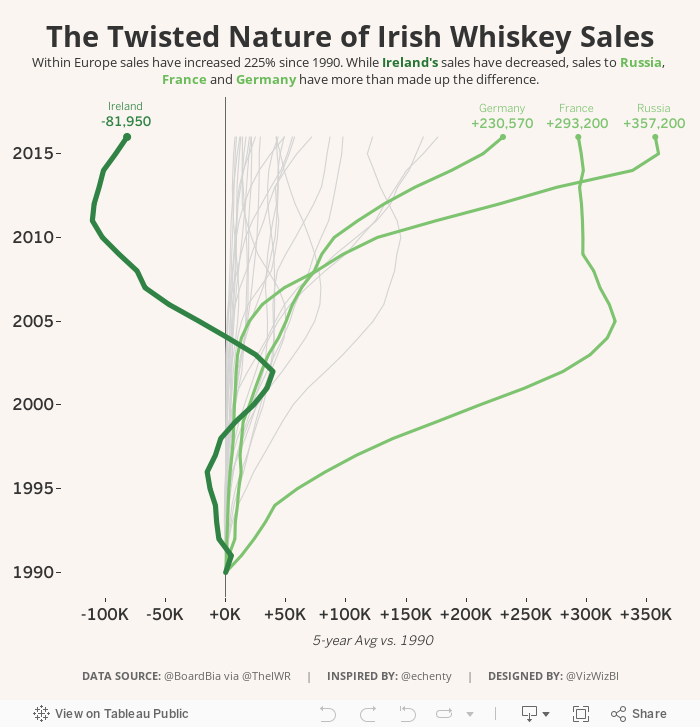
Makeover Monday: The Twisted Nature of Irish Whiskey Sales
alcohol consumption
,
BordBia
,
Glendalough
,
Information Lab
,
ireland
,
irish
,
Makeover Monday
,
St. Patrick's Day
,
The IWSR
,
whiskey
,
whisky
4 comments

Also, thank you to BordBia for providing the data that they collected from The IWSR. Let's have a look at the visualization to makeover from Bloomberg Businessweek:
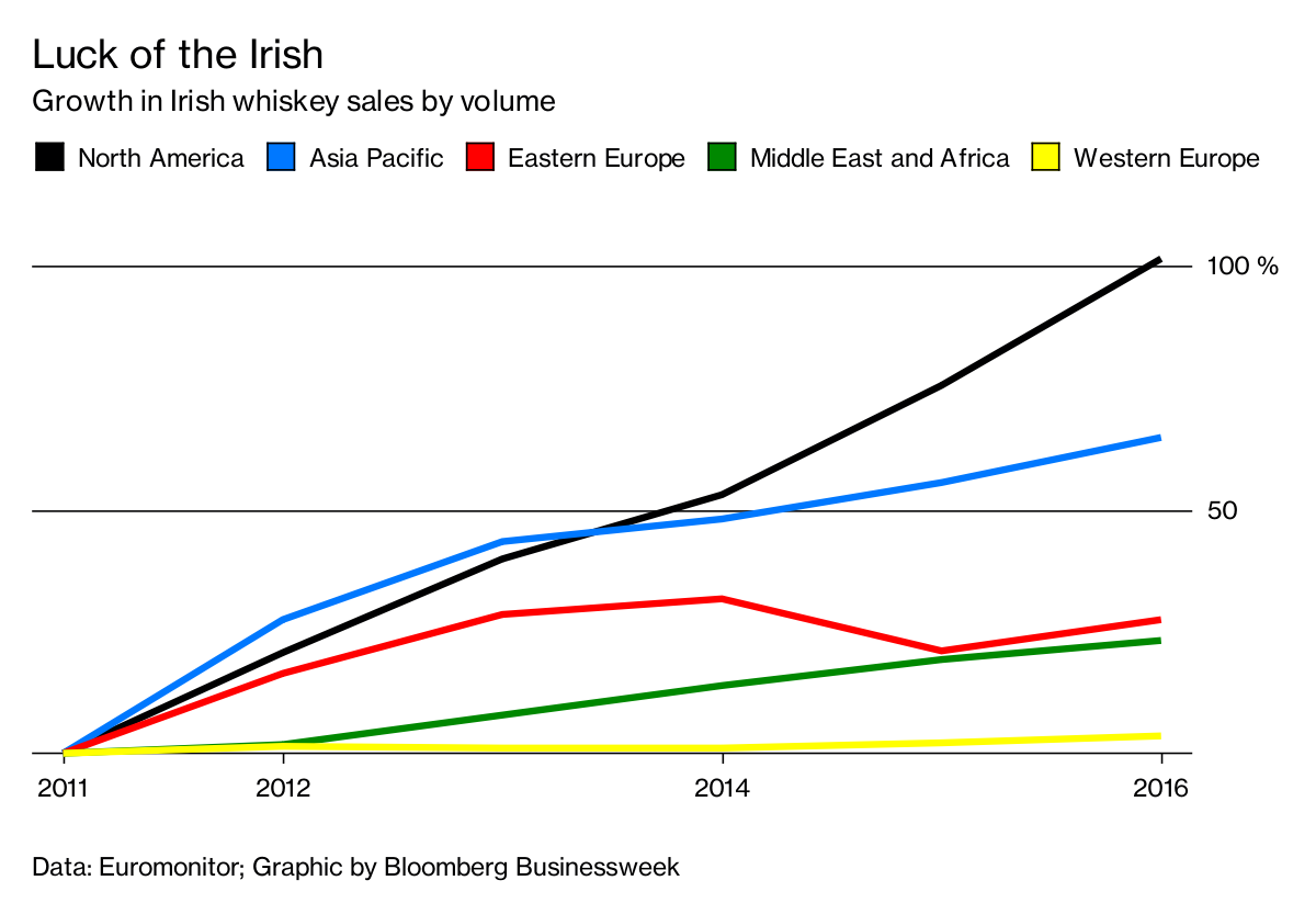
What works well?
- Overall the design is clean, including minimal gridlines.
- Showing cumulative growth since 2011 makes it easy to compare the regions.
- The region colors are easy to distinguish from one another.
- The subtitle tells me what the chart is about.
- The legend is prominently placed so that we know it's important.
- Putting the axis on the right speed processing because the axis is next to the end of the lines.
What could be improved?
- Labeling the lines directly would remove the need for the legend.
- Labeling the ends of the lines would tell us what the growth actually has been.
- The title isn't very relevant to the data. Why does this make the Irish lucky? A better title is needed.
- So what? What are we supposed to get from this?
My Goals
- There are a lot of countries and a lot more years in the data set, explore them and look for stories.
- Consider the regional aggregations to see if there's an significance.
- Look at both volume and change. Looking at just change doesn't factor in the volume that each country imports.
- This is time series data, so spend time looking at line charts.
After playing with data for a while, I remembered this great viz by Emily Chen and thought it might fit well with this data set because whiskey sales within Ireland have decreased. I used her viz as my style guide to create my Makeover Monday week 11.
March 7, 2018
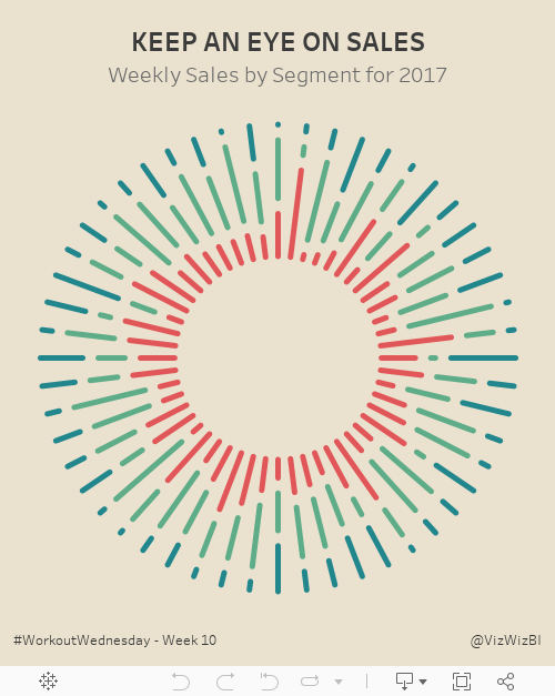
Workout Wednesday: Keep an Eye on Sales
Let's all start week 10 by agreeing that Luke is mean. Just kidding Luke! Workout Wednesday is supposed to be difficult and this week it sure was. This was definitely the hardest week for me so far.We had to build this sunburst chart:
I had built sunburst charts before (link) so I opened that workbook knowing that would at least get me started. Ok, I was quickly about 75% of the way done, but my colors were all overlapping and starting at the same spot. The requirement has them essentially stacked with a gap in between.
I tried over and over again, but couldn't get the calculation right. So I went to lunch and went for a walk to get away from the computer and do some thinking. To figure it out, I thought about it as one week at a time, figuring if I get one week right, I might have it all correct.
The trick is figuring out the length of each segment within each week. Notice how they all end at the same spot. That's a pretty big hint. Then once you figure that out, you probably won't have a gap between the colors. That part is pretty simple.
Good luck!
March 5, 2018
Makeover Monday: How good are policymakers at estimating indicators related to girls and women?
comparison
,
dot plot
,
equal measures 2030
,
estimates
,
girls
,
goals
,
politics
,
women
No comments
I ended up skimming through parts of the main report to get a better idea as to what the survey is about and any interesting findings they might describe.
In the end, there were major themes:
- Policymakers are really out of touch with the issues facing girls and women in the five countries in the study.
- Policymakers "think" they know what's going on.
Really, it's quite a sad situation. When policymakers are so far disconnected from the truth yet think they are close, I suspect not enough action is taken. I guess that's politics.
It took me a good 15 minutes to comprehend what the original chart was even about. Apparently it shows how far policymakers' estimates are from the actual indicators.
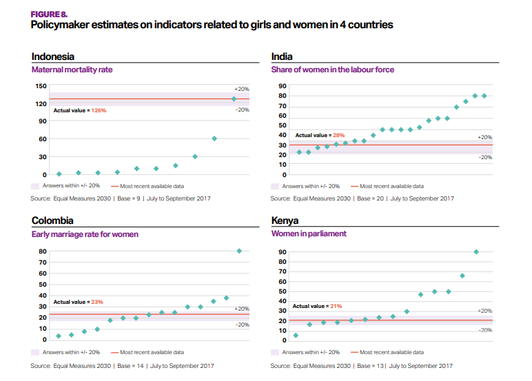
What works well?
- The bands for +/- 20% from the actuals helps give context to the estimates from policymakers.
- The country titles and subtitles for the topic make is easy to know what each chart is about.
What could be improved?
- What do the green diamonds mean? Apparently they are policymaker estimates, but there's no indication of that in the dashboard.
- Why are these topics picked for these countries?
- Why is Senegal excluded?
- A more impactful and descriptive title would help.
- It's unnecessary to include the source and legend with each chart.
My Goals
- Try to understand the data; easier said than done
- Understand the spread of each topic within each country
- Show ALL responses
- Allow the user to filter and drill in to the topic they are interested in.
- Stick to the overall style guidelines from Equal Measures 2030
- Include BANs for the number of policymakers that estimated within +/- 20% of the actual values
I don't love my final dashboard, but after working on it for far too long, I figured it was "good enough". It could probably use an explanation somewhere for how to read the charts.
Click on the image for the interactive version.
March 3, 2018
Creating Runkeeper Tile Maps with Alteryx & Tableau
In this post, I'll detail how I created the tile maps and share the workflow and visualizations. The inspiration for this project comes from Marcus Volz and his great github tutorial on how to create small multiple visualizations of your Strava runs, which I wrote about here. This was the viz that I created based on his R code:
 When I visited The Information Lab France in January, we decided that we would try to replicate Marcus' process with Alteryx and Tableau because we wanted it to be an interactive visualisation, whereas Marcus' creates a static image. This process should work for Runkeeper, Strava or any fitness app that uses GPX files.
To get all of your routes from Runkeeper:
- Login to Runkeeper
- Go to "Account Settings" from the gear at top right of the screen
- Choose the Export Data option on the left
- Select the date range
- Click on Export Data
- Unzip the files
To get all of your routes from Strava:
- Login to Strava
- Select "Settings" from the main drop-down menu at top right of the screen
- Select "Download all your activities" from lower right of screen
- Wait for an email to be sent
- Click the link in email to download zipped folder containing activities
- Unzip the files
I actually don't follow either of these methods. I pay a small yearly fee for a service called Tapiriik that allows you to sync your fitness data with Dropbox.

ALTERYX WORKFLOW

Steps
- Input all of the files using a wildcard match for 2018 runs only.
- Assign a unique number to every row. In these files there's a GPS reading every second. Having a unique number makes creating the routes easier because you know the sequence.
- The next few steps are the magic part. These essentially give every route the same size as a square. We need them all to be the same size regardless of the actual geographical area covered.
- Create points for each GPS points and connect them to create a polyline. Do this for both the route itself and the boundary
- Calculate some summary stats for each run.
- Bring them all back together.
- Export as a SHP file.
TABLEAU VISUALIZATION
Once the shapefile is done, all you need to do is connect to it in Tableau. I created two visualizations. Click on the images for the interactive versions and to download the workbook.
1. Small Multiples
Like Marcus' viz, I created a view that spaces the runs based on the number of runs in the view. For example, in February, I recorded 22 runs, so I get a view with 5 rows and 5 columns. Each square has a route from the first run on the upper left to the most recent run in a Z pattern. There are additional details about each individual runs available on hover.
This view uses table calculations to determine the spacing.

2. Calendar View
The calendar is much simpler to create since it doesn't need any table calcs.
- Double click the Geometry field to get a map
- Filter to a single month
- Place Weekday on the Columns
- Week on the Rows
- Add information for tooltips
- Add total monthly mileage to the caption
- Resize the rows and columns to fit the window

LESSONS LEARNED
I'm nowhere near an expert in Alteryx. I know I can improve if I practice more. Here are five lessons learned I learned that I will be taking forward:
- Leverage the strength of your team to help you solve a problem and to help you learn.
- Alteryx makes creating and working with spatial objects incredibly simple.
- Prepping the data exactly as you need it in Tableau will make the visualization process much faster.
- Data prep processes in R and Python make for great data prep exercises in Alteryx.
- Fail fast and iterate quickly. Both Alteryx and Tableau allow you to try lots of things quickly without fear of breaking anything. Try something. If it doesn't work, try something else. Keep going until you've nailed it.
Subscribe to:
Posts
(
Atom
)


