March 30, 2019
Groundwater Contamination and Cow Poo: A Major Contributor to Global Warming
cow poop
,
environment
,
EPA
,
groundwater
,
methane
,
nitrate
,
pollution
,
United States
No comments

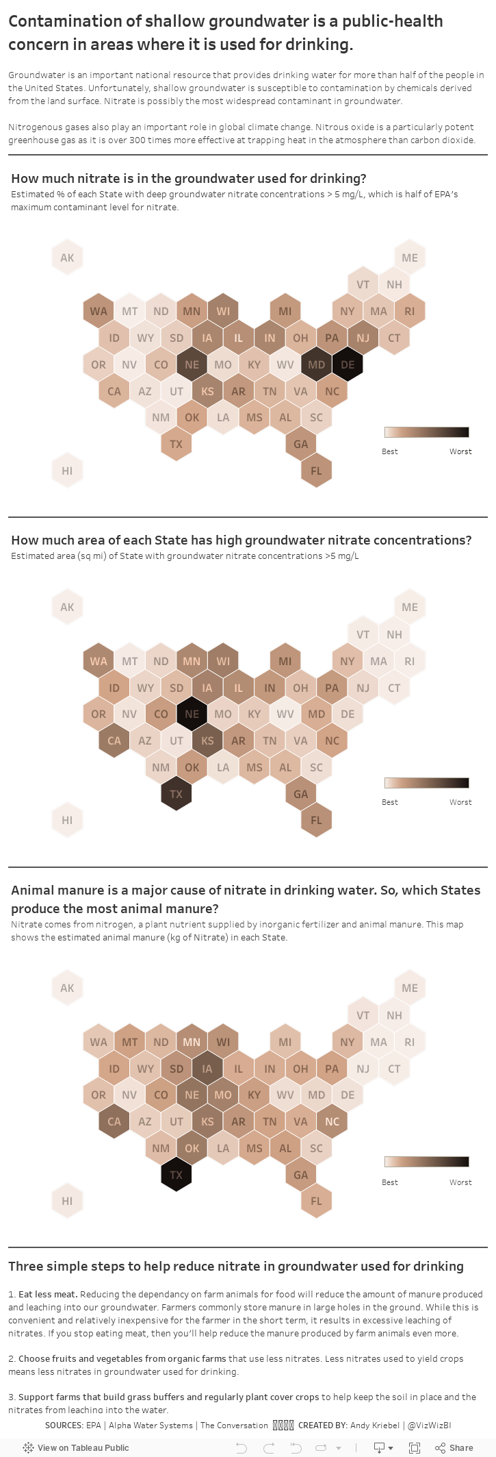
While watching a documentary, they mentioned how methane from cows (i.e., cow farts) are a major contributor to the greenhouse gasses and how cow manure is a major source of nitrate released into groundwater used for drinking. Fortunately, there is tons of data available, the primary source being the Environmental Protection Agency (EPA).
I wanted to understand the geographical distribution of three factors:
- The percentage of each State with high groundwater nitrate concentrations.
- The total area (square miles) of each State with high groundwater nitrate concentrations.
- Where the cow crap comes from that pollutes groundwater used for drinking.
I decided to create a map for each of these topics, as a scrolling story, with three actions you can take to help reduce the impact of cow manure pollution. We all want safe drinking water after all.
March 26, 2019
#TableauTipTuesday: Create a Region to State Drill Down Map with Set Actions

March 25, 2019
#MakeoverMonday: Consumer Spending by Generation

What works well?
- The generations are sorted from youngest to oldest.
- The title is clear.
- The gridlines help guide the eye across the viz.
- It's easy to compare the general/misc category and the restaurants across generations.
- A stacked bar chart is easy to understand.
What could be improved?
- The story in the data, from the article, is about how millennials are spending more on restaurants. It would be good to make that a more obvious focus of the viz.
- There are too many colors.
- While the title is clear, if you don't read the article, you could miss the purpose for the chart.
What I did
I really enjoyed using Google Data Studio last week, so I thought I'd give it another try to continue my learning. Since this was a simple stacked bar chart, I wanted to create a "set" for restaurants vs. all others. I needed to create a calculated field using a case statement that checks the category field. That's it!
From there, it was formatting, which is pretty intuitive as well. I'd highly recommend you give Data Studio a try, especially if you know exactly what you want to build; it's not a data exploration tool.
March 20, 2019
#MakeoverMonday Data Studio Edition: Reykjavik Index for Leadership in G7 Countries

DATA PREP REQUIRED
- Add values for the remainder (100 - index)
- Add a sort column
- Pivot the data so that the index and the remainder were in the same column
WHAT WORKED WELL
- To create the stacked bar chart, all you need to do is select the chart type and drop the fields on the appropriate shelves.
- Customizing the split of the colors for the index and the remainder was easy.
- I was able to customize the size of the viz.
- You can choose any font that Google supports!!
- The tooltips are super responsive.
- Everything looks very crisp.
- Hiding the gridlines leaves a nice thin black line on the y-axis without me needing to fiddle around with a few different settings.
- The overall UX is quite intuitive. I see they have a data explorer now too.
WHAT I COULDN'T OVERCOME
- I couldn't find a way to show only the mark labels for the purple bars.
- I couldn't add a reference line for the G7 average so I had to leave it in the view.
- I couldn't hide the x-axis only. When you do, the y-axis gets hidden as well.
With that, here's my third Makeover Monday for week 12 2019.
March 19, 2019
#MakeoverMonday Power BI Edition: Reykjavik Index for Leadership in G7 Countries

DATA PREP REQUIRED
- Add values for the remainder (100 - index)
- Add a sort column
- Pivot the data so that the index and the remainder were in the same column
WHAT WORKED WELL
- Creating a stacked bar chart in Power BI was quite simple.
- Customizing the split of the colors for the index and the remainder was easy.
- The viz layout is super intuitive and automatically adjust to the size of the screen while maintaining the original chart ratio.
- The fonts look super crisp.
- Simple to add a constant reference line for the G7 average.
WHAT I COULDN'T OVERCOME
- I couldn't find a way to show only the mark labels for the purple bars.
- I had to change the mark labels so that the values of the grey bars wouldn't be visible by making the text the same color as the grey bars.
- I couldn't copy/paste into a text box.
- I couldn't customize the font size for the reference line.
- I'm sure there's a way, but I couldn't figure out how to color code the bars based on whether they were above or below the G7 average. For example, I wanted to make those countries below the G7 average a lighter shade of purple.
With that, here's my second Makeover Monday for week 12 2019.
March 17, 2019
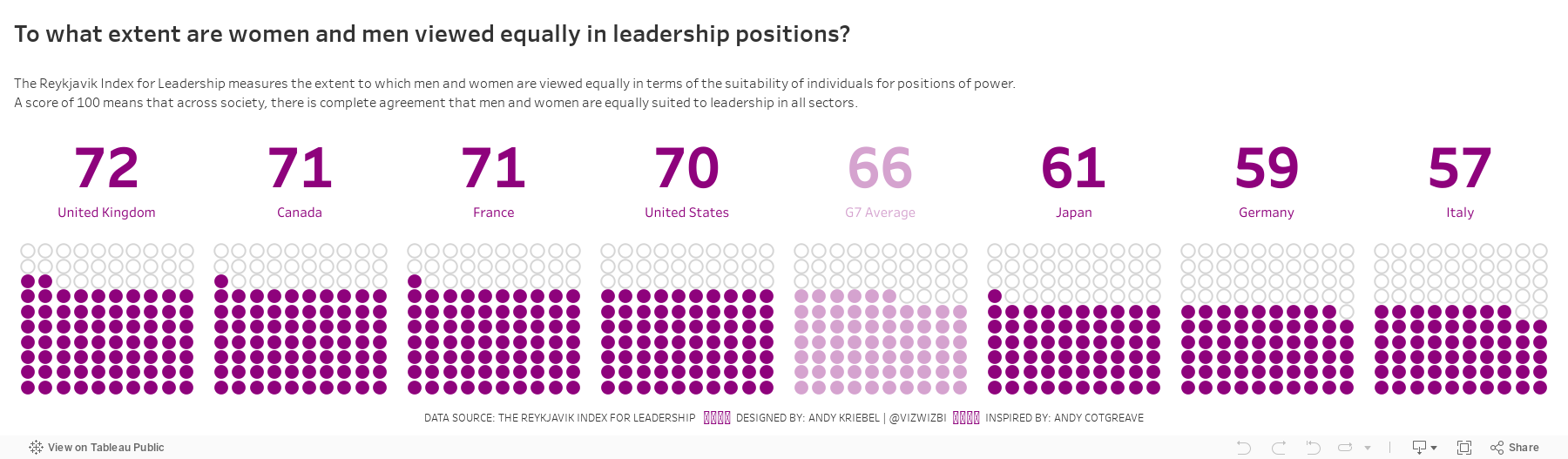
#MakeoverMonday: To what extent are women and men viewed equally in leadership positions?
equality
,
female
,
G7
,
Makeover Monday
,
Reykjavik Index
,
women
No comments

Let's have a look at the chart:
 |
| Source: World Economic Forum |
WHAT WORKS WELL?
- Ordering the countries from highest to lowest in terms of people that view women and men equally in leadership positions
- Including the G7 average for context
- Assigning a different color to the G7 average
- Labeling the end of the lines
WHAT COULD BE IMPROVED?
- Circular bar charts are horrible for comparisons.
- The title is meaningless.
- The lines start thin, get thicker, then get thin again. Why?
- The title and the center of the chart are the same. That's certainly unnecessary redundancy.
WHAT I DID
I started by creating a simple bar chart and that was fine. I also added a grey bar to have it as a stacked bar for each country that goes up to 100%. I then thought about doing a waffle chart (with circles) and then I remembered this viz from Andy Cotgreave back in Makeover Monday week 4 2016. I decided to replicate Andy's work since it looks great and gives lots of context. I created a mobile version like Andy did too.
With that in mind, here's my makeover for week 12.
March 12, 2019
#TableauTipTuesday: How to add a one pixel line to a dashboard

March 11, 2019
#MakeoverMonday: Has Philadelphia recovered from the Great Recession?
Makeover Monday
,
marginal histogram
,
mortgage
,
open data
,
philadelphia
,
real estate
No comments


What works well?
- Consistency of colors
- Simple design
- Using an area chart with a bold line at the top
- Bar chart is sorted
- Interactive actions
- Automatic proportional brushing
What could be improved?
- Reduce the outline of the zip codes on the map
- Remove the background from the map
- Add a dashboard title
- Change the chart titles to be more meaningful
And here's my makeover. Click to interact.
March 5, 2019
Makeover Monday Power BI Edition: Births Attended by Skilled Health Staff vs. Female Life Expectancy as a Motion Chart

What's one to do? Try a tool that does support animation. In this case, Power BI. Scatter plots in Power BI support animation natively and it took less than five minutes to create this.
- Upload the data.
- Choose the measure for the x-axis and place it on the X Axis shelf.
- Choose the measure for the y-axis and place it on the Y Axis shelf.
- Add a dimension to the Details shelf to draw more dots.
- Place the dimension to animation across, i.e., years, on the Play Axis shelf.
- Add a title.
- Add a text box as a footer.
BOOM! Done! Easy peasy. Check it out below.
March 4, 2019
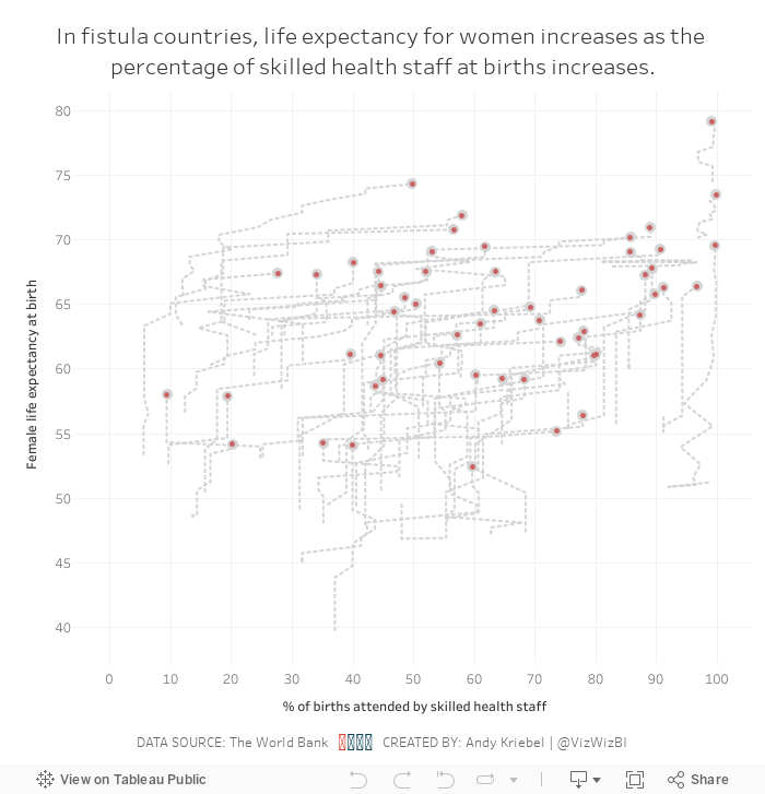
Makeover Monday: Are skilled health staff an indicator of female life expectancy in fistula countries?


What work well?
- Using a continuous color palette
- There are no exceptionally large countries compared to the others, so a filled map is a good choice.
- Normalizing the data to make comparisons across countries more relevant.
- Using grey for countries with no data.
- Good title and subtitle
What could be improved?
- If there is data across years, it would provide additional context to the data. In other words, is the situation improving?
- Make the title bigger; it's too small compared to the large map.
My Goals
- Compared the metrics between fistula and non-fistula countries
- Look at change over time
- Figure out how to deal with all of the nulls
- Be done
Subscribe to:
Comments
(
Atom
)


