October 21, 2025
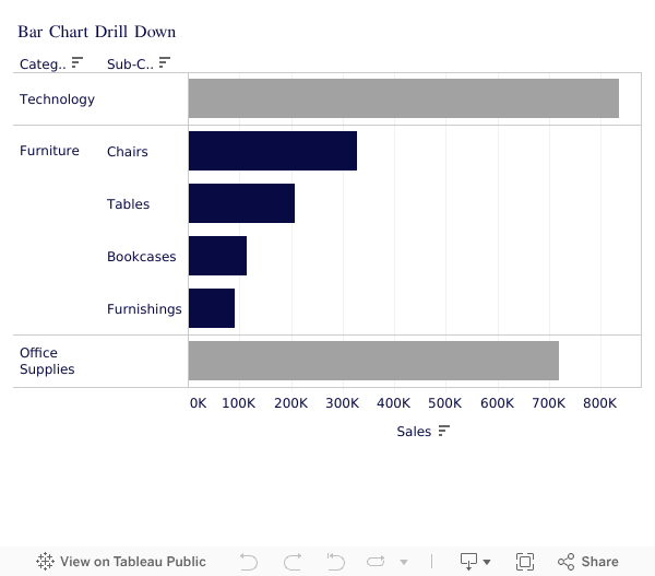
How to Drill Down in Tableau Using Set Actions (Bar Chart Tutorial)

Unlock Powerful Tableau Drill Downs With Set Actions 🔍
If you’re still clicking around dashboards trying to “fake” a drill down — stop! In this video, I’ll walk you step-by-step through how to use Set Actions in Tableau to build a fully interactive bar chart drill down.
👉 Start here to level up faster:
Tableau Starter Kit → https://www.nextleveltableau.com/starterkit
Core Concepts Course → https://www.nextleveltableau.com/tcc
Next-Level Tableau → https://www.nextleveltableau.com/
I’ve helped thousands of Tableau analysts move from frustration to clarity using features like this — and once you master Set Actions, your dashboards will finally work like your users expect them to.
📌 If you’re ready to stop confusing your users and start building cleaner, smarter dashboards… you’re in the right place.
See how it all works below the video.
October 13, 2025
Proportional Brushing in Tableau with Set Actions

In this video, you'll learn how to use Proportional Brushing in Tableau to show contribution without filtering your data.
Most dashboards rely on filters. But sometimes your users need context, not isolation. In this tutorial, I’ll walk you step by step through how to build a proportional brushing interaction using Set Actions in Tableau.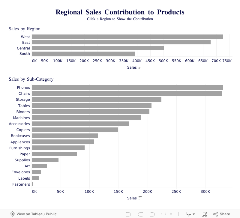
September 17, 2025
Tableau Donut Chart with Map Layers (Step-by-Step)

Master Tableau Donut Charts with Map Layers in Minutes!
In this tutorial, I’ll show you exactly how to create the perfect donut chart in Tableau using map layers—step by step. 👉 Ready to go deeper? Explore my Tableau courses here: https://www.nextleveltableau.com Whether you’re just starting out or already an experienced Tableau developer, this walkthrough will help you create clean, professional donut charts that impress clients and stakeholders. Download the workbook at the bottom 👇Check out my other Tableau tutorials: 🎥 Make an AWESOME Tableau Dashboard in Only 10 Minutes 🎥 Create a Perfect Waffle Chart Using Map Layers ----------

August 14, 2025
How to Clean Messy Data in Tableau in Seconds!

In this tutorial, I’ll show you how to use Tableau’s Data Interpreter to clean up a messy dataset in seconds. You’ll learn how to automatically remove unnecessary headers, fix field names, and get your data ready for analysis.
Then, we’ll take that cleaned data and build a Population Pyramid from scratch — perfect for visualizing demographic distributions like age and gender.
You’ll learn:
• How Tableau’s Data Interpreter works and when to use it
• Tips for cleaning data quickly without leaving Tableau
• Step-by-step instructions to create a Population Pyramid
• How to make your visualization clear and easy to read
Whether you’re a beginner or an experienced Tableau user, this video will help you save time, clean your data, and create a chart that impresses stakeholders.
📚 RESOURCES
Data (from ONS)
📩 NEWSLETTER
Each week, I'll send you Tableau tips, tutorials, and strategies to design better dashboards, have more impactful, and stand out in your career: https://nlt.kit.com/
📖 LEARN FROM ME
Want to get better at Tableau?
Pick the path that fits your level:
Join Next-Level Tableau: Advanced training, live sessions, expert support → https://www.nextleveltableau.com/ Already know the basics?
Get the Core Concepts course and sharpen your skills fast. → https://www.nextleveltableau.com/tcc Just getting started?
Try the Starter Kit: A simple intro to Tableau with zero fluff. → https://www.nextleveltableau.com/starterkit
August 6, 2025
Tableau Tutorial for Beginners (2025)

Want to learn Tableau fast?
Start with this beginner-friendly tutorial where I'll show you how to import data, clean it, build your first interactive dashboard, and share your dashboard—all using Tableau Desktop.
📚 RESOURCES• 📂 Sample Excel file to follow along (thanks Kevin Stratvert)
• 📊 Workbook 📺 RELATED VIDEOS
• Mastering Containers
• 370 FREE Tableau Tutorials 📩 NEWSLETTER
Each week, I'll send you Tableau tips, tutorials, and strategies to design better dashboards, have more impactful, and stand out in your career: https://nlt.kit.com/ 🔽 CONNECT WITH ME
• Official website
July 31, 2025
How to Create Hexbin Scatterplots in Tableau

Want to get better at Tableau?
July 24, 2025
How to Add Two Values to One Parameter in Tableau

March 19, 2025
How to Analyze Customer Retention with a Jump Plot

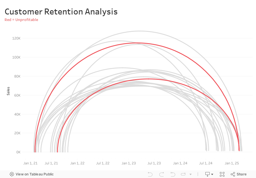
-
Connect sales data source to 180 points and relate “1” to “1”
-
Compute Min Date by customer
{ FIXED [Customer Name] : MIN([Purchase Date]) } -
Compute the Max Date by Customer
{ FIXED [Customer Name] : MAX([Purchase Date]) } -
Filter customers that made more than one order (Max Date > Min Date)
[Max Date]>[Min Date] -
Create Customer Length calc
DATEDIFF('day',[Min Date],[Max Date]) -
Create Columns calc (continuous dimension)
DATE( ((COS([Point] * PI() / 180)) + 1 ) * (FLOAT([Max Date])-FLOAT([Min Date])) / 2 + FLOAT([Min Date]) ) -
Create Rows calc (continuous dimension)
SIN((MIN([Point])) * PI() / 180) * SUM([Sales]) -
Add Columns and Rows to viz
-
Add Customer to Detail
-
Add Path to Path
-
Create Profitable calc and add to Color
{ FIXED [Customer Name] : SUM([Profit])}>0
February 20, 2025
How to Create a Multi Column Dot Plot

February 12, 2025
Advanced Calendar Heat Maps in Tableau (No More Workarounds!)

February 4, 2025
How to Exclude Reference Lines from Grand Totals in Tableau

Ever added a reference line to your Tableau visualization, only to see it appear in the grand total row, even when it doesn’t make sense?
If your grand total uses a different aggregation than your main data (e.g., SUM vs. AVG), the reference line can be misleading.
Unfortunately, Tableau doesn’t offer a simple way to exclude it—but there’s a trick to removing it while keeping your totals visible.
In the video below, I’ll walk you through the step-by-step solution to remove reference lines from grand totals.
Want to become an advanced Tableau user?
Unlock your full potential with Next-Level Tableau, the ultimate training program for Tableau users. Gain access to expert-led tutorials, live sessions, and a supportive community designed to help you master advanced skills, create stunning dashboards, and achieve your career goals.
Learn more and take your Tableau skills to the next level today at nextleveltableau.com.
Unsure? Sign up for my free course at starter.nextleveltableau.com.
January 22, 2025
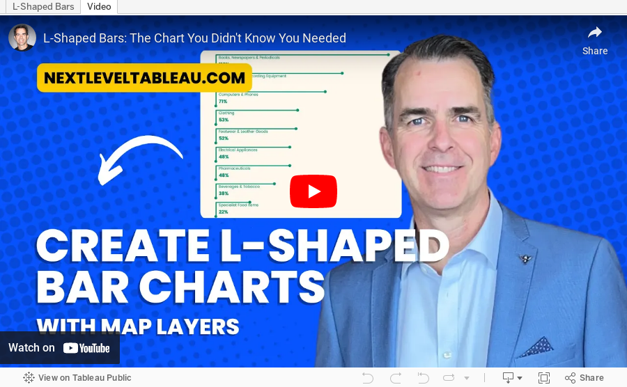
L-Shaped Bars: The Chart You Didn't Know You Needed