December 24, 2014
Tableau Tip: How to make KPI donut charts
donut chart
,
dual axis
,
KPI
,
Ryan Sleeper
,
tableau
,
tips
,
tricks
40 comments
On his great Evolytics blog, Ryan Sleeper, former Iron Viz Champ and renowned design guru, wrote about how to create donut charts in Tableau. His technique is sound. The concern I have is that he recommends using floating objects on a dashboard to create the hole in the donut.
If you have any experience with floating objects in Tableau, you know the pain of taking lots of time to make a dashboard look perfect in Desktop with floating objects, only to have it get all messed up once you publish it to Server or Public. I rarely recommend using floating objects for just this reason; it's frustrating and can make your work look sloppy. Hopefully Tableau soon fixes this bug that has been around as long as floating objects have existed.
Another reason to avoid floating objects is that there are more objects that have to be drawn on the dashboard, which can potentially have a performance impact.
While I typically hate pie charts, I think that donut charts, used in this specific way, can indeed be effective. As Ryan says in his post:
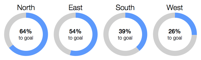
When used for the specific purpose of showing a metric’s progress to goal, with one “slice” being the current state of the KPI and one “slice” being the remainder to goal, I think a donut chart works well.Here's how I would create a donut chart in Tableau using a single worksheet. The final product looks like this:
December 23, 2014
Video Tip: How to quickly add labels to background images in Tableau
background image
,
labels
,
Molly Monsey
,
tableau
,
tips
,
training
,
tricks
,
video
5 comments
I don't use background images often in Tableau. In fact, I never knew how to REALLY use them until I went to Tableau Trainer Certification with Molly Monsey, trainer extraordinaire at Tableau. With Molly's permission, I am sharing with you the super simple way that she showed us how to add labels to background images in Tableau.
First, here is the video and farther down the page are summarized steps with screenshots.
Step 1: Open the background image in a tool like Snagit to get the dimensions. Write the dimensions down.
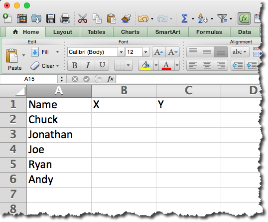
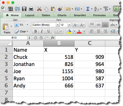
Step 2: Create a data source. In this example, I created the outline of the data source in Excel and left the X/Y coordinates blank.
Step 3: Connect to the data source created in step 2 in Tableau.
Step 4: Change the data type for the X & Y fields to Numbers and move them to the measures area.
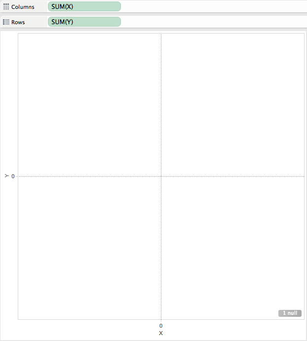
Step 5: Add the X field to the Columns shelf and the Y field to the Rows shelf.
Step 6: Add the background image by going to Map => Background Image => [Sheet Name]. Choose the image and enter the dimensions that you wrote down in step 1 in the Right and Top boxes respectively.
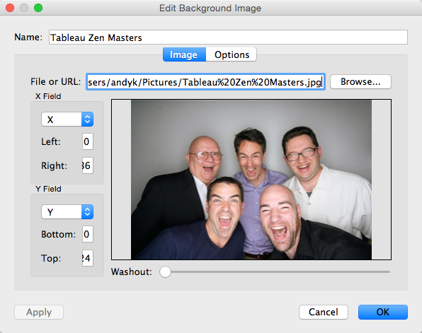
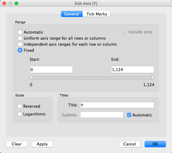
Step 7 (optional): Fix the axes to the size of the image.

Step 8: Hide the axis headers.
Step 9: Drag the Name field to the Label shelf.
Step 10: Annotate a point with the X/Y coordinates.
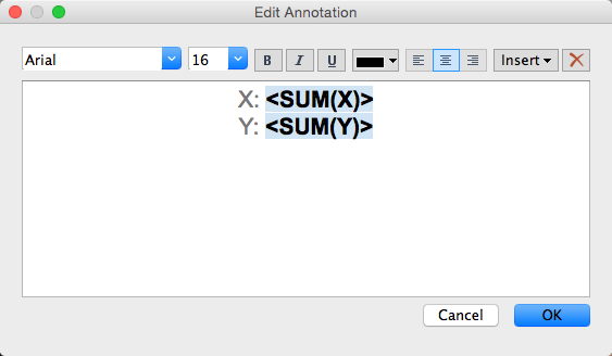
Note how this looks after you hit OK. You can now move the end of the arrow around to get the coordinates of any point in the image.

Step 11: Move the end of the arrow around to each place in the image that you want to place a label and enter those X/Y values into the Excel spreadsheet. Save the Excel spreadsheet.
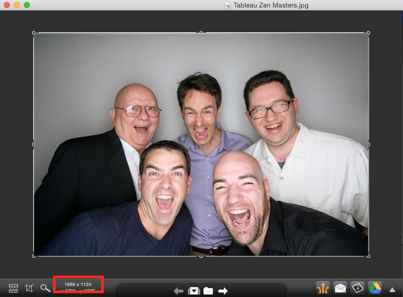
Step 12: Refresh the data source in Tableau and the labels will magically appear above the heads of each person.

Step 13: Remove the annotation.
Step 14: Change the Mark Type to Text and format the text as you see fit. That's it!

You can download the Excel file here and the Tableau workbook here.
First, here is the video and farther down the page are summarized steps with screenshots.
Step 1: Open the background image in a tool like Snagit to get the dimensions. Write the dimensions down.
Step 2: Create a data source. In this example, I created the outline of the data source in Excel and left the X/Y coordinates blank.
Step 3: Connect to the data source created in step 2 in Tableau.
Step 4: Change the data type for the X & Y fields to Numbers and move them to the measures area.
Step 5: Add the X field to the Columns shelf and the Y field to the Rows shelf.
Step 6: Add the background image by going to Map => Background Image => [Sheet Name]. Choose the image and enter the dimensions that you wrote down in step 1 in the Right and Top boxes respectively.
Step 7 (optional): Fix the axes to the size of the image.
Step 8: Hide the axis headers.
Step 9: Drag the Name field to the Label shelf.
Step 10: Annotate a point with the X/Y coordinates.
Note how this looks after you hit OK. You can now move the end of the arrow around to get the coordinates of any point in the image.
Step 11: Move the end of the arrow around to each place in the image that you want to place a label and enter those X/Y values into the Excel spreadsheet. Save the Excel spreadsheet.
Step 12: Refresh the data source in Tableau and the labels will magically appear above the heads of each person.
Step 13: Remove the annotation.
Step 14: Change the Mark Type to Text and format the text as you see fit. That's it!
You can download the Excel file here and the Tableau workbook here.
December 22, 2014
Makeover Monday: Instapurge - Which accounts lost the most Instagram followers?
action
,
bar chart
,
donut chart
,
infogr.am
,
instagram
,
Makeover Monday
,
order
,
sort
,
spam
,
tableau
No comments
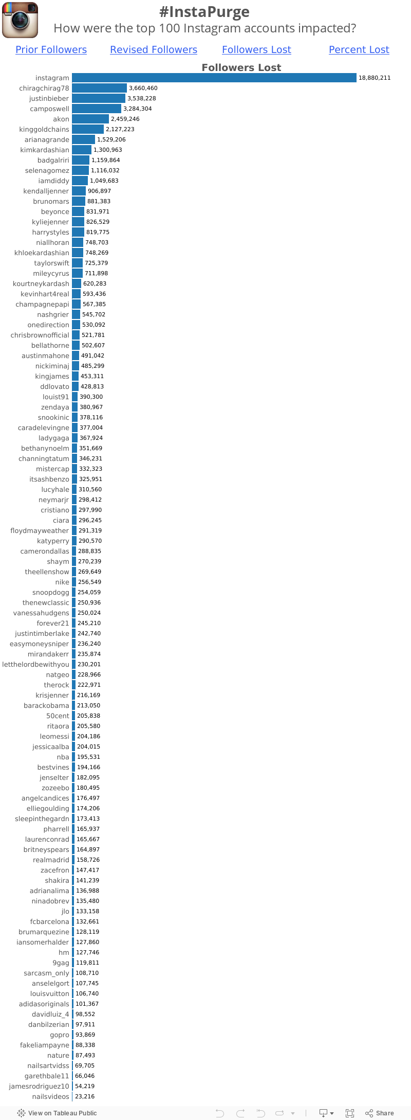
If you're an Instagram user, you likely noticed last week the message on the app indicating the sweeping cleanup of spam accounts that was coming. The cleanup took place late last week and shortly after I saw this donut chart from Zach Allia.
Click on the image below to go to the interactive version.

Holy cow! What an overwhelming mess! So what's wrong?
Click on the image below to go to the interactive version.
Holy cow! What an overwhelming mess! So what's wrong?
- It's a donut chart, which is a terrible way to display ranking relationships.
- When you change the metric, the sorting gets lost.
- There are way, way, way too many colors.
- It's impossible to make any sense of this.
Whenever I see pie charts or donut charts, I immediately turn to bar charts as a way to communicate better. Some might call me boring, but I'm ok with that. Here's my makeover. Click on a metric to see it's value and to sort by that metric.
December 19, 2014
VizWiz: 1 million pageviews and counting
blogger
,
blogging
,
followers
,
pageviews
,
posts
,
sessions
,
stats
,
traffic
,
users
,
visitors
2 comments
Dear Readers,
I started this blog as a way to document what I had been learning, starting with a simple makeover of a pie chart. 1,949 days and 402 posts later, at 8:48pm PT on December 18, 2014, my blog officially reached 1 million pageviews. I can't believe it!!
It's been an incredible journey. Thank you all so much for reading what I write. I love to write and I love to share, so blogging has proven to be a perfect platform for me.
Thank you for your comments! Thank you for your emails! Thank you for your phone calls! Thank you for your advice! Thank you Tableau for making the most addictive piece of software I've ever used!
What better way to celebrate than with a simple viz of my basic blogger stats. Here's to another million!
All the best,
Andy
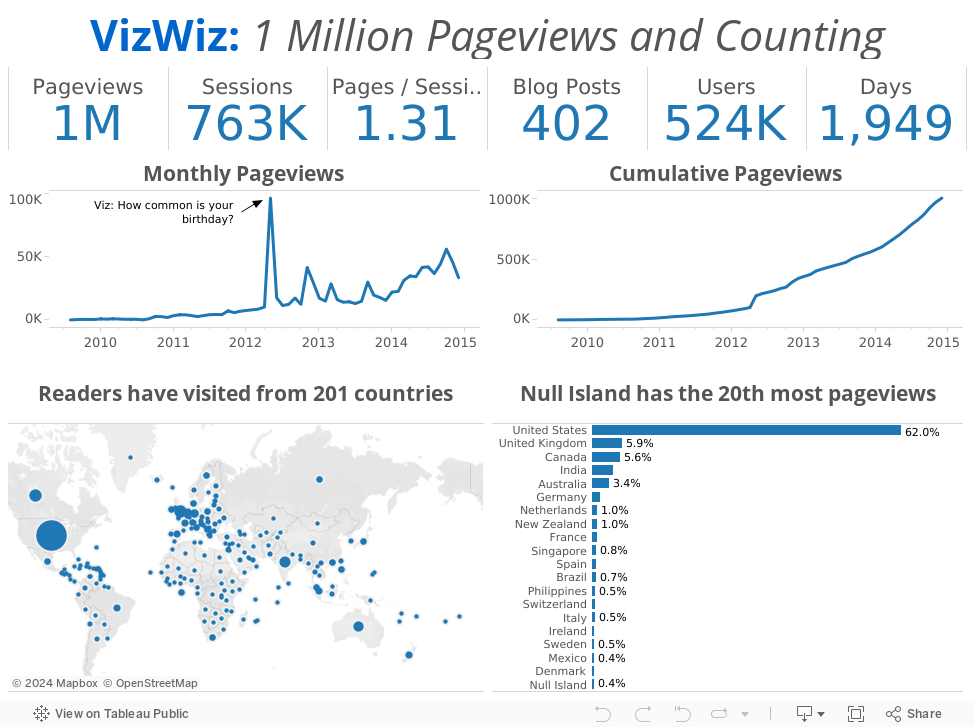
I started this blog as a way to document what I had been learning, starting with a simple makeover of a pie chart. 1,949 days and 402 posts later, at 8:48pm PT on December 18, 2014, my blog officially reached 1 million pageviews. I can't believe it!!
 |
| Image From http://www.cinevox.be/ |
Thank you for your comments! Thank you for your emails! Thank you for your phone calls! Thank you for your advice! Thank you Tableau for making the most addictive piece of software I've ever used!
What better way to celebrate than with a simple viz of my basic blogger stats. Here's to another million!
All the best,
Andy
December 18, 2014
Makeover Thursday: Average Daily Time Spent on Smartphones
bar chart
,
Business Insider
,
business intelligence
,
infogr.am
,
makeover
,
pie chart
,
sort
1 comment
My dislike for the pie chart is well documented. Yesterday morning, Tableau Zen Master Matt Francis sent me this gif of a pie chart makeover.
At the same time, I was reading an article by Business Insider about how people spend time on their smartphones. The article contained this pie chart:

Here are some of the problems with this chart:
 |
| Courtesy Darkhorse Analytics |
Here are some of the problems with this chart:
- It's a pie chart.
- Each slice is labeled with the category and the amount. Why not just make it a table if you're going to do that?
- There's no apparent order to the slices. At least sort the slices in descending order starting at 12 o'clock.
- In the article, they emphasize the top 3 categories, but they don't emphasize them in the pie chart.
December 17, 2014
Henry or Shearer? Who is the greatest Premier League Striker?
Alan Shearer
,
appearances
,
arsenal
,
English Premier League
,
EPL
,
football
,
goals
,
interactive
,
Newcastle
,
soccer
,
statistics
,
tableau
,
Thierry Henry
No comments
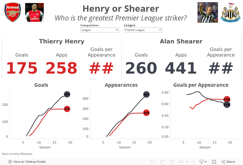
December 16, 2014 will always be remembered in Arsenal lore as the day Thierry Henry officially retired from football. He's been away from Arsenal for the most part since he left for Barcelona after the 2006-07 season. At that point in his career, he had scored 174 Premier League goals, getting one more in January 2012 in a brief return, closing his Premier League account with 175 goals.
In a tribute to The King, the Premier League created this great compilation video.
Henry's retirement led to the inevitable debate of who is the greatest Premier League striker ever? Most people agree that Thierry Henry and Alan Shearer are in a class by themselves. The great thing about sport is that it leads to lots of opinions and great debates. There are Henry camps and there are Shearer camps.
I gathered their career data from wikipedia (here and here) and combined them into a single spreadsheet here. I built this quick viz in Tableau to allow you to answer the question for yourself. Download the workbook here.
In a tribute to The King, the Premier League created this great compilation video.
Post by Premier League.
Henry's retirement led to the inevitable debate of who is the greatest Premier League striker ever? Most people agree that Thierry Henry and Alan Shearer are in a class by themselves. The great thing about sport is that it leads to lots of opinions and great debates. There are Henry camps and there are Shearer camps.
I gathered their career data from wikipedia (here and here) and combined them into a single spreadsheet here. I built this quick viz in Tableau to allow you to answer the question for yourself. Download the workbook here.
December 16, 2014
College Football's Richest Teams
bar chart
,
Big 12
,
Big Ten
,
college
,
expenses
,
football
,
infogr.am
,
interactive
,
revenue
,
SEC
,
smartycents
No comments
As a follow up to my post about how rich the University of Alabama football team is, I wanted to show a quick overview of the top 10 richest teams. Note that, despite making $47.1M in revenue in the 2012-2013 season, Alabama only ranks 6th.
The data comes from smartycents.com. I would encourage you to read their article if you're curious to know where all of this money comes from. It's pretty fascinating just how big of a business college football has become.
Initially, I was going to create the viz for this post in Tableau, but I was reading the Interactive Inspiration article on Visualoop and saw this ad for infogr.am:

The ad reminded me of Datawrapper, so I thought I would give it a try. I must say I was super impressive with infogram's simplicity. In just a couple of minutes, I registered for an account and had this nice interactive chart.
There are three things I wish I could do with infogram that I can't out of the box:
The data comes from smartycents.com. I would encourage you to read their article if you're curious to know where all of this money comes from. It's pretty fascinating just how big of a business college football has become.
Initially, I was going to create the viz for this post in Tableau, but I was reading the Interactive Inspiration article on Visualoop and saw this ad for infogr.am:
The ad reminded me of Datawrapper, so I thought I would give it a try. I must say I was super impressive with infogram's simplicity. In just a couple of minutes, I registered for an account and had this nice interactive chart.
- Auto-sort the bars based on the metric selected
- Color the bars by a dimension, conference in this case; This would allow me to highlight that 5 of the top 10 teams are in the SEC.
- Hide the axis; I don't need it on this view since I'm labeling the bars directly.
December 15, 2014
Makeover Monday: ESPN is biggest reason cable TV isn’t going to die anytime soon
bar chart
,
cable
,
Cork Gaines
,
dot plot
,
ESPN
,
gantt
,
Makeover Monday
,
sports
,
time
No comments
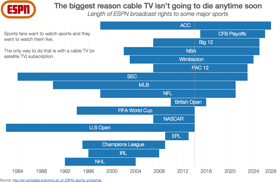
I'm a HUGE sports fan and love to watch live sports, which means I love ESPN. This also means I'm tied to cable or satellite TV since ESPN does not broadcast online without a subscription. Today's Makeover Monday take a look at ESPN's broadcast rights to major sports.
Consider this simple bar chart by Cork Gaines of Business Insider:

Seems simple enough, right? Simple, yes. But is it 100% truthful? No.
Consider this simple bar chart by Cork Gaines of Business Insider:
Seems simple enough, right? Simple, yes. But is it 100% truthful? No.
- I'm not convinced the data is accurate. The rights listed on wikipedia don't align, but you shouldn't assume wikipedia is 100% accurate either.
- The very first bar bugs me. How can you bucket a bunch of sports into NCAA when each sport has a separate contract?
- Using a bar chart assumes that all of these contracts started in 2010, which is not the case.
- This chart shows that the college football playoff contract started in 2010, yet the CFB playoffs don't start until 2015. This is clearly wrong.
I was torn between a couple of alternatives, so I'll show you both of them. If you want the data, you can download it here. You can download the Tableau workbook here.
My first alternative was to make a Gantt chart so that I could see the entire length of the contracts. In this view, I've updated the timeline to go back to 1981.
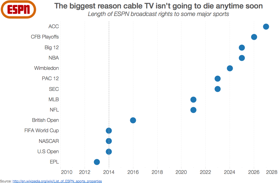
My second alternative is simply a dot plot view of the original chart. This view keeps the timeline starting at 2010.
Which do you prefer? I'm torn.
December 11, 2014
Makeover Monday (on Thursday): How one of the richest teams in college football makes & spends its money
Alabama
,
big business
,
college
,
Cork Gaines
,
emily kund
,
expenses
,
football
,
Makeover Monday
,
NCAA
,
Nick Saban
,
profit
,
rank
,
revenue
,
SEC
,
sort
6 comments
In late November, Cork Gaines of Business Insider wrote about how the University of Alabama football team makes and spends its money. The two articles were accompanied by these two pie charts:


There are many issues with these charts:
First, I need to give a special thanks to Emily Kund for reviewing this viz and providing some great feedback. For example, it was her idea to use the Alabama official colors in the viz. Thanks Em!
- They are pie charts, which makes comparing the slices difficult.
- The slices are not labeled with the amount, so I have to make some guesses as to their contribution to the whole and then multiply that by the total shown in the titles. That's way too much work.
- There are categories missing from the source data.
- Why are these in two separate articles since they are a related story? Why aren't they combined in a single story?
- There's no mention of the profit the football team turns.
I could go on, but I'll stop there. One of the great things Cork does in his articles is link to the source data. This allowed me to download the data from this website and build my own visualization.
 |
| NOTE: This is an update of the original chart based on feedback from Nelson Davis. Nelson suggested making the bar sizes relative across the charts, which my first version failed to do. |
First, I need to give a special thanks to Emily Kund for reviewing this viz and providing some great feedback. For example, it was her idea to use the Alabama official colors in the viz. Thanks Em!
In my version of the viz I wanted to:
- Bring the revenue and expense data into the same view
- Provide a high-level overview, including profit
- Rank the categories in descending order, except for "Other", which I prefer to place last in the sort
- Include the actual amounts by labeling the bars
December 10, 2014
Using data blending to compare a superset of the same data source
calculated field
,
comparison
,
data blending
,
median
,
superset
,
table calculation
,
tableau
,
tips
,
tricks
2 comments
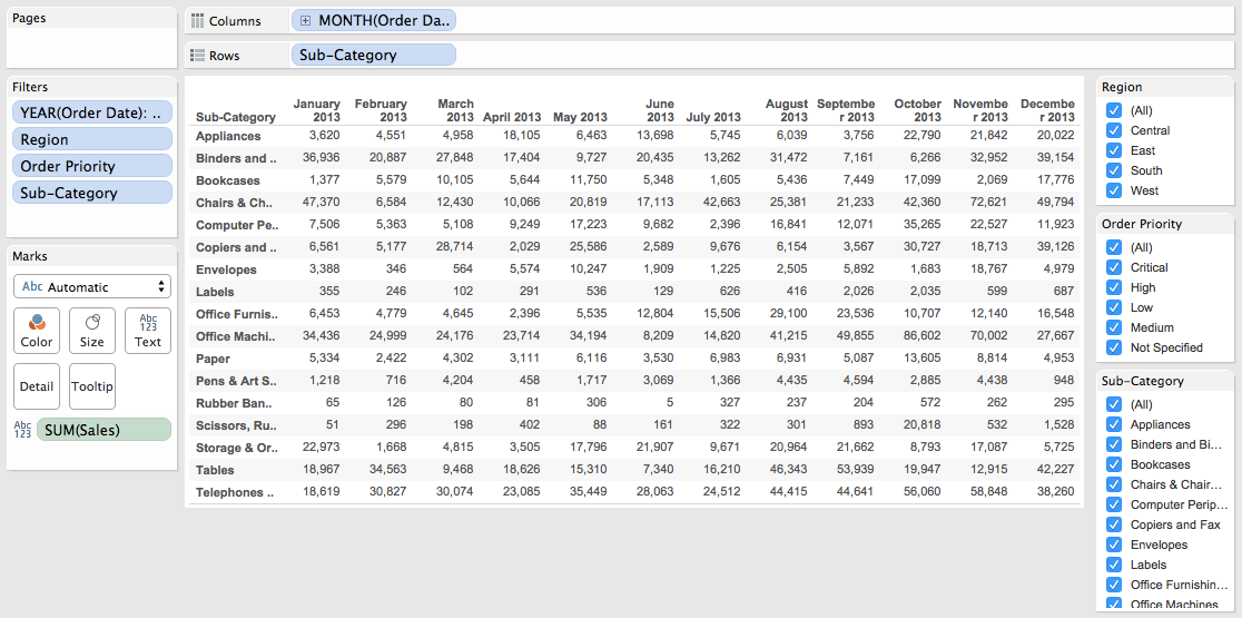
Yesterday at work, I received the following scenario that one of our users was stuck on:
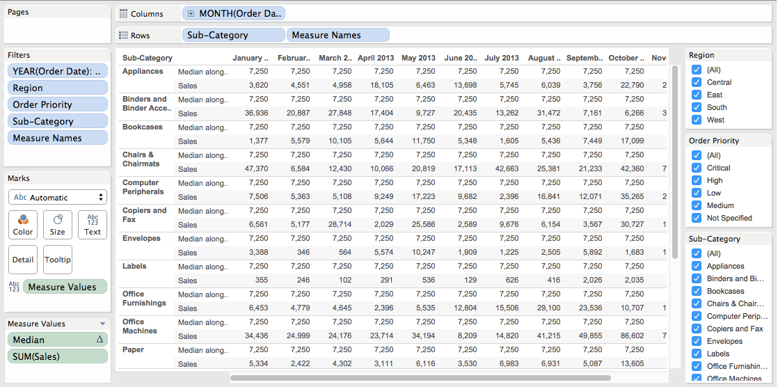
First, consider that you have a view like this, which is sales by monthly by subcategory, with quick filters for region, order priority and subcategory.
Next, create the median calculation and add it to the view. Remember, the median should account for the entire view.
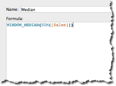
I've added Median to the view and changed the Compute using to Table (Across then down).
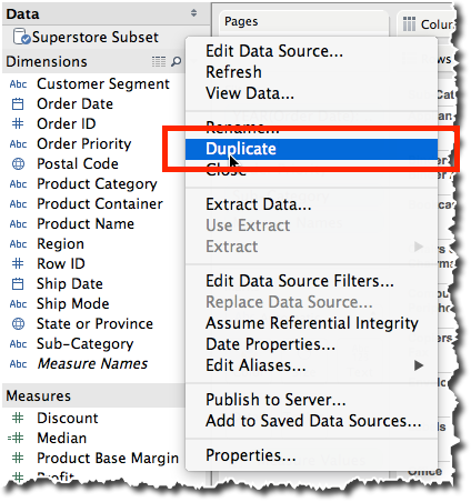
Duplicate the data source by right-clicking on it and choosing Duplicate.
You should now see a copy of the data source in the data window. Go to your secondary data source and drag Median into the view and change the Compute using to Table (Across then down).

Sweet! We're almost done!
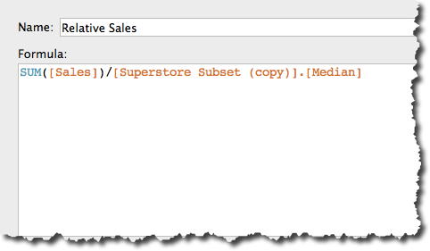
Create a calculated field in your primary data source for the Relative Sales. This is going to use Sales from the primary data source and divide it by the Median Sales from the secondary data source.
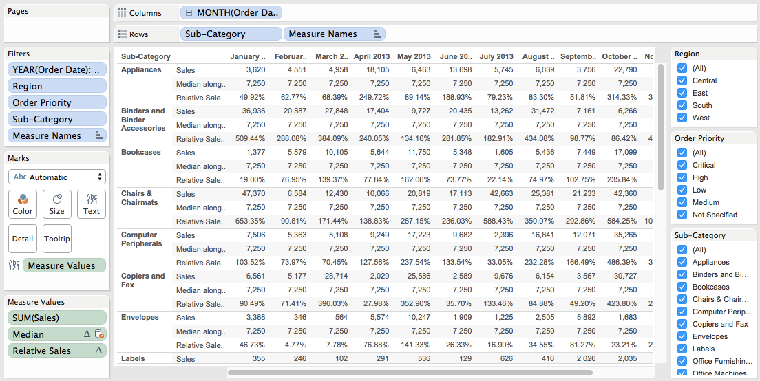
Change the default format of this new field to percentage. Choose the right level of precision for your data. Add Relative Sales to the view and again change the Compute using to Table (Across then down).
It might look like we're done now, but we're not. If I filter by Subcategory at this point, my median changes, which I don't want. To make this work, we have to tell Tableau which fields to use in the blend.
In the Dimensions list, we want Tableau to blend on Order Date, Region and Order Priority, but not Subcategory, so click/un-click the link icons as appropriate.
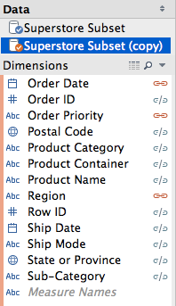
Wait! What just happened? Our median has changed! Why? Is that right? Yes, that is correct, because we removed Subcategory from the blend, therefore when Tableau calculates the median, it's no longer considering Subcategory in the calculation, which is what we want.

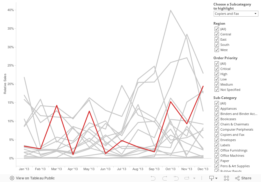
Now I need to make this look a little prettier. I'm going to change it to a line chart and allow the user to pick the Subcategory they want to highlight.
 Download the workbook here.
There is a list of products that the user can filter. The monthly sales for each product needs to be compared to median of all products across all of the months, but the median should recalculate if the user filters the region and/or priority. The end result should be a "Relative Sales" calc that is the sales for each subcategory divided by the median of all sales.The trick here is that the Subcategory filter cannot impact the median calculation. The steps below could also easily be applied to a sum, min or max. I demonstrating a median because that was the question at hand.
First, consider that you have a view like this, which is sales by monthly by subcategory, with quick filters for region, order priority and subcategory.
Next, create the median calculation and add it to the view. Remember, the median should account for the entire view.
Duplicate the data source by right-clicking on it and choosing Duplicate.
Sweet! We're almost done!
Create a calculated field in your primary data source for the Relative Sales. This is going to use Sales from the primary data source and divide it by the Median Sales from the secondary data source.
Change the default format of this new field to percentage. Choose the right level of precision for your data. Add Relative Sales to the view and again change the Compute using to Table (Across then down).
It might look like we're done now, but we're not. If I filter by Subcategory at this point, my median changes, which I don't want. To make this work, we have to tell Tableau which fields to use in the blend.
In the Dimensions list, we want Tableau to blend on Order Date, Region and Order Priority, but not Subcategory, so click/un-click the link icons as appropriate.
Wait! What just happened? Our median has changed! Why? Is that right? Yes, that is correct, because we removed Subcategory from the blend, therefore when Tableau calculates the median, it's no longer considering Subcategory in the calculation, which is what we want.
Now I need to make this look a little prettier. I'm going to change it to a line chart and allow the user to pick the Subcategory they want to highlight.
December 1, 2014
Makeover Monday: What it feels like when a bar chart doesn't start at zero
axis
,
bar chart
,
chart junk
,
Makeover Monday
,
non-zero baseline
,
tips
,
Victor Blaer
4 comments
This week's Makeover Monday is written by reader and friend Victor Blaer. Victor sent me this rant:

Victor provided the following two examples:
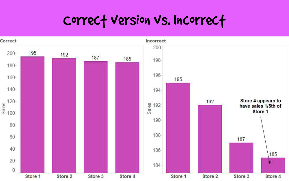
Victor's explanation about why these don't work:
Victor provided the following two examples:
Victor's explanation about why these don't work:
The primary problem with these graphs is that they visually misrepresent the truth. They mislead the viewer by manipulating the data.
The primary misrepresentation involves the use of a non-zero baseline. If you look at the vertical axes on all of these bar graphs, you'll notice that none of them start at zero. This would be fine if lines or dots were used to encode the values, but because the length of the bar encodes its value rather than just the position of its endpoint in relation to the quantitative scale, the use of a non-zero baseline doesn't work. By starting the quantitative scale above zero, the relative differences in the values represented by the bars have been exaggerated.Additional references:
http://www.perceptualedge.com/example14.php
http://www.excelcharts.com/blog/of-bars-and-lines/
November 29, 2014
Tableau Tip: Conditional Axis Formatting Using an Axis Selector
container
,
dashboard
,
hide
,
parameters
,
show
,
tableau
,
tips
,
tricks
3 comments
Back in July 2012, I wrote about "Dynamic Axis Selections". The problem with this approach, though, was that it created a single axis, which only allows for a single format. Reader Dave Andrade posted a different, yet related question in the comments.
Download the workbook here.
Let's say we choose 3 metrics - Mail Volume, Spend, and Response Rate as part of our parameter metrics. That means we now have a regular number, a dollar value, and a percentage as part of our available measures. After building the case statement and building a chart similar to the one you've shown in this post, the best thing we can do to show the correct values (sans label of $ or %) on the y-axis is using the "automatic" number formatting option for the 'Measure chosen' measure. I know Tableau has made it much easier to add the label on the chart itself with the Label mark after v8.0, but what about the actual y-axis value? Is there any way to dynamically update the measure value's axis label to reflect it's true number format?While the direct answer to Dave's question is no, there's isn't a way to dynamically update the format of the Measure Values pill, there is a work around using containers, which will can give the perception of conditional formatting. Here is the final output of the technique I've used. Read farther down for detailed step-by-step instructions, plus a video.
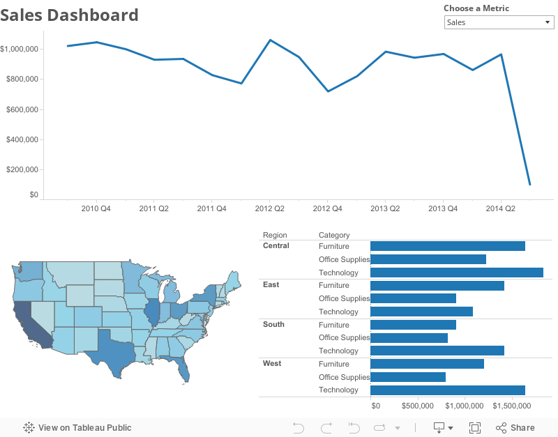
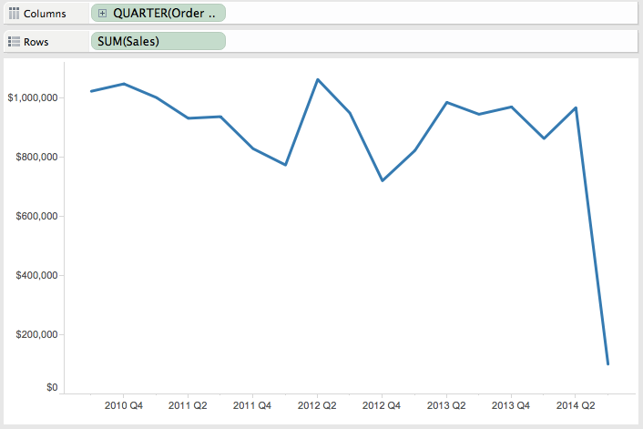
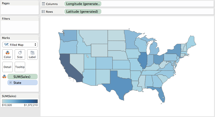
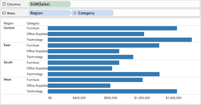
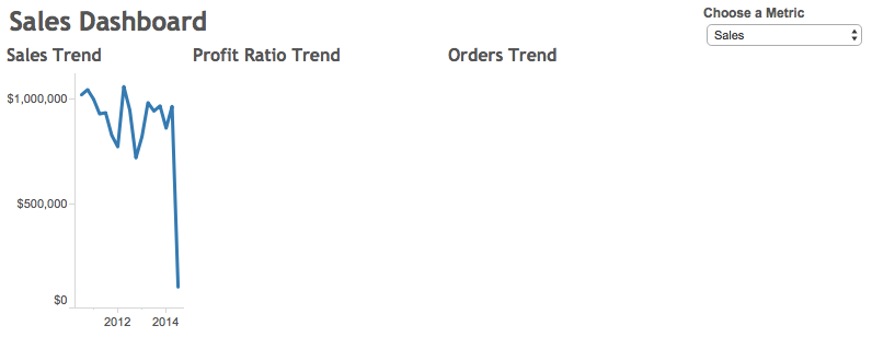
In this example, I've created a simple dashboard with three viz types: Line Chart, Map, and Bar Chart. I created three separate sheets for each type of chart, one for each metric: Sales, Profit Ratio, and Order Quantity, each having a different format for a total of nine worksheets.
Step 1 - Create the lines charts. I started with Sales and then duplicated the sheet and replaced Sales with Profit Ratio and Order Quantity, leaving me with three separate worksheets.
Step 2 - Create a map for each metric. Again, I end up with one worksheet for each metric.
Step 3 - Create a bar chart for each metric, giving us three more worksheets for a total of nine.
Step 4 - Create a parameter with a list of the metrics.
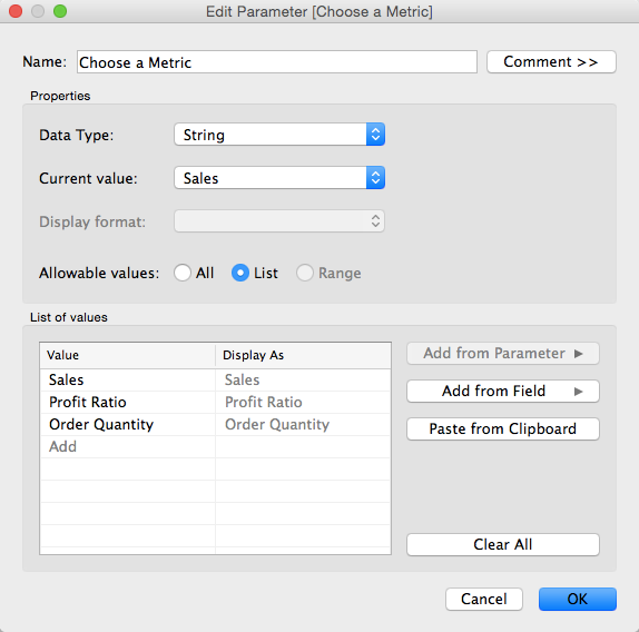
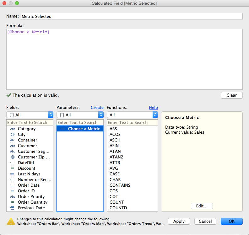
Step 5 - Create a calculated field to get the value selected in the parameter created in Step 4.
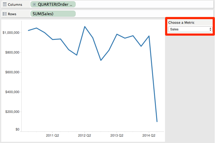
Step 6 - Show the parameter control on one of the Sales worksheets and choose Sales from the list.
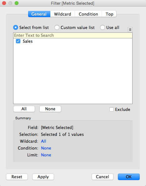
Step 7 - For each of the worksheets that is using the Sales measure, drag the calculated field created in step 5 onto the Filters shelf and explicitly choose Sales from the list. There should only be one item in the list of available selections. Do NOT choose the "Use All" option or this hack won't work.
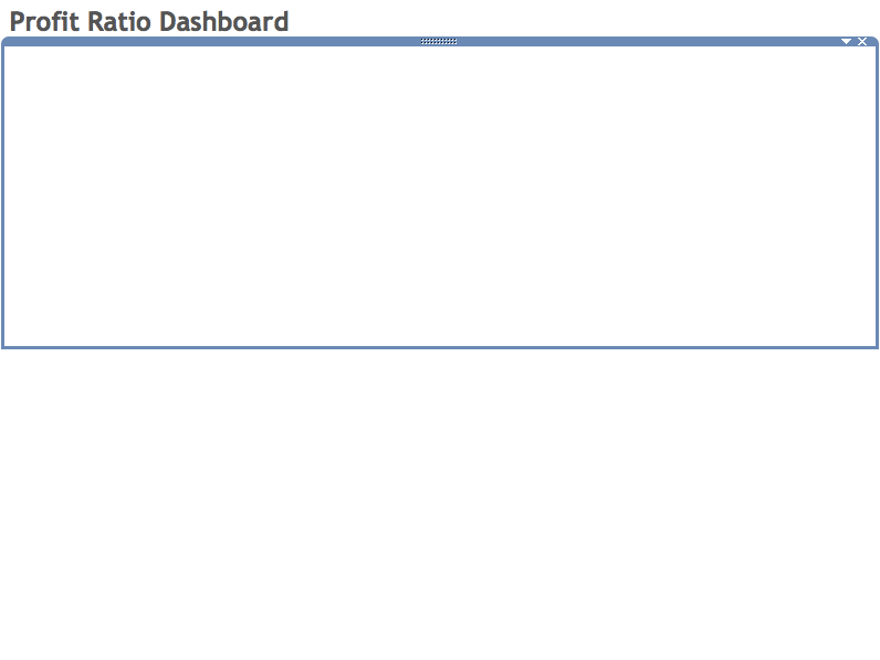
Note what happens when you change the selection in the parameter (e.g., choose Profit Ratio); the worksheet will go blank. This is exactly what we want because we want the Sales worksheets to go blank when a different metric is chosen. Go ahead, give it a try.
Step 8 - Change the metric chosen in the parameter to Profit Ratio and then add the calculated field created in step 5 onto the Filters shelf for each of the worksheets that contains Profit Ratio and explicitly choose Profit Ratio from the list.
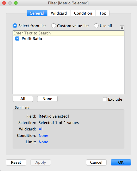
Again, notice how Profit Ratio is our only available selection in the filter list.
Step 9 - Repeat step 8, but this time choose Order Quantity and add the filter to each of the Order Quantity sheets.
Step 10 - Create a new dashboard.
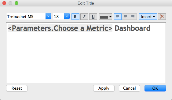
Step 11 (optional) - Add the title to the dashboard and in the title, include the parameter. This way the title will make the dashboard more intuitive.
Step 12 - Add two horizontal containers to the dashboard, one above the other.
...then hide the titles for each worksheet.
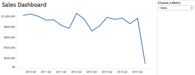
Step 14 - Add all of the maps and bar charts to the bottom container...
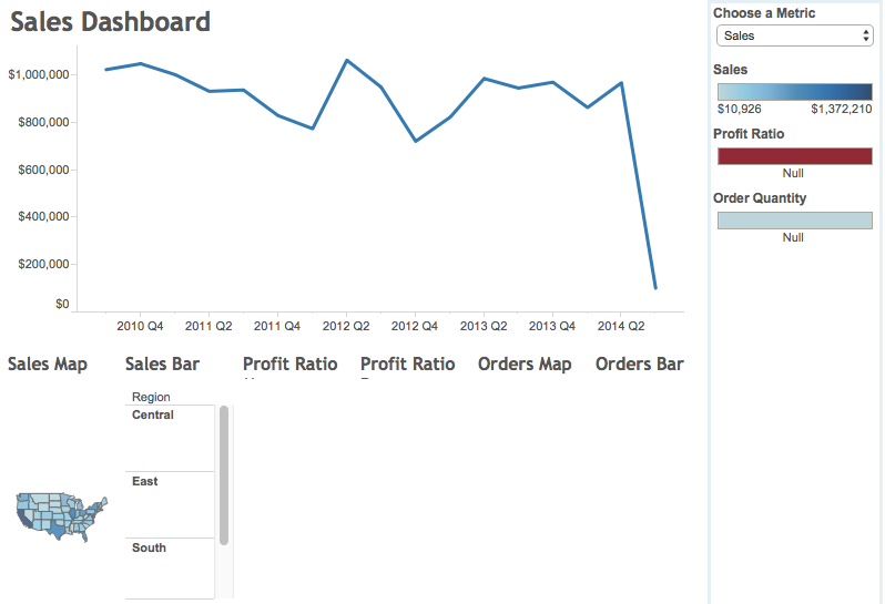
...then hide the titles for each worksheet.
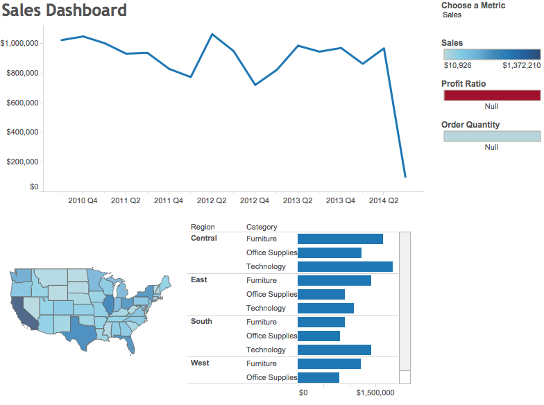
Step 15 - A bit of cleanup, like sizing the charts to fit the view, removing the color legends, making it all looks pretty and floating the parameter and you're all done!
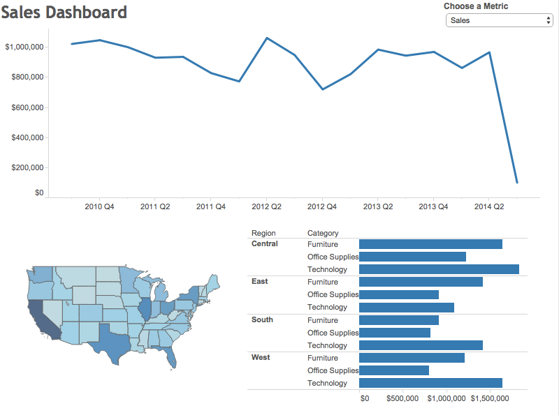
Go back to the viz at the top to play with the interactive version. Here's a video recording of how I built this dashboard.
Subscribe to:
Posts
(
Atom
)


