June 26, 2018
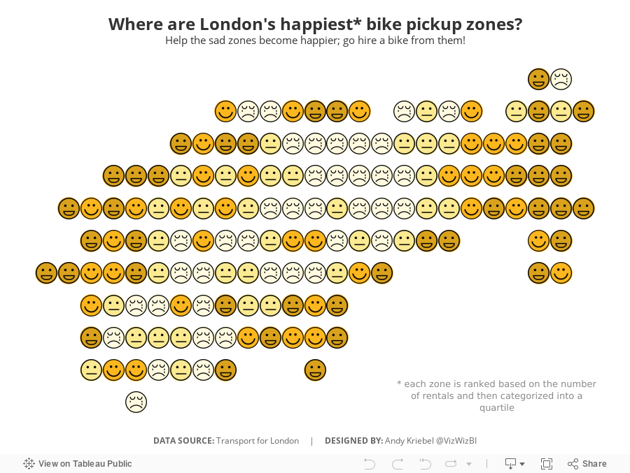
Makeover Monday: Where are London's happiest bike pickup zones?
bicycles
,
cycle hire
,
cycling
,
happiness
,
Makeover Monday
,
santander
,
TfL
,
transport for london
No comments

I created a viz last year about American happiness, so decided to use a similar theme. What I did was group stations together based on their location. It takes two calculations:

You then makes the continuous dimensions and place them on the appropriate shelves (Round Lon on Columns and Round Lat on Rows).
I then created a calculation that ranks each "zone" by the number cycle hires and then places them into percentiles. I then take the percentiles and break them up into happiness quartiles.

I set the Location Happiness to discrete, placed it on the Shapes shelf and applied my emoticon shapes. I then duplicated the Round Lat field on the Rows shelf and moved the Location Happiness field to color, changed the shape to circle, moved the marks to the back and assigned colors.
Simple! I like how this turned out.
June 25, 2018
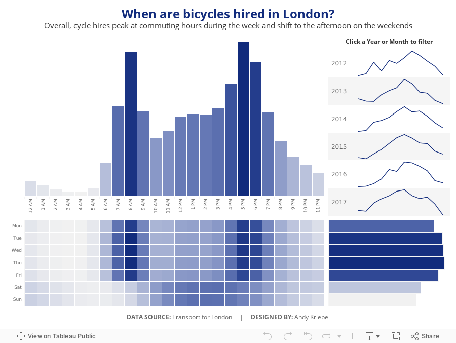
Makeover Monday: When are bicycles hired in London?
bicycles
,
cycling
,
London
,
Makeover Monday
,
TfL
,
transporation
,
transport for london
No comments

I asked Eva to use data from Transport for London's open API about their cycle hire scheme. Data is available back to 2012 and I offered to prep it for her and upload it to Exasol...all 50M+ bike hires worth. I love the weeks when we get to use Exasol because I can ask and answer questions on massive data sets without any performance constraints.
The visualization to makeover this week comes from Sophie Sparks:
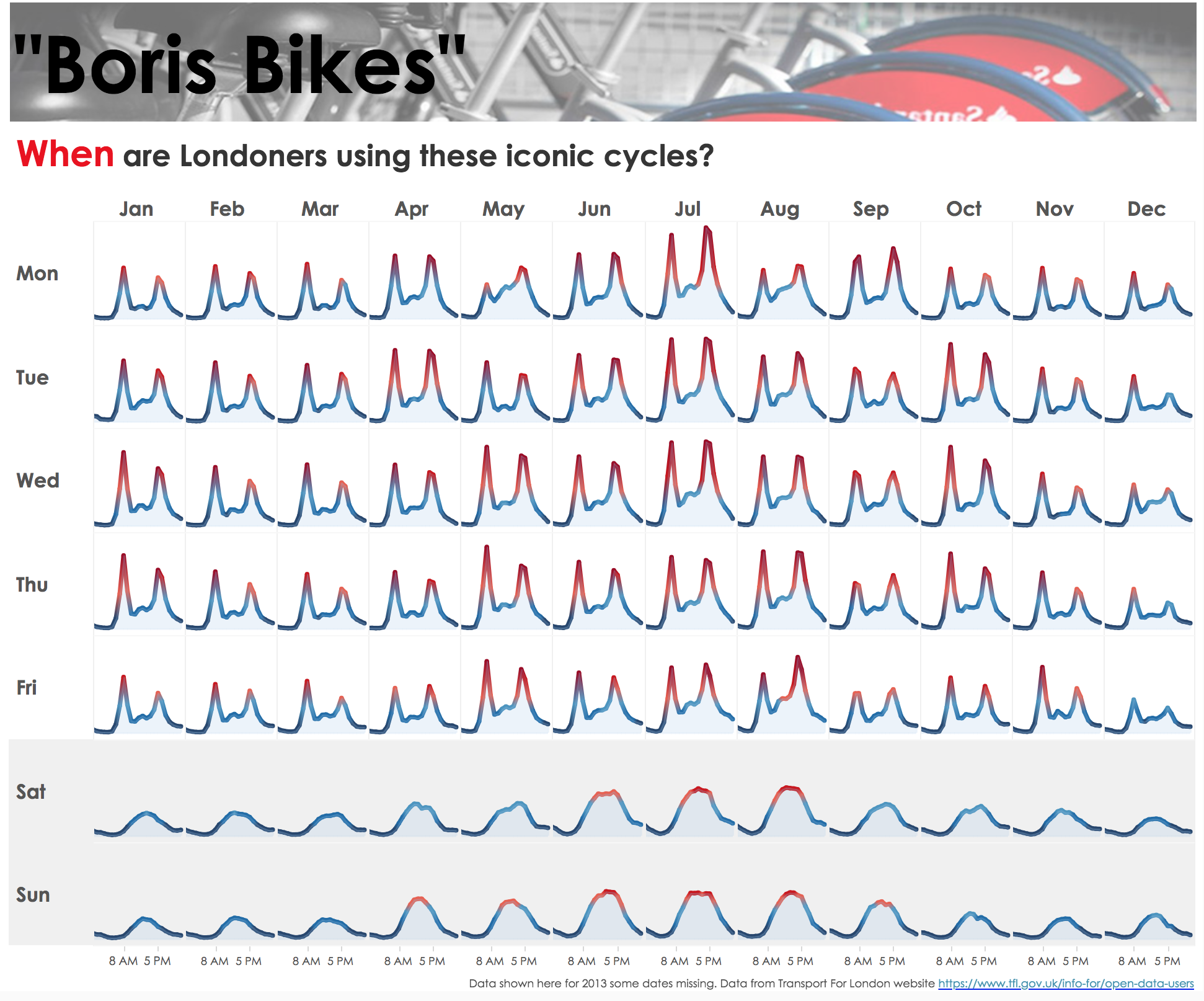
What works well?
- The small multiple layout works great or showing cyclical patterns (see what I did there?).
- The diverging color scale helps accentuate the peak periods.
- The shading under the lines makes the viz feel more full and complete.
- Shading the weekends helps separate them from the rest of the weekdays.
- Putting the word When in red in the title to match the peak period.
What could be improved?
- I would remove the section at the top that says "Boris Bikes" and the image.
- Include some sort of insight as a subtitle.
- There's no indication of what the y-axis means. I assume it's the number of bikes hired, but it could just as easily be something else.
What I did
- First, I rebuilt Sophie's viz because I like it.
- I wanted to focus on the weekday and hourly patterns in the data.
- Use the TFL blue as a single color for the viz.
- Provide some interactivity so that people could see when the peaks and troughs in the data are for a specific year or month.
Click on the image for the interactive version.
June 19, 2018
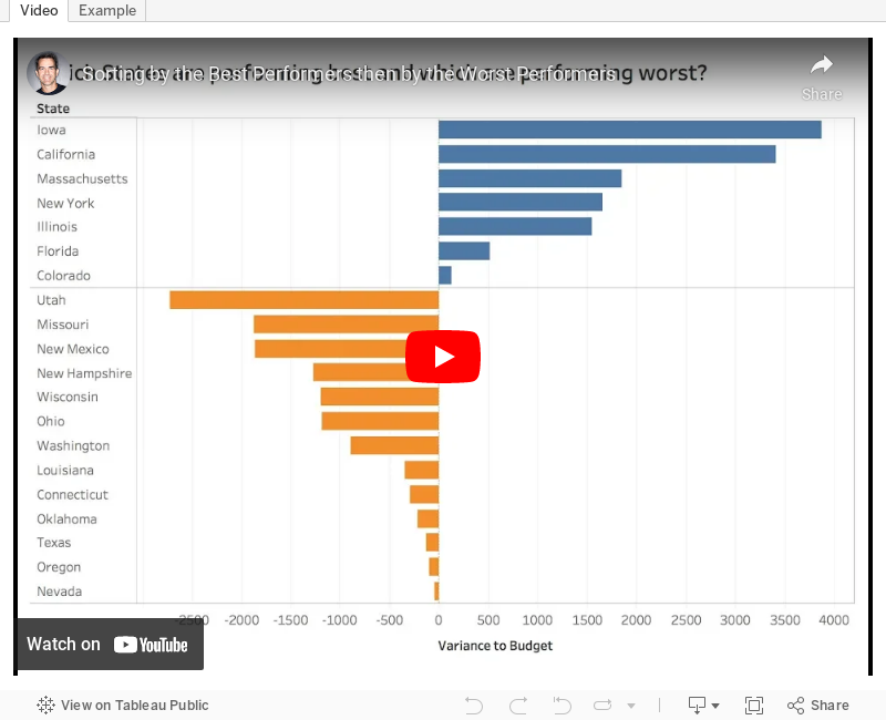
Tableau Tip Tuesday: How to sort first by the most positive values, then by the most negative values in a single chart

Enjoy!
June 18, 2018
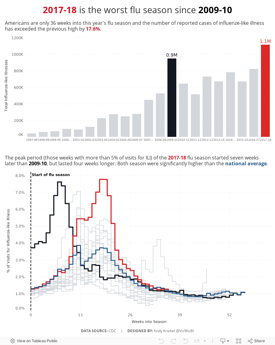
Makeover Monday: U.S. Influenza Surveillance Report
flu
,
highlight
,
influenza
,
Makeover Monday
,
stepped lines
,
United States
,
USA
No comments

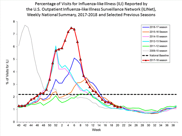
What works well?
- Clearly marking the x-axis so that it's evident that the weeks don't start at the beginning of the year
- Including the national baseline for context
- Chart dimensions scaled properly
- Using red for the most recent season so that it stands out more
What could be improved?
- The colors are too bright and are competing for attention.
- The symbols on the 2017-18 line are unnecessary.
- The start of the 2009-10 season is wrong, according to the data that can be downloaded.
- The national baseline should be weekly, not flat across the time period.
What I did
- I liked the idea behind the original chart, so I kept that but made it look nicer and more focused.
- I included a summary to set the context for the line chart.
- I included the national average by week for context.
- Use a stepped chart to make the weekly change easier to see.
- Focus the lines on the two outlier periods.

June 15, 2018
Tableau Prep Tip: Returning the First and Second Purchase Dates
aggregation
,
summarize
,
Tableau Prep
,
Tableau Tip Tuesday
,
workflow
,
Workout Wednesday
No comments

In this video, I should you how I approached returning the first and second purchase dates for a customer, include some summary measures, then bring them both back together into a single table for visualizing in Tableau.
June 13, 2018
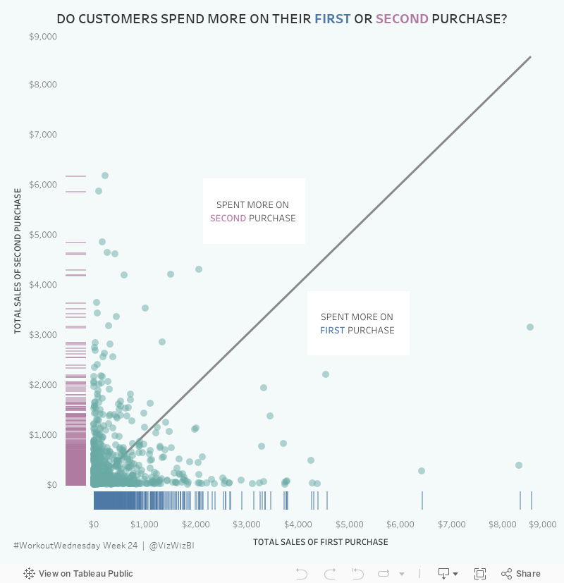
Workout Wednesday: Do Customers Spend More on Their First or Second Purchase?

The high-level requirements:
- Create a data set in Tableau Prep that returns the first and second order for each customer along with the sales, number of categories and number of products sold on that day.
- The data must be wide rather than tall. That is, you must have nine columns in total: Customer ID, two dates, two sales totals, two category counts, two product counts.
- Create a dashboard with a scatterplot and two strip plots.
- Float everything...YUCK!
Here's what my flow looks like from Prep:

I intentionally did NOT rename my tools so that you wouldn't know exactly what I did. You can see my final output below the flow.
Building the viz was pretty simple. Scaling the axes the same is something I do a lot, but I do expect that to trip up people. Creating the 45º line is something I've written a tip on before, but Ann's has a twist as it has to be behind the dots. Sneaky!
The sucky part was floating everything. I started by tiling everything, literally writing down the position and size for each element. Then I floated them one by one and entered what I wrote down to put them back in their proper position. From there, it was a little bit of tweaking to move the axes closer together.
Nice challenge. It wasn't overly complex and required me to reach back into the memory bank.

June 10, 2018
Makeover Monday: Tourism Density Index
bubbles
,
comparison
,
country
,
density
,
index
,
Intrepid Adventure
,
Makeover Monday
,
tourism
No comments

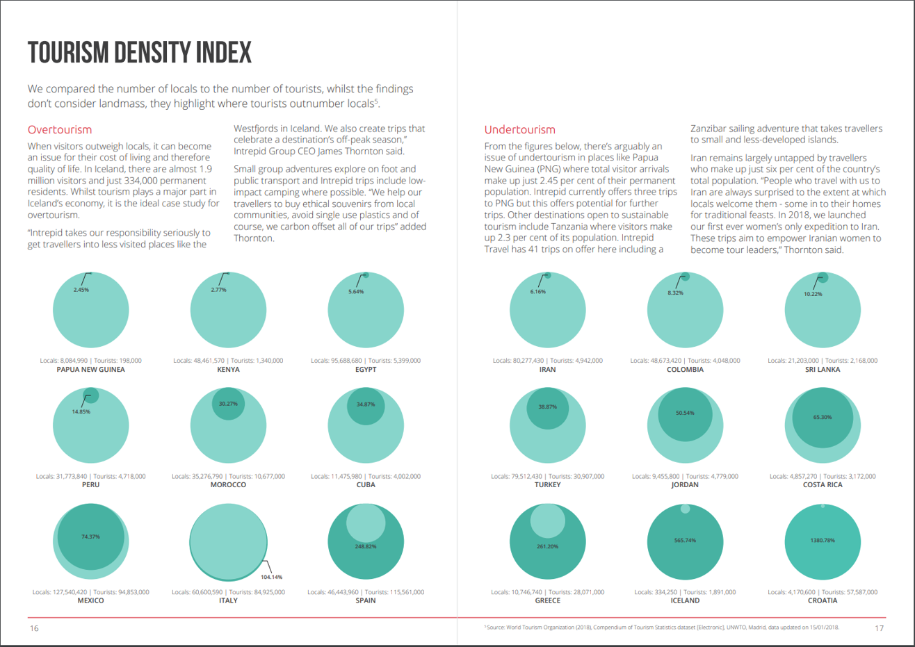
What works well?
- Really good explanations for how they define overtourism and undertourism and examples for each
- Providing the exact figures for each country
- Colors are easy enough to distinguish
- Sorting the countries from lowest to highest
- Splitting the view between the highest 9 and the lowest 9
What could be improved?
- Circles are inherently difficult for comparisons. Are they measure by area or diameter? Either way, the circle in a circle in overkill.
- Why does the size of the light green circle change once the dark green circle is a larger value? That makes no sense at all.
- If the exact numbers were not included, it would be impossible to compare countries.
- Why show the top 9? That seems like an unusual way to select the countries.
My Goals
- Focus on either the raw values or the percentages. I'll figure this out once I explore the data.
- Make it easier to compare countries.
June 7, 2018
Workout Wednesday: How does sales compare in the Current Period to the Previous?
date
,
dateadd
,
datediff
,
dates
,
highlight
,
parameter
,
size
,
Workout Wednesday
No comments
It's been eight weeks since I've done Workout Wednesday. Sometimes you have to reprioritize things to get other things done. For me, WW was something I could cut out to free up more time for finishing the Makeover Monday book (pre-order here).But I'm back and this week Rody gave us this challenge. Read all of the requirements here.
I had an idea straight away how to do this and in all it took about 30 minutes. The date offsetting took some tinkering, but the rest was pretty easy. I'm glad Rody is back from his hiatus too. His challenges aren't as brutal as Ann's.#WorkoutWednesday Week 23: How do Sales compare in the current period to the previous.— Rody Zakovich (@RodyZakovich) June 6, 2018
Giving a slight twist on some older challenges. Enjoy!https://t.co/gBn05E4gev@lukestanke @AnnUJackson pic.twitter.com/trqc3ZnT3G
Click on the image for the interactive version.

June 5, 2018
Tableau Tip Tuesday: Split, Pivoting and Union with Tableau Prep
flow
,
pivot
,
split
,
Tableau Prep
,
Tableau Tip Tuesday
,
union
,
workflow
No comments

You can download the flow here.
June 4, 2018
Makeover Monday: The UK Gender Pay Gap Across Salary Bands
female
,
gender
,
gov.uk
,
heat map
,
highlight
,
Makeover Monday
,
male
,
parameter
,
pay gap
,
UK
,
united kingdom
No comments

Let's start with this viz from the official report:

What works well?
- The symbols make it clear this about females and males.
- The BAN in the middle tells us what the bonus pay gap is.
What could be improved?
- Both icons are filled to the same level, making it look like there is no bonus pay gap. These should be filled to the actual values for each gender.
- The icons don't add much value.
- The title could tell us a whole lot more.
- There's no source listed nor no timeframe.
- The gridlines aren't evenly spaced between 0% and 50%.
I must admit, this is a tough data set. Hopefully the explanations I wrote on data.world provide sufficient context. I found it most useful to look at a specific company and look those values up in the data provided to ensure I understood what it means. Given that I found the data overwhelming, I decided to focus on the pay bands since that's what Aisling focused on in her article.
From there, I started to build lots of charts, but found the number of companies overwhelming. Therefore, I decide to limit the data to those companies located in the City of London (i.e., those with a postcode that starts with EC). I also knew I need to do some data prep so that I could compare females and males in each pay band more easily. I turned to Tableau Prep for this.

The flow works like this:
- Remove columns that aren't needed
- Splitting the data up into two streams, one for the female columns and one for the male columns.
- Pivot the data so that the pay bands are listed down instead of across
- Add a column for the gender
- Union the data back together
- Export to an extract
Pretty straightforward and this short amount spent prepping the data made the gender comparison significantly easier. I first wanted to understand how the median proportion of females and males in each pay band by the size of the company with a City of London total (NOTE: the total only represents companies that reported).
Click on the image for the interactive version.
Click on the image for the interactive version.

This simple view makes it incredibly evident that the proportion of females declines as the pay band increases. Males would be the inverse. It's particularly stark in the largest organizations. In the City of London, there are only three employers in that range (British Telecom, Royal Mail, and Sainsbury's Supermarket).
The heat map helped give me an overview of the data and felt ready to create something more detailed. This time I wanted to look at all companies together by gender by pay band compared to the overall median for each gender. I also wanted to provide the user with the option to choose a specific company. When they do, that company gets highlighted.
Click on the image for the interactive version.
What first struck me in this view is the clear, overwhelming patterns down and to the right for women. This gave me a great impression for how big the gender pay gap problem is.
The gender pay gap is not a myth. These are facts, facts that show women are underrepresented at higher salary levels. Don't let this discussion get lost. Check out your own company. How are they performing? Ask them to share the data within your organization. Transparency is a key to fixing this discrepancy.
Subscribe to:
Posts
(
Atom
)


