January 31, 2018
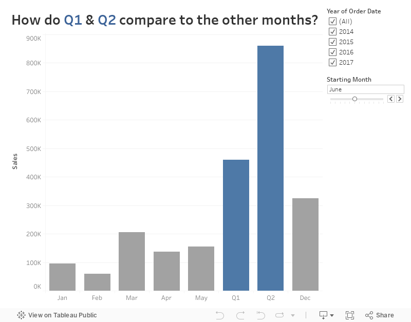
Workout Wednesday: Dynamic Quarter Highlighting
For week 5, I sent Luke and Rody a little challenge to see if they thought it was worthy of a WW. It all started with a question from a customer on Convo, which led me to creating this view, which led to it showing up on WW.The requirements are simple:
- Allow the user to pick a starting month.
- Allow the user to filter the years.
- Based on the starting month, group the next 6 months into two quarters.
- Display the remaining months as individual months.
- Color the Quarters separately from the months.
- You can used table calcs or LODs.
- The quarters must appear in the correct order within the months based on each quarter's starting month.
Here's my solution. Enjoy the challenge!
January 29, 2018
Makeover Monday: What the Most Profitable Companies Make per Second
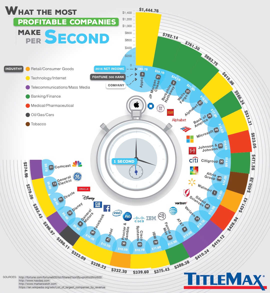
What works well?
- The companies are sorted by profit per second.
- The chart is certainly different, which caught my attention. Capturing your audience's interest is a good first step.
- Coloring the companies by industry makes it easy to see that tech companies and banks are dominating the top spots.
- Including additional information like net income and Fortune 500 rank provides additional context.
What could be improved?
- If the companies weren't sorted, it would be way too difficult to compare the companies.
- The unusual shape of the graphic distracts from the message of the story.
- There is lots of unnecessary decoration like the stop watch in the middle.
- The company logos don't add anything to the visualisation.
- What do the blue bubbles mean? I think they represent net income, but you can't even see the whole bubble and bubbles are terrible for comparisons.
My Goals
- Simplify the viz by removing the decoration and flattening it out
- See if there are any relationships between the different metrics.
- Consider grouping the companies by industry.
- Read the article and incorporate some of the text that includes some interesting facts.
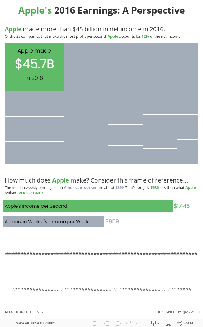
In the end, I found that a particular section of article about Apple would be a nice way to tell a story and provide some perspective.
January 24, 2018
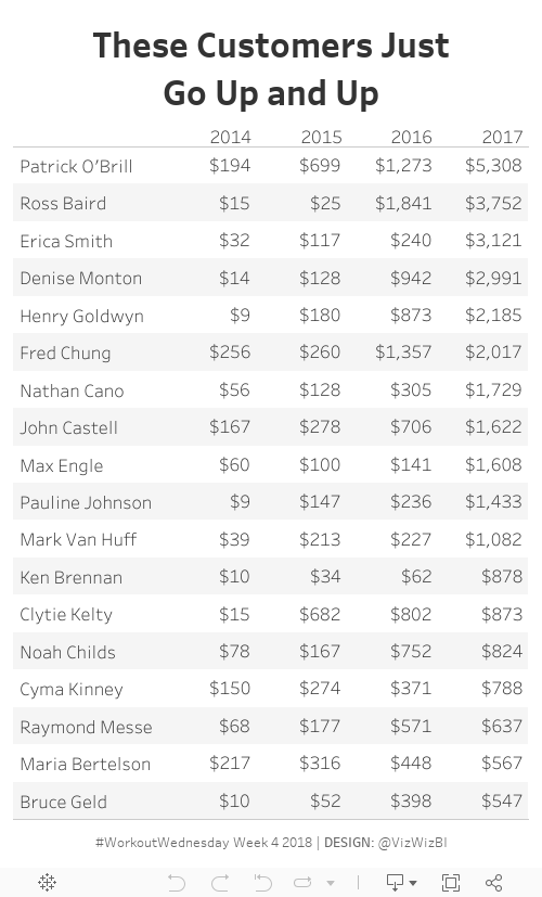
Workout Wednesday: Who are the customers that have grown every year?
Rody's week 4 2018 challenge called for a simple table to created. All you had to do was:- Only include customers that had sales increases every year
- Sort by 2017 sales
- You could not use table calcs or LODs in the solution
10 minutes! BOOM! (I got lucky!)
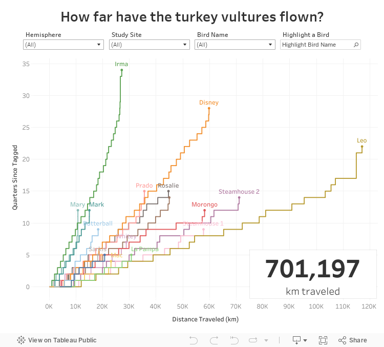
Makeover Monday: How far have the turkey vultures flown?
Inspired by Mike Cisneros' viz this week, I thought I would look at the cumulative distance each turkey vulture traveled. And, as a bonus, I wanted to use stepped lines, which are not yet available in Tableau. Fortunately, Rody Zakovich has written a great, easy to follow tutorial.In addition to the stepped lines, I wanted to be able to compare all the birds on the same baseline. I created a calculation for quarters since each bird was tagged and then calculated the running total of the distance along the quarters. Standardizing the data this way helps me to see which bird flew the farthest (Leo) and which bird has flown to longest (Irma, which really means Irma has been tagged the longest).
Lastly, I sent the viz to Eva for some feedback and she suggested swapping the axes so that distance was on the X and time on the Y. This definitely makes more sense since distance is the independent variable.
Fun learning exercise and Rody's blog really makes creating stepped lines so, so much easier.
January 23, 2018
Makeover Monday: Distance Traveled by Turkey Vultures (Power BI Edition)
My goal was to recreate my Tableau viz from week 4 in Power BI. Here are ten thoughts about the process:- I had to install a custom chart type in order to create the heat map.
- The heat map did not allow me to have year across the top and months down the side.
- I had no control over the colors in the heat map.
- I had to create a separate column for each of the years in the data set so that they were each individual measures that I could then use in the rows. That took way too long!
- I could not create a distance per bird calculation like I did in Tableau that could then be used in the heat map; I went with total distance instead.
- I could not connect the dots on the map to show the paths for each bird.
- I could not make the dots really small on the map nor could I color the dots by the bird name.
- I love how PBI automatically resizes to the screen. The viz I created is about 1300x900 in PBI, yet I can embed it as 800x600 and it rescales perfectly. This is fantastic!
- I love the pixel perfect layout; it's super easy to get everything just right.
- Mapping options are limited and you can't use a custom map (that I could see) so I had to match the dashboard background to the map background as close as I could.
With that, here's my Makeover Monday week 4 2018 created in Power BI.
January 22, 2018
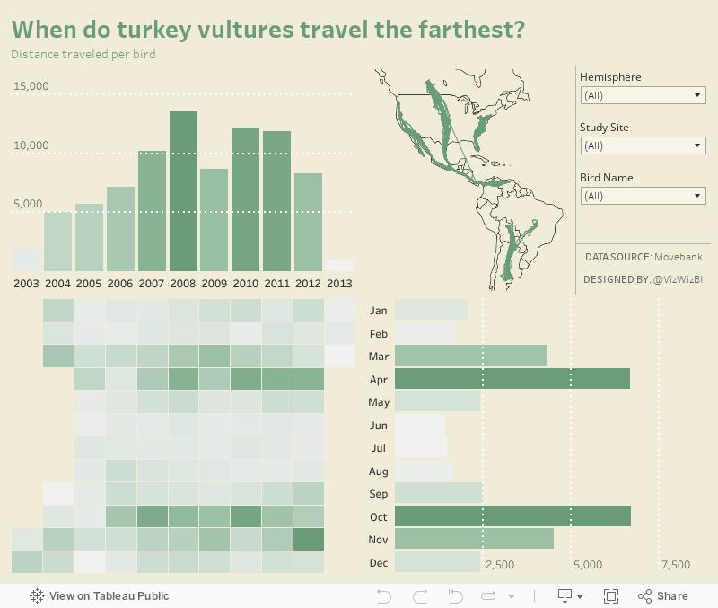
Makeover Monday: When Do Turkey Vultures Travel the Farthest?
Eva posted these maps to makeover:

What works well?
- Using a map helps show the migration patterns.
- Using color to indicate the speed by which the birds travel (FYI, they're FAST!!!)
- Splitting the view between outbound and return migration.
What could be improved?
- Remove the latitude and longitude axes
- Remove the region labels
- Change the red/green colors for the middle two speeds
- Add a title so we know what the viz is about
- Make it interactive so that we can see the patterns of individual birds
What I did
- I focused on the distance the birds traveled. To do this, I exported the data to excel and added a column for distance which was calculated row by row for each bird. This then makes aggregating the distance easier.
- I created a calculation for distance per bird. This is a better measure than the average distance because the denominator is the number of birds, not the number of measurements.
- I create a marginal histogram to show the monthly/yearly patterns.
- I included filters to make it easier for the user to look at a specific bird or birds.
- I include the map for context and it draw a line for the pattern for each bird, whereas the original was a series of dots.
- I created a custom mapbox map that only includes the country borders (for decluttering) and has a background color that matches the dashboard color.
With that, here's my Makeover Monday week 4 2018 visualisation.
January 18, 2018
Gender Bias: Interruptions in the Supreme Court
This morning I was listening to the Justice, Interrupted, an episode of Radiolab's great podcast More Perfect. The episode refers to a paper on gender bias in the Supreme Court with respect to Justices interrupting each other. In that paper, there's data about which Justices interrupt other Justices the most, so I thought I'd turn it into a Tableau story.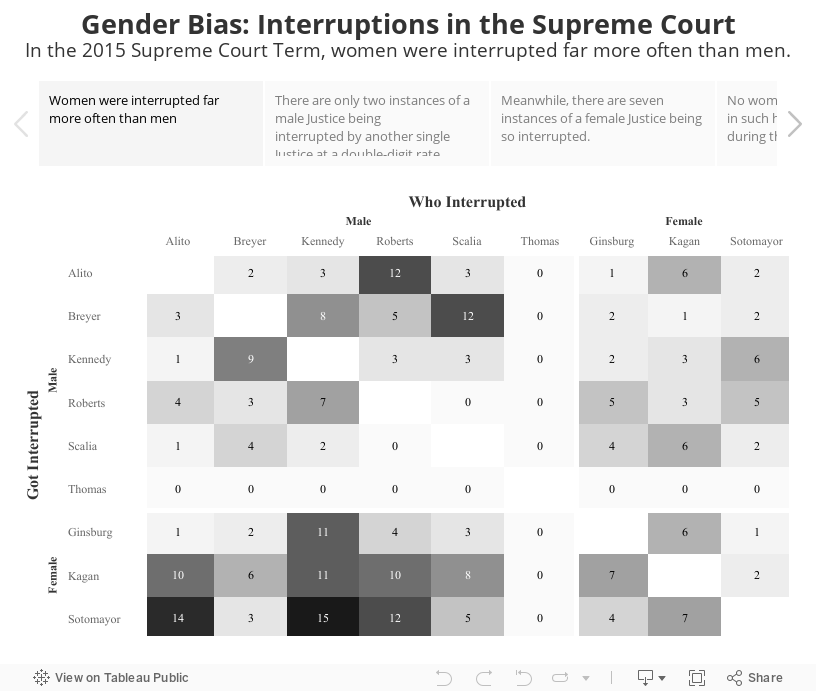
January 17, 2018
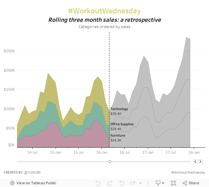
Workout Wednesday: Rolling Three Month Sales
level of detail
,
LOD
,
moving sum
,
parameter
,
sorting
,
stacked area chart
,
table calc
,
Workout Wednesday
2 comments
Nice challenge from the boys this week. Essentially you have to create a stacked area chart with the stacks adjusting top to bottom depending on which one is the largest. The title also needs to be the same color as stack that's on top. Finally you need a parameter to determine where to split the colors of the view and where to display the values.There are some other tricks too. I won't give away my solution, but I'm 99% sure it different than theirs. Get the requirements here.
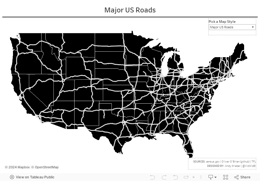
Creating Maps With Linear Geometries in Tableau
This blog post is a couple months late as Tableau added support for linear geometries in version 10.4. So what are linear geometries? Essentially the are spatial files that are represented as a single line.For example, let's say you have a series of locations that represent train stops. In Tableau you can draw the route by connecting the dots via the line shelf. This will result in marks for every station. If the route is a linear geometry (or linestring) instead, it is represented in Tableau as a single mark, meaning the viz will load much faster.
This is useful if you each point isn't important and you care more about the path itself. To help me understand how these work I downloaded shapefiles from the US Census, github and Transport for London. Each of these was a linear spatial file already, meaning I could connect with Tableau and go.
If I had a series of points, like the train stops example, I could use Alteryx to convert them to spatial points, create the path and export as a shapefile.
With that, here are a few example I've built using linear geometries and custom Mapbox maps. Note that the maps may be slow to load in Tableau Public. I'm not sure why because they're super fast in Desktop. Enjoy!
January 16, 2018
Makeover Monday: Rank of Income Distribution in the United States | North Dakota vs. The Rest

So this morning, since I had the Data Schoolers give Power BI a whirl with the Makeover Monday data, I thought I'd try to rebuild his viz in PBI. It took a pretty long time and there were tons of needless hurdles:
- I had to manually color each line to grey. I can't use a group or set to color by.
- There's no way to use a parameter type of object to highlight a chosen state; thus in my viz I've manually chosen North Dakota to match Sean's viz.
- To make the rank start at the top, you have to create a calculation that makes the axis negative; you can't reverse the axis.
- I couldn't move the North Dakota line to the front. I found a couple of blog posts that recommended techniques, but none of them worked.
- Creating a rank calculation is a monumental pain in the ass.
I persevered and got something built. I don't love it, but I'm learning more each time I use PBI about it's strengths and weaknesses. I still stand by my previous statement that Power BI IS NOT a data analysis tool; it's a dashboarding tool, that's it.
With that, here's my re-make of Sean's viz.
January 15, 2018
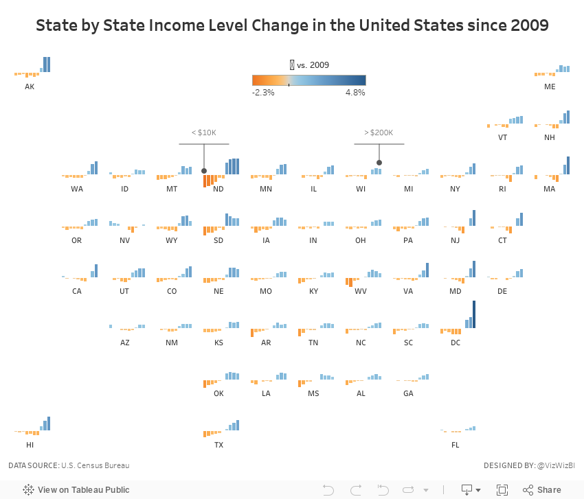
Makeover Monday: U.S. Household Income Distribution by State
census
,
household
,
income
,
inequality
,
Makeover Monday
,
tile map
,
United States
,
US
No comments

What works well?
- The ordering of the states by the highest income level from smallest to largest is easy to see.
- The colors are all pretty distinct from each other (as I'm not color blind).
- The colors seem like an intentional choice to go from red (low) to green (high) with steps of color in between.
- The labels help add context to the stacked bars and they aren't distracting.
- Including the data source
What could be improved?
- There's no indication as to which year this represents.
- As it's not interactive, you can't sort by a different income level, therefore it's not easy to compare different states without reading the labels, which is slow.
- Are there region differences? I can't tell from this view.
What I did:
- To be able to see regional trends, I included a tile map.
- I used bars that represent the change since 2009 so that we could see which income groups grew and shrank the most.
- I included context in the tooltips that show each income level for 2016 and the change since 2009 for the selected income level.
- I added some annotations to aid understanding (thanks Eva for the idea).
January 12, 2018
Visualizing 854 Strava Runs
ggplot
,
Marcus Volz
,
routes
,
rstats
,
running
,
strava
No comments
Before Christmas, Chris Love sent me this tweet to check out:— Marcus Volz (@mgvolz) December 23, 2017
Uh...HELL YES I want to create this. Chris suggested recreating it in Tableau, which I plan to do next week The Information Lab France. In the meantime, I decided to follow the simple instructions that Marcus posted on github.
The vizzes are built using using rstats and ggplot.
I ran into a few errors at first; upgrading my version of R was all it took to make them go away. The processing is super fast and the outputs are really, really cool. You also have the option to customize the size of the viz. I'm thinking of getting these printed as posters.
Here are the routes of my 854 runs from 2013-2017 as small multiples.
And here are all of the runs I've done around London.
Another really fun couple days learning. Now that I understand how all of this works, it should make prepping the data in Alteryx and creating the viz in Tableau significantly easier.
January 10, 2018
Workout Wednesday: Fiscal Date Running Sum
With Rody Zakovich and Luke Stanke taking over Workout Wednesday this year (see the new Workout Wednesday website for the challenges), I think we're in for some quite extensive learning this year. I likely won't be able to participate every week; I will when I have time though.This week, Rody posted a challenge that required calculating the running total of sales based on a parameter that determines the fiscal month.
My Thoughts
- Fiscal dates suck; they are way too hard to work with in Tableau (this was my first time ever using them)
- The calculations are quite straightforward. I figure out what I needed to do by building a table of dates first, then creating the calcs.
- Getting the x-axis formatting correct took me the most time.
- It's way more fun issuing the pain of these challenges than it is to receive the pain.
Overall, a fun challenge and I hope to never see fiscal dates again. Click on the image below for the interactive version.
January 8, 2018
Makeover Monday: Using Gauges in Highcharts to Understand Characteristic Preferences In Romantic Partners
gauge
,
Highcharts
,
javascript
,
Makeover Monday
,
men
,
romance
,
women
2 comments
Have I finally found a use case for gauge charts? That might be up for debate. The purpose of this viz was to practice Highcharts. I thought the gauges, when aligned as I've done them, are easy to compare.Click here for the interactive version, which doesn't really do much other than animate the filling of the gauges.
Makeover Monday: Which characteristic preferences are most different with British men and women?
What I really like is how Datawrapper automatically colors the difference between the two dots. Really slick!
Subscribe to:
Posts
(
Atom
)


