April 30, 2017
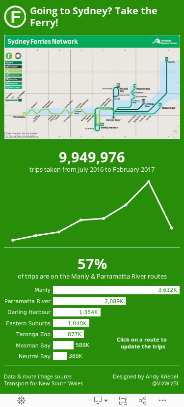
Makeover Monday: Going to Sydney? Take the Ferry!

This viz to makeover was created by Transport for New South Wales and I believe they'll be in attendance for the Sydney TUG on Monday to see everyone's makeovers.

What works?
- Data points are in sequential order
- Colors are used consistently
- Each chart title tells us exactly what the chart is showing
- Including instructions on the filters
What could be improved?
- Dashboard needs a more meaningful, engaging title
- Too many colors
- Since the blue segment (adult) makes up such a large percentage, make it to bottom slice to it's easier to compare its contribution over time.
- Include more months
- Scrap the table, it's not needed
- Scarp the stacked bars, unless you reduce the slices (How about three categories? Adult, children, other)
- I have no idea where any of these stations are. Is that important?
- Are people taking the ferry more or less? I can't tell with their viz.
- Overall, a LOT of simplification needs to be done.
My Makeover
I've never been to Sydney, so I was thinking about what would be important to me.
- I'd probably be using my phone as I try to find a ferry terminal, so make it a mobile dashboard.
- Are there more or less trips over time? Does that hold true for each route?
- Which are the busiest routes? I might want to avoid those if I don't like crowds.
- All of the ferry lines and the logo are green, so use that as the primary color.
With those ideas in mind, I created a simple, mobile-friendly dashboards that answers these most basic of questions.
April 27, 2017
A Day of Data Viz With the English Institute of Sport and PGIR
critique
,
data visualization
,
EIS
,
england
,
English Institute of Sport
,
feedback
,
presentation
,
rugby
No comments

 |
| Twickenham Stadium - Home of England Rugby |
Twickenham is my home town, so I was able to walk to the stadium and rehearse my presentation along the way. The day started with a quick recap of their previous day, and this was the first chart I saw. "Oh boy, this might be a long day" was the first thought in my head. Deep breaths Andy. Deep breaths.

Surely Duncan did this on purpose for the benefit of the day. And yes, I did say something. From there, we went on a tour of the ground going through the tunnel onto the pitch.

Once on the pitch, we made our way to the coach's box.
 |
| View from the England coach's box |
There, the team analysts talked to us about their gameday setup, where the coaches sit, how they pass information, etc. I found it fascinating how rugby teams use data in-game, right there with the coach, to make decisions, yet football doesn't allow any of that. How archaic!
We went back into the locker room to talk about the facilities available to the players and how they transmit all of their data post match.
 |
| England dressing rom |
 |
| Team conditioning room |
We then made our way upstairs so the analysts could learn about data visualisation. The rest of the day started with a talk by me titled
What is Data Visualisation? And Why Should You Care?This was a new talk for me, with the focus on getting the team to understand the impact displaying data visually can have. I started with a couple of simple examples, we discussed why we do data analysis, talked about how they can get started, how to constructively evaluate visualisations, and a brief intro to the design process.
After this talk, four different analysts presented some of their work. Each table then took 10 minutes to discuss and write down what works and what could be improved based on what I had taught them. This worked like magic! I then gave my opinion in front of the whole group and suddenly a mere four hours after we started, we had a bunch of data viz snobs! I love it! It's so great to see the light bulb go off and especially to see them critiquing their own work.
The day concluded with a series of "appointments" where they could chat with me one-on-one about their work and get individual feedback. It reminded me a lot of the Tableau Doctor sessions at TC.
I made notes throughout the day and came up with a list of 10 key takeaways:
- Include context - compared to what?
- Where should the eye focus?
- Highlight what's important
- Be careful with stop light theme
- Include a call to action whenever possible
- Pay attention to color usage
- Know your audience
- Does the audience now what to do next?
- Effective chart types (boring is ok if it works)
- White space is ok - it gives the viz room to breathe
Overall, an incredibly satisfying day. Thank you EIS for asking me to come! I'd be happy to do it again any time. For those interested, here's my presentation.
April 26, 2017
Workout Wednesday - Product Spread Treemap (Part 1)
% of total
,
challenge
,
level of detail
,
LOD
,
table calc
,
treemap
,
Workout Wednesday
5 comments
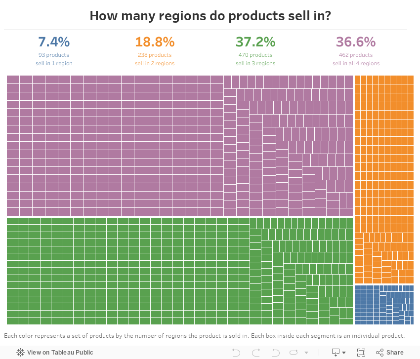
My next two Workout Wednesday challenges for you will build upon each other. WARNING: This might be tough. This challenge came from a Data School project that I helped the team with.Use this data source to build this treemap. The idea is to be able to count how many regions each product sells in. Here are the requirements:
- Dashboard needs to be 850x700
- Include a summary table at the top that shows the number and % of products that sell in each region.
- Match the color-coding and text of the table.
- Create a treemap that segments the products by the number of regions it sells in.
- Match the tooltips in the treemap.
- Clicking on a color in the summary table should highlight that segment in the treemap.
- Include the caption on the treemap
That's it! The brutal part of the challenge I'm saving for week 19. Good luck!
April 25, 2017
Tableau Tip Tuesday: How to Create a Pop Drop Box
Thank you Lorna for recording the video and thank you Curtis for the inspiration!
April 24, 2017
Makeover Monday: Which data skills are HOT where you live?
data
,
jobs
,
Makeover Monday
,
skills
,
tableau
4 comments

What works well?
- Clear title that tells me what the viz is about
- Can easily find the top 10 job skills in any country (but there are some problems with this too).
- Keyword search in the box & whisker plot
- Overall layout is simple
What could be improved?
- What do the colors mean in the bump chart? There's no legend.
- The bump chart cuts off jobs when they aren't in the top 10, making it look like they didn't exist in the other years.
- The country filter only applies to the top chart. I didn't realize that. I think it could be more clear.
- Box & whisker plots are hard to understand for most audiences. And using one for data that is ranks doesn't make a lot of sense to me since you really can't tell how much better the top is from the bottom with ranks.
- How are the jobs organized in the bottom chart? Is there a logic to the sort?
- What's the scale of the box & whisker plot? It looks half cut off to me.
- For most people, they probably won't care how their country compares to other countries. I would think it's more important to understand which jobs are hot where you live.
- There are a LOT of missing roles in 2016 that existed in 2015 & 2014. I would remove 2016 since it's not comparable to the other years.
Much like Eva, I decide to make this a tool people could use. If someone lives in the U.S., they probably don't care which jobs are hot in Singapore. Or maybe they do care about Singapore because they want to move there. My viz is intended to help people find the hot jobs that are geographically important to them.
Click on the image for the interactive version.
April 21, 2017
Five Years of Parking Violations in Philadelphia
#VizHawks
,
Amarendranath
,
Corey Jones
,
dashboard
,
Eagles
,
Eva Murray
,
interactivity
,
open data
,
parameter
,
parking
,
philadelphia
,
St. Joseph's University
,
violations
3 comments
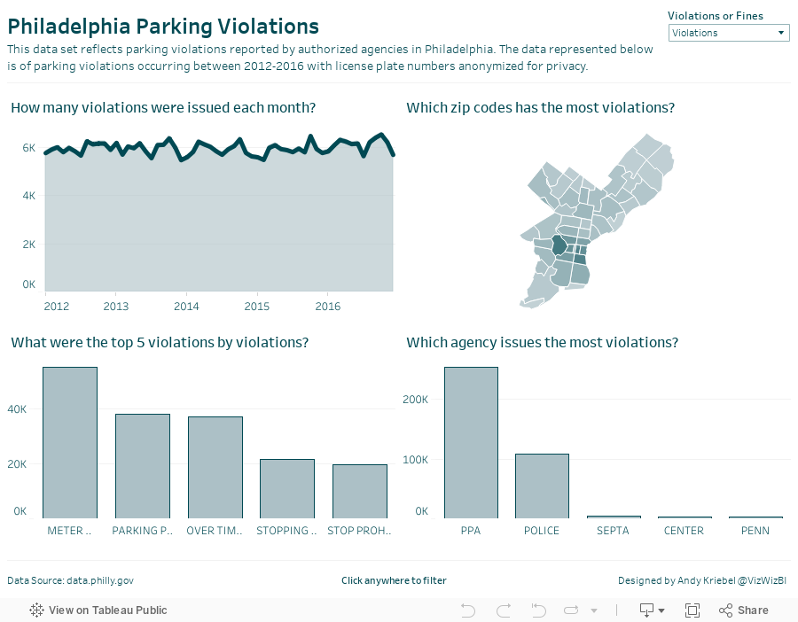
Tuesday evening, Eva and I were invited by Amarendranath to participate in an event at St. Joseph's University in Philadelphia (my hometown) where we got to introduce them to Makeover Monday, watch Corey Jones give a great Tableau demo in which he introduced them to their challenge.How can you visualize 7.4 million parking violations in Philadelphia?
The data comes from the City of Philadelphia and was provided in a packaged workbook. This was sent to Eva and I as well, but the extract was painfully slow for me. I promised everyone I would create my own viz and the performance had to be addressed. I knew Exasol would give me the performance I was needing, so I created a workflow in Alteryx to take the CSV and upload it to Exasol. The great thing about throwing the data into Exasol is that I don't have to do any performance tuning. Exasol figures all of that out for you.
Now I was cooking with gas! I explored time series, types of violations, where violations occur, etc. to get a feel for the data. Next I went to back to the city's website and had a peek at their dashboard and thought it wasn't too bad. The major issue I see with it is filtering performance. I decided to build the same view in Tableau with a few changes:
- Create an aggregated extract that only includes the fields I need and aggregates to the monthly level. This significantly reduces the data for publishing to Tableau Public and makes the user experience better.
- Since the Eagles are my favorite NFL team, I changed the color scheme to use their official colors.
- I made the chart titles more informative by putting them in question form.
- I added an option for the user to switch between the number of violations and the amount of the fines.
All of this took about 30 minutes (primarily because the dashboard design was already done for me). Thanks Corey and Amarendranath for the opportunity to meet the team and participate! Let's do it again soon.
April 19, 2017
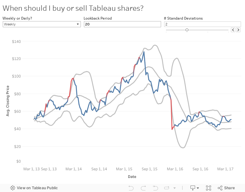
Workout Wednesday: Bollinger Bands and Tableau Stock
Emma had a cheeky grin on her face today when I asked her about Workout Wednesday. I'm fairly sure she was convinced that she had something tricky up her sleeve for me because, well, we're a bit competitive.This week she challenged us to build a Bollinger Band chart based on Tableau's stock performance.
Fortunately for me I had already done nearly this exact chart back in 2014 as a tip here and as a video here. Heck, it was even based on Tableau's stock! How convenient is that!#WorkoutWednesday week 16 is now up: Should I buy Tableau shares? https://t.co/GOVDlm8i7H pic.twitter.com/e2yA0dNr1F— Emma Whyte (@EmmaWhyte) April 19, 2017
Emma threw in a couple nice nuggets in her tooltips that required a couple calcs, but nothing overly complex. The trickiest bits are the table calcs you need for the lower and upper bounds. Mostly everything else is formatting the view.
Thanks for the challenge Emma! I'll be extra mean next week because you seemed excited about that.
April 18, 2017
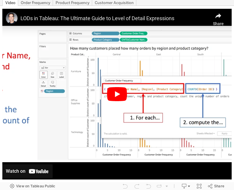
Tableau Tip Tuesday: FIXED Level of Detail Expressions in a Plain English Sentence

Back in February, I wrote about putting table calculations into an english sentence. This concept can be easily extended to level of detail expressions. As such, I'm going to kick off a series of blog posts that show how to take ANY level of detail expression and turn it into an english sentence.
First up are three use cases for FIXED LODs.
|
| How many customers placed how many orders by region and product category? |
 |
| How many products sell in how many regions by year and quarter? |
 |
| What is the total number of customers acquired by region by day? |
Here's a video of how I created each of the scenarios and the examples for you to download and follow along. Enjoy!
April 16, 2017
Makeover Monday: Lamotrigine vs. Lamictal - How much does the NHS save by prescribing the generic drug?
anticonvulsant
,
comparison
,
drugs
,
infographic
,
lamictal
,
lamotrigine
,
Makeover Monday
,
NHS
,
prescriptions
,
saving
,
seizures
,
UK
,
united kingdom
No comments
I've used this dataset before, so I was already pretty comfortable with the data. The viz that she asked us to makeover in underwhelming given the detail of the data behind it.#MakeoverMonday for week 16: An introduction to the dataset and some tips for working with >700 million records...https://t.co/AfFganu8iB pic.twitter.com/lZCpCCpRRv— Eva Murray (@TriMyData) April 15, 2017

What works well?
- Line charts are always very easy to understand
- Laying the charts out side-by-side allows me to see that while prescriptions have been rising, costs haven't been rising at the same rate.
- Axes are clearly marked and not too crowded
- Title tells me what the viz is about, though it's pretty boring
- Chart titles describe what I'm seeing
- Using green for the lines, which is the color for pharmacists in the UK
What could be improved?
- There's no story. Are the trends good or bad?
- There could be more comparisons and context. Something like cost per prescription makes it easier to understand if costs are going up or down overall.
- More detailed data, like at the quarterly or monthly level, might show more interesting patterns like if the prescriptions are seasonal.
- Do these trends apply to all regions in the UK? Does it apply to all medicines?
- Use a more impactful title.
- When I look at medical data, I always wonder what it means for me. This viz can't answer that.
For my viz, I wanted to look at two specific drugs. Well really it's the same drug, just in generic and brand name versions. Pharma companies spend a ton of money pushing their new medications, yet the NHS has a responsibility to keep costs down. To help me understand this better, I reviewed Lamictal (brand) vs. Lamotrigine (generic). I chose these because I've taken both of them and know how stupidly expensive the brand can be. If you're curious to know why I took these, I explain at the bottom of the viz.
Special thanks to Johannes Meier for creating this dataset and to EXASOL for hosting it.
April 13, 2017
Mac’s Declining Relevance To Apple | A Tableau Remake
% of total
,
annotations
,
apple
,
Business Insider
,
line chart
,
mac
,
Mike Nudelman
,
remake
,
revenue
,
share
No comments

I had a few minutes this morning so I decided to build a Tableau version. The first problem I ran into was getting the data in fiscal quarters. I couldn't find the data quickly, so I went with calendar quarter data that I found on Bare Figures. My data doesn't match the original above due to the calendaring, but that wasn't the point of the exercise. This was all about practice for me.
Essentially I wanted to replicate the viz with a more impactful title and some other minor formatting changes. Here's what I came up with. Click on the image for the interactive version.
April 12, 2017
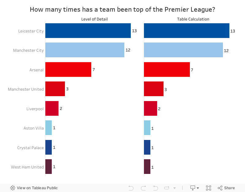
Workout Wednesday: How many times has a team been top of the Premier League?
level of detail
,
LOD
,
points
,
Premier League
,
standings
,
table calculation
,
Workout Wednesday
3 comments
@VizWizBI @infolabUK @dataschooluk @MissLaura203 Sounds great but please don't feel obliged to. Maybe sneak it in as a Workout Wednesday of sorts to avoid creating extra work for yourself?— Charlie Hutcheson (@CharlieHTableau) April 11, 2017
The requirements this week are pretty simple and use a data set of Premier League points from the 2015/16 season. Note that this data set doesn't include the whole season; that's not the purpose of the exercise.
- Must be a single chart
- Match the colors of the teams exactly
- Match the tooltips
- Sort the teams by the number of weeks they were in first place
- Left bar chart must be based on a LOD expression
- Right bar chart must be based on a table calculation
- Both bar charts need to have a label on the end of the bar with the number of weeks in first place
- Match the column headers
- View size is 800x600
Good luck!
April 11, 2017
10 Years Later...What Tableau Means to Me?

Can you create a few dashboards to help us monitor the annual planning process?
Seemed simple enough, yet we didn't have any dashboard software. All we had was pivot tables in Excel sitting on top of OLAP cubes. I had tried and failed miserably to created dashboards before. I knew I needed to try something else. So I turned to Google and entered this simple search:

The first result that came back seemed to be exactly what I was looking for.

I downloaded and installed Tableau 4.1 and watched the first few training videos. 30 minutes later, the whole project was done and my life was changed forever.

It might seem odd that a simple piece of software could change my life, yet I know that finding Tableau has been the most important moment in my career. No doubt about it!
At the time, Tableau had just added dashboards. There were no table calcs, no LODs, yet the software got out of the way and allowed me to enjoy every minute of every working day. 10 years later, I'm just as in love with Tableau as I was on that first day. Here are some of the reasons why.
VISUAL ANALYTICS
Tableau is fast and easy to learn, yet sophisticated and elegant. Tableau's most powerful feature, in my opinion, isn't dashboarding, which is what so many companies purchase it for. Rather, Tableau's bread and butter is visual analytics. When Tableau says they allow you to "see and understand your data,” they mean it. Tableau does what it says on the tin. If you're not using the power of visual analytics in your organization, you're missing out on the true power of Tableau. No other product allows you to answer questions you have visually, at the speed of thought. You can literally SEE the answers to your questions.THE COMMUNITY
Tableau users are a passionate bunch. No other product comes even close to the network of people freely willing to help each other. Post a question to the Forums and you're likely to have a response in a matter of minutes. There are countless people waiting to help you. Tableau doesn't require their users to help each other. The users help each other because they WANT to. From Joe Mako to Jonathan Drummey to Pooja Gandhi to Alexander Mou and many others; these people feel their personal mission is to help others succeed with Tableau. People helped them and they are merely paying it forward.Then there are the bloggers: people that use their free time to write about Tableau. We do it (assuming I can speak for others) because we want to help people learn. When we learn something, we want to share the knowledge. Why? Because writing about Tableau helps everyone get better. And really, it helps the writer the most. When you write about what you learn, it helps reinforce the learning. Sounds great for everyone!
And of course, there are the Community projects. Projects like Makeover Monday that I run with Eva Murray (and last year with Andy Cotgreave) have been wildly successful because, first and foremost, they encourage people to learn, practice and improve. Every week, I'm amazed that hundreds of people can take the same data set and all create a unique visualisation. No other piece of software has Community projects like this that I'm aware of. Beyond Makeover Monday, people will come up with any excuse to meet and use Tableau. Viz Club even meets in a pub!
THE LEADERS
I count myself one of the few fortunate people that have gotten to know the leadership team at Tableau very well. In fact, I consider all of them my friends. I know I'm not the only one that feels this way and it's to their credit that they really want to get to know their customers. Most importantly for me, if I have a concern, I know I can email Elissa Fink or Francois Ajenstat or Andrew Beers or Dave Story and they'll respond. What makes them special is they genuinely stop and listen. They know that without their passionate customers, Tableau wouldn't be the product that it is.Case in point: a few weeks ago I had some concerns that I needed to vent about. I was in Scotland and sent an email to Francois who was in Seattle. The next evening we were on the phone discussing my concerns. And you know what? Francois followed up with me. He didn't have to take my call. He didn't have to listen. Yet he did, and I'm grateful for that.
INNOVATION
Products seem to spring up monthly, claiming to be the “Tableau Killer!” I'll let you in on a little secret these companies don't know: Tableau is innovating faster than they are, and it's a moving target they won't catch. No other data visualisation product reinvests as much in the product as Tableau. This means amazing new features in every single quarterly release.What impresses me most, though, is how Tableau takes the complex and makes it appear effortless. That's an art! Other products don't think that way; they see features as a checklist. Tableau sees features as capabilities to solve problems. Don't believe me? Try to create the same chart in several products. I guarantee it will be simpler and more elegant to do in Tableau.
THE CONFERENCE
If you haven't been to a Tableau Conference, you need to get yourself there. Even if you have to pay for it yourself, do it. It's like a Bruce Springsteen concert for data nerds. People are literally high-fiving, giving standing ovations, cheering at the new features they're seeing for the first time. You don't see this at other software conferences. You come out of every Tableau Conference ready to take on the world.I love TC because I get to learn, to connect with people I've only ever known on Twitter, to see the people I consider some of my closest friends. You know that feeling when you reconnect with someone you've known for a long time and it's like no time has passed? That's what TC is like for me.
As a Tableau Zen Master, I have the privilege of connecting to TC in a unique way. I've had the pleasure of speaking at seven TCs in the US, including the very first TC in 2008 which had barely over 100 people in attendance. Now, there are over 10,000 people. I also get to help with Tableau Doctor. People come to the Doctors for help with their Tableau problems and we get to help them 1-on-1. I get to sit in on Community Alley for a meet and greet. This is special for me because I get to meet the people that read my blog and get to know them personally.
ALWAYS LEARNING
I bet I can count on one hand the number of days that I've used Tableau where I DIDN'T learn something new. That's right, I've been using Tableau for 10 years and still learn nearly every day. I love that about Tableau! Whether it's a new way to accomplish a task or breaking an old habit, Tableau and the Community are there to help me learn.That's the inspiration behind the Workout Wednesday project that I run along with Emma Whyte. Each week we post a challenge to each other and we get to learn. Plus, the Community learns along with us. I love how we see the same task accomplished in Tableau in many different ways. Some may be more efficient or cleaner than others, yet they all work.
Tableau lets you work through your problems the way your brain works. And what's more fun than learning and improving every day?
TABLEAU IS FUN
Yes, using data visualisation software can indeed be fun. I spring out of bed every day in anticipation of using Tableau. I keep a notebook beside my bed to write down ideas I get in the middle of the night. I use Tableau to answer any data-related question I have. I might see some football stats or some political commentary I want to fact check. It's so simple to get the data, explore my hunches in Tableau and turn it into a data-driven story I can share with everyone.TABLEAU CHANGES LIVES
Perhaps this is a bold statement. I stand behind it as proof of the positive impact Tableau can have on one's life. Without Tableau, I'm fairly sure I'd be in a job that isn't as fulfilling. Instead, I've had the opportunity to spread the Tableau gospel at places like Coca-Cola and Facebook. And now I'm creating the next generation of great data analysts at The Data School. Seriously, The Information Lab actually pays me to teach really smart people Tableau every day. What a gig!My life isn't the only one that's been touched and impacted by Tableau though. Think about the work that DataBlick is doing with PATH to eliminate malaria in Africa. Or the work The Data School does for Connect2Help in Indianapolis. Or the many other Tableau Foundation projects. People genuinely use Tableau to make an impact on the world.
There are tons of people that have moved onto bigger, better and more fulfilling careers because of Tableau. Tableau Public helps you create a portfolio that helps you stand out from the crowd. In my opinion, the CV/resume is dead. Companies that want to hire great people don't look at these. They look at your body of work. So get to it! Create content. Publish it to Tableau Public. That dream job will find YOU.
THANK YOU
Let me end with a simple thank you. Thank you to Chris Stolte, Pat Hanrahan, and Christian Chabot for creating Tableau. Thank you for being pioneers. Thank you for creating a great product. Thank you to my wife for encouraging me to chase my dreams. Thank you to the Tableau Community and everyone that has helped me. Thank you to Dan Murray for being my first Tableau mentor and for kicking me in the rear when I needed it. Thank you to Jeffrey Shaffer for being an incredible project partner and teaching me so much. Thank you to Andy Cotgreave and Eva Murray for Makeover Monday; you have no idea how much I enjoy this project. Thank you to Tom Brown for the best job in the world!Thank you for an amazing 10 years. Cheers to the next 10!
April 9, 2017
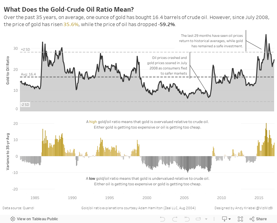
Makeover Monday: What Does the Gold-Crude Oil Ratio Mean?
area chart
,
comparison
,
economics
,
gold
,
index
,
inflation
,
Makeover Monday
,
oil
,
ratio
,
scatter plot
2 comments

An interesting sidebar: I went back to the original blog post, downloaded the workbook, then opened it to see how I had shaped the data. Turns out I build this in Tableau 4.1. How cool is that!?! Dashboards had just been added to Tableau. Ahh, the good old days! People starting to use Tableau now have no idea how good they have it.
Anyway, back to the makeover.
What works well?
- Minimal use of color
- Axes are clearly labeled
- Trend line adds context
- Scatterplot portrays the relationship well
What could be improved?
- The title doesn't tell me much at all.
- What does each dot mean?
- Is there more to the story?
- What does being above or below the trend line actually mean?
Keeping all of these questions in mind, I had an idea. Instead of looking at a scatterplot again, does it make sense to look at the gold price compared to the oil price as a ratio? That is, the price of one ounce of gold divided by the price of one barrel of crude oil. I wasn't really sure if this metric was valid. It made sense in my head, so I ran it by Eva who said it made sense to her too.
Ok great, but what does this ratio actually mean? I turned to Google and found a few great articles, one of which I refer to in my final visualisation. First, I looked at this article from The Telegraph, which included a chart of the gold-oil ratio. Phew! I'm not crazy after all.

Next, I read this article that explained in simple terms with examples, what the gold-oil ratio means. This was incredibly helpful in crafting the story of my viz. Referenced inside of the article was a very detailed research paper on the gold-oil ratio that provided a tremendous amount of context. This bit of research didn't take long and it really helped solidify the ideas that were in my head.
With all this in mind, here's my Makeover Monday week 15 about the gold-oil ratio.
Subscribe to:
Posts
(
Atom
)


