December 23, 2009
Crime Rates Fall in the First Half of 2009
The FBI issued a press release on Monday 12/21/2009 declaring that crime rates had fallen across the board. The FBI has provided the data here.There are lots of facts listed in the press release, but only one visualization. So, I took the data and built three visualizations for them.

Facts from the FBI found on the top left of this dashboard:
- Violent crime overall decreased 4.4 percent, property crime is down 6.1 percent, and arson fell 8.2 percent.
- Individual crimes are also decreasing across the board:
- Murder (down 10.0 percent)
- Forcible rape (down 3.3 percent)
- Robbery (down 6.5 percent)
- Aggravated assault (down 3.2 percent)
- Burglary (down 2.5 percent)
- Larceny-theft (down 5.3 percent)
- Motor vehicle theft (down 18.7 percent)
On the upper left chart, I included Violent Crime and Property Crime; these are not on the FBI's chart. The crimes are sorted the way they are because they fall within the three major categories of violent, property crime and arson (The violent crime category includes murder, forcible rape, robbery, and aggravated assault). I essentially added subtotals to combine facts 1 and 2 above into one chart.
On the bottom left chart I am displaying the crime rates changes in ascending order. This is more impactful to me.
On the right hand side, I have two charts:
- The first is a simply trend chart of the changes each of the last four years broken down by major category.
- I think the second chart tells more of a story though. In this chart, I'm showing the cumulative change across the years. This allows you to see the total change as you go across the years.

The top chart on this dashboard supports the following from the FBI:
- Murder was lower in all four regions of the country, with the largest decreases in the Northeast (13.7 percent) and the West (13.3 percent)
- Motor vehicle thefts decreased significantly in all four regions of the country (Northeast, 19.3 percent; Midwest, 21.4 percent; South, 17.8 percent; and West, 18.2 percent)
- On a regional basis, the only uptick in any crime was a slight increase in burglaries in the South (up 0.7 percent)
I'm not sure why they didn't mention it, but ALL categories of crime are down across ALL regions excluding the one uptick.
The bottom chart on this dashboard supports the following from the FBI:
- While violent crime and aggravated assault were down in cities of more than 1 million people (7.0 percent and 6.2 percent, respectively), in cities of populations between 10,000 and 24,999, violent crime rose 1.7 percent and aggravated assault rose 3.8 percent.
- While both metropolitan areas and non-metropolitan areas experienced decreases in violent crime and property crime in general, non-metropolitan counties saw increases in robbery (3.8 percent) and arson (1.2 percent)
For me, these two facts lead you to the question "So what?" I could have just as easily stated the first fact with the 50,000-99,999 population group. I feel like they're implying some type of significance to the population. However, the intent of most dashboards is to provide facts. The facts are the facts; it's the analysts job to analyze the dashboard and provide supplementary information.
The last set of data relating to major metropolitan areas (MSAs) is not directly referenced in the press release. Here's the dashboard:

Here are some points that jump out at me:
- Overall, about 2/3 of MSAs had a decrease in crime over the last year. However, the Central region had only one more MSA decrease in crime than those that increased. The Northeast region showed the most improvement in the number of MSAs that reported a decrease in crime (34 vs. 11).
- Minnesota improved at a rate nearly 3 times of second place North Carolina. On the other hand, Alabama's crime rate increased at a rate 2.5 times that of the second worst, South Dakota.
- Within MSAs, violent crime dropped 5.7% compared to 4.4% nationally. Property crime was about even comparing MSAs to the nation.
- The motor vehicle theft rate reduced dramatically across all MSAs in each region, with the overall decrease at 19.2%.
- Forcible rape, burglary and larceny theft in the Central region are the only crimes that increased.
Now, if this was supplemented with information about the steps that were taken that led to these decreases, then the FBI would really have a story to tell. For now, they're just reporting facts.
There are likely tons of other insights to be gleamed from this data. I'd love to see what you can come up with. Download the Tableau Packaged Workbook on my Google Group.
December 21, 2009
Cocaine: Are the number of addicts increasing?
The Guardian DataBlog is a great resource if you want to take random data sets and practice your visualization skills. One of the great aspects of this blog is that they provide all of the data; all you need to do is download them and start playing.There was a blog post on December 3rd with the subtitle "Latest figures show more and more young people seeking treatment for cocaine addiction." The report in this post was concise and to the point: the number of people between the ages of 18-24 seeking treatment for cocaine use has skyrocketed between 2005 and 2009. I wanted to take their text-based summary and create visualizations (which is what they challenge their readers to do).
First, I wanted to understand the amount of drug use for all drugs.

A few observations quickly jump out:
- 70% of the addicts are being treated for opiates or an opiates/crack cocktail. This should obviously be the focal point for reducing addiction rates.
- It looks like there could have been some type of drug prevention or treatment program launched in 2006-2007. I would have to do some deeper research to find out, but this quick visualization leads you in that direction, which is exactly what rapid fire analysis is all about.
- Female drug use is at its highest between the ages of 18-24, while men seek treatment between the ages of 25-29.

The facts stated are:
- A total of 1,591 people in England aged 18-24 began receiving treatment for dependence for cocaine in 2005-06.
- That number has soared to 2,998 in 2008-09, a jump of 88%.
- The number of women in the 18-24 age group rose 80% (from 329 to 592) over the four years, while the number of men increased by 91% (from 1,262 to 2,406).
- Among under-35s, the number of women starting treatment has gone up 60% (from 790 to 1,261), while for men it jumped 75% (from 3,024 to 5,263).
If you have Tableau Desktop, then you can created your own views and I'd love for you to share them. If not, you can use the free Tableau Reader and interact with the data by simply clicking on the points of interest. Once you click, all of the other views will automatically refresh.
December 12, 2009
The Best Pie Chart Ever
This is so perfect!The genius that created this said: "Needed to do a pie chart... so bought an apple pie at M&S, cut the percentages, and shot the pic. Pudding was served later with custard! ;-)"

Simple is better
I've been critical of ChartsBin in the past, but this time I really like what they've done.They produced a simple bar chart with a simple explanation of their findings: "Even with increasing restrictions on marketing, tobacco companies continue to compete fiercely for cigarette market share. Between 2004 and 2007, the top-selling brand changed in more than 22 percent of the countries surveyed."

I like their color choices...good color variation and no one color sticks out much more than another. I typically don't like anything flashy, but the mouse-overs are quite good.
Check it out.
November 27, 2009
Sometimes a dual axis is not a dual axis
comparison
,
DanGreen
,
dual axis
,
economy
,
FRED
,
interest rates
,
mortgage
,
tableau
,
variance
No comments
I learned something after my last post, thanks to my friend and co-visual analysis geek (or is it enthusiast??) Joe Mako. The title from the graph I was referring to was "Fed Funds Rate vs. 30-Year Fixed." That right there should have told me the graph was a comparison, but the fact that there was an axis range on both sides of the graph, led me immediately to assume it was a dual axis chart. We all know why you don't assume...Joe point out to me that the subtitle is "Interest Rate Differential Since 2000." That's the key to the chart...differential. Maybe it says something about the chart that I didn't notice the subtitle or that my eyes were drawn to the ranges on both axes, but I made a mistake. Phew, that felt good to say.
Joe recommended recreating the graph that I had previously posted with a single axis range, since the ranges were so close already.

I also wanted to look at the differential, since the author's point was to show that the differential between the Fed funds rate and the 30-year fixed mortgage rate was that the Fed funds rate only influences the 30-year fixed rate. If the Fed established mortgage rates, then the chart would be completely linear, which it clearly is not.

I chose the color red since the farther from the zero axis, the less influence the Fed has on mortgage rates. The darker the red, the less the influence.
I also changed the title so that it would be more clear what the chart was comparing. The author of the article titled the chart "Fed Fund Rate vs. 30-Year Fixed." When I recreated the chart, I simply took the Fed rate and subtracted the 30-year fixed rate, but that made the chart a mirror image of the author's, meaning that he had the title backwards in my opinion, thus the title I arrived at.
The bottom line is that I agree with Dan Green's evidence...the two rates are NOT strongly correlated.
November 25, 2009
The Fed Fund Rate: Establish or Influence?
DanGreen
,
dual axis
,
economy
,
FRED
,
interest rates
,
mortgage
,
tableau
No comments
I am always interested in what drives the economy and you often hear talk about whether or not the Fed fund rate truly drives the economy.Dan Green wrote a clear concise article on the Fed fund rate vs. the 30-year mortgage rate. There are many misconceptions, media driven I suspect, that the Fed establishes mortgage rates, however, that is not the case. As Dan points out in his article, "The Federal Reserve Does Not Make Make Mortgage Rates (And Here’s Your Proof)", the Fed merely influences rates.
Dictionary.com defines influence as the capacity or power of persons or things to be a compelling force on or produce effects on the actions, behavior, opinions, etc., of others.
It also defines establish as founding, instituting, building, or bringing into being on a firm or stable basis.
These definitions are important as you review the data.
The chart in the article is supposed to reveal this quickly and easily, but it does not. On a dual axis line chart, it measures the Fed Funds Rate vs. the 30-year fixed mortgage rate. (I'm not allowed to reproduce the image, so here is a link to it.) I cannot make heads or tails of the influence one measure has on the other on Dan's chart because there is only one line.
A dual axis chart is supposed to have two lines. The chart should look like this:

Quickly scanning this chart, there appears to be a pretty strong correlation between the two measures. The 30-year mortgage rate generally follows the same pattern as the Fed Fund Rate. If the Fed established mortgage rates, then the pattern of the 30-year mortgage would follow the pattern of the Fed Funds Rate exactly.
I wanted to verify that the Fed is only an influencer using a scatter plot. If the Fed indeed established rates, you would expect the points to line up nice and neatly.

The scatter plot strengthens the notion that the Fed rate has a significant influence on the 30-year mortgage rate, but does not establish mortgage rates.
November 5, 2009
Avitec Airline Dashboard
airlines
,
avitec
,
barchart
,
color
,
dashboard
,
dashboardinsight
,
linechart
2 comments
Dashboard Insight named the Avitec Airline Dashboard as its Dashboard of the Month for November. I can only assume that this dashboard is being recognized as a shining example, but I hope it was chosen simply by blind draw.
There are so many issues with the visual design of this dashboard. Just a couple of my observations (I could go on and on):
- The color choices, while pretty, are completely inappropriate and unnecessary. The two charts on the right are particularly horrific.
- The width to height ratio on the SAFA Ratio, Inspection Severities and Items charts are a poor choice. It looks like they are designed to ensure the screen is filled up, but they distort the story in the data.
- Why is the gigantic Avitec logo right in the middle of the Dashboard? I know it's self-serving, but it sure distracts you from interpreting the charts.
What else do you see?
November 2, 2009
Lessons from Sumi-e
From Garr Reynolds' blog Presentation Zen...8 key lessons from Sumi-e
- More can be expressed with less.
- Never use more (color) when less will do.
- Omit useless details to expose the essence.
- Careful use of light-dark is important for creating clarity and contrast.
- Use color with a clear purpose and informed intention.
- Clear contrast, visual suggestion, and subtlety can exist harmoniously in one composition.
- In all things: balance, clarity, harmony, simplicity.
- What looks easy is hard (but worth it).
Not only is this great advice for presentations, but it's essential for communicating visualizations clearly and effectively.
I'm Dizzy
If this doesn't make you cringe or make your eyeballs spin, I'm not sure what will. On top of that, I have no idea what it's trying to tell me.
October 28, 2009
Chocolate Cream Pie
chartjunk
,
chartsbin
,
gender
,
Guardian
,
nobelprize
,
piechart
3 comments
Oh how I love pie! They are delectable, delightful and delicious. Better yet, they're interactive; who can't use an interactive pie? Click on the image. I promise, you'll love it.
Some things I like (wink, wink):
- The colors get darker the farther out from the radius you go. I guess you could say they radiate.
- The pie doesn't start at the zero degree mark for easier ranking/comparisons.
- The level of precision...people must really care about the 1/10,000th of a percent of an award.
- What takes the cake, I mean pie, is the interactivity. You have to try it out; it's worth the giggle.
Don't fret. There's more pie on the buffet:
Nobel Peace Prize Winners by Gender (I like how this chart sort of "swirls" in when the page loads...fancy stuff!)
Nobel Prize Winners in Physics by Gender (The 1.0695% of women who won are probably more upset about this pie chart than any apparent sexism.)
I will give ChartsBin some credit though. Their interactive maps are quite good. They're very similar to the maps on Google Analytics.
October 18, 2009
October 11, 2009
A Perfect Summary
Jessica Hagy has possibly the best and simplest explanation of when information is most effective.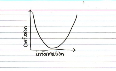
All-Criminal NFL Offensive Lineup
crime
,
football
,
nfl
No comments
I ran across this absolutely hilarious visualization on the Guardian Flickr group.I love how the players have on the stripes. The title is priceless: "Talented, Dangerous and Idiotic."

October 9, 2009
Afghanistan Troop Deployments
afghanistan
,
barchart
,
bubblechart
,
contribution
,
davidmcandless
,
flickr
,
Guardian
,
military
,
war
No comments
My favorite bubble man uploaded another doozy. This time he's displaying troop deployments to Afghanistan.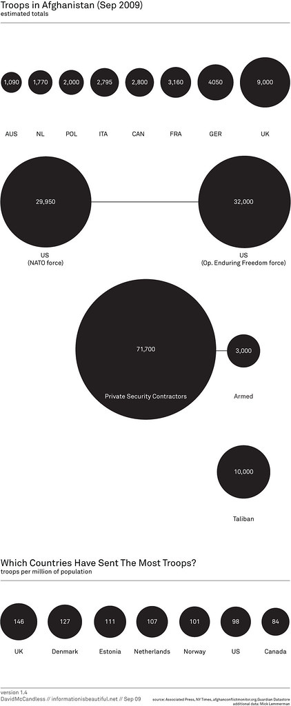
The first message that the bubbles are trying to communicate is simply the number of troops deployed.
I can see why he has the bubbles across the top; they're in a neat ascending order, but then the US is show below all of the other countries? Why aren't they all arranged together?
Also, what is the purpose of having all of the other types of "troops" on the chart? Finally, there is one pretty big issue with the data; where are all of the other countries that have sent troops?
Bubbles are a poor method of showing relative size. A simple bar chart works much better. Unlike the author, I have included "all other" countries.

The second message, which I cannot make heads or tails of, is the number of troops per million of the population. What is the purpose of this data and what insight can you possibly gain from it?
When I first saw this chart, I immediately tried to connect the bubbles at the top to the bubbles at the bottom, but it's impossible.
The title of the second chart is "Which countries have sent the most troops?" Ok, one more time, how could anyone possibly answer that question based on the troops per million of the population?
When I saw the question, I immediately though of a bar chart showing the percent of the total troops that each country has sent. I created this visualization below and added color to emphasize those countries that have more skin in the game.
From my visualization, you can see that the US has sent about 47% of the troops. In the bubble chart, I see the number 98. Which one do you think answers the question more appropriately?

If you really want to get sick, check out the rest of the author's bubble charts on this topic. I don't get the fascination with the bubbles...
* Data courtesy of The Guardian DataBlog
October 8, 2009
Auto Sales & Unemployment
cars
,
cashforclunkers
,
danmurray
,
facebook
,
FRED
,
government
,
iraq
,
politics
,
presidentbush
,
tomprice
,
unemployment
,
wallstreetjournal
,
war
,
WSJ
3 comments
Before you judge my political views, let me first say that I think ALL politicians are frauds and that few of them represent anyone except the special interest groups that support their campaigns.I received the following message from Congressman Tom Price on Monday (10/5/09): "Last week we received more bad news in the job market. 263,000 jobs were lost during the month of September and the unemployment rate is now at 9.8%. The verdict is in and the economic policies of President Obama and Democrats in Congress have become a massive failure."
I understand Congressman Price's position, but it bothers me that he has taken the lead of talk show hosts to use scare tactics to spread his message. I would, for once, like to hear his opinion. His entire rant can be found here.
In addition, my friend Dan Murray posted a link to a Wall Street Journal article on his Facebook page that essentially said the "Cash For Clunkers" program failed.
I wanted to see if I could draw any sort of correlation, or at least possibly provide the specific details.
Here is my visualization:

First, to Congressman Price's accusations. The rise in unemployment started around January 2007. Obviously President Obama was not yet in office. So what happened that could have sparked the sudden rise? This is precisely when President Bush announced the surge in troops for the Iraq War during his State of the Union address. I can't say that was the exact cause, but I do find the timing neatly coincidental.
Now, onto the WSJ's claims that Cash for Clunkers failed to help the economy. Yes, there was a huge decline in new car sales in September, but this is not unprecedented if you look at historical sales.
Back in October 2001, the "0% interest" programs were introduced by the Big 3. This program was a HUGE boost to sales (35% over prior month), but it resulted in a decline of 18% in November and 25% over the following two months.
The Big 3 introduced the "Employee Pricing" programs in July 2005. This program was another HUGE "success" (sales increased 15% over prior month and 22% over May), but it resulted in a decline of 18% in August, 20% through September, and 28% through October.
The Cash For Clunkers program (August 2009), resulted in a 4.4M units increase in sales over June or 45%. That increase has never been approached in the last 10 years. The results, however, was a decreased in sales in September of 4.9M units or 35%. If this program follows the behavior of the previous two, we should see a decrease of an additional ~7% over the next 1-2 months at which time sales should stabilize.
My take: the auto industry waited too long to offer another teaser program.
Now, I want to take a leap to connect the two (auto sales and unemployment). A significant number of people were employed by the Big 3, so when auto sales take a nose dive, you would have to expect that they would begin laying off workers, which would ultimately have a direct impact on the national unemployment rate.
Back to President Bush. I cannot directly correlate his Address to these figures, but the timing sure is suspect.
* All data courtesy of FRED.
October 7, 2009
Cell Phone Usage
I received my cell phone bill from AT&T today and noticed that there are usage reports on the site. I typically don't look at these because I really don't care about my usage, but for some reason I decided to look at them.Here is how AT&T presents the data:

Icky, icky! Where are the dates? I can't tell the difference between some of the bars. Why are long distance and roaming included? You'd never be able to see them anyway. Why not use a simple line graph?

Come on AT&T, get your act together. Although I suspect these were created by a developer that only knows how to use the default graphs in Excel and thought "Oh, I can make these so pretty with the 3D bar charts."
Why the big spike in September? Conference calls...boooooo!
October 5, 2009
Follow up: Evolution of the Ozone Hole
bubblechart
,
davidmcandless
,
flickr
,
Guardian
,
ozone
,
pollution
,
tableau
1 comment
You know, I really love it when people discuss issues and share solutions. Joe Mako and I had a great discussion on my last two posts regarding the most effective visual representation of the ozone hole over time. Joe create an OUTSTANDING representation of the data using floating bars.
Joe created this visual using Tableau. I had not seen anyone do this in Tableau before. I had thought about doing stacked bars and making the lower of the two bars white, but this is way better. Joe has also provided the Tableau Packaged Workbook. I have posted this on a Google Group that I just created.
Thanks Joe! Excellent work!
Size Evolution of the Ozone Hole
bubblechart
,
davidmcandless
,
flickr
,
Guardian
,
ozone
,
pollution
2 comments
Joe Mako left a comment on my previous post critiquing the use of bubbles to represent the size evolution of the ozone hole. I agree with what Joe said: "a bar or line would have been better." The only problem with using a line is that there is not a consistent time measure (1996 throws it off...yes I know, a minor issue).So I recreated the data with two bar charts. (1) Representing the actual values and (2) the change from the previous measure. I like (1) better. How about you?

October 4, 2009
Quick, help save the bubbles
bubblechart
,
davidmcandless
,
flickr
,
Guardian
,
ozone
,
pollution
1 comment
Someone, please help explain this to me. There is no legend to reference the colors, the data, nothing. Why 1996 instead of 1995? What do the numbers represent? What do the colors signify? Why is the last bubble green instead of hot pink?
If the dark grey in the middle four circles represents the ozone hole and the total size of the circle is earth (which I can only assume), then I think it's a poor representation of the problem. Is the ozone layer really that huge? No, it's not.
Please someone, save me! No wait, don't save me, save the bubbles!

October 1, 2009
Pop the Afghanistan War Bubbles
afghanistan
,
barchart
,
bubblechart
,
davidmcandless
,
flickr
,
Guardian
,
military
,
war
No comments
Flowing Data had a post today listing resources to find data. One of these sources was the Guardian Datablog. The image below caught my eye. It's from a Flickr pool for the Guardian datablog.

The author's says "Latest military casualty figures in proportion to each force's troop numbers. I think this gives a clearer sense of which armies are taking the most flak."
Ok, I get the intent, but why the bubbles? Doesn't a simple bar chart provide a much simpler method for communicating the data?

Here's what I see in the data: the US provides the bulk of the forces, but loses the fewest casualties as a percentage of the total force. It's known across the world that the US military is one of the most prepared, so this shouldn't surprise anyone. I don't see any enlightening information in the author's analysis, other than simply giving us a pretty report.
September 26, 2009
The Big 3
atlantabraves
,
baseball
,
bobbycox
,
gregmaddux
,
johnsmoltz
,
pitching
,
stats
,
tomglavine
2 comments
My friend Dan Murray left a comment on my previous post about Bobby Cox's retirement. Dan brought up an interesting point that Maddux, Smoltz and Glavine might be tougher for the Braves to replace than Cox. I thought I'd look into it.Some notes to the data:
- This data covers 1991-2008 (the entire period that they pitched for the Braves). During this time Smoltz was a Brave for all 18 years, Maddux was with the Braves from 1993-2003 and Glavine from 1991-2002.
- Smoltz was the Braves closer for the 2nd half of 2001 through the 2004.

I find all of this quite impressive. Sure, they made a lot more money, but they backed it up. Their ERA was 21% better than the rest of the team, they won 9% more games, clearly had a better ERA year after year, and more than pitched their fair share of innings.
In fact, the most impressive stat to me is that between 1993-1998 the Big 3 threw 50.3% of the total innings for the Braves. Three pitchers throwing that many innings is simply incredible. I can't imagine there are too many, if any, teams in the last 50+ years that could even come close to that.
September 24, 2009
The Bobby Cox Era
Long-time Braves manager, Bobby Cox, announced his retirement today effective at the end of the 2010 season. Bobby took over the managerial duties for the Braves in the middle of the 1990 season. The next season started a string of 14 consecutive Division titles, a record likely to never be approached again.The Braves were dominant in all facets of the game compared to the rest of Major League Baseball. He's going to be tough to replace.

September 19, 2009
Katrina Contracts
government
,
halliburton
,
hurricane
,
katrina
,
spending
,
waste
2 comments
I read a story recently about Halliburton and the incredible number of contracts and money they scored from Hurricane Katrina. Oh by the way, George Bush was President, Dick Cheney was VP and Cheney was CEO of Halliburton from 1995-2000. That led me to finding how Katrina contracts were being awarded by government Department. It's been tough to identify just which contracts were awarded to Halliburton since most of them are to subsidiaries. I'm working to gather all of those. The data was gathered from the Federal Procurement Data System (FPDS).
This is a very simple analysis, well not really much analysis at all, but in this instance, given the amount of information I want to display, I actually think the pie chart works better. Thoughts?


September 16, 2009
Why was Dave Stewart picked on?
1988
,
balks
,
baseball
,
davestewart
,
oaklandathletics
,
stats
,
tableau
,
trends
2 comments
I was building out the pitching stats of baseball database I downloaded from Baseball Databank and happened to look at a trend of balks. I noticed this HUGE spike in the number of balks in 1988. I figured there had to be something wrong with the data, so I turned to Google. I found this terrific blog post that explains exactly what happened in 1988. THE RULES WERE CHANGED!
So what happened? In 1988, the Oakland Athletics led the majors with 76 balks or just over 8% of the total. 1988 accounted for 37% of the A's balks from 1985-2008...that's ridiculous!
Dave Stewart set a record with 16 balks. Order was restored in 1989 and Dave Stewart had zero balks. I do remember Dave Stewart going to the plate quickly, so maybe it was the change in the rule that says "the pitcher must come to a single complete and discernible stop" that got him.

September 11, 2009
Two ways to look at job losses
Time Magazine blogger Justin Fox took a wonderful jab at a chart that Nancy Pelosi's office posted about the current recession. The Pelosi chart below makes it look like the sky is falling, but it looks at the data in terms of total job losses.
Justin did a great job of creating a different, perhaps more realistic, comparison of the current recession to past recessions by looking at job losses as a percent decline.

What an incredible difference if you just look at the data slightly differently.
It's kind of scary that there isn't someone in Pelosi's office that would know to at least consider looking at the data as a percent decline. This spins the data in a more positive light, or maybe I should say, a less negative light.
Read Justin's full post here.
September 10, 2009
Is pitching still more important than hitting?
I'm a big fan of the Atlanta Braves. Last night their TV broadcasters, were having a discussion about which league is stronger, the American League or the National League. The age old adage is that pitching wins, but Joe Simpson gave a pretty strong argument in favor of hitting and thus, that the American League is the "stronger" league.Interleague play, which started in 1997, is a good place to determine how the leagues match up.

In 2004, they were separated by only one game, but since then, the American League has been winning by wide margins. This fact, in and of itself, does not support Joe Simpson's argument.
I extend the research a bit further by comparing ERA and batting average. I used Tableau to analyze the data.

On the top, it's clear that the American League has had a higher ERA and a higher batting average every year since 1985. I don't think it's a stretch then to say these charts in conjunction with the interleague comparison indicate that hitting is more important to winning than ERA, and Joe's argument is now supported.
The scatter plot on the bottom left again shows that the American League typically has a higher ERA and batting average. This is really just the two line graphs compared to each other.
Finally, the scatter plot on the bottom right extends the first scatter plot to include the league that won the World Series.
I find it interesting that when the American League wins the World Series, they win it because of hitting, whereas when the National League wins the World Series it's due to pitching.
Maybe this is all related to the DH. Hmmm....
September 8, 2009
Inflated Salaries
3D
,
barchart
,
baseball
,
baseballalmanac
,
stats
,
strike
No comments
Stats, stats, stats. That's what baseball is all about. I found a great site, baseball-almanac.com, that provides just about every stat imaginable. I have a baseball database as well, so I like to find sites like this and compare them to visualizations I build on my own. The chart below references salary data over five-year periods.
Source: Baseball Almanac
There are some fundamental flaws with this chart:
1) The 3D bars are unnecessary and make it very difficult to determine an approximate value for the bar.
2) The color choice would makes it virtually unreadable by those that are color blind.
3) The data is misleading. What good is a chart if the data is misrepresented? The stacked bar chart artificially inflates the average salary. It is increased by the amount of the minimum salary, whereas they are separate measures. I moused over the average salary bar for 2005; the value is $2.6M, but without mousing over the bar, I would have assumed the average salary was nearer $3M.
4) The header indicates "Salary Data Appears in Five-Year Increments." What does that mean? Is it a five-year average, is it every fifth year?
5) The chart leads you to believe that the average salary has increased every year since 1970, but it hasn't. Below is the average salary by year from 1980-2008. Visualizing this as a line chart reveals that salaries indeed did NOT increase every year.

Oh, by the way, salaries sure have escalated dramatically since the 1994 Players Association Strike. So much for revenue-sharing controlling spiraling salaries.
September 7, 2009
Bubbles Bubbles Everywhere
aoscott
,
barchart
,
bubblechart
,
contribution
,
internet
,
media
,
newyorktimes
,
piechart
,
stats
,
stephenfew
,
tableau
,
television
4 comments
The New York Times ran an article written by A.O. Scott back in November. The purpose is not to critique the article, but rather the, gasp, bubble chart used to rank media consumption hours.
I'm a big fan of Stephen Few and have learned a lot from Stephen and his books about effective visual design. Stephen point out that "Visual perception in humans has not evolved to support the comparison of 2-D areas, except as rough approximations that are far from accurate."
As soon as I saw this ranked bubble chart, I immediately began exploring other, more effective display mediums. Here are some examples.
I wanted to start by trying to find a way to use the bubble charts. The only method I could employ was to add color to the bubble charts, but I don't gain much at all.

Of course, the simplest way to rank data is through a simple bar chart. The first example is as intuitive as it gets; it's very easy to compare the relative size of the bars. The only purpose of this graph is to emphasize the rank.

I took this a step further. When reviewing Scott's bubble chart, I had the impression that he was emphasizing the percentage of time that we spend in each of the different medium. That led me to a bar chart that shows the contribution to the total. It's the same graphic as the ranking chart above, but this time I intentionally labelled the bars to emphasize the contribution of each activity.

I'll conclude with one of the least effective displays, the dreaded pie chart, but I think one of the pie charts is actually a bit effective. The first pie chart displays every category, which makes it impossible to compare the sizes and has way too much information.

I decided to group all but the top two categories into an "other" category to simplify the pie chart and I also ensured that they were ranked by contribution as you made your way around the pie.

Which display do you like best? Which display is most effective? My vote is for the bar chart displaying the contribution to the total.
September 3, 2009
A correlation justified
chrispereira
,
correlation
,
economy
,
scatterplot
,
tableau
,
trends
,
videogames
No comments
I read an article by Chris Pereira the other day that made an attempt to link the recession to video game usage. In fact, the subtitle is: "With economy troubles, gamers are buying a larger percentage of used games." While there is a link between video game usage and the current recession, this a pretty bold statement given the analysis presented (which Chris built on from a Time magazine article). I'll show you my evidence that backs up Chris in a bit.The first chart presented by Chris (via Nielsen) analyzes video game usage trends over the last four years. I don't think this chart proves anything more than the fact that video game usage has increased year over year for the last four years...that's it. You simply can't say that the upswing in time spent playing video games in 2009 is due to the recession.

The second chart tries to make the same correlation, but again, I see the same type of trend from 2007-2009 that you see in the first chart. People are just playing more variety of games...that's all. There is absolutely no way from this chart to draw a conclusion that used video game sales are in any way related to the recession.

Ok, so how can I say that it's just a matter of fact observation? Look at this chart (created with Tableau). If you look at the four year trend of hours played, there is a continuous increase is hours played. You might say "I don't see this in 2009." But in each year in May, you see a big decrease in hours played. As Chris says in his evaluation: "May has traditionally seen a drop-off each year (blame the improving weather)." I can see the reasoning there.
You can also see that from 2007-2009, a similar trend can be derived from used game sales.

I tried to find a correlation between hours played and used game sales (since the article says both are related to the recession), but the facts don't support this.

I decided to look at other factors that could correlate the recession to video game hours played to help support Chris' argument. We have been hearing quite a bit regarding the housing crisis and it's impact on the economy. I gathered economic data from FRED and was able to demonstrate that a prolonged decrease in housing starts does indeed indicate that a recession is coming.

My next step was to identify correlations between housing starts and the increase in video game hours played. Based on this analysis, I believe that a much stronger argument can be made the an increase in hours played is a possible indication that a recession is taking place. I set the "hours played" scale to match the Nielsen Data.

I find the color-coding of the years very useful and, to me, the relationship can be clearly seen. As housing starts decrease, video game hours player per week decrease. Since the years are color-coded, you can tie them back to the housing starts/recession trend chart above.
What's the bottom line? I agree with Chris that there is a relationship between video game hours played and the recession, but the way to get there is much more conclusive if you use economic indicators to support the theory.
Subscribe to:
Posts
(
Atom
)


