June 30, 2015
Alteryx + Tableau: Visualising a Simpler RunKeeper Training Plan
Alteryx
,
calendar
,
dashboard
,
elevation
,
fitness
,
map
,
marathon
,
routes
,
RunKeeper
,
running
,
tableau
,
workflow
7 comments

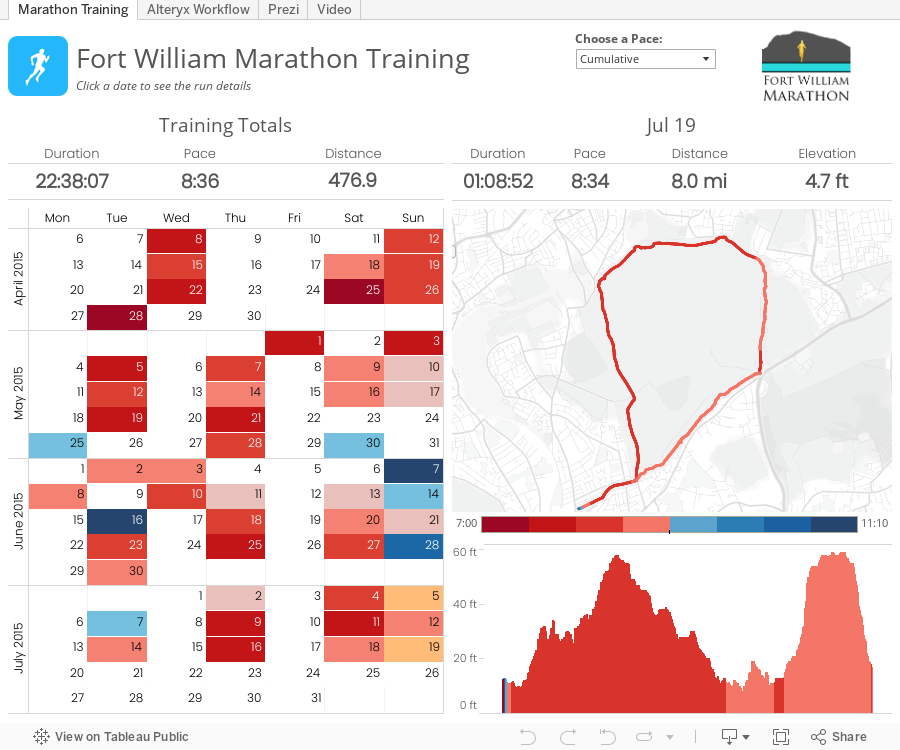
Last night I had the honor of presenting at the London Quantified Self Meetup about a project I've been working on to improve the training plan interface for RunKeeper. The session wasn't recorded, so I've recorded it again this morning, which also allows me to go into more detail.
The basic reasons behind this project were twofold:
Everything is embedded within the Tableau workbook:
The basic reasons behind this project were twofold:
- I was learning Alteryx and wanted a use case to apply what I was learning.
- I'm training for my first marathon and wanted a better way to see all of my runs in one place.
June 29, 2015
Makeover Monday: A Day in the Life
Americans
,
bullet graph
,
chart junk
,
Emma Whyte
,
infographic
,
Information Lab
,
Makeover Monday
,
wall street journal
,
WSJ
No comments

I found an infographic on Twitter this week from the Wall Street Journal that described the average American's day.
What Americans did with their time last year: more work, more sleep, more TV, less school http://t.co/MhLZkOBBdU pic.twitter.com/TIJB6FR4y1
— Nick Timiraos (@NickTimiraos) June 25, 2015
There are several problems with this infographic:
- It's really hard to see easily what American's spend most and least of their time doing
- It's difficult to compare the years - the colour encoding helps, but you have to work out the actual change in your head
- Your eyes have to look around a lot to get the whole picture
- There's a lot of reading involved
- The squares equal one minute - but it's hard to compare values using area I had a go at making an alternative.
I have to admit I couldn't find the same data set that the Wall Street Journal used. I downloaded this one from the Bureau of Labor Stats (hence my numbers don't exactly match).
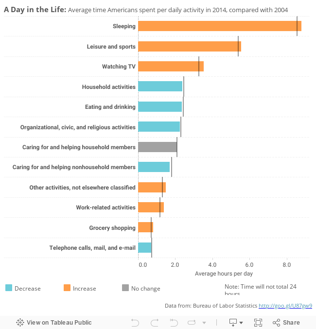
In this version I have:
- Changed the infographic to a bullet chart - the bars show the 2014 values and the reference line 2004 values.
- Sorted the bars by the 2014 value
- Coloured the bars by the change, to let you easily spot increases / decreases
- Added tool-tips to show the actual change (rather than doing the Math in your head)
You can download my viz from Tableau Public here.
Would you do anything differently?
June 25, 2015
Tableau Tip: How to Create DNA Charts
barbell
,
Chris Love
,
connected
,
Data School
,
difference
,
DNA
,
dot plot
,
Information Lab
,
Laszlo Zsom
,
learning
,
lines
,
magnitude
,
tableau
,
teaching
,
tip
,
tricks
,
variance
7 comments

The Data School launched this week and on the consultants' second day, we brought them into an all day training class with the rest of the Information Lab team. One of the courses we taught was advanced visualisations. The reason we run these internal training classes is because we have a core belief in continuous learning.
As part of this exercise, we were building a dot plot and Laszlo Zsom asked how to connect two dots on the same row. I hadn't ever done it before, so I used a Gantt chart to connect them. Then Chris Love suggested using lines.
In this week's tip (two days late as it is), I demonstrate both of these methods. Click on the image below to enjoy the video.
June 22, 2015
Makeover Monday: Historical Rainfall in 3 of Australia's Largest Cities
Australia
,
cumulative
,
datablog
,
Guardian
,
heatmap
,
line chart
,
radial heatmap
,
rainfall
,
trend
A few weeks ago, the Guardian Datablog published this series of circular heatmaps to represent monthly rainfall across a 20 year period in three Australian cities.


 There are several problems with using radial heatmaps:
In this version, I have:
You can download the viz from Tableau Public here. What would you do differently? What could be improved in my version?
- They are not too dissimilar from geographical heatmaps in that they tend to skew towards the segments that cover the most surface area, in this case 2015.
- It’s difficult to compare across years, across months, and across months and years.
- Your eyes are drawn all over the place.
- There’s very little sense for trends.
- Like a pie chart, you’re trying to compare the angles of the slices, which is nearly impossible.
- The hover does not work once you get to the smaller segments.
- The labels are quite hard to read.
- When I hover, all I get is the value. This means that I have to look back to the labels to see which month and year it refers to.
- Taken the radial heatmap and flattened it out. I liked their idea of using a heatmap, but needed it to be easier to read.
- Added two trend charts: (1) cumulative rainfall, (2) monthly rainfall
- Added a selector for the city
- Added a highlight action on the year
- Included informative tooltips
- Improved the title
You can download the viz from Tableau Public here. What would you do differently? What could be improved in my version?
June 17, 2015
Tableau Tip Tuesday: Showing an Axis Above a Chart
A very common question and feature request I see on the Tableau Forums is to show the axis above a chart rather than below, as Tableau does by default.

When I was working on solving this, I started by looking at the XML for a workbook and there is a bit of code that controls whether an axis displays. I built a dual-axis chart to see if I could change the display in the code.

In the <style> section, note the value=‘false’ setting. This is what is hiding the axis. I changed only the top axis by setting it to ‘true', but when I opened the workbook again, both axes were displayed. Back to the drawing board I went.
Here are the steps to follow to display the axis above the bar chart and not below (sort of):
Step 1: Create a bar chart.

Step 2: Duplicate the measure that is shown in the chart by right-clicking on the measure in the Measures list and choosing Duplicate.

Step 3: Drag the duplicated measure onto the secondary axis.

You should now have a chart that looks like this:

Step 4: Change the mark type for both measures to Bar.

Step 5: Remove the Measure Names field from the Color shelf. This isn’t required, but you really don’t need to have two colors for the same measure.

Step 6: Right-click on the bottom axis and choose Format. Change the Font to white and set the Ticks to ‘None’. This doesn’t hide the axis (hence the reason I said ’sort of’ above), but it will give the appearance that the axis isn’t there.

Step 7: Double click on each of the axes and remove the titles. This isn’t required, but it makes the axis narrower.

That’s it! While this isn’t a perfect solution, it works. Also, be sure to clean up the tooltips since they will show the measure twice.
You can download the workbook used to create this viz here.
When I was working on solving this, I started by looking at the XML for a workbook and there is a bit of code that controls whether an axis displays. I built a dual-axis chart to see if I could change the display in the code.
In the <style> section, note the value=‘false’ setting. This is what is hiding the axis. I changed only the top axis by setting it to ‘true', but when I opened the workbook again, both axes were displayed. Back to the drawing board I went.
Here are the steps to follow to display the axis above the bar chart and not below (sort of):
Step 1: Create a bar chart.
Step 2: Duplicate the measure that is shown in the chart by right-clicking on the measure in the Measures list and choosing Duplicate.
Step 3: Drag the duplicated measure onto the secondary axis.
You should now have a chart that looks like this:
Step 4: Change the mark type for both measures to Bar.
Step 5: Remove the Measure Names field from the Color shelf. This isn’t required, but you really don’t need to have two colors for the same measure.
Step 6: Right-click on the bottom axis and choose Format. Change the Font to white and set the Ticks to ‘None’. This doesn’t hide the axis (hence the reason I said ’sort of’ above), but it will give the appearance that the axis isn’t there.
Note: The reason that you have to duplicate the measure has to do with how formatting works. If I used the same measure again for the secondary axis (i.e., Sales in this case), then when I format Sales, it applies to both axes. However, when you duplicate the field, Tableau treats it like a totally separate measure with its own formatting.
Step 7: Double click on each of the axes and remove the titles. This isn’t required, but it makes the axis narrower.
That’s it! While this isn’t a perfect solution, it works. Also, be sure to clean up the tooltips since they will show the measure twice.
You can download the workbook used to create this viz here.
June 4, 2015
Dear Data Two | Week 7: Complaints
analogue
,
complaints
,
Dear Data Two
,
frustration
,
lollipop
,
radar graph
,
story points
No comments

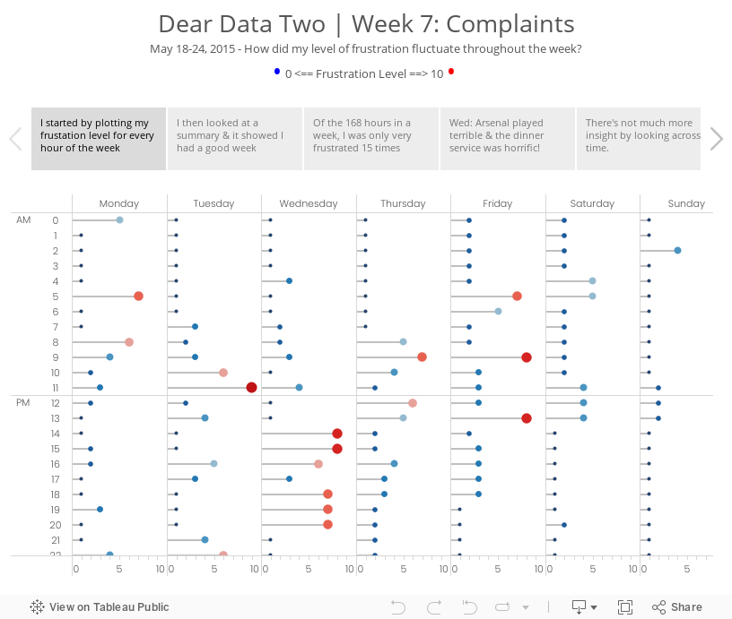
During week 7 of Dear Data Two, I recorded my overall frustation level for each hour of each day of the week. I was at the Alteryx Inspire conference most of the week, so I had to keep data collection simple. I used a scale of 0-10, with zero being no frustration and ten being extremely frustrated.
For week 3 Jeffrey sent me a donut chart by accident (so he says…) and while I was thinking about my ideas for this week, I started connecting some data points with lines and ended up with a radar chart. (See the draft version in the story points.) It’s funny how he and I both have gone against what we would consider best practices. What does that mean??
I decided to go with a clock them this week and split the data up between morning and afternoon. From there, I plotted each day going outward from the centre for that hour. For example, at 12am, Monday is closest to the middle and Sunday is farthest from the middle. This helped me see which hours were cumulatively the most frustrating for me for the week. Each dot is separated by the frustration level. If the frustration level was three, then the dot would be 6mm from the previous dot. I then sized the dots by the frustration level so as to double encode the values.
It’s no surprise that my sleeping hours were generally the least frustrating, except for 5am when jetlag kicked in. Overall, 9am was my worst hour in the morning and 1pm was the worst in the afternoon. The story points viz below goes into more of the explanations.
June 2, 2015
Tableau Tip Tuesday: Sizing Worksheets & Dashboards to Fit Perfectly in Story Points
dashboard
,
fit
,
size
,
story points
,
tableau
,
tip
,
Tuesday
,
worksheet
4 comments

For this week's Tableau Tip Tuesday, I demonstrate something that I learned earlier this week that has been a long time frustration for me...getting worksheets and dashboards to fit perfectly in Story Points.
June 1, 2015
Makeover Monday: China Is Poised to Surpass the Americas as Apple's Largest Market
apple
,
Chart of the Day
,
emphasis
,
line chart
,
Makeover Monday
,
revenue
,
stacked bar chart
,
storytelling with data
No comments

I am not a very big fan of stacked bar charts, particularly those that try to represent change over time, like this week’s makeover candidate from Chart of the Day.

The article is trying to emphasize the change in the share of Apple revenue in China compared to the Americas. Here are some problems I have with this chart:
For the makeover, I’m going back to some of the things I learned in Cole Nussbuamer’s fantastic course about emphasising the data that you want people to pay attention to.
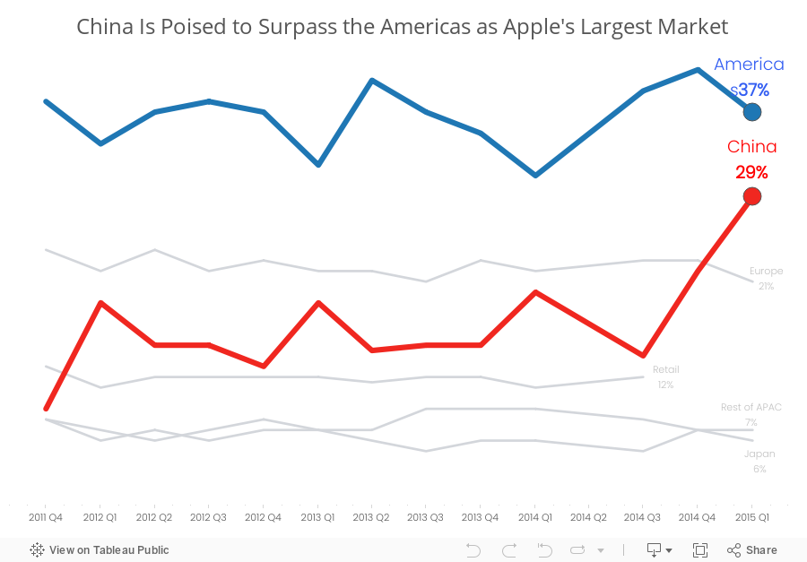
Here’s what I’ve done differently:
Which version do you prefer? What would you do differently? There are so many ways to redesign charts and no single way is 100% correct.
- It’s very hard to compare stacks in a bar chart over time because each stack is influenced by those stacks below it.
- The title of the article and the chart don’t match. The article says China vs. the US, but the chart is China vs. the Americas.
- There is not enough emphasis on the comparison. The rest of the regions should fall to the background.
- I don’t like the legend above the chart in this case because I’m constantly having to go back and forth.
For the makeover, I’m going back to some of the things I learned in Cole Nussbuamer’s fantastic course about emphasising the data that you want people to pay attention to.
Here’s what I’ve done differently:
- I changed the title to reflect the purpose of the story.
- I changed the chart to a line chart to make it easier to see the trends for each region.
- I’m only emphasising the Americas and China. The rest of the regions are in a light grey.
- I’ve added annotations to make it easier for the reader to see the values.
- I removed the color legend as it’s not necessary since I’ve labeled the end of each line.
Which version do you prefer? What would you do differently? There are so many ways to redesign charts and no single way is 100% correct.
Subscribe to:
Posts
(
Atom
)


