December 27, 2017
Workout Wednesday: UK's Favorite Christmas Chocolates
Week 52 of Workout Wednesday is upon us. I do have one more challenge ready for next week, then Emma and I plan to turn the reins over to someone else (announcement coming). We're both kind of out of ideas and inspiration; some fresh blood will help keep this going and make it more valuable to the Community.This week, Emma set out a challenge for us to viz the UK's favorite Christmas chocolates in a single sheet.
- Remake the dashboard in one sheet / view.
- Copy the colours - the favourite chocolate should be orange, the least favourite dark grey, and the rest light grey. You CANNOT use manual colours based on the chocolate name - it has to be based on the ranking of the chocolates in each brand.
- Label the bars with the chocolate name and the percent of people who picked it as their favourite.
- Match all the titles, tooltips and labelling exactly
Pretty simple set of requirements. For requirement 2, I came up with a different solution because there are two least favorites for Cadbury Roses. I chose to color both of the least favorites the dark grey whereas Emma only colored the last bar. I think mine is more accurate.
December 24, 2017
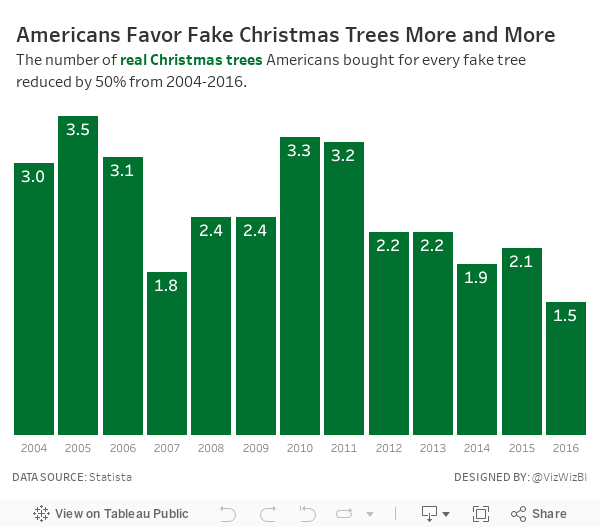
Makeover Monday: Americans Favor Fake Christmas Trees More and More
Here's my challenge for everyone that participates...Get one new person to participate. That's it! Simple! Do it! Everyone will benefit.
For week 52, Eva chose a simple viz from Statista about real vs. fake Christmas tree purchases by Americans. We switched to fake about eight or nine years ago and haven't regretted it one bit. Every year we think about that one tree we have saved.

What works well?
- Nice interactivity on the tooltips
- Colors are easy to distinguish
- The tops of the stacked bars allow you to see the overall trend of all tree purchases
What could be improved?
- Including all of the labels on the bar is distracting
- Remove the shadows from the text
- Use colors that are associated better with trees (like green)
- Use a more impactful title and the wrapping is sloppy
- Use a smaller footer that won't take up way so much space
My Goals
- Complete something quick; it's Christmas Eve after all
- Find something interesting in the data
- Use Christmasy colors
- Use a title that tells the user what they're seeing
With those goals in mind, here is my last Makeover Monday for 2017. See you next year!
December 20, 2017
Workout Wednesday: State by State Profit Ratio
For today's challenge, you'll need two data sets: Superstore Sales (the one we always use for WW) and the hex map template.
Requirements
- You are NOT allowed to use blending.
- Create a small multiple hex map showing profit ratio by state.
- Color the hexagons using the Sunrise-Sunset Diverging color palette
- Match the tooltips on all of the charts
- Include a summary heatmap by year and month at the bottom of the map
- Everything in the dashboard needs to be tiled
- Ensure there is no gap between the hex map and the heatmap. The column divider lines must match up.
- Include a sparkline of profit ratio by quarter with labels on the ends of the lines.
- Ensure there is enough space for the labels on the sparkline, but you CANNOT manually fix the axis. Make it dynamic via calculations.
- Clicking on a state should update the sparkline, update the heatmap, and highlight the state in the hex map. Mississippi and West Virginia are good test cases to ensure it's working.
- The dashboard should be 700x700.
That's it! This is one of the easiest challenges this year from me. It's a good way to bring together a lot of what we've learned this year.
Good luck!

December 18, 2017
Makeover Monday: State by State Temperature Change
Antti Lipponen
,
Exasol
,
Ken Black
,
Makeover Monday
,
NOAA
,
starburst
,
table calc
,
temperature
No comments
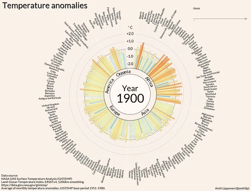
What works well?
- The animation makes the viz pulsate.
- Organizing the countries by region then alphabetically within each region.
- Including space between the regions
- Animating the global temperature over time as the years increment in the viz.
- Great choice of colors
What could be improved?
- The bars all go out from the center including the negatives. I would expect negative bars to go in the opposite direction of the positives.
- Align all of the countries to the same edge. The center alignment doesn't work for me.
My Goals
- Create something similar to the original (e.g., a starburst chart) but do it for each US State.
- Use similar color coding as the original; that is, show the variance to the 1951-1980 average temperature.
- Practice a trellis chart. I struggle with these, especially when using dates, as the table calcs get quite messy.
- Include a 10-year moving average on the sparkline that updates when you hover over a State.
- Start the starburst chart at 12 o'clock.
This all worked great, so I created an aggregated extract and all hell broke loose. When I tried to view my viz, I got this exceedingly unhelpful error message.

Guess what it shows when I click on Show Details...EXACTLY the same message. Dumb. A Google search turns up this KB article which is just as unhelpful. I went through all of the options outlined to resolve the problem and none of them worked. I give up!
So this week, all you get is an image. If you want to interact with it, download the workbook here. Note that this will require you to login to the Exasol database. Anyway, I'm frustrated. I get annoyed when the simplest of things like creating an aggregated extract break EVERYTHING.
December 15, 2017
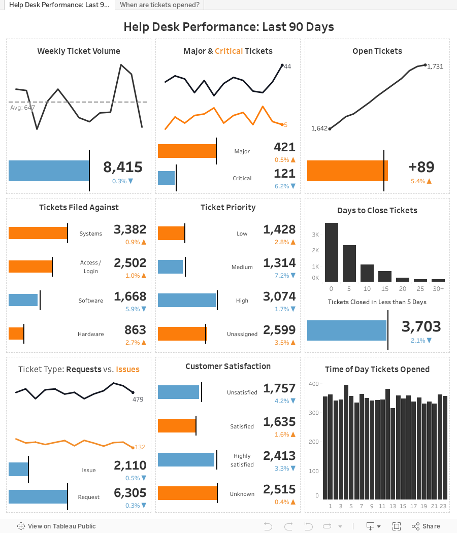
Visualizing IT Help Desk Performance
dashboard
,
example
,
help desk
,
IT
,
KPI
,
performance
,
sample
14 comments
I'm looking for some good examples of Customer Support dashboards (incidents, hours worked, forecasting, etc.).
I did a quick Google search and a search on Tableau Public and didn't find anything that was particularly good or useful (even from the support desk software vendors themselves). So I decided the best way to help was to create an example.
I didn't have any data, but I found this dataset on IBM's Watson Analytics website as a sample. The data set contains 100,000 records yet didn't include a date for when tickets were opened. It included a field for how many days a ticket was open though. What to do?
- Create a new column to generate a random date (to the second) between Jan 1 2014 and Dec 31 2016,
- Added a column for the Closed Date based on the difference between the Open Date and the days the ticket was open.
- Randomly removed the Closed Date for some of the records so that I would have some tickets that were not closed (because that's reality).
BOOM! Sample data set done! You can download it here.
From there, I went back to my Google image search to get an idea for the metrics that were important. Many of the designs has a "card" style layout, so I create a design very similar to the P&L statement I created before.
I posted iterations throughout the day and into the evening and got feedback from Eva and Mark Kernke (of Groupon) as he had a similar need. Based on their feedback, here's where I ended up. This is merely a framework, but shows what a IT help desk performance dashboard COULD look like.
I hope you like it! Oh, bonus, there's a mobile version too. Check it out on your phone.
December 13, 2017
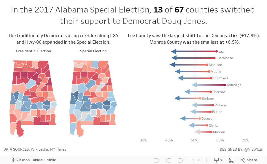
Alabama's Special Election: The 13 Counties that Swung the Vote
Alabama
,
Democrat
,
Donald Trump
,
Doug Jones
,
election
,
map
,
republican
,
Roy Moore
,
special election
,
United States
No comments
To help me understand where Senator Jones won, I downloaded the election results from Wikipedia (for the 2016 Presidential election) and from The New York Times (for the 2017 Special Election).
My Goals
- Understand the change county-by-county across the two elections
- Emphasize the counties that switched from Republican to Democrat
I was struggling with the wording of my dashboard, so I posted it on Convo for feedback from my colleagues. Here's what I posted:

The feedback was fast and furious, just the way I give it to them. Essentially this view wasn't terribly clear, especially the map. Ben Moss basically told me that I created a confusing (a.k.a. crap) viz and suggested using a blue color palette instead to emphasize the change towards the Democrat in each county.

Better, but this could easily mislead the reader into thinking that every county was won by the Democrat. Ravi Mistry suggested grey instead.

Nope! That doesn't work either. So back to the drawing board I went. Ben Jones and Jonni Walker were visiting The Data School today so I asked for their feedback. Ben suggested directional arrows and pointed me to his blog post for creating the arrow shapes I needed.
The next step was to take the slope graph and make it directional arrows, focusing only on those counties that switched from Republican to Democrat. From there, it made sense to split the map into two by election to give side-by-side maps and shade the counties by the party that won and the percentage of the vote.
Lastly, I cleaned up the titles and I was done. Fun exercise and I learned quite a bit about directional arrows and the Democratic stripe that goes straight through the middle of Alabama.
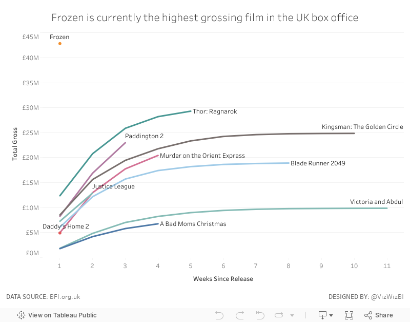
Workout Wednesday: UK Box Office Leaders
Workout Wednesday week 50 looks at a rocket ship chart of films currently showing in UK cinemas. Read Emma's requirements here.The data provided doesn't match the data Emma used, so my results don't match exactly. The main requirements that took a bit of thought were:
- Filtering to only films that are currently showing
- Showing only the top 10 films (which Emma sneakily didn't include as a requirement)
- Creating a tooltip on a title (I'd never seen this done before a Data School interview yesterday)
While these were the trickiest parts, I had an idea for how to approach them pretty quickly. My filtering was done differently than Emma.
Fun challenge and learned something new!!
December 11, 2017
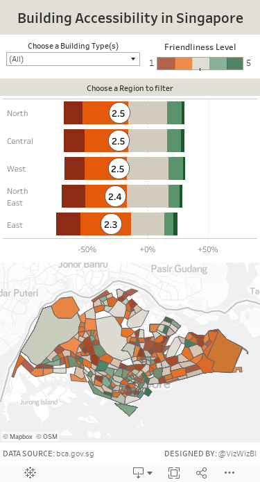
Makeover Monday: Building Accessibility in Singapore
Anyway, Eva posted this viz for us to makeover:

What works well?
- The flashing dots tell you where to click.
- Nice zoom action
- Showing the rating out of five in the pop up provides useful information.
What could be improved?
- Just about everything. The viz is all over the place and incredibly busy.
- The viz needs focus so I know where to look first.
- There are too many colors.
- There are too many symbols.
- The legend is massive! Make it smaller.
My Goals
- When I started exploring the data, I noticed the likert scale value recorded for each building. Therefore, I thought of creating a survey visualisation similar to this one from Steve Wexler.
- Create a map of the average score for each postcode.
- Provide the survey results at the region level and use that to drill down into that region in the map.
- Create a mobile-friendly viz.
With those goals in mind, here is my Makeover Monday week 50.
December 8, 2017
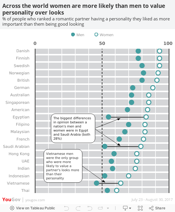
Looks vs. Personality - A Tableau Remake
dot plot
,
looks
,
makeagain
,
personality
,
remake
,
YouGov
No comments
Yesterday I wrote about a great viz from YouGov and in that post I wrote about some of the things I wanted to see improved in the viz. As a way for me to learn, I decided to try to rebuild the viz in Tableau, mostly because I knew it wouldn't be straightforward, and also to address some of the areas for improvement. There were quite a few tricks I had to mix together to make it work and I learned a ton along the way.If you ever need a great way to learn, find a viz you like and rebuild it. You won't regret it.
December 6, 2017
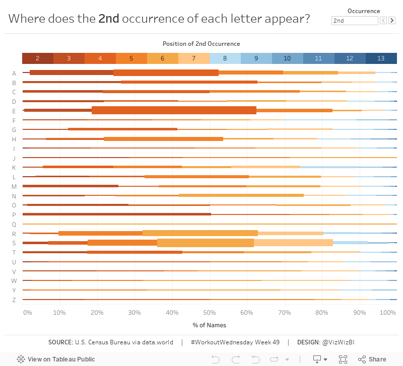
Workout Wednesday: Position of Letter Occurrences in Baby Names
Using this data set of names from the 1990 U.S. census (via data.world), build the same viz that you see below based on this set of requirements:
- The letter down the left is the first letter of the name.
- Determine the % of total times that a letter appears in the nth position of the names. In other words, the letter A appears in the 2nd position in 27 names, which represents 2.1% of names starting with the letter A.
- The viz should NOT display the % of times the letter appears in the first position.
- The % of total display should be sized by the number of names in which the letter appears in each position.
- The scale should show at 10% increments.
- Match the tooltip.
- When you click on a letter/position combination, those names should appear in a table below the chart. The table layout must look like mine.
- Notice how the names in the table are small. This helps them fit better (but not perfectly).
- Match my tooltips on the names table.
- When you deselect a letter/position combination, the table should disappear.
- Create a legend above the chart that reflects the possible positions of the nth occurrence.
- Match the colors on the legend, which should match the colors in the chart.
- When you click on a position in the legend it should highlight that position throughout the chart.
- Match my tooltips on the legend.
- The user must be able to select the nth occurrence they want to view. The options should be 2nd, 3rd or 4th and should look like mine.
- The title must update dynamically to reflect the nth occurrence selected.
I think that's everything. If I missed anything, please let me know. When you're done, be sure to post your solution on Twitter as an image (or gif) with a link to the viz and tag @VizWizBI and @EmmaWhyte. To help you, here's a gif for how it should work and farther down is the Tableau Public version.
Good luck!

December 4, 2017
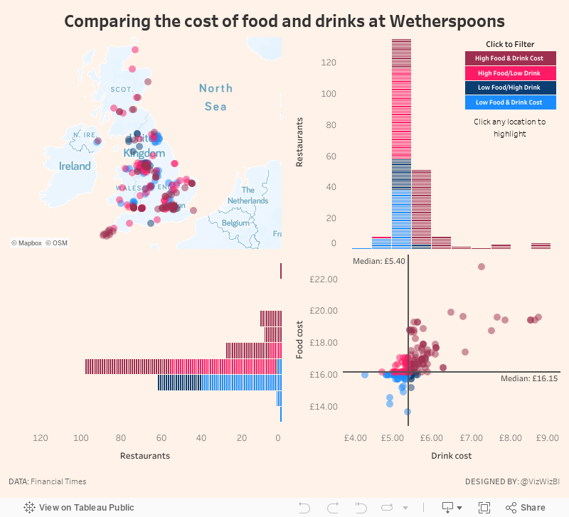
Makeover Monday: Comparing the cost of food and drinks at Wetherspoons
cost
,
drinks
,
food
,
Makeover Monday
,
quadrant chart
,
restaurants
,
scatter plot
,
strip plot
,
Wetherspoons
2 comments
What works well?
- Binning the prices helps cluster the restaurants
- Distinct enough colors
What could be improved?
- The viz is desperately trying to be a map, but failing miserably.
- The dots are so big that they are causing massive overlapping.
- There's no interactivity, so I have no idea which restaurant is which.
- The title doesn't tell me anything.
- What do the dots represent?
My Goals
- Explore the data, particularly focusing on price comparisons.
- Are there regional differences?
- Do large metro areas charge more?
- Many restaurants make a lot of their money from drinks. Does Wetherspoons?
- Elaborate on the price buckets idea from the original. How are the prices distributed?
- Use FT-themed colors (which you can find here)
- Practice highlight actions so that a restaurant can be more easily found on the map
- Create a custom Mapbox map based on what I learned from our webinar last week.
With these goals in mind, here's my creation for Makeover Monday week 49.
November 29, 2017
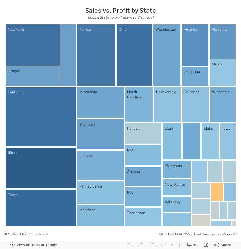
Workout Wednesday: Treemap Drilldown
This week's Workout Wednesday from Emma builds primarily on several previous challenges, primarily:- Week 12: Highlight a Treemap
- Week 17: Product Spread Treemap (Part 1)
- Week 19: Product Spread Treemap (Part 2)
- Week 41: State to City Drilldown
If you haven't done those weeks yet, I would highly encourage you to tackle those first. They build upon each other and make this week's challenge much easier.
As for week 48, Emma asked us to build this treemap:
Go to Emma's blog for the requirements. For me, this was pretty straightforward as I'd done the other challenges. The only part that tripped me up was the sorting of the States. Once I got that figured out, it all fell into place.
Good luck! Here's my viz:
Subscribe to:
Posts
(
Atom
)


