May 31, 2017
Workout Wednesday: Wine Tasting Is Harder Than It Looks
conditional formatting
,
discrete dimension
,
highlight
,
labels
,
squares
,
Workout Wednesday
1 comment
- Dashboard is 800*1000 pixels
- Re-create Emma's dashboard as close as you can get it
- Use a separate sheet for each of the red and white wine heatmaps and scores
- The scores should be formatted so when it is a whole number no decimal places are shown.
- When the score has a half point, it should be shown to 1 decimal place.
- Highlighting the Taster in the reds or whites also highlights them in the other chart
Ok, not too bad! They layout itself was pretty simple. It's just squares. To color them separately, since there is only one Score field, I created two calculations.


I made both of them discrete dimensions and assigned the colors using the color picker to choose the colors from Emma's viz. I then duplicated both of them and assigned alias names to use for the color legend of each chart.

For the score formatting, all I did was create a simple calculation that first summarizes the score, then changes it to a string, then determines if it has a decimal and if so, return it rounded to one decimal and converted to a string, otherwise return it rounded to zero decimals and convert it to a string.

I'm going to have to download Emma's version to see how she did it. We tend to take very different approaches. With that, here's my Workout Wednesday Week 22. Click on the image for the interactive version.
May 29, 2017
Makeover Monday: How Has Internet Access Changed Around the World?
accessibility
,
comparison
,
country
,
highlight
,
internet
,
line chart
,
Makeover Monday
,
map
,
rates
,
time series
,
usage
11 comments
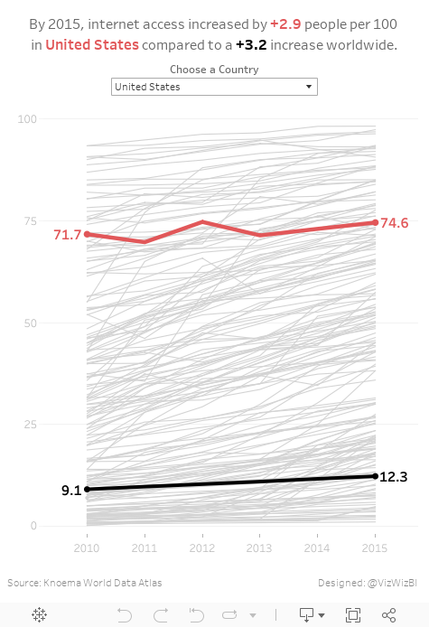
For #MakeoverMonday week 22, Eva picked an interactive map from Knoema that shows internet access over time.
| Click image for the interactive version |
What works well?
- Nice interactivity
- Informative tooltips
- Summary in the subtitle provides some context
- Including a definition of an internet user
- Highlighting on the timeline the block for the year you are seeing
- Providing the context of "per 100 people"
- Per 100 people makes it easy to understand because you can think of them like percentages
What could be improved?
- Include a more engaging title.
- Stoplight colors work ok for me, but not for the color-blind folks.
- The color scale in this case makes anything below 75% look bad. Is that really the case? Isn't providing more access over the years more important?
- Why are years without data included on the timeline?
- Having to flick through the years prevents you from seeing the change over time.
- Smaller countries get lost on filled maps
- Needs more context
What were my goals?
- Create something easy to understand
- Only include 2010-2015 since those were the only reliably consecutive years
- Eliminate countries without values for 2015
- Allow the user to pick a country to spotlight
- Be able to compare that to the worldwide average
- Label the ends of the lines for context
- Include a title with a summary of what happened between 2010 and 2015
With that, here's my Makeover Monday week 22 creation. Enjoy!
May 24, 2017
Workout Wednesday: NCAA Final Score-by-Score
basketball
,
cumulative
,
Gonzaga
,
NCAA
,
North Carolina
,
sports
,
table calc
,
tarheels
,
UNC
,
Workout Wednesday
2 comments
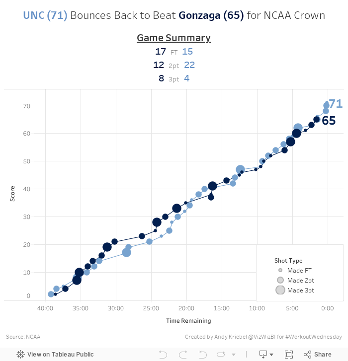
Here's your challenge:
- Final dashboard is 700x700
- Everything must be a single sheet except for the footer
- Match the title, summary below the title, colors, and tooltips
- Each circle represents a score
- Circles are sized by the type of basket (FT, 2Pt, 3pt)
- Score must be cumulative across the game; note that time counts down in basketball
- Tooltips should shows the score at that moment in time and a description of what happened
- UNC color is #6490C6 while the Gonzaga color is #00143F
- Gridlines should be displayed every 5 minutes and every 10 points
- Last basket for each team should be labeled with the cumulative score
Download the data here. I think that's it, but if I missed a requirement, let me know and I'll update this post. Good luck!
May 23, 2017
Tableau Tip Tuesday: Two Methods for Creating Dashed Lines
May 21, 2017
Makeover Monday: How has alcohol consumption in Britain changed since 2005?
A couple weeks ago, BBC Health published this simple viz about the change in drinking habits in the UK between 2015 and 2016.
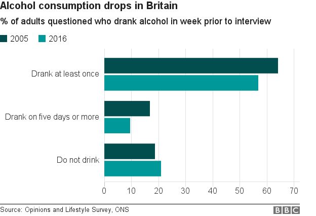
What works well?
- Simple title that tells me what the viz is about
- Subtitle that provides context for the numbers
- Side-by-side bars are a good way of comparing values year-over-year
- Overall clean layout
- Nice fat bars to make comparisons easier
- Colors are distinct enough
What could be improved?
- Include a % symbol on the axis somewhere
- This is a very narrow view of the data, whereas there are many more years available and it's also available by gender.
- It's a pretty boring viz; one that you'll often skim by and not engaged with.
- Label the bars
For my viz, I knew I wanted to use male, female and all people plus all years. This removes a bar chart as an option, preferring lines to show the trends since 2005. In addition, I wanted to show change since 2005 to provide better context that matches the purpose of the title.
I drew inspiration from this European IronViz entry by Ravi Mistry. I like how he is showing the change since the beginning.

Unlike Ravi, though, I decide to only label the line for all persons. I made this decision because labeling the end of each line would have made the viz feel crowded, as the numbers are varying enough to provide room to breathe.
I wanted to test out the Inconsolata font that Nathan Yau uses for his charts over on Flowing Data. If you have it installed on your computer, you'll see my intended display. If not, Tableau Public will server up something, not sure what really.
I wanted to test out the Inconsolata font that Nathan Yau uses for his charts over on Flowing Data. If you have it installed on your computer, you'll see my intended display. If not, Tableau Public will server up something, not sure what really.
Lastly, the colors. I picked them from the ONS dashboard about the UK economy.
Click on the image below for the interactive version.
May 17, 2017
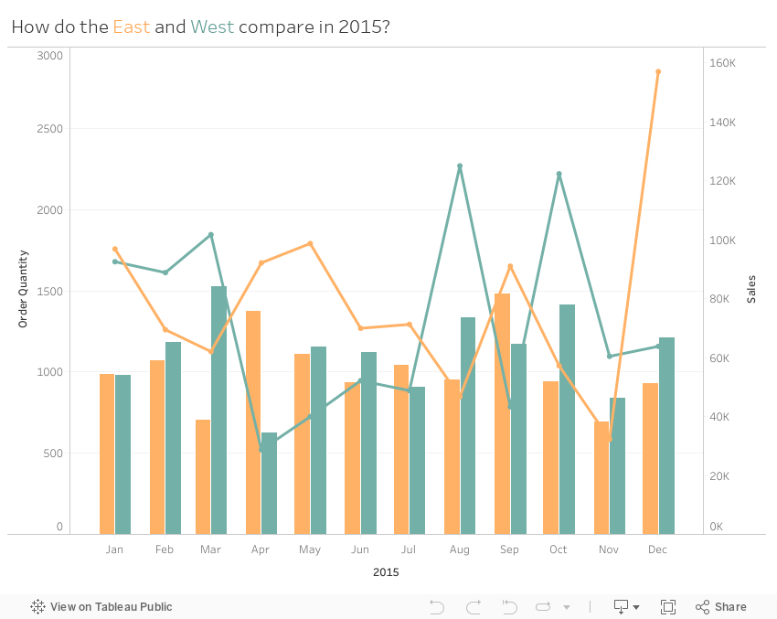
Workout Wednesday: Comparing Regions
Here are the requirements from Emma:
- Dashboard size is 850x650
- Quantity for the East and West regions should display as side-by-side bars
- Sales for the East and West regions should be displayed as lines
- Filtered to 2015 only
- Match the colours and tooltips
- Match the axis labels (abbreviated months)
We didn't find this too difficult. A simple calculation put the bars side-by-side. I'm going to ask Emma to be more harsh. :-)
May 16, 2017
Makeover Monday: Female vs Male Youth Employment in Latin America & Caribbean Countries
caribbean
,
employment
,
female
,
highlight
,
latin america
,
Makeover Monday
,
male
,
slope graph
,
unemployment
,
youth
No comments
Today, I had a few spare minutes and knew that Eva really wanted me to create something with the full data set she created for #VizForSocialGood. Also, I was really surprised at the remarkably few slope graphs this week. This is a great data set for slope graphs, whose main purpose is comparing two points.
So, here is my second Makeover Monday this week. Special thanks to Eva for feedback on my iterations. In this viz, I wanted to compare the unemployment percentage for 15-24 year olds by country. Perfect use case for a slope graph...and my 500th Tableau Public viz!! I wonder who has more??
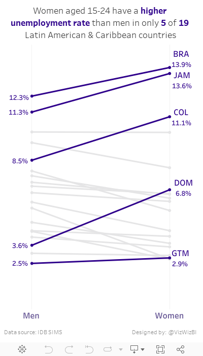
Tableau Tip Tuesday: Using the Modulo Function to Conditionally Format Numbers
conditional formatting
,
Jonathan Hayter
,
labels
,
mark labels
,
modulo
,
number format
,
Tableau Tip Tuesday
5 comments
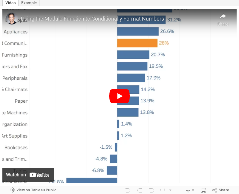
I want to show one decimal point on the value of my mark labels -- except when the digit following the decimal point is zero. So, in the example below, I'd like to make the label for 2013 show as "57%" rather than "57.0%."

Great question! I told Jonathan that I disagree with formatting the numbers differently, but I also wanted to help him find a solution. The answer is two calculations and the modulo function.
In the final version you see below I've included a third calculation to highlight the bars that a zero following the decimal point. This is merely to make it easier for you to see. I didn't show this in the video. Download the workbook to see the solution.
Enjoy!
May 15, 2017
Makeover Monday: What jobs do young people in Latin America hold?
bar chart
,
Cole Nussbaumer
,
donut chart
,
employment
,
jobs
,
latin america
,
Makeover Monday
,
text
,
youth
3 comments
For Makeover Monday, this week is a collaboration with #VizForSocialGood and Inter-American Development Bank. It's always a special day when you can make an impact. Eva and I are also hosting a Brightalk webinar about Makeover Monday at 4pm BST today. Join us if you have a chance.
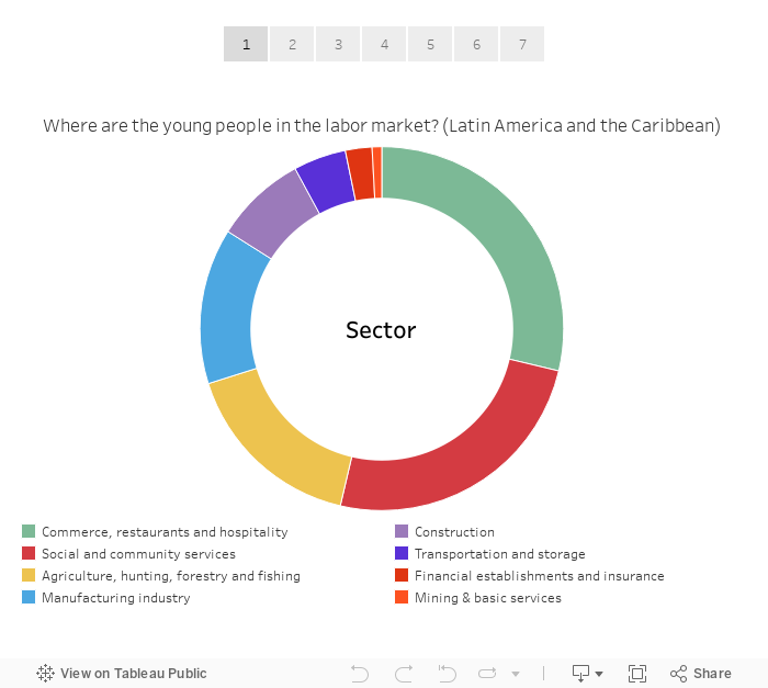
This week's makeover is a donut chart that shows how many youths in Latin America and the Caribbean are employed in different jobs.

What works?
- Using a question for the title
- People immediately understand how to read a donut chart
- Sectors are sorted from largest to smallest
- Nice tooltips
What could be improved?
- Why are mining and basic services combined?
- The middle of the donut is wasted.
- The data doesn't tell an effective story.
- A bar chart would make comparing the sizes easier than a donut chart.
- Too many colors
For my viz, I decided to start by recreating the original in Tableau and then using story points to walk through each step of my makeover. I recalled this great post by Cole Nussbaumer in which she presents alternatives to pie charts. In particular I really like her big number viz, so I did my best to emulate that style. Simple and more effective that the donut chart for me.
May 10, 2017
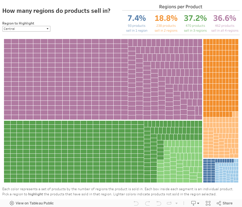
Workout Wednesday: Product Spread Treemap - Part 2
CAUTION: This took me the better part of two days to figure out. Don't let that scare you though; I'm fairly sure there's a much simpler way that I missed because I got so deep into it.
Use this data source to build this treemap. The idea is to be able to count how many regions each product sells in, to highlight the region those products sell in and to include the regions in the tooltip. Here are the requirements (several are repeats from week 17):
- Dashboard needs to be 850x700
- Include a summary table at the top right that shows the number and % of products that sell in each region.
- Match the color-coding and text of the table.
- Create a treemap that segments the products by the number of regions it sells in.
- Match the tooltips in the treemap. NOTE: The tooltip contains a list of the regions that each product sells in.
- Create a parameter that includes the list of regions and it should highlight the products that sell in the selected region.
- Products that do not sell in the selected region should be the same color as the segment, but a lighter shade.
- Match the caption on the treemap.
Remember to post a picture on Twitter with the hashtag #WorkoutWednesday and tag me (@VizWizBI) and Emma (@EmmaWhyte). Good luck!
May 9, 2017
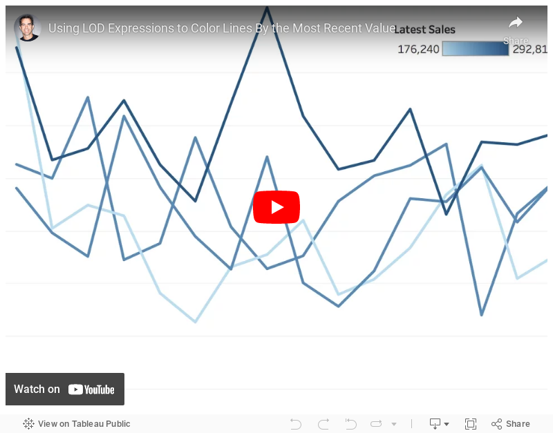
Tableau Tip Tuesday: Using LOD Expressions to Color Lines By the Most Recent Value
date
,
fixed
,
latest
,
level of detail
,
line chart
,
LOD
,
most recent
,
nested
,
Tableau Tip Tuesday
2 comments
How can I color each line on a line chart by the most recent value?This requires a three-pass LOD expression. The key is to realize that Tableau created an aggregate table for each LOD working from the inside out. So
- Tableau calculates the inside LOD first.
- Then the second LOD is calculated based on the results of the first LOD.
- Then the third LOD is calculated based on the results of the second LOD.
Make sense? I hope so! If not, let me know. Enjoy!
May 8, 2017
Makeover Monday: Which cars do the Dutch prefer?
automobile
,
cars
,
Dutch
,
heat map
,
infographic
,
Makeover Monday
,
Netherlands
,
purchase frequency
,
purchasing
,
time series
,
trends
4 comments
The viz to makeover this week is merely a table:

What works?
- The table is ranked starting with the best seller.
- Including only the top 10 gives the table focus.
- Title gives us the overall summary for context.
What could be improved?
- Include a more impactful title
- How does this compare to prior years?
- The table makes me do math in my head to compare the top cars.
- Simply by making the table a bar chart it would become more engaging.
- Some of the models are missing the brand.
The data set is actually pretty extensive: 9.2 million car purchases covering 1952-2017. For my viz, I'm going to focus from 1970-2017. I chose to start with 1970 because that looks like the start of purchases every month.
Before I start my exploration, here are the things I'm interested in learning (to help me focus my analysis):
- How are purchases changing over time?
- What car brand do people prefer? Has that changed?
- How has the price per car changed over time?
- What's the most popular color?
- If I were moving to the Netherlands and needed to buy a car, what should I buy?
- When is the best time to buy a car? Conversely, when is the most expensive time?
Next, I did a bit of Googling for inspiration. Over and over again, infographics about the best time to purchase a car came up. This one in particular caught my attention for the colors and the layout:

I used Coolors.co to upload the images and pick off the colors. I then added these to my preference file. I created a regular color palette that included the green and a sequential palette for the more brown colors. Overall, I want to mimic this layout, replacing the text with charts as much as I can.
Lastly, I really like the storytelling and design of Pooja Gandhi's week 16 viz, so I wanted to emulate parts of that and also use this an exercise to see how long it may have taken her. HINT: It took me hours to float everything and get it just right. It sure would be easier if there was a grid to snap everything into.
Another fun week, one in which I feel like I learned a lot about design. With that, here's my week 19 visualisation about car purchasing in The Netherlands. Click on the image for the interactive version.
Subscribe to:
Posts
(
Atom
)


