December 30, 2015
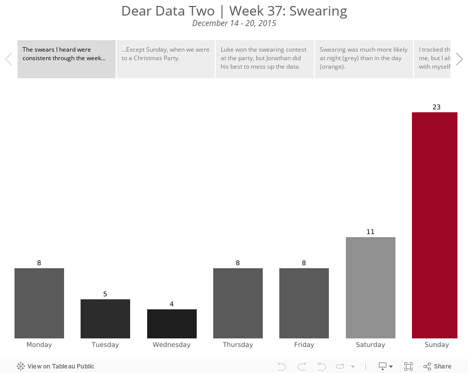
Dear Data Two | Week 37: Swearing

It was interesting paying attention to the swearing I heard around me. I know I definitely changed my behaviour this week knowing that I was tracking myself. That's been one of the outcomes I didn't expect from this project; changing my behaviour knowing I have to report on myself. Yet this week, I still swore the most. I'm chalking this up to me being with myself all of the time.
The most fun part of this week was a Christmas party we went to on Sunday. I was covertly recording all of the swear words I heard. Naturally, as people drank more, the swearing increased. Then they caught me tracking them. And the game changed. They starting blurting out swear word after swear word, knowing I couldn't possibly keep up with the tracking. So, I ignored that noise and only recorded "natural" swears.
As for the postcard, if it didn't take so long to create, I would have re-created it. I wish I had spaced out the words better for a less cluttered effect.
I'm incredibly curious to see how Jeffrey reacts to this. He was a great sport about my drinking card, given that he doesn't drink. And I've never heard him swear. Is this project changing his opinion of me? He certainly knows way more about me than he ever did before.
Check out my analysis below to see how I interpreted what the data was telling me.
December 29, 2015
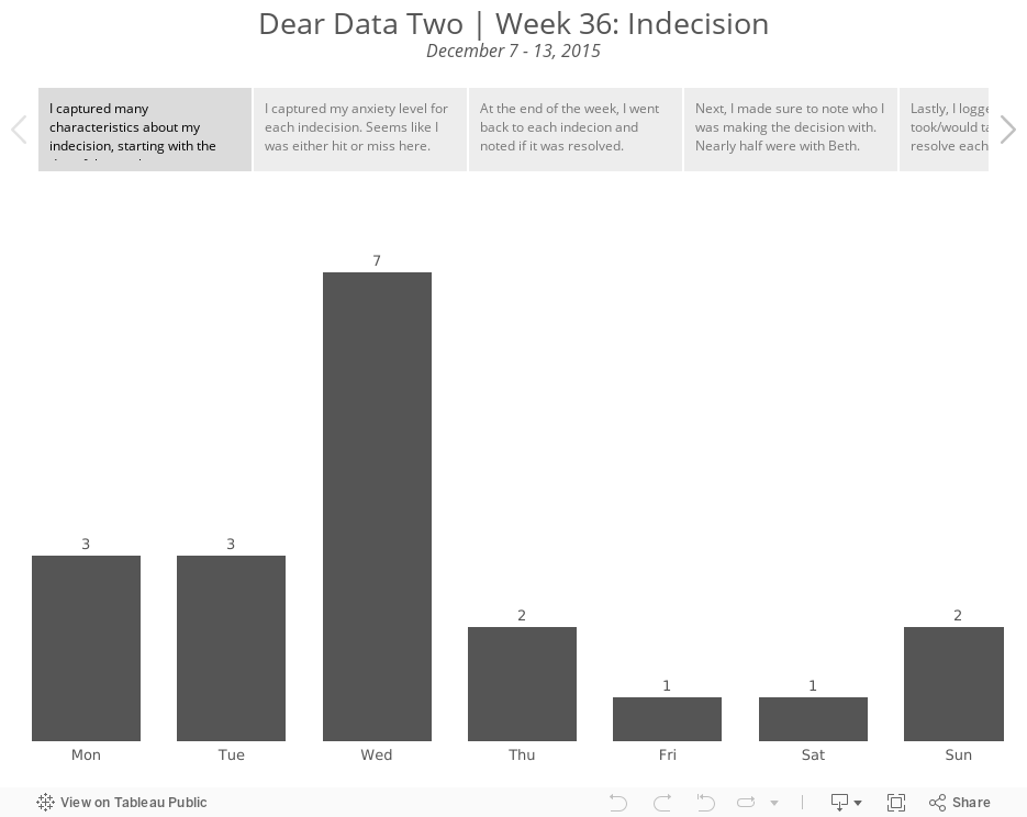
Dear Data Two | Week 36: Indecision

- Who I was with?
- What stress level did it introduce?
- What was the major topic?
- How long will it take to resolve?
- Was it resolved by the end of the week?
- There was an even split (42%) between low and high anxiety levels. To me, that means that my decisions were either simple or hard, which doesn't surprise me as I'm a pretty much black or white kind of person.
- I was able to resolve 68% of my indecisions. I take that as a good sign that I follow up on things and try to not let things pester me for too long.
- As for who I was with, nearly half of the indecisions I logged were with my wife. That didn't strike me as unusual because it's really just a sign of a married couple making decisions together.
- 79% of my indecisions took days or less to ultimately resolve.

December 28, 2015
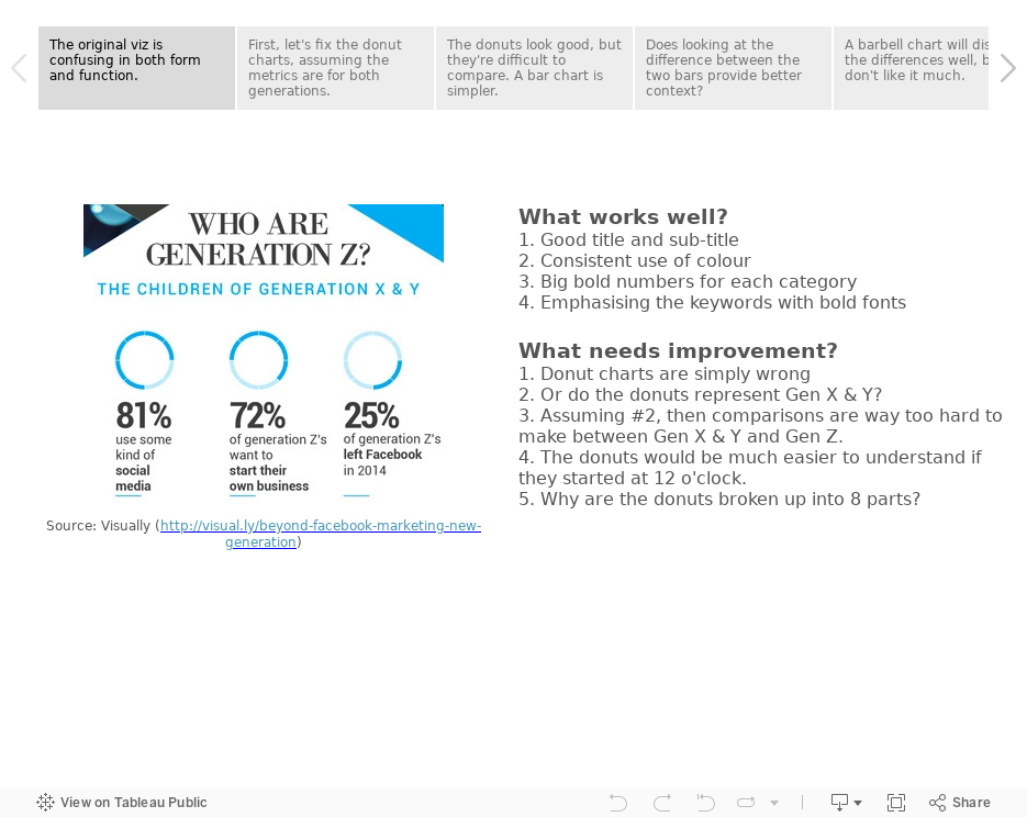
#MakeoverMonday: Who Are Generation Z?


To makeover these charts, I've used Tableau's story points to:
- Discuss what works and what doesn't work
- Take you through my thought process
- Show you alternative visualisations
- Pick a final makeover
How would you do it differently? Download the Tableau workbook and have a crack at it yourself. Leave a comment with a link to your version. Enjoy!
December 25, 2015
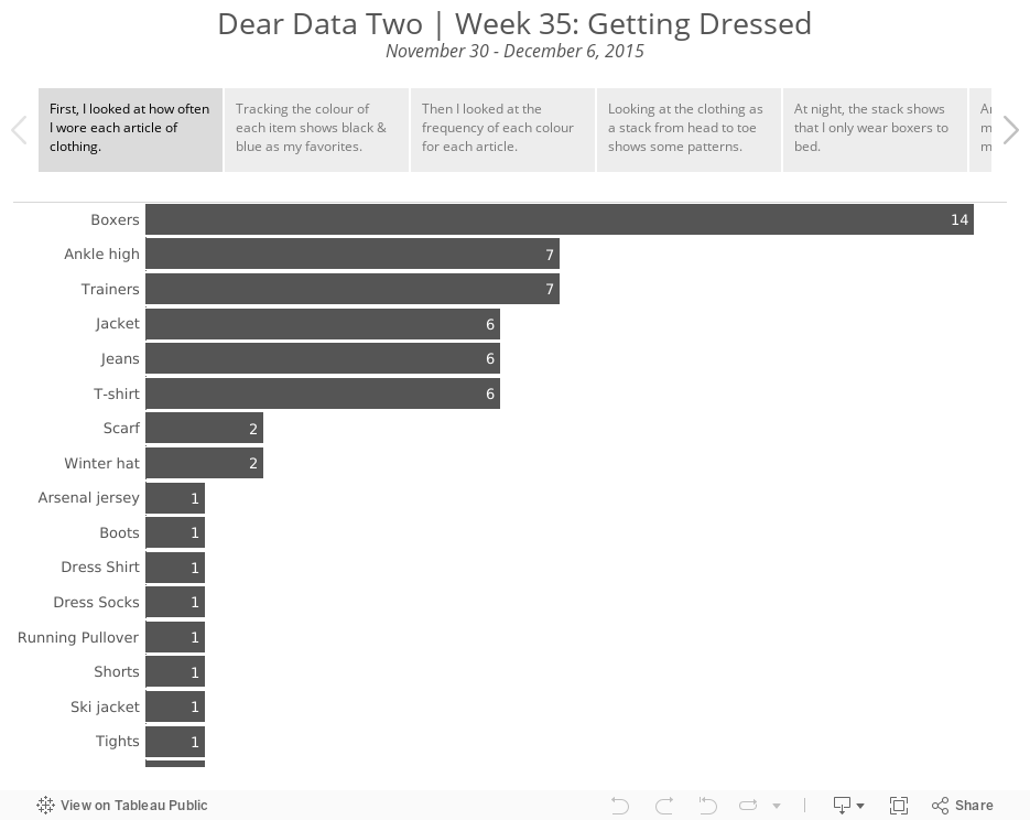
Dear Data Two | Week 35: Getting Dressed

The topic of "Getting Dressed" for week 35 felt way too similar to week 19 (Wardrobe), but I knew I couldn't take the easy way out and do the same viz again. I had two inspirations for this postcard, Jeff's bullseye card from week 19 and Stefanie's week 35 postcard which showed every article of clothing she wore. I ended up somewhere in the middle.
The data collection was straight forward. I logged every article of clothing in eight categories every time I changed. From what I wore on my feet to what I wore on my head. I then explored the data in Tableau, which you can see below.
In Tableau, I wanted to try to mimic Stefanie's card by "stacking" my clothes and I wanted to create a bullseye viz like Jeff did. I really liked how the bullseye turned out, so I showed both options to my wife. She thought the stacked clothes were easier to understand because it's like I'm building a person from toes to head.
The postcard reveals a few things:
- Clearly I like the colour blue.
- I wore trainers every day, but that's been the norm since I worked at Facebook.
- I never wear anything except boxers to bed. TMI, I know, but this is a project about learning about myself and my habits after all.
Not the most exciting week from a learning perspective, yet it was interesting learning my patterns.
December 24, 2015
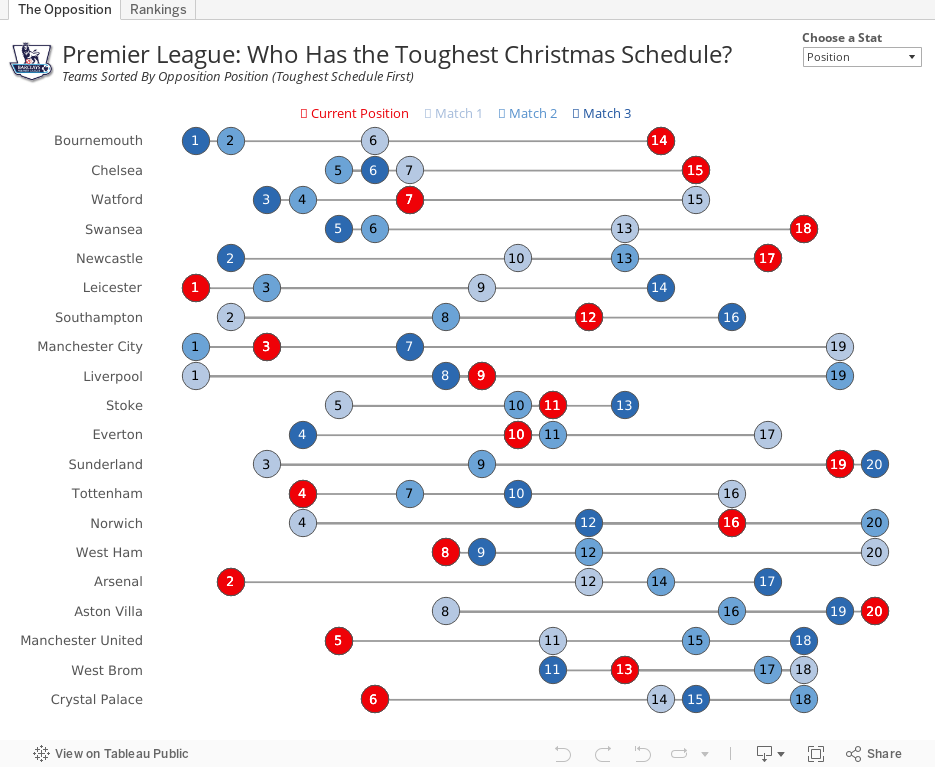
Premier League: Who Has the Toughest Christmas Schedule?

Using the viz below, you can see that, based on the average position of their opponents, Bournemouth has the toughest run followed by Chelsea. Leicester has the 6th toughest run, while Arsenal have the 5th easiest. This provides hope that Arsenal can finish the festive season on top of the Premier League.
I've added a parameter on the upper right to allow you to view by opposition points as well. In this view, Bournemouth and Chelsea still have the two toughest schedules, but the teams with the easiest schedules shifts a bit.
On the 2nd tab, I've added a bit of an exploratory view. Pick a metric and see the team rankings.
#COYG!
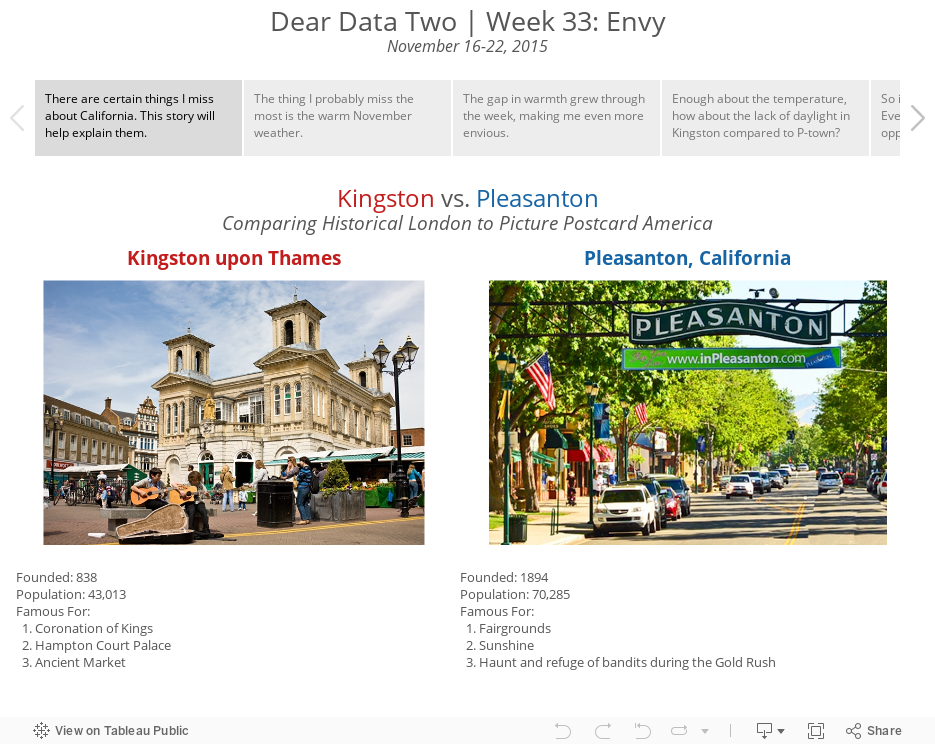
Dear Data Two | Week 33: Envy

I turned to Jeff and told him about my problem and he gave me a few suggestions. Things like creating a survey for myself or the kids. Then as I finally saw the sunshine again, it hit me. What I'm most envious of is the great weather that we used to have in California, and by contrast, how generally dreary the weather is here in London. Throw in the lack of daylight and I thought I was on to something.
To collect the data, I went to Weather Underground and recorded the high temperature, overall weather condition for the day, sunrise and sunset. I then started to explore the data in Tableau to find a story I could tell.
Here's to hoping I see the sun again before April!
December 22, 2015
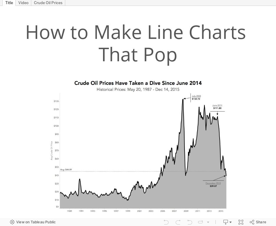
Tableau Tip Tuesday: How to Make Line Charts That Pop

In this week's Tableau Tip Tuesday, I show you how I created the line chart that I used in my Makeover Monday. I like combining area charts and line charts. To me, they are more aesthetically pleasing, make the line more impactful, and bring out the patterns in the data better. But use them with caution as well. If you're going to include the area chart with your line chart, be sure to start the axis at zero. This is because visually the reader will interpret the entire area for comparison; if you don't include the entire area (i.e., not starting at zero), then you could mislead your readers.
December 21, 2015
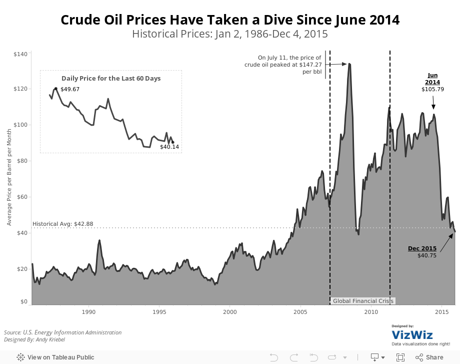
Makeover Monday: Crude Oil Prices Have Taken a Dive Since June 2014


What can be improved?
- The title doesn't tell us anything about the visualisation itself. It's important that titles engage the readers and let them know what to expect. Or the title could provide a headline for the story.
- The title says 1986-present, yet the initial visualisation shows only 2005-2015.
- The subtitle says that the viz shows "a look at previous August prices", yet every month in shown.
- There are too many lines with too many colours. Try adding all of the years back to 1986. It really gets messy then.
- It's too hard to see the overall trend from 2005-2015. The peaks and valleys are nearly impossible to see.
- The table on the bottom right is in reverse chronological order. Why? And what does the colour on the background of the table mean? It's not necessary.
So, given this list of concerns, I've created this visualisation that shows:
- The entire timeline from 1986-2015.
- I note key events that were occurring in the financial markets.
- I made the whole viz simpler and cleaner. Notice the absence of colour.
- I included the historical average for context (things aren't as bad as the original viz makes things out to be).
- I included a close-up view of the daily oil price for the latest 60 days.
Feel free to download the viz and create your own version.
December 17, 2015
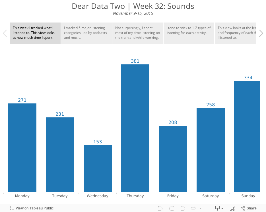
Dear Data Two | Week 32: Sounds

I tend to have a fairly set routine, so I didn't learn much about myself this week. Overall, I listen to podcasts on the train and when running and I listen to music at work and when running. I was hoping that adding the length of time listened would provide some insight, but it really didn't. The longest things I listened to were sporting events and movies, duh, of course!
Anyway, here's my Tableau story that walks you through how I looked at the data. For the postcard, I drew inspiration from Giorgia's postcard, which looks like a sheet of music. I have my lines going down as well, but my didn't turn out quite as nice. It looks like I'm hanging myself when running.
December 15, 2015
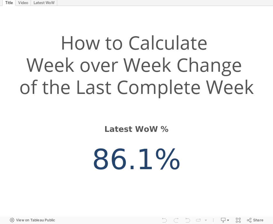
Tableau Tip Tuesday: How to Calculate Week over Week Change of the Last Complete Week

How do I calculate the week over week change for only completed weeks? And how to I show only value for the latest complete week.This required several table calculations, and I'm pretty certain that there's a better, more efficient way to calculate this with LOD calcs. However, I couldn't figure out how to get the LOD calc to work, so I got the result the way I would have before LOD calcs existed.
If you know a better way to accomplish this, please leave a comment. Enjoy!
December 14, 2015
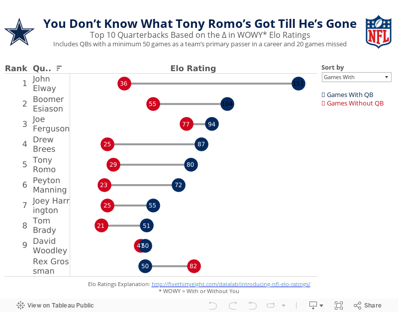
Makeover Monday: You Don’t Know What Tony Romo’s Got Till He’s Gone

Anyone that knows me knows that I despise the Dallas Cowboys and, in particular, their golden boy Tony Romo. As a lifelong Eagles fan, I’ve been indoctrinated into the hatred for anything associated with that ugly blue star. It drives me nuts to hear how much all of the NFL pundits love Tony Romo. He’s never won anything and chokes in the playoffs every time they make them.
So when I saw this article by FiveThirtyEight, it caught my attention. Was I not giving Romo his due? Does that matter anyway? In the article, the author looks at a metric they call WOWY (or With or Without You). In its most basic sense, this metric measures the impact that a particular player has on their team by measuring the Elo rating when that players plays and when they do not. For this piece, they considered quarterbacks that were the primary QB for at least 50 games and missed at least 20 games. They then pared that down to the top 10 based on what they called the WOWY ∆ ELO.
The result is this table:

The table clearly shows Tony Romo as the 3rd most important player to their team based on this metric. Ok fine. But is there more to the story? Can this simple table be made more intuitive for the readers to understand?
I created the barbell chart below. This view makes it much easier to see the difference between the With and Without You metrics. I also added a metric to the view that calculates the difference between the two. I then created a drop down to allow you, the reader, to sort by the metric you find most interesting. In essence, I’ve turned this simple table into four stories:
- WOWY ∆ ELO - This metric shows Romo as the 3rd most missed player in NFL history when he’s out injured.
- Games With - Sorting the chart by the Games With Elo rating, suddenly Romo is only 5th on this list, yet he’s ahead of Peyton Manning. This view also shows just how amazing John Elway was when he played. Elway’s Elo rating is nearly 50% higher than the second best.
- Games Without - Interesting…the teams that Rex Grossman played for actually performed better without him in the lineup. Clearly he was quite terrible as an NFL quarterback. You can also see Romo down in 6th position; the Cowboys are definitely much worse without him.
- Difference - I added this metric to show the variation between the With and Without You values. Now Romo is back in the 3rd position, and look at that gap for John Elway…wow!
Give it a play for yourself. Do you see anything else interesting?
December 12, 2015
Dear Data Two | Week 31: Positive Feelings

I recently had a conversation with Paul Banoub and he was telling me about the impact that the Dear Data Two presentation in Vegas had on him, particularly when I talked about being nicer to people (specifically my family). This really struck me and it made me realise that I have a great opportunity through this project to really learn about myself.
So when I looked back at tracking positive feelings, I assumed that all would be rosy and great. I mean, I have a great life, a great job, a great family, live in an amazing place. Yet little did I know that I was in for a shock!
For week 31, I tracked the time, place, who I was with, and what I was doing each time I felt a positive emotion. I started by exploring the data in Tableau, which I walk you through in the story points below. The shock came when I started looking at the people I was having positive feelings with, or I should say, the people I WASN’T having positive feelings with, notably my three youngest kids. I had no idea that I felt this way until I actually looked at the data, and this is the power that this little project has brought into my life. It has helped me recognize areas where I can improve. For that, I’ll be forever grateful.
If I listen to the data, I can make a real, significant difference on my life, how I perceive people, how I treat people, and how and who I spend my time with.
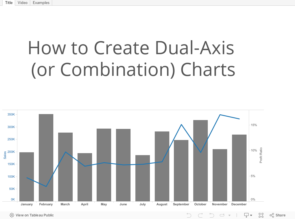
December 8, 2015
Tableau Tip Tuesday: How to Create Dual-Axis Charts

December 7, 2015
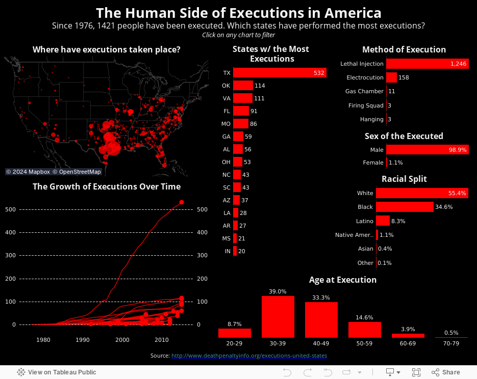
Makeover Monday: The Human Side of Executions in America

For this week's Makeover Monday, I take a look at this visualisation I saw on FlowingData.

What works well?
- Nice summary table
- Impactful
- The chart needs a title.
- There are too many colours on the line chart to distinguish and unless you pay attention carefully, you might not notice that the legend is actually the text on the table.
- The scale of the line chart distorts the view and the non-linear scaling is not called out.
- The line chart should have about a 3x2 scale; this one is more like 2x3, making the lines too steep.
- For people not from the US, a map would be helpful.
- Why not include the data for all states? It only took me a few seconds to find it.
- My eyes are drawn to all of the text on the upper left first, not the story in the charts.
December 4, 2015
Dear Data Two | Week 30: Time Alone

This was the first time I ever remember consciously thinking about my state of “being alone” and what being alone means. I always thought that I was alone more than I apparently am. In this week, I was alone 44% of the time, and what really surprised me is that I was alone the most on a Saturday, which is when I normally spend a lot of time with the kids. Perhaps this isn’t a representative week of my life due to our family holiday. If you don’t count sleeping as time alone, then I spent very, very little time alone in this week. I really do enjoy being around people though.
As for the data collection, I created a spreadsheet for each hour of each day and recorded whether I was alone or not. I defined “alone” as being either:
- By myself
- Around others but not interacting with them
- In an “alone” state of mind
From there, I recorded what I was doing during each hour. I then looked at Stefanie’s postcard because I wanted to emulate what she did in Tableau before creating my own postcard.
December 2, 2015
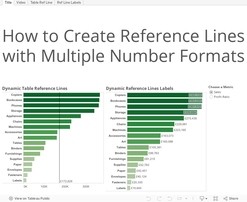
Tableau Tip: How to Create Reference Lines with Multiple Number Formats

This tip comes from a question on this blog post: Can you have one parameter and multiple number formats for reference lines?
Well indeed you can! And here's the demonstration of how to do it. Enjoy!
December 1, 2015
Dear Data Two | Week 34: Urban Wildlife

The pigeons scare the daylights out of me, but this week, I decided to note every time and place that I saw a pigeon and how they reacted to me. One interesting thing I found is that they only seem to be prevalent during the day; I only saw one all week in the evening.
After plotting them on a map, I decided to copy what one of Jeff's students did in class: create a map overlay. The postcard itself only plots the pigeon sighting (which I really like how it turned out), whereas if you add the map overlay, you then see the locations of the pigeon sighting. Great idea from UoC!!

Tableau Tip Tuesday: How to Create a Single Filter with Multiple Levels of Aggregation

This week's tip covers two scenarios which are based on a great question from Pablo Sáenz de Tejada, who recently finished his training at The Data School and is on his first placement at easyJet with Paul Chapman.
- First, Pablo wanted to know how he could create a single select filter that includes multiple levels of aggregation (e.g., State and Region)
- Can he include a custom level of aggregation in the same filter (e.g., a custom defined Region)?
With that question in mind, here is this week's tip.

November 30, 2015
Makeover Monday: The Budget of A 25-Year-Old

Several months ago, I read this interesting article about a 25-yr old that was tracking his expenses and how he was choosing to budget his money. The author of the article chose to show the breakdown of the budget as two separate pie charts. This wasn't a surprising choice as it's the first way we learn to show parts to whole in school. The problem of choosing a pie is compounded by including a second pie for the next year, to which you are expected to make comparisons.
So, in this week's Makeover Monday, I walk through a better way to show this data. Enjoy!

November 23, 2015
Makeover Monday: Stephen Curry is Taking 3-Point Shooting to a New Extreme

November 21, 2015
The Golden State Warriors Have the Most Efficient Payroll in the NBA
With that being said, I decided to re-work the story and elaborate on Brian’s point. In this story, I walk through an analysis of NBA payrolls versus winning percentage.

November 19, 2015
Philadelphia Has the Worst Sports Teams in North America
How bad are Philly sports teams?
- The Eagles are more or less unwatchable. They’re inventing new ways to lose.
- The 76ers have lost 20+ games in a row. That’s really, really hard to do in the NBA.
- The Flyers couldn’t score if there was no goalie in the opposing net.
- The Phillies…well, they did their best to be one of the worst baseball teams of all-time.
I took the ugly table of numbers from the article and built the interactive dashboard you see below, confirming my worst fears.
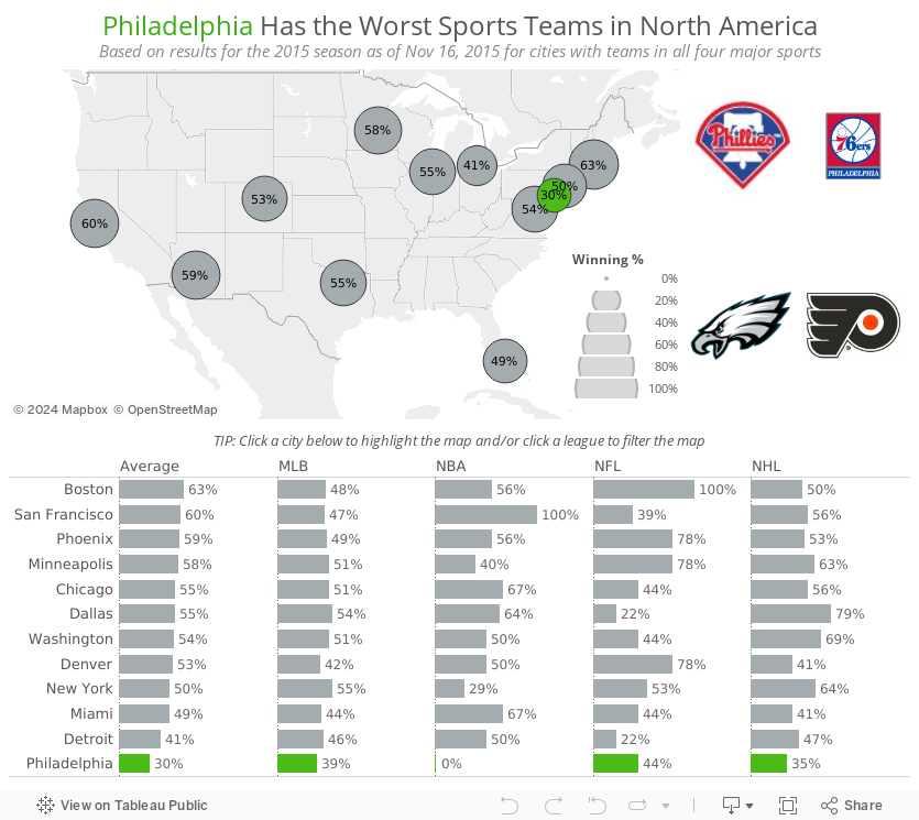
This merely confirms the misery that is being a Philadelphia sports fan.

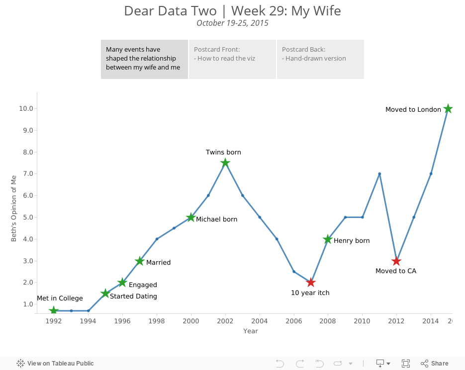
Dear Data Two | Week 29: My Wife
I then had a chat with my boss, Tom Brown, and in his Tom Brown way, he said that I should simply track the number of wives I’ve had over time. Well, I went with that idea and added a twist. At our #DATA15 presentation, I talked about the wife KPI, so what I decided to do is create a chart of the wife KPI since Beth and I first met in 1992.
From there I added major milestones to the dataset, categorised those event as positive or negative, then built a simple line chart. It's really interesting to me to see the ebbs and flows of our relationship. I would have never noticed it if I didn't see it depicted on a graph this way.
Note that on this postcard, I intentionally used red/green to indicate bad/good. I preach to people not to do this if they don’t know if their audience is colour-blind. In this case, my audience of 2 (Jeff and my wife) are not colour-blind, so I knew it would work.

November 17, 2015
Tableau Tip Tuesday: Aligning Time - An Analysis of the Greatest 3-Point Shooters of All-Time
Click on the video tab to see how I built this.
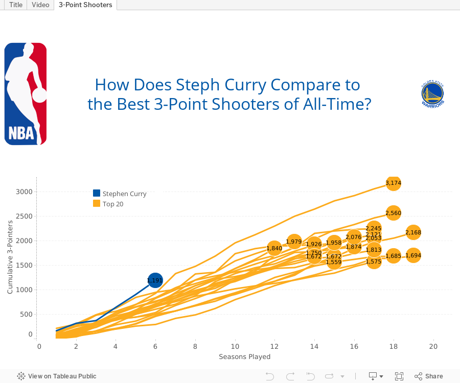
SPOILER: At this point in his career, Curry is far and away the best 3-point shooter of all time.

November 16, 2015
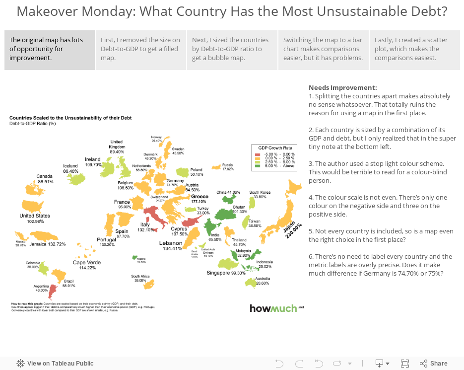
Makeover Monday: What Country Has the Most Unsustainable Debt?


Let’s take a look at what they’ve done poorly:
- Splitting the countries apart makes absolutely no sense whatsoever. That totally ruins the reason for using a map in the first place.
To Do: Put the map back together and let the map serve its purpose. - Each country is sized by a combination of its GDP and debt, but I only realized that in the super tiny note at the bottom left.
To Do: Make the sizing more obvious and easier to understand. - The author used a stop light colour scheme. This would be terrible to read for a colour-blind person.
To Do: Change the colour scale to something more effective that appeals to everyone. - The colour scale is not even. There’s only one colour on the negative side and three on the positive side.
To Do: Make the ranges equivalent. - Not every country is included, so is a map even the right choice in the first place?
To Do: Consider alternative charts, e.g., bars. - There’s no need to label every country and the metric labels are overly precise. Does it make much difference if Germany is 74.70% or 75%?
To Do: Clean up the clutter.
Given the above challenges, I’ve used Tableau story points to walk you through the makeover. In the story, I take you through a series of visualisations that gradually improve the original.