March 19, 2025
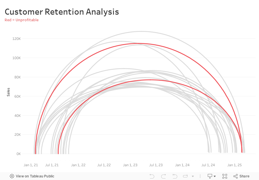
How to Analyze Customer Retention with a Jump Plot

-
Connect sales data source to 180 points and relate “1” to “1”
-
Compute Min Date by customer
{ FIXED [Customer Name] : MIN([Purchase Date]) } -
Compute the Max Date by Customer
{ FIXED [Customer Name] : MAX([Purchase Date]) } -
Filter customers that made more than one order (Max Date > Min Date)
[Max Date]>[Min Date] -
Create Customer Length calc
DATEDIFF('day',[Min Date],[Max Date]) -
Create Columns calc (continuous dimension)
DATE( ((COS([Point] * PI() / 180)) + 1 ) * (FLOAT([Max Date])-FLOAT([Min Date])) / 2 + FLOAT([Min Date]) ) -
Create Rows calc (continuous dimension)
SIN((MIN([Point])) * PI() / 180) * SUM([Sales]) -
Add Columns and Rows to viz
-
Add Customer to Detail
-
Add Path to Path
-
Create Profitable calc and add to Color
{ FIXED [Customer Name] : SUM([Profit])}>0
February 20, 2025
How to Create a Multi Column Dot Plot

February 12, 2025
Advanced Calendar Heat Maps in Tableau (No More Workarounds!)

February 4, 2025
How to Exclude Reference Lines from Grand Totals in Tableau

Ever added a reference line to your Tableau visualization, only to see it appear in the grand total row, even when it doesn’t make sense?
If your grand total uses a different aggregation than your main data (e.g., SUM vs. AVG), the reference line can be misleading.
Unfortunately, Tableau doesn’t offer a simple way to exclude it—but there’s a trick to removing it while keeping your totals visible.
In the video below, I’ll walk you through the step-by-step solution to remove reference lines from grand totals.
Want to become an advanced Tableau user?
Unlock your full potential with Next-Level Tableau, the ultimate training program for Tableau users. Gain access to expert-led tutorials, live sessions, and a supportive community designed to help you master advanced skills, create stunning dashboards, and achieve your career goals.
Learn more and take your Tableau skills to the next level today at nextleveltableau.com.
Unsure? Sign up for my free course at starter.nextleveltableau.com.
January 22, 2025
L-Shaped Bars: The Chart You Didn't Know You Needed


December 20, 2024
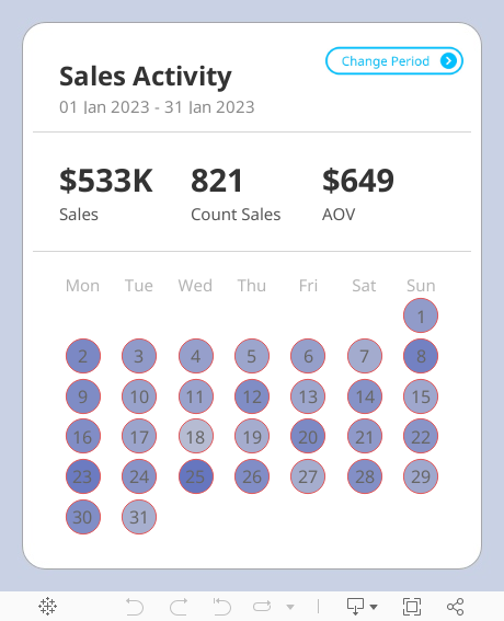
Create a Custom Calendar Widget

Thanks Nicholas for providing me with the data set and setting an example of how simple visualization can communicate data effectively.
If you're not already following Nicholas, do so. You're guaranteed to find inspirational designs for your dashboards.
No extensions required. I think you'll love the trick I did with the title so that you can't click on it.
Downloading the workbook so that you can reverse engineer it is one of the best ways to learn.
December 17, 2024

Learn how to build a stunning waffle chart in Tableau using map layers and calculations!
This advanced Tableau tutorial will show you how to simplify the creation of waffle charts while unlocking powerful design and flexibility for your data analysis projects.
You’ll Learn How To:
- Connect Tableau to Superstore and a waffle chart template with Relationships
- Use the MakePoint function to create dynamic map-based charts
- Apply map layers for advanced customization and perfect label placement
Why You Need This:
This method combines advanced Tableau charts with the flexibility of map layers, allowing you to:
1. Create precise grid-based waffle charts.
2. Perfectly center labels without complex workarounds.
Who Is This For?
- Data analysts looking to enhance their Tableau dashboards
- Advanced Tableau users exploring new chart techniques
Become a Next-Level Tableau member and become a Tableau expert

November 25, 2024
Perfect Labels For Rounded Bar Charts In Under 2 Minutes

Labeling a rounded bar has always been tricky. You might manually drag the labels, try to play around with the alignment and more, but still, you can't get the labels perfect.
No more! In this Tableau Tip, I'll show you:
1. Why standard labels don't work
2. How to build a rounded bar chart
3. How to perfectly align the labels
September 26, 2024
Stop Chart Disasters NOW With This Crucial Method

August 30, 2024
How to Create a Win/Loss Sparkline

Check out the workbook here.
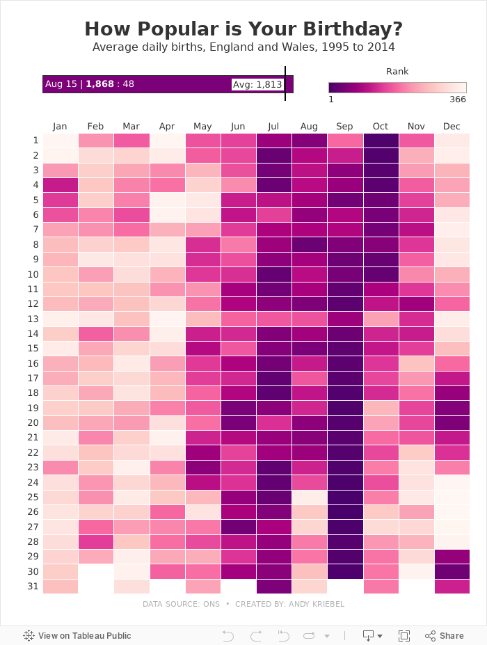
August 15, 2024
How Popular is Your Birthday?

Click on your birthday to see how popular it is.
July 8, 2024
Build an interactive Tableau dashboard in 3 minutes!

Build 80% of your dashboards with these 4 charts, a bit of interactivity, and that's it.
You probably won't need to create anything fancy, formatting will be minimal, and you won't need to wrestle with containers.
This video show you how to create it in only 3 minutes!
June 30, 2024
How to Rank & Filter the Top 5 in Tableau in Under 60 Seconds!

June 28, 2024
How to Replace a Datasource & Fields in Tableau

Need to change a datasource but don't want to rebuild the workbook? Has a field name changed?
It can be a real pain to update each sheet in a workbook one by one.
Conveniently, Tableau allows you to change the entire datasource with the "Replace Datasource" option.
Or, if you only need to change a field, Tableau has an option called "Replace References" that allows you to swap one field out for another all in one shot.
In this example, I take you through the whole process.
You could also apply this method when you simply want to swap out all existences of one field for another.
For example, you want to change all used of Order Date to Ship Date.
Easy peasy!
June 25, 2024
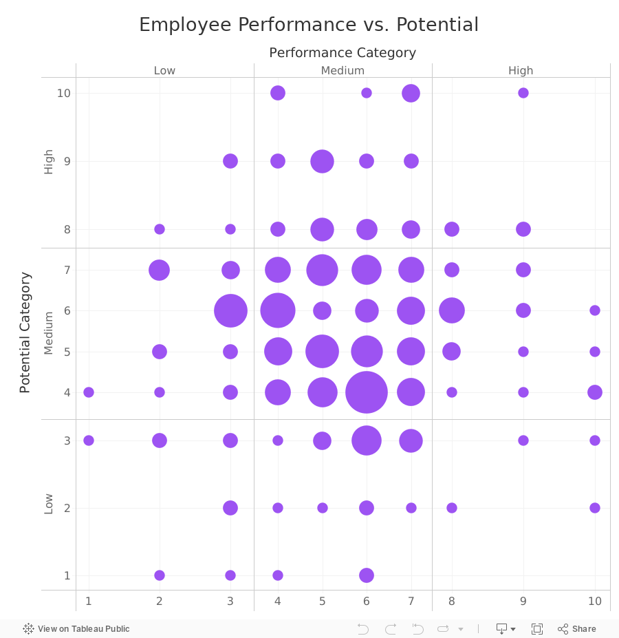
How to Create a 9-Box Matrix in Tableau

In this video, I show you how to build a 9-box matrix.
These are commonly used in talent management and HR to map a company's workforce along two dimensions, potential and performance.
Each of these two dimensions is split up into three categories, low, medium, and high, depending on the score.
For each employee performance is then plotted horizontally and potential is plotted vertically. From there, we summarize the number of employees that fall within each box.
June 20, 2024
How to Simultaneously Highlight & Deselect with a Parameter Action in Tableau

June 4, 2024
Find Red Flags in Your Data in ONLY 5 MINUTES with Control Charts


